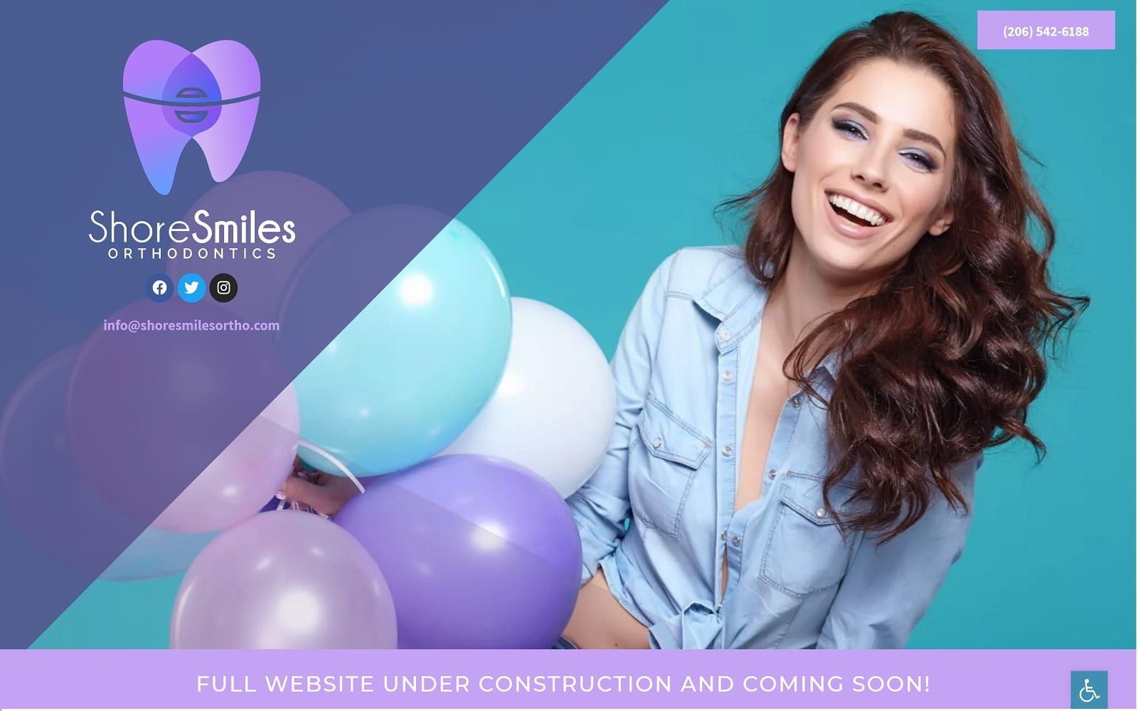
This website’s design includes a playful color scheme consisting of pinks and blues with a dash of white. These colors bring with them associations with hope and nurturing, while the lavender shades represent subtle calm. This orthodontics website is a welcome feeling for those nervous about receiving dental care. The dividing slash through the hero image brings a sense of energy to the site while serving a function we’ll touch on soon. Pink and blue are used as action colors, drawing the eye. They direct viewers to the phone number and accessibility tab directly below it alike. The dynamic mobile-responsive hero image adjusts depending on the screen size used by the visitor, ensuring full compatibility across all platforms.
The hero image on this page is more than a pleasing aesthetic; it also uses artistic design to attract the viewer’s eye. It draws the eye down the angle of the divider, connecting with the phone number, social media contacts, and email address for the clinic. The site is geared for accessibility through the blue tab found in the bottom right corner bearing the disability logo. This tab opens a menu that allows the patient to alter the visual elements of the website to ease their interaction and ensure they can make the best use of the clinic’s site. Click-to-dial functionality will be integrated with the phone number to ensure that patients on mobile devices can reach out to the clinic with a swipe of the finger.