New design idea

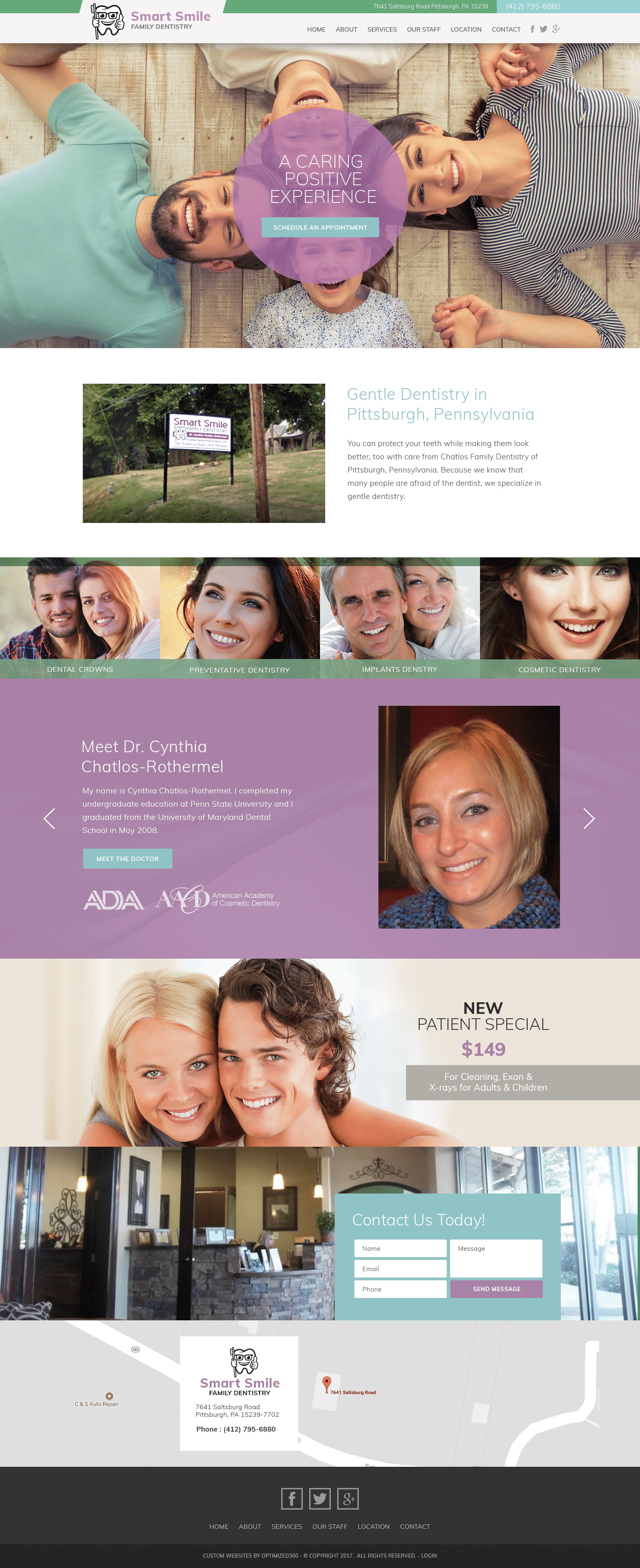
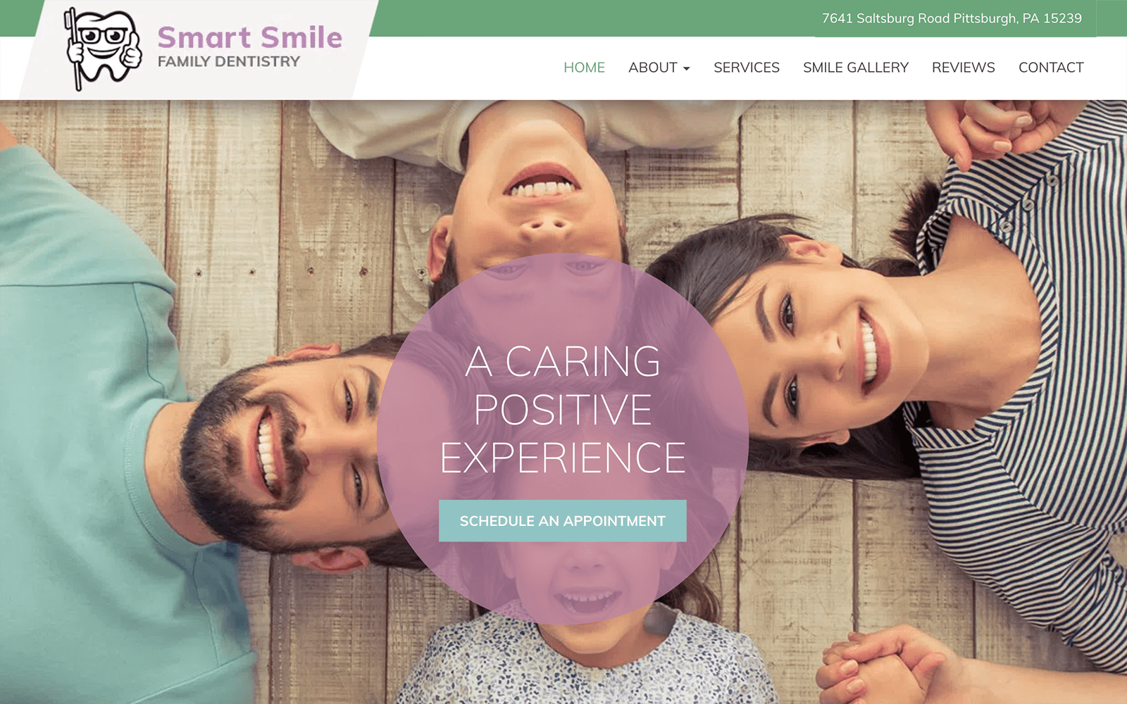
Cynthia Dentistry personalizes its dental website with sentimentality, embracing the qualities of lavender purple, spearmint green, and light blue to accomplish this goal. All of these colors have similar attributes, working with the gentleness of their hues to create tranquility throughout the site. Mauve brings notions of nostalgia, romance, and sensibility. Spearmint green brings freshness, creativity, and crispness, and thus combines beautifully with the mauve purple. Light blue promotes trustworthiness and innocence. These colors maintain cool tones and compliments one another in their similarities. Each of these colors is implemented in varying degrees without overwhelming one another, and the website’s choice in family-focused photography and design elements, including its choice in slideshow applications, semi-flat designs, and layouts, all promote the gentleness and courtesy that Cynthia Dentistry hopes to achieve.
Cynthia Dentistry establishes its home page by beginning with a solid white border, containing the website’s main menu services, click-to-call service number, social media icons, and business logo. Underneath, the hero image contains its introduction text and action button for scheduling appointments. Its featured services include elements such as a semi-flat design that expands when hovered over, and its slideshow presentation showcases its main dentists and its staff members. Near the footer of the page, the HIPPA secure form can be filled out and submitted for security. A google maps widget can be interacted with, containing click-to-action service numbers and addresses for immediate contact. The footer repeats its social media icons and main menu services and contains its copyright information and login portal for admins.


