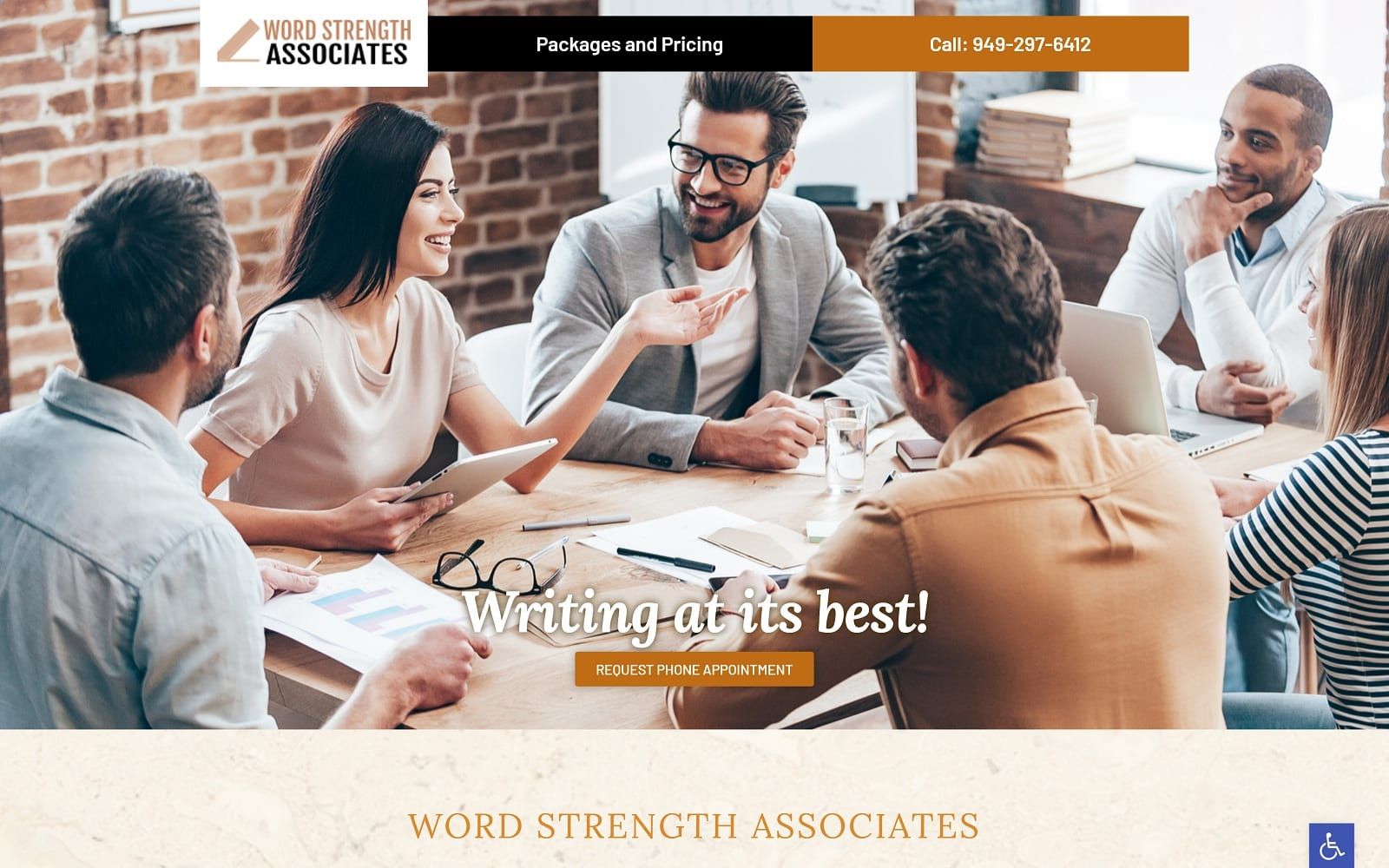
A group of professionals sit around a table networking and brainstorming their next big project in this websites hero image, promising boosted productivity to visitors. The color palette used in this website’s design is black, orange, and a marbled white that provides a striking contrast while giving a sense of professionalism and motivation. Imagery is used throughout the site to demonstrate the specialties and services provided and the boost customers will see in their business by working with Word Strength Associates. The website has a streamlined layout that meets the needs of modern users through its mobile-responsiveness design. This site has a minimalist approach to it that makes finding everything a visitor needs easy.
Ease of function is key to the layout and design of this website, starting with its inclusion of all available services and contact number in its opening page. Brevity best conveys the skill set this company provides, demonstrating its ability to deliver necessary information in a compact and direct way. Information is seamlessly conveyed to the visitor as they scroll through its minimalist design. Each section containing valuable information about the services they provide, their company philosophy, and the pricing available for its most common projects. The testimonial section makes maximum use of space with a scrolling slideshow of word-of-mouth references from previous clients.