New design idea

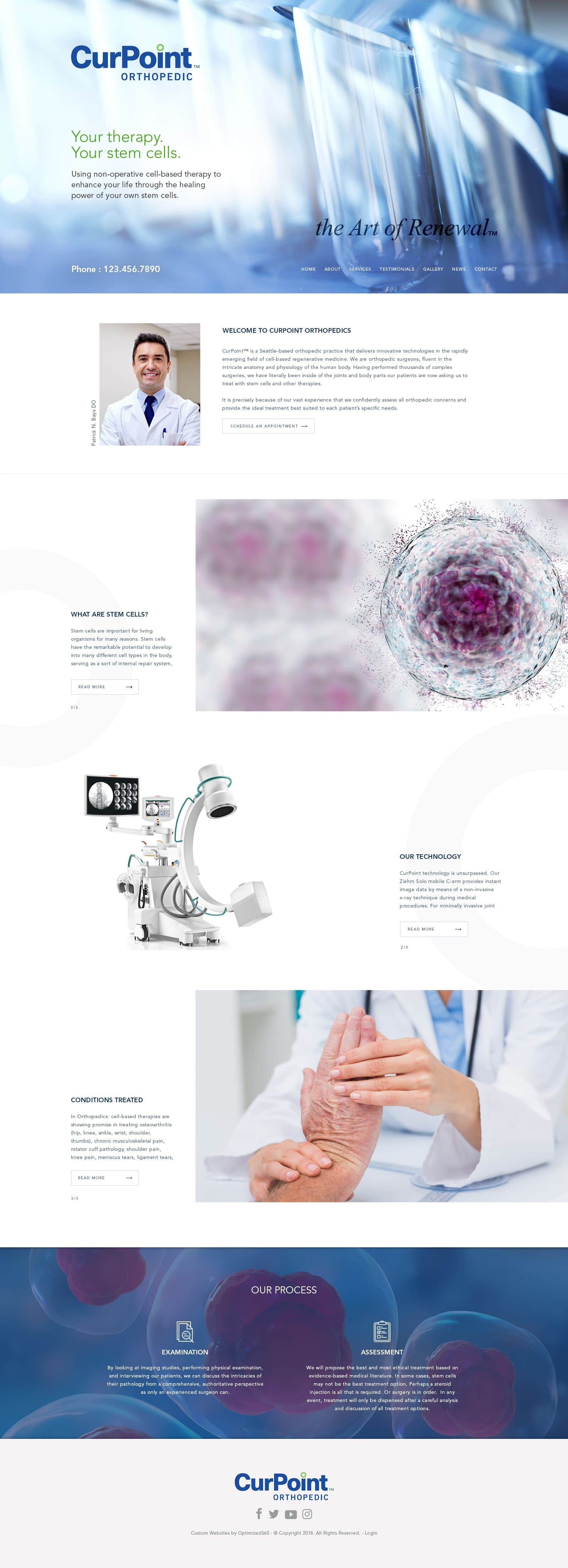
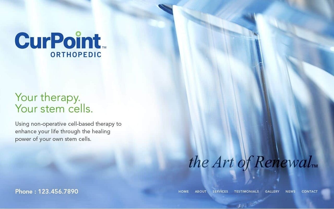
CurPoint Orthopedic Surgery publicizes its qualifications, expertise, and transparency through a dependable, classic color palette, utilizing the effects of dark blue, white, and yellow-green to show off its progressive design. White primarily acts as a clear background, giving clarity and focus to its users, and dark blue establishes authority and intelligence, complimenting the white and creating a professional setting for engagement. Yellow-green’s used as an accent color, and while normally used to bring cheerfulness and excitement, it instead creates a dynamic sense of sustainability. CurPoint Orthopedic Surgery website opens its page with actively engaging features, which include design elements such as video widgets, large background images, and hyperlinks. All of the elements combine to form a space of competence and command for the user, implementing its abilities and proficiency through commitment and finesse.
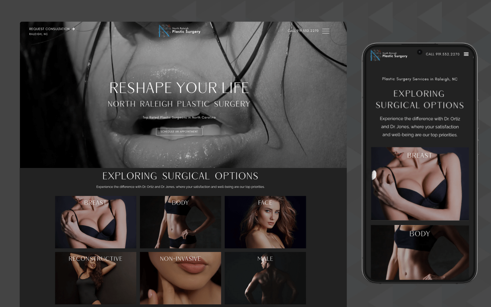
CurPoint Orthopedic Surgery institutes its web site through a responsive, transparent header that transitions into a hamburger menu when shrunk, and the header contains the company logo, service number, click-to-action email address. Its hero image contains its introduction text and action button for scheduling, and below the hero image, a video is embedded for immediate engagement. Each of its divisions is sectioned out by subheaders and correlated with images, with parts of the information text containing hyperlinks to other parts of the website. Near the footer of the home page, an advertisement for their services can be found, allowing users to interact with the action button for scheduling appointments. At the footer, users can interact with its main menu services, business logo, and connect with the business’s phone number and email address.


