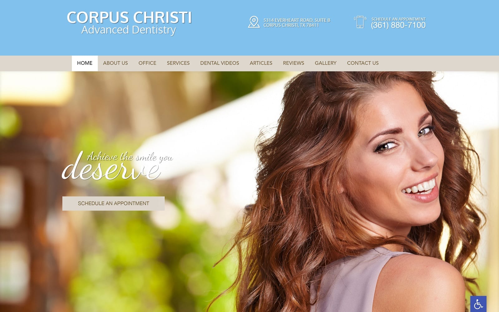
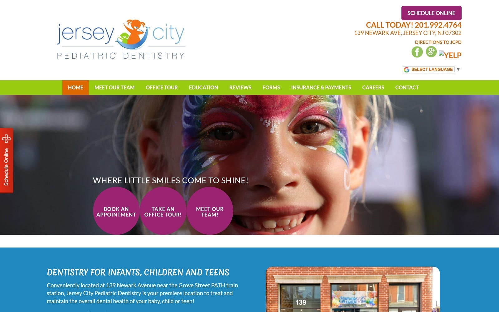
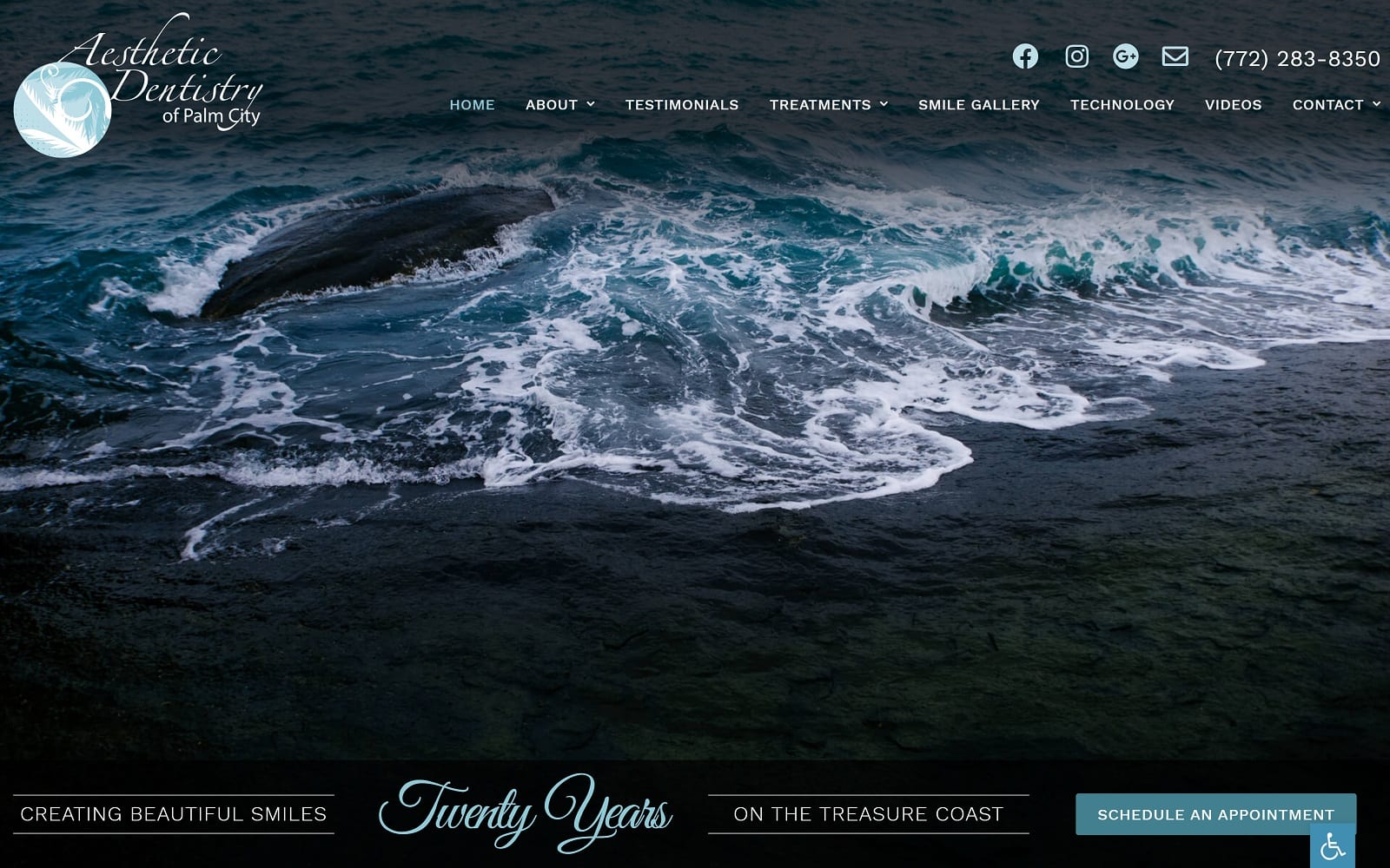
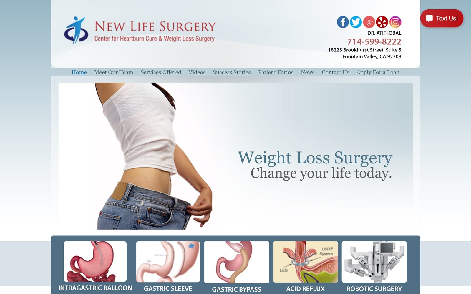
Located in Corpus Christi, Texas, Corpus Christi Advanced Dentistry aims to be at the forefront of dental care with advanced technology and treatment methods that set the bar for surrounding dentistries. Build to be modern and professional, we designed a custom website that would help feature these distinctions that differentiate Corpus Christi Advanced Dentistry apart from the competition.
Overview of Design
In our day and age, having visuals on your website is no longer an option – it is no a MUST. We designed the home page to be both modern and professional. Essentially, the entire home page is comprised of engaging images that reflect the services offered at the dentistry. Some of the pictures also having a gliding feature when you scroll over them. Near the bottom of the homepage, you will conveniently find the team’s mission statement as well as some additional links to patient videos and a contact form to schedule an appointment. The website uses a full-width layout that allows for optimal reading engagement as well.
Use of Color
Along with all the images featured on the website, we also lightly used blue to highlight the certain call to actions throughout the website. When you blend blue with a wide white background, you create an aesthetic contrast that works well with the specialty at hand. The blue meshes well with the imagery on the website to create a feel-good, family-orientated impression for incoming patients.
Design Elements
When building any website, we go out of our way to ensure that all the features on the given website is easy to navigate and remains accessible at all times. The navigation menu on top of the web site features all the additional services and educational videos that any patient could ask for.
The articles page is home to a plethora of information. Here, readers can learn more about the different procedures offered. When you click on any of the procedures specifically, you are redirected to another page that describes the procedure in more detail. Spacing is always expertly managed on all our websites. No one likes to read on a website that is crowded and sloppy.
The dental videos tab features a video database that helps incoming patients review different dental services. This is a great way to help any patients with dental anxiety and can mean the difference between a skeptical patient to a committing, lifelong patient. The smile gallery features many before-and-after shots of clients. There are also different video testimonials featured on the page as well.
Marketing Aspect
Clear, cut, and concise, we planted Corpus Christi Advanced Dental’s contact information and office address on the top of the website – a call to action for any incoming traffic. Blogging and informing patients is a great way to bring in additional traffic to your website. Featured on our navigation menu, there is a tab dedicated to the team’s blog articles and informationals. These visuals are a great way to convince first-time web visitors about your experience and knowledge of the dental industry. At the bottom of every web page, you will find additional quick links to help increase traffic engagement with the website. Right next to the quick links is an interactive Google map for patients to time their estimated time of arrival to the office!
Image the Website Represents
This website reflects a practice that is in touch with its community and is utilizing the latest technology in its website design. Potential patients tend to look locally for their medical care needs and prefer working closely within their community. This site uses excellent design and imagery to help display its connection to its community.


