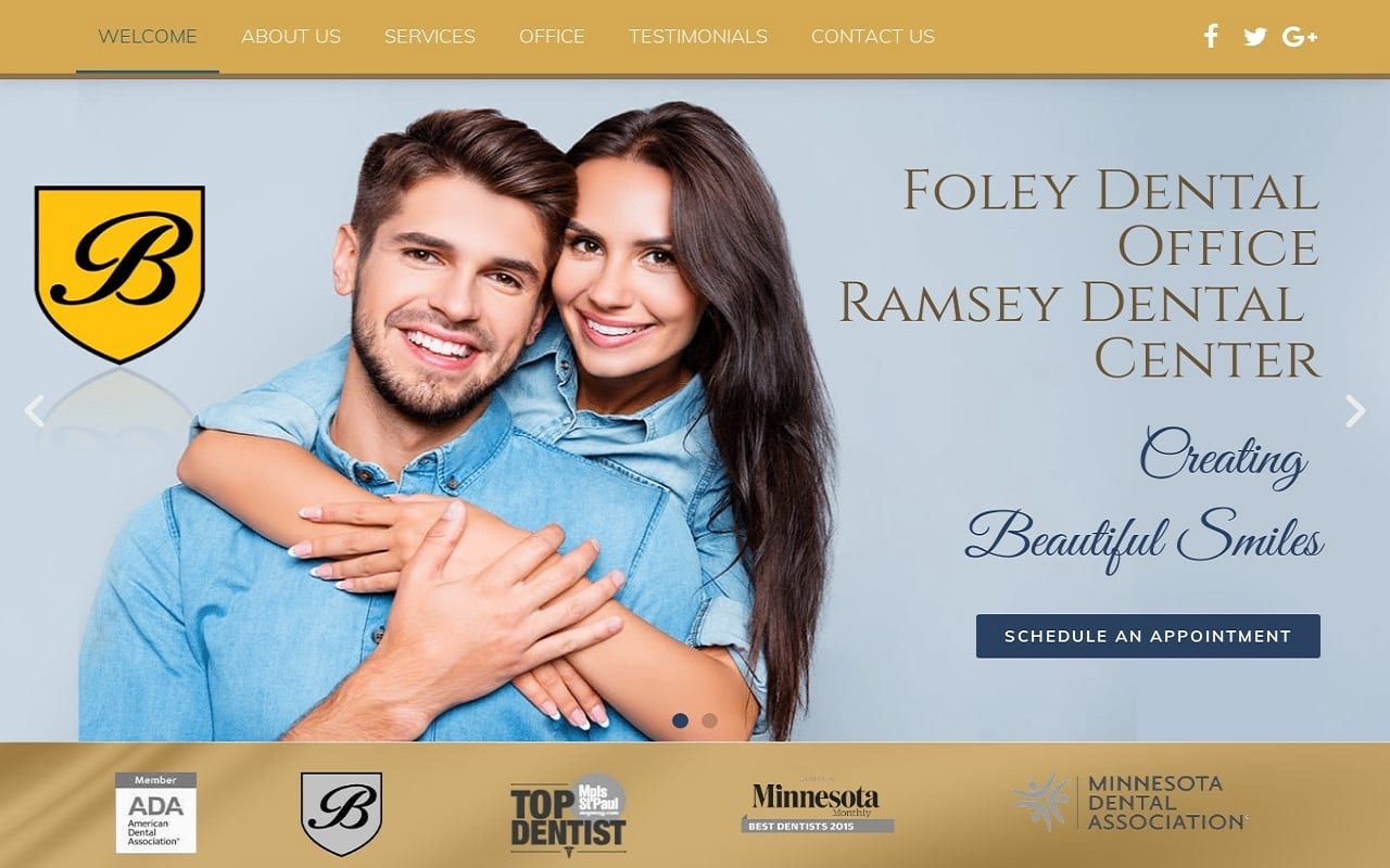
When Foley and Ramsey Dental Center approached us to produce a website for them that would be warm and inviting for their visitors, as well as easy to navigate, we knew exactly what to do. It started with a palette of warm complimentary colors and bright smiles and then carried through to an elegant design that puts everything the visitor needs at their fingertips without having to look around.
Overview Of The Design
The people at the Foley and Ramsey Dental Center love their community and love helping the patients who walk through their door. It all starts with a welcoming office atmosphere that makes it apparent that the office exists to serve, and we wanted to reflect that in their site.
Use Of Colors
When we use orange in a website design, we’re already setting the theme for the rest of our work. The color orange is unremittingly friendly and inviting, but it also can be a bit picky about the colors it contrasts with. The neutral and professional white is a great first choice as a contrasting color, and you’d be surprised how well the soothing and reliable nature of blue completes the set.
• Contrast – While great contrast exists in this site, it’s all done quite subtly. Orange, blue, and white don’t tend to make strong statements (though white can on a darker background) but instead blend together into a pleasing and comfortable palette.
• Striking and Compelling Blue – Blue is the color of choice for calling the customer to action in this site. Set against the orange/gold background the vivid blue that was chosen stands out, making it the perfect choice for buttons as seen below.
Analysis Of Design Elements
One of the most critical elements of design in our dental websites has to do with ease of navigation and immediate access to the contact information on the site. Medical and dental sites both need to have clear information presented in an accessible way, and we feel that this design accomplishes that well.
• Space – The available space on the site is used clearly and effectively, without making the webpage seem crowded. Everything in the site is laid out in a clean manner that makes it easy to get what you came for.
• Navigation – The presence of a Hamburger Menu at the top of the screen is one of the hallmarks of sleek, modern design. Hamburger menus make information immediately accessible, and in many cases will scroll through the site with the viewer.
• About Us – The About Us pages serves as one of your first introductions to potential patients, and this one is laid out in a way that lets you get a good piece of information about each of the three friendly doctors that work here. Wrapping it up with their mission statement and links to more information about how their office works and its accreditations ensure the viewer they’re working with professionals.
Marketing Aspect
Marketing is one of the trickiest aspects of any website, as it requires combining a sleek and easy to use interface with aspects that drive conversion in visitors. One of the most important pieces driving a marketing based website is ensuring that it’s easy to navigate and that the contact information is immediately available.
• Contact Information – The contact information on this site is prominently displayed part-way down the page in an attractive and eye-catching display under the navigation cards. Along with the social media links available at the top of the screen and the hamburger menu with a direct link to the contact us page, it’s easy to get in touch with the office.
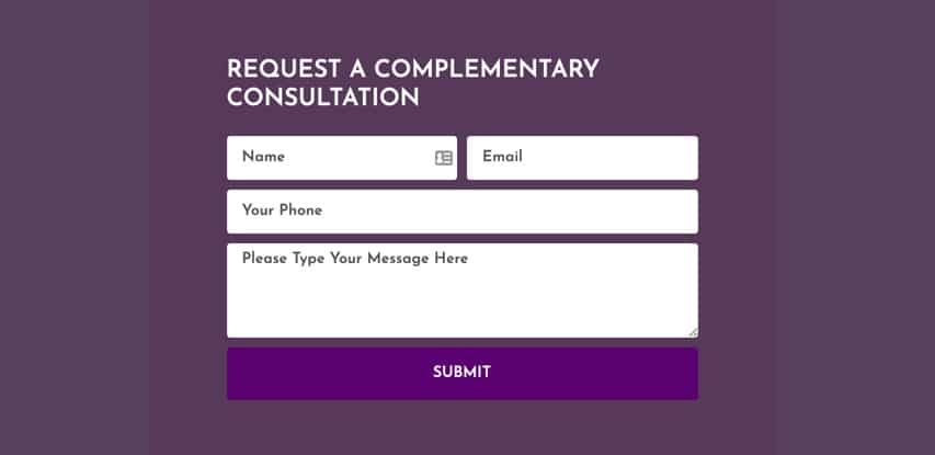
•Prominent Short Forms – Info forms can be a great way to drive conversion, but it’s important to balance visibility against requesting too much information. Here you’ll find a concise information request form with a blue button that draws the eye.
The Image this Website Reflects
This image demonstrates an inviting office that respects its clienteles time. Information is prominently available, the site is full of uplifting imagery and color, and you’re always just a couple clicks away from connecting with the office. Further information is available through easy to find links, allowing the more inquisitive customer to find the additional information they desire.
