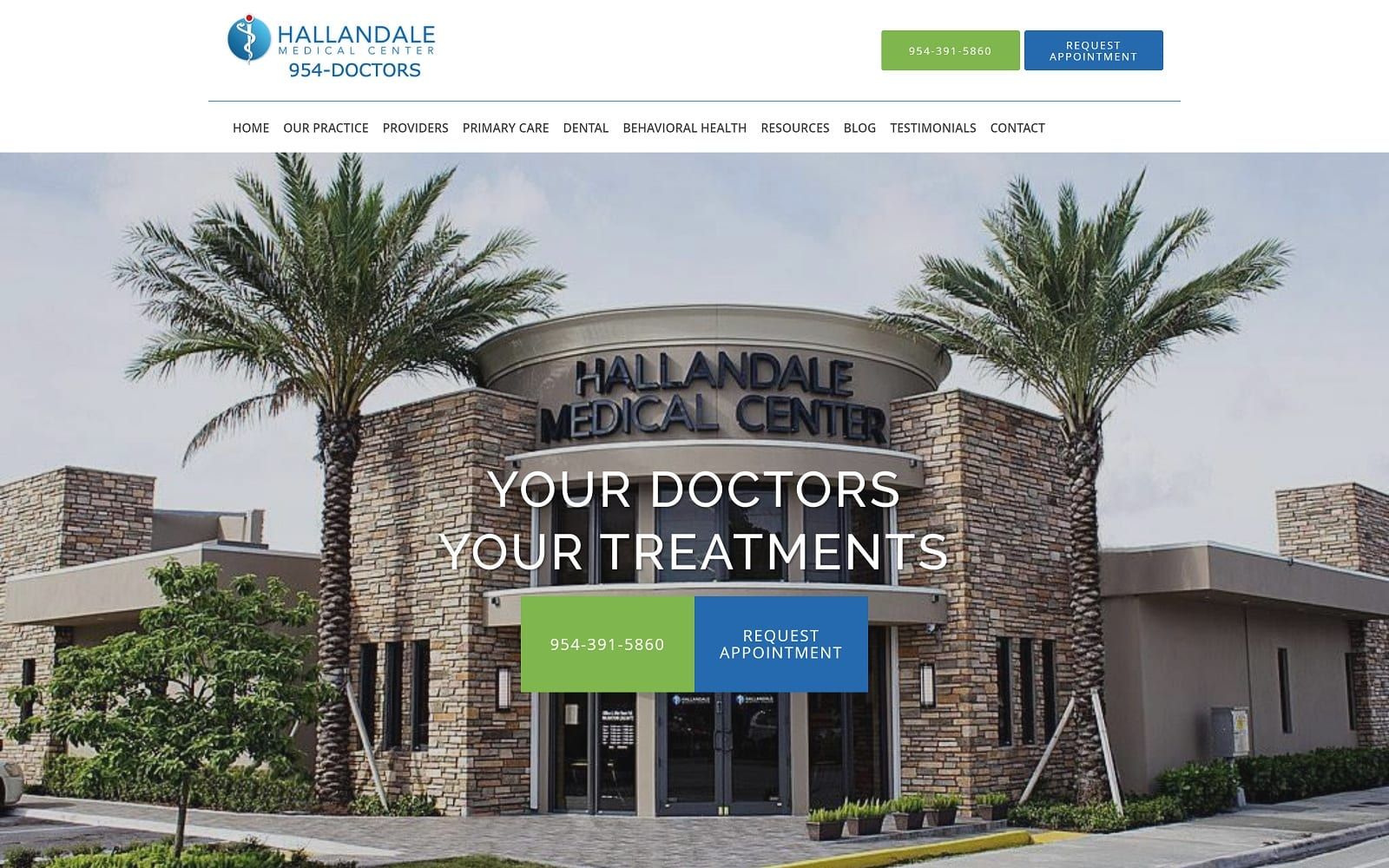
The Hallandale Medical Center is a well-respected location in its namesake town in Florida, and when they came to us, they were looking for a new site that would capture the personality of their medical community and the services it could bring to its patients. Throughout the site, it was important that their emphasis on patient involvement in treatment be prominent. We took the time to coordinate the site and produce something that we think fit the bill.
Overview Of The Design
This design opens by presenting the staff and CEO of the Hallandale Medical Center to the viewer using the slideshow, framing it with contact information and their operating hours. As you scroll through the page information is presented in a pleasing and accessible format, following by an introduction to the CEO. Red buttons highlight places the visitor can take action, while blue is used as a calming backdrop for presenting information.
Use Of Color

Blue, White, and Red are used to significant effect throughout this site. Blue is a favorite color for our medical site designs thanks to its soothing nature, while white lends the site an air of authority and cleanliness. Red is a common element in sites that are calling for the visitor to take action, whether that’s to click a link, fill out a form, or get information.
• Contrast – The three color palette selected for this site contrast well with each other, helping information to be easily red, buttons to stand out for the viewer and drive action, and overall giving the site a clean, coordinated look.
• Action Oriented – Red’s role throughout the site is to highlight buttons and ensure that they are both visible and encourage the viewer to take action.
Analysis Of Design Elements
The layout of a site can do a lot to make it an effective way to present information to the visitor while also encouraging them to navigate through the site and select your facility as the one to deliver their care.
• Space – Hallandale’s site makes effective use of every bit of the space without coming off as being crowded or squeezed in. This efficient use of space makes information easy to find while its attention to open space makes it seem somewhat relaxed.
• Navigation – Navigating throughout the site is simple, starting with the hamburger menu in the upper right-hand corner allowing instant access to the entirety of the site, along with the many links and connections to various areas of the site found throughout.
• About Us – The About Us section of this site focuses not just on the doctors who will be providing your care, but the entirety of the facilities care team. Their family focus doesn’t end at the patient’s care; it extends into how they think of their staff.
Marketing Aspect

Even medical sites need to think about marketing, as it’s this aspect that converts visitors to the site into patients in your office.
• Contact Information – Having your contact information readily available is an essential part of driving conversion on your site. Customers that have decided to make an appointment can quickly change their mind if they have to search for how to contact your office. The prominence of this information at the top and bottom of the main page is key.
• Testimonials – Testimonials are essentially digital word of mouth, and this site takes an interesting approach to it by including images of the person leaving the feedback. This humanizes the feedback making it more human and impactful, and is a great way to bolster the effectiveness of testimonials left on your site.

The Image this Website Reflects
This site reflects a patient first approach to the visitor by providing copious information about the services they provide and ensuring they start their relationship with the doctors and staff at Hallandale by learning about them and the roles they play. The overall site is attractive and orderly and is designed to quickly get the patient into the office without presenting a ‘pushy’ feel.