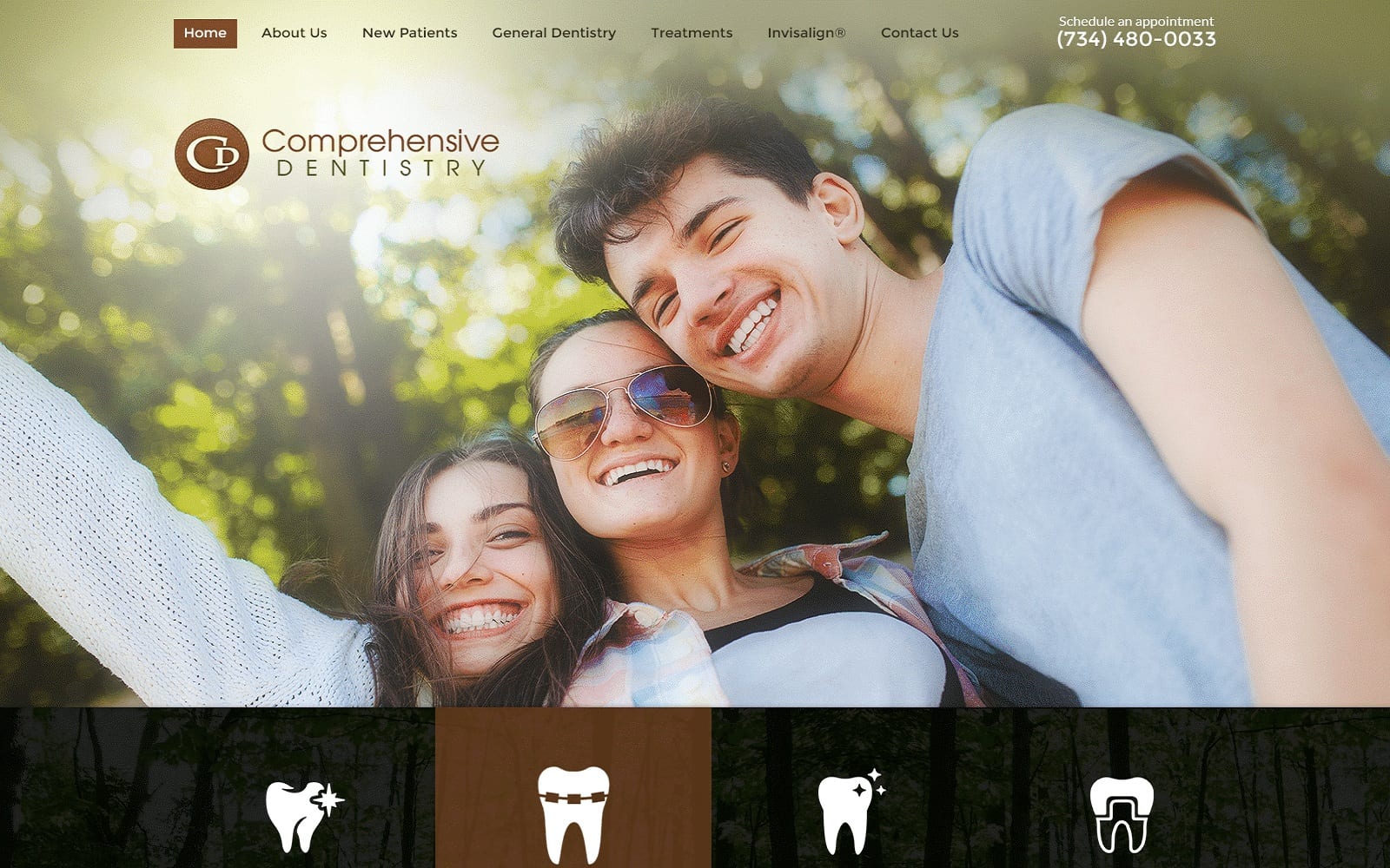
New design idea.
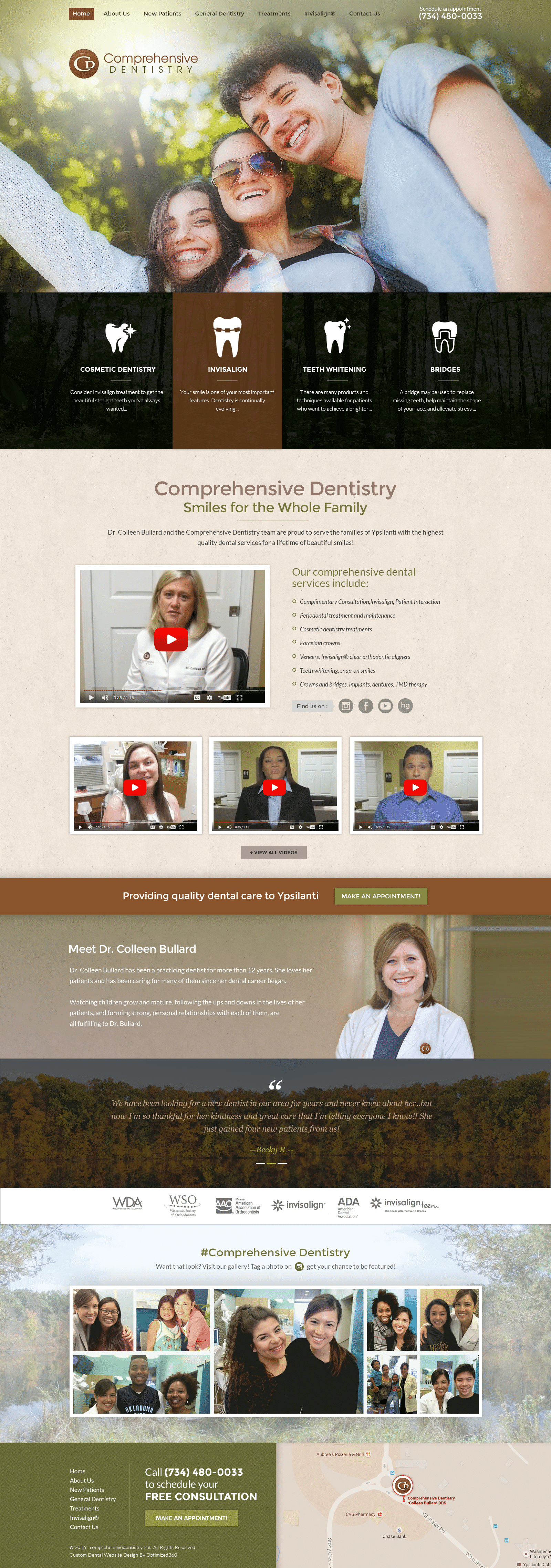
Comprehensive Dentistry uses a color scheme of brown, champagne, black, and olive green, all neutrals, or used as neutrals to show sophistication, elegance. Brown is used as this dentistry website‘s primary color choice among its selection, and can typically represent reliability and strength. Its choice in olive evokes compassion, humanity, and space. All these colors create a rustic feel to the overall aesthetic of the website but also removes the earthy components and replaces it with thoughtful, reflective space for the visitors to interact. Thus, the site evokes a sense of peace, harmony, and combines it with a sense of quiet nobility that’s mature and easy-to-interpret.
The immediate incorporation of its services just below the header helps to create contrast, thus allowing the visitor to flow through the home page smoothly. The main menu header doesn’t contain a border, thus opening up space for the visitor to notice the click-to-call service number and home page hyperlink button. Its central section uses flat design, unlike it’s featured services that use icons and descriptive text. The section primarily uses interactive YouTube videos and social media icons to begin its introductions, and throughout the rest of the page, scatterings of responsive images with tightly sectioned off borders help to create a more dynamic set up near the footer of the page. At the footer of the page, a testimonial slideshow, along with an invitation to interact on social media, can be found. At the very bottom of the footer, visitors can see the website’s google maps widget and a sidebar containing its main menu section and click-to-action button for scheduling.
