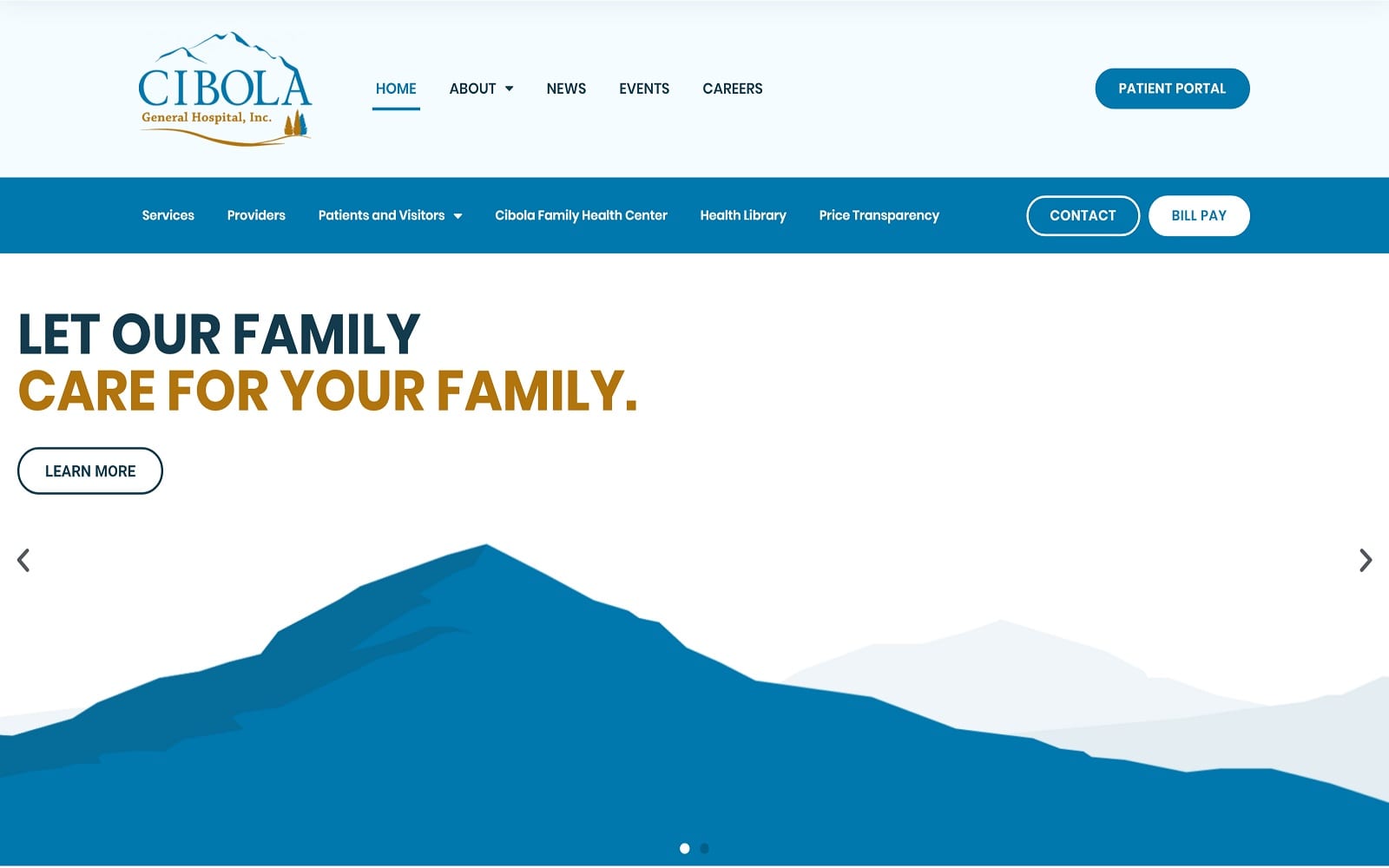
Cibola General Hospital’s website welcomes its visitors by creating a friendly, professional environment, encouraging users through its dynamic color scheme and organized design elements. Bright blue’s associated with credibility, trust, and professionalism, and its hue allow it to also bring in the sense of tranquility and serenity, giving its users a safe, secure space for their medical services. Spearmint green helps to off-set the brightness of the blue, and acts as a transitional filler, representing renewal and rebirth and evokes sensations of composure and cleanliness that’s best associated with for hospitals. In order to contrast these cool-toned colors, desert sun tan adds a bright, warm feeling to the website, forming a sophisticated palette that’s youthful and technologically savvy. Its design elements, which include drop-down panels, service-focused icons, action buttons, and search bar widgets, help to add dimension and integrity to the overall image of Cibola General Hospital,
Cibola General Hospital familiarizes its users with the website’s format by beginning with a multi-layered header containing essential information such as its main menu services, click-to-call service numbers, patient portal action button, and payment processing action button. Its hero images, which operate through a slideshow widget, present the website’s introduction text and action buttons for its pages. Cibola General Hospital organizes its services and providers through semi-flat panels and drop-down panels, allowing the user to interact with the website’s content and find services relevant to their needs. Near the footer, its testimonials are presented through a slideshow widget, and users can find the website’s google maps widgets, click-to-call service numbers, search bar applications, and the latest news at the footer of the page.


