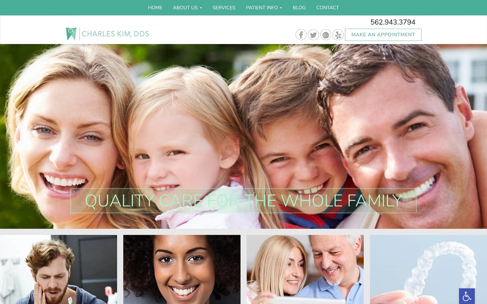
Making a lasting first impression is important. Based in La Mirada, Dr. Charles Kim aims to provide quality care for the entire family – we made sure that was the predominant goal of the website. We made sure that all the elements of Dr. Kim’s website would appeal to the parents visiting the website. The end result: a modern, clean dental website that balances fun with professionalism.
Design Overview
The design of this website uses a clever combination of colors and style elements to present a website that gives a laid-back impression with a welcoming atmosphere. The first thing a visitor sees when they hit this website is the bright smiles from our rotating image gallery and a friendly blue button directing them to make an appointment. At the top of the page can be found a selection of services they offer as well as the phone number and social media links, encouraging efficiency of use and accessibility. Below are a series of testimonials that help add another layer of credibility to the website.
Use of Colors
We used different hues of green throughout the website. The color green is associated with health, caring, and comfort. These are all emotions and feelings that you should feel when entering any dental website. In addition, we kept in mind that we are marketing for parents. We kept the colors light and welcoming. Having green highlight different calls to actions represents something organic and not manufactured or forced.
Analysis of Design Elements
The design of this site is very open and bright with a streamlined approach, at no point is there too much information presented, the overall feeling being one of efficiency and minimalism. Websites like this will appeal to professionals from every walk of life, encouraging them to bring their friends and family in for reliable and consistent treatment. Contact information, including a map showing the area around the location, are displayed in a very approachable format, nothing is up and in your face. This demonstrates a sense of respect for the visitor and indicates that the site is aimed at patients who know what they want and are looking for providers that understand that.
We also added animations as visitors hover over different services and buttons on the homepage. There is even an icon on the bottom of the webpage that allows visitors to interact with Live support.
Marketing Aspect
When something looks appealing or different, we tend to gravitate towards it by nature. When visitors first enter the website, they will notice an interactive chat menu available for them on the right side of the web page. This allows patients to send a direct message to Dr. Kim himself! Not only does this add a hint of distractibility and flair to the website, but it also can also be a great way to engage new or skeptical patients.
In addition, Dr. Kim displays testimonials on his website on the homepage. No dental site is complete with social media! All of Dr. Kim’s social media formats are conveniently located on the top banner of each web page.
Image the Website Reflects
Everything from the Live chat to the images on the website gives the impression that Dr. Kim and his staff are family oriented. The smiling images along with the modern elements of design make for a great website that will attract new patients from far and wide. To top it all off, Dr. Kim establishes himself as a credible dentist for the entire family by including testimonials and certificates on his website
Charles Kim DDS Dentist Website Designed by Optimized360


