Fourth Corner Neurosurgical Associates provide surgical and pain management options for patients with brain, neck, and spinal conditions. Dealing with such an important issue, we made sure that the website would be reassuring and comforting for incoming patients. With simple navigation and a modern appeal, Cascade Brain and Spine Center’s custom website offers a great first impression for first-time visitors.
Design Overview
When dealing with any sort of neurosurgical website, it is important to keep in mind your potential audience. We made sure to highlight the most important information on our navigation menu to ensure patients would leave the website informed above all else. Credentials, testimonials, and reviews all play a huge part in the patient’s decision-making process when it comes to committing to a new specialty or doctor.
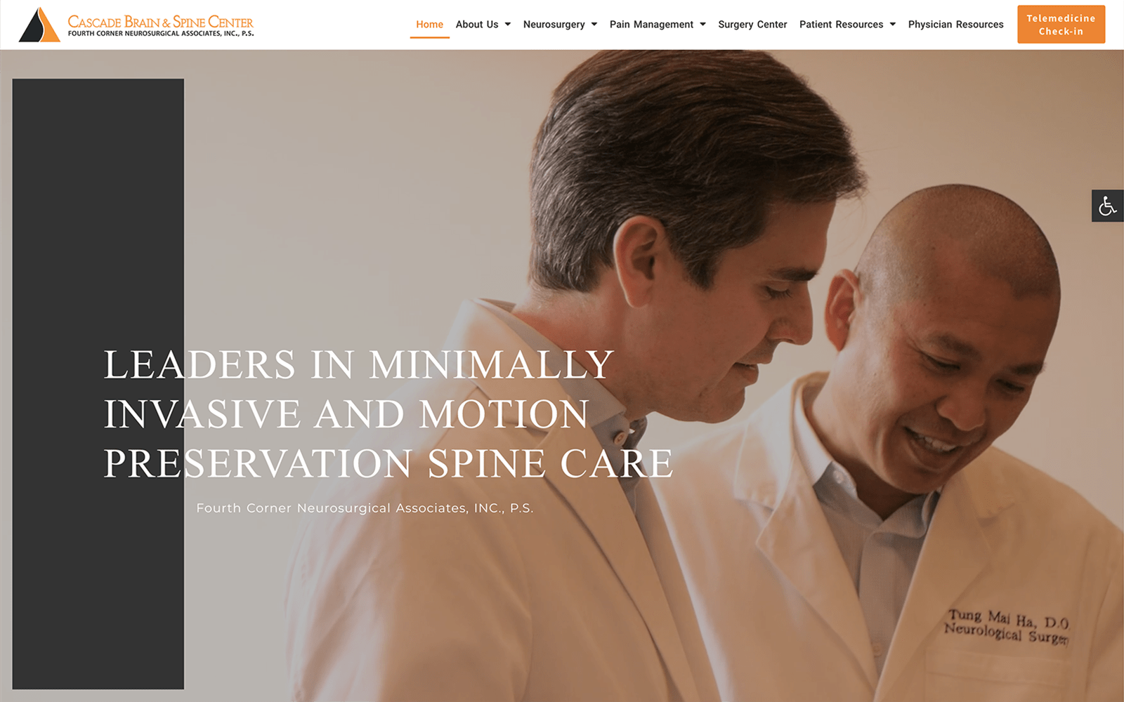
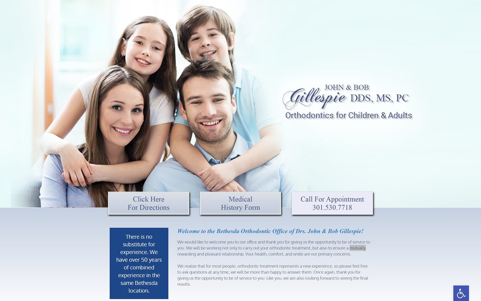
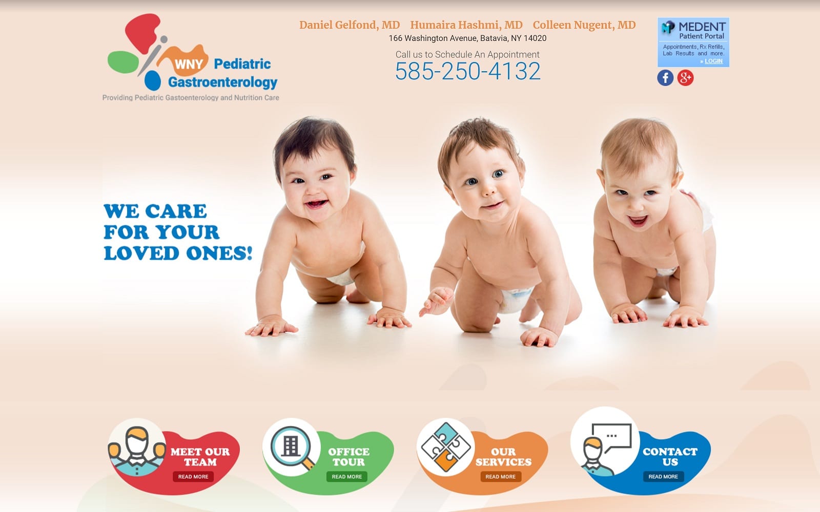
The home page features a soothing picture that plays well into the specialty. There is an instant call to action up front, along with the featured services and a short mission statement on the home page.
Use of Color
As stated earlier, when dealing with any form of health specialty, everything on the site needs to assure and soothe the incoming web-visitors. We used an orange color theme to complement the wide white background that encompasses the site. Orange is generally associated with joy and sunshine. In addition, the orange is primarily used to promote calls to action for viewers without coming off as too pushy or aggressive.
Design Elements
Space is expertly managed throughout the website. The ample amount of white background along the text helps the patients navigate through the site with ease. The navigation menu is always available at the top of any web page as well as featuring drop-down elements for additional information.
The conditions page features more information for viewers to explore additional spinal issues and deformities. The about drop-down menu is a great way for incoming visitors to meet the doctors at the Cascade Brain & Spine Center.
At the top of the banner, there is a new patient packet available at all times, immediately hooking in potential leads. Not only does this mean less time spent in the waiting room, but this also translates to more time with the specialists at hand. There is also a Google translation machine for patients who may not be as well-versed in English.
Image the Website Reflects
All the images of the website reflect a sense of hope and represent the professional manner in which the team operates. To complement this, there are even pictures of the office and neurosurgeon staff on the website, giving a great impression for first-time patients. Being personable and relatable is extremely important for the doctor-patient relationship. Having feel-good, personable imagery on your website can be the difference between a potential patient and a lifelong patient.
Marketing Aspect
The patient stories tab under the navigation menu is home to testimonials. There is also a patient portal available for returning patient. The news tab also has updated news about the office and office staff – another great way to add personability to the team.
The Washington veterans understand how important it is to keep patient information secure. As a result, they have incorporated SSL Security in their website. This means that patient information will be inaccessible to hackers around the world. The contact page has all the information any patient would need about the office – phone, address, email, etc. To top it all off, we integrated an interactive Google Map for easy access and driving directions!
