New design idea
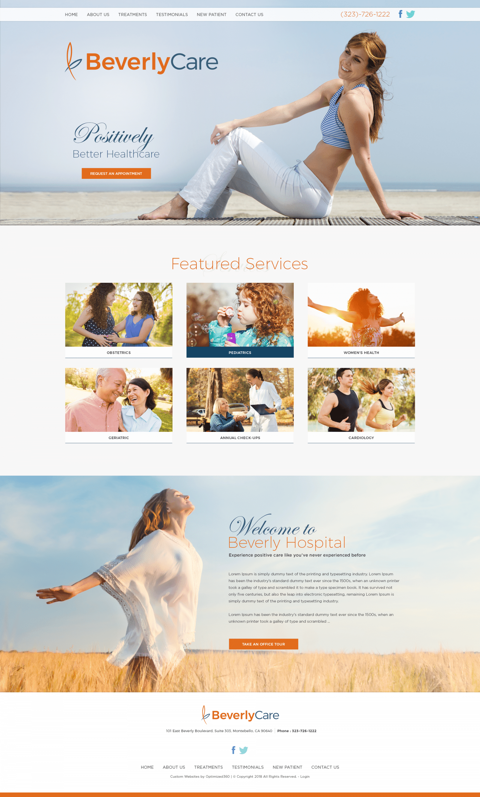
Beverly Care focuses on using aesthetically pleasing, vibrant colors to bring positivity to its medical web design by using complementary colors such as bright orange and dark blue. The cool, dark shade of blue denotes emotions of elegance, authority, and trustworthiness, while its complementary color, bright orange, evokes the idea of change, excitement, enthusiasm, and cheerfulness. When these colors interact with one another, they create bold, captivating contrast. These colors contain deep saturation, both of which help to brighten and bring life to the overall aesthetic of the web page. These two colors, combined with the purity of white, create a progressive feel to the design, especially when added with elements such as semi-flat designs, action buttons, and click-to-call service numbers. Beverly Care hones its focus on providing medical care, specifically for patients looking for a positive, welcoming experience.
Beverly Care introduces its home page with a thin, white header, containing their main menu services, click-to-call service number, and social media icons. Its header overlaps the hero image, which includes the business brand logo, introduction text, and action button for appointment requests. Throughout the website, its services section introduces its specialties with semi-flat design elements, allowing the visitor to easily interact with the content of their website. Underneath, the visitor can find the mission statement of the business, along with an action button leading them to their office tour application. At the footer of the page, visitors can find the business logo, address location, service number, social media icons, and repeated main menu services.
