Taking care of your nervous system, especially your brain and spine is serious business, and Dr. Sassan Keshavarzi was looking for a website that would reflect his expertise and dependability. Every day, he takes the lives of his patients into his hands, performing reconstructive surgery on spines and helping adults and children alike with their Scoliosis. We worked with him to produce a website that reflected his dedication to patient health and recovery and his reliability and skill in equal measure.
Overview Of The Design
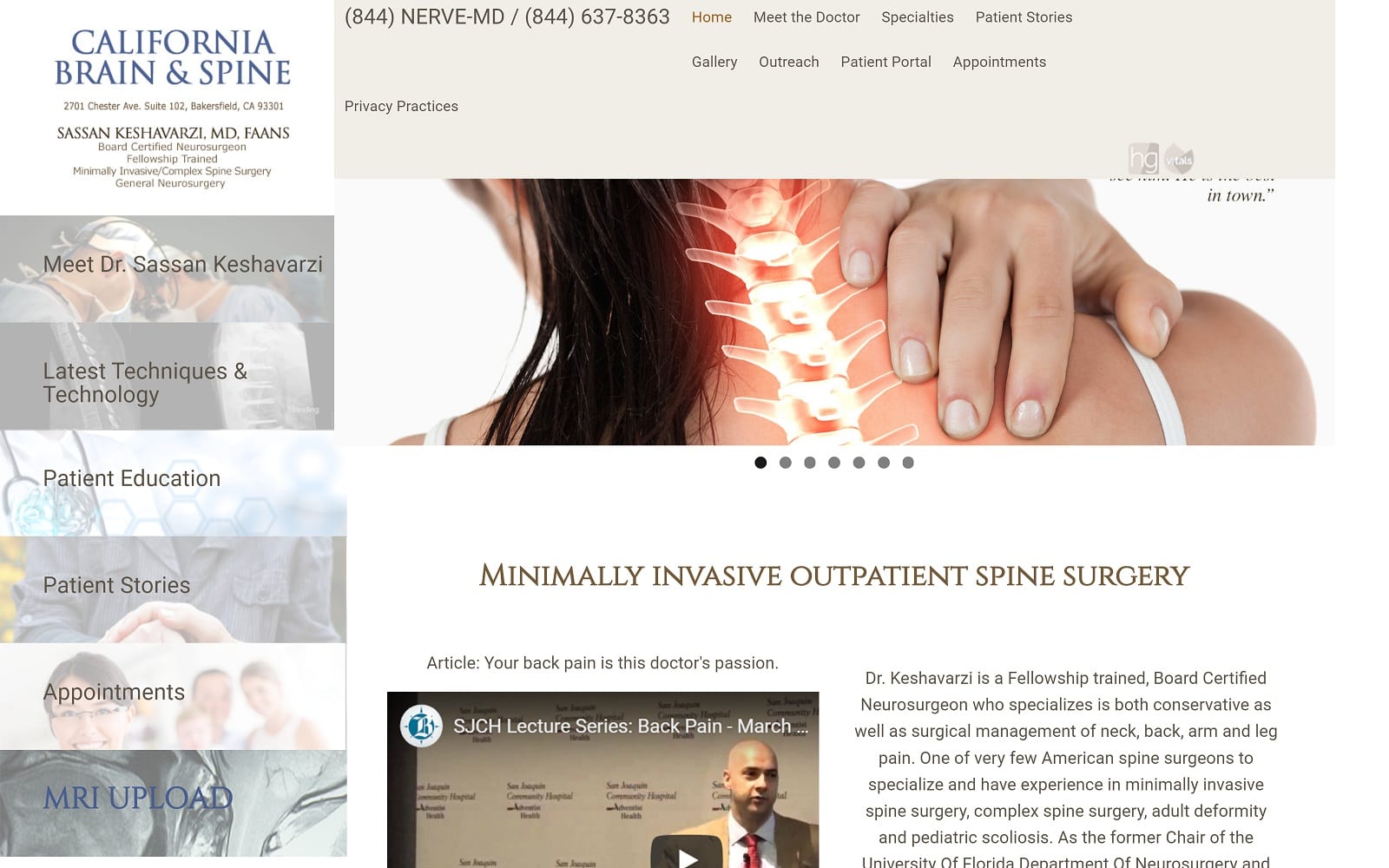
The overall design of this website is targeted at ease of navigation and availability of information. When any ailment involving the spine is mentioned, it’s understandable for patients to get a little nervous, and the best way of addressing that nervousness is with properly presented, detailed information. Links along the left-hand side provide information about the Doctor and his staff, as well as information about the most up to date equipment and techniques. Stories from his patients and a link targeting patient education are available as well. Everything in the design of this website is aimed at setting the patients mind at ease and providing them with the confidence they need to experience an anxiety-free procedure.
Use Of Colors
It’s no mistake that everything on this website bears a slight beige tone with careful sprinkles of blue. Tan, beige, and off-white are all colors that are associated with reliability and professionalism, while blue can encourage feelings of hope and calm. Patients who have confidence in the professionalism of their practitioners have less anxiety and a strong sense of faith during the entire experience, so it was vital to include those subliminal cues in the design of this site.
Analysis Of Design Elements
All the design elements of this website are centered around making information about the procedures immediately at hand. The list of links down the left side, the connection to those same links across the top. As soon as you arrive on the site, you’re getting information about the procedures that are offered and how they are better or safer than other potential options. Convenience is a central goal as well, as evidenced by the MRI Upload option on the sidebar. Overall this website is calming and approachable, a perfect representation of Dr. Keshavarzi himself.
Marketing Aspect
The website has extensive information about common procedures performed by physicians in this specialty and prominently mentions its location. These essential elements aid in it turning up on searches, especially where those points are mentioned in headlines (such as minimally invasive outpatient spine surgery, clearly a keyword in headline form). The bottom of the screen prominently lists awards and recognition that have been received by Dr. Keshavarzi.
The Image this Website Reflects
This website represents a dependable and talented physician who firmly believes in patient education as an essential tool for generating patient comfort and confidence. Every element of the design centers around this but also reflects a no-nonsense design that is direct and to the point. Overall it’s a comfortable and approachable site that is sure to instill confidence in visitors.
California Brain and Spine Neurosurgeon Website Designed by Optimized360


