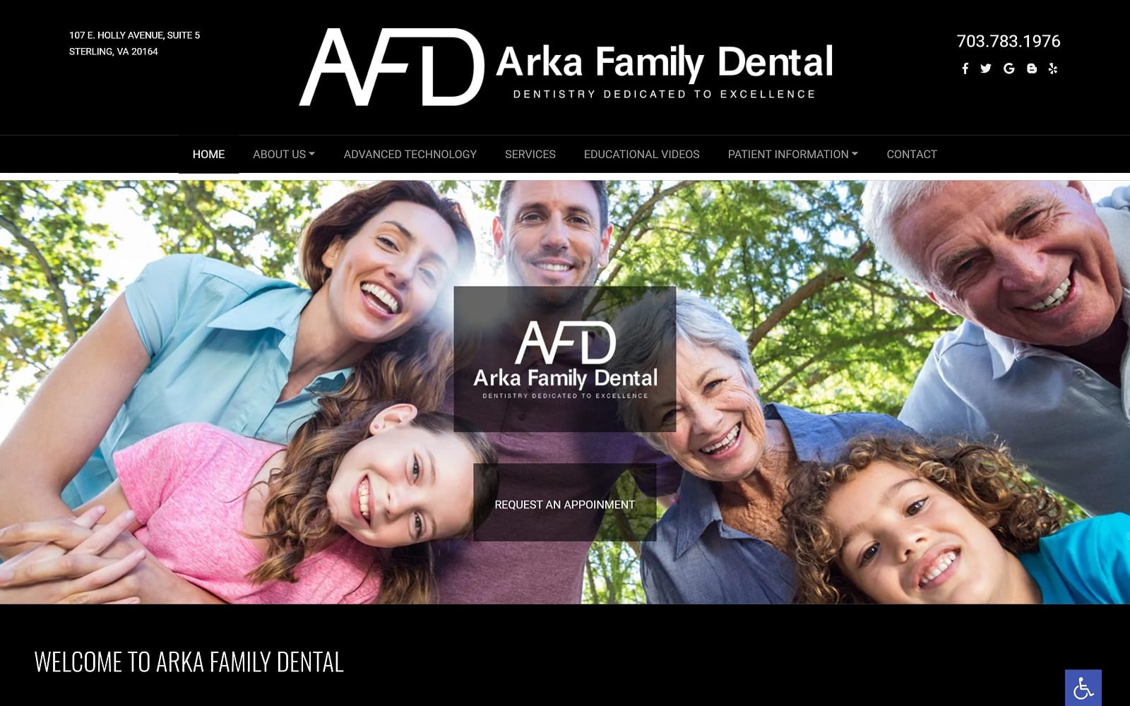
Arka Family Dental, organized by Dr. Roja Vemula, is a site dedicated to excellent service and providing households all over Virginia with smile makeovers. Invested in the latest dental technology, the team at Arka Family Dentist is able to provide dental treatments that are faster, more comfortable, and safer than ever before. It is a highlighted advantage for her patients. Some of these include the use of digital x-rays, Zoom! Whitening, Cone Beams, and the almighty jaw-dropper! Following in her footsteps, we dedicated ourselves to creating a jaw-dropping website for her dental procedures.
Overview of Design
Just like her office, we wanted to implement a style that would allow optimal navigation for the user. We created a clean and open interface for users to interact with. With sites that plan to educate and inform, we always try to accommodate through our design. We used wide-navigation to allow readers to access information quickly. In addition, our navigation bar breaks off information based on their specialty. When you have the dentistry skills that Dr. Roja Vemula has, there is no need to go all out on the special effects. The work and results will do the fancy talking for you.
Use of Color and Design Elements
We used simple colors to ensure that readers would be able to efficiently browse the site without straining their eyes. We chose a black and white color theme to make the words pop. In addition, we used a basic font for legibility. The homepage displays a black background while the other pages read like a book – white background with black text. Not only is this extremely simple and alluring for readers, but it also adds to the education feeling that the page radiates. All the pictures on the site are a clear representation of Dr. Roja’s hard work. Our personalized logo also adds a nice finishing touch when all is said and done. Black displays a sense of luxury and class, while white presents professionalism and modernism on any website design.
Space is expertly managed throughout the website. The ample amount of white background along the text helps the patients navigate through the site with ease. The contact page also has an interactive Google map for those wishing to find their estimated time of arrival to the office.
Marketing Aspect
Dr. Roja has an education blog which we curated on our navigation bar for easy access. We also placed a call to action in the dead center of the homepage. The main prospect of this website is to educate and inform to help make the readers more aware of the different options available. We also placed special emphasis on the use of advanced technology in her office and made sure to highlight their specialty through a variety of demonstrative videos and interactive links.


