Based in the high-tech capital of the California Bay Area, the Arbor Dental Group provides dental care to a young and vibrant community bursting with families. This practice has made it their mission to provide excellent care in a comfortable and welcoming environment that will have their patients returning for years to come. To this end, they’ve developed a relaxing spa-like atmosphere to help make every visit to their office a pleasant one. When Optimized360 designed their custom dental website, we took steps to incorporate that feeling into their design to create a consistent flow of experience from website to the office.
Overview Of The Design
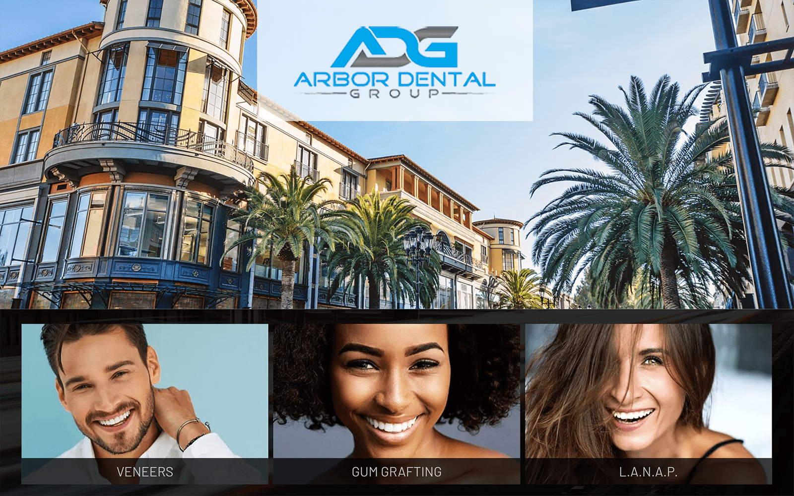
The design of this website uses a clever combination of colors and style elements to present a website that gives authoritative air with a welcoming atmosphere. The first thing a visitor sees when they hit this website is the bright blue of the San Jose sky and a friendly blue button directing them to make an appointment. At the top of the page can be found a selection of services they offer as well as the phone number and social media links, encouraging efficiency of use and accessibility. Below are a series of young fresh faces representative of their community and the bright smiles Arbor Dental can help the visitor obtain.
Use Of Colors
When used in website design black provides an authoritative air, and in this specific presentation, it gives the reassuring and uplifting blue a distinct pop that draws in the eye. In areas where the practice’s services are described on a black header with a white base is used to present the information to the client, blending professionalism and authority into a single and effective element. These colors serve to establish a narrative of excellent care with comfort and reliability.
Analysis Of Design Elements
There are two dreams being sold by the introduction to this website, the refreshing environment of the San Jose area and how amazing your smile can be in and around town. The logo is an incredible work art and compliments the rest of the website quite well, while the layout moving down the page provides clear, inviting links to the services offered by this facility. Once the visitor reaches the lower areas of the website, they find a scrolling list of testimonies along with additional links to social media accounts and organizations that the facility is endorsed by.
Marketing Aspect
Laid back, but on the go, best describes the target audience of this website, an audience that will appreciate the immediate availability of an appointment form and phone number, as well as the direct links to Yelp where they can take advantage of crowd-sourced reviews.
The Image this Website Reflects
Young, fresh, and in touch with the lifestyle of modern families, Arbor Dental Group’s website is a beautiful piece of design with a strong eye to its target audience. The sharpness of the design helps to draw in visitors and keep them looking for information from this authority on dental care. The expanse of procedures ensures that they’ll be able to make this their destination dental spot while the spa atmosphere will ensure they enjoy a comfortable and relaxed visit.
Arbor Dental Group Designed by Optimized360


