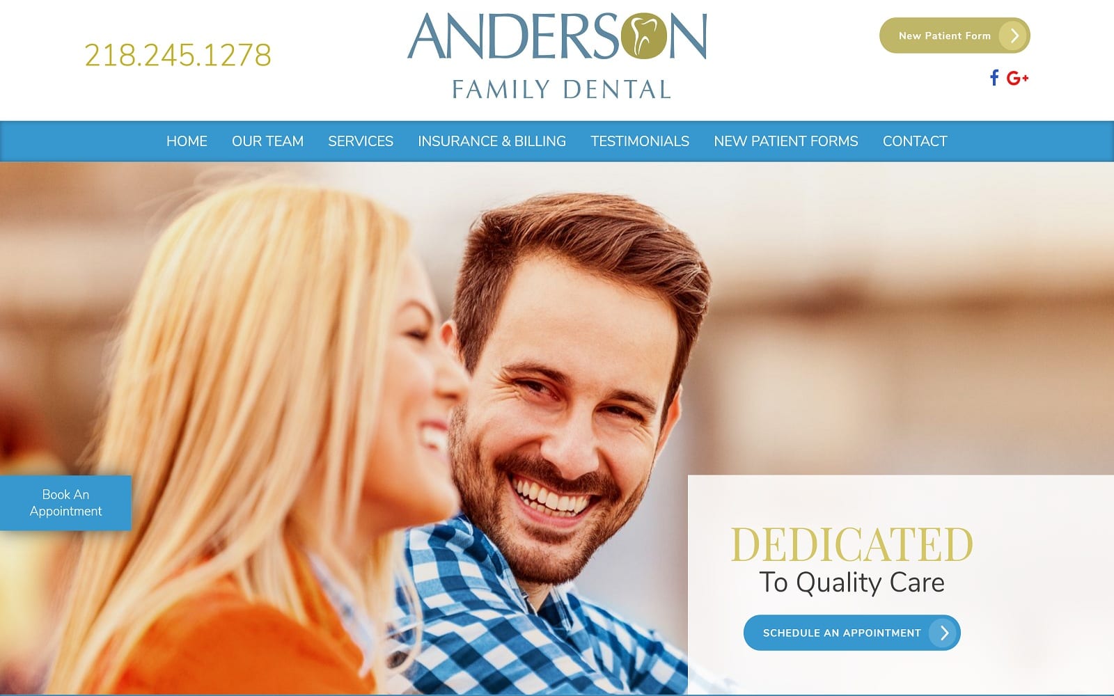
Anderson Family Dental focuses on building a friendly, adept environment through its choices in color and imagery. Bright blue is typically associated with authority, trust, and credibility, while also containing soothing, refreshing sensations desirable in a Dental Website. It’s incorporated as the primary color, creating the aesthetic framework that greets users as they interact with the website and engage with its content. To offset the cool-tones of the blue, a light olive green accents the website through semi-flat layers, action buttons, and hyperlinks to bring sophisticated neutrality to the bright colors chosen. While charcoal black adds dimension to the footers and accents of the website, both bright blue and olive green provide warm and cool undertones to accentuate the home page and help form a competent, cultivated, and receptive website. Its design elements, which include action icons, semi-flat layers, and friendly imagery, target a wide audience, as the website caters to users in need of various types of dental care.
Anderson Family Dental directs its users by beginning with a large, encompassing header that contains the website’s business logo, new patient forms action button, click-to-call service number, and social media icons. Its hero image contains a white layer containing the website’s introduction text and an action button for scheduling appointments. Throughout the home page, an action button located on the left side follows through as the user scrolls, and the accessibility tool can be found at the bottom right corner for inclusive engagement. Its services are organized with semi-flat panels that activate when hovered over, and at the footer of the page, visitors can find the HIPPA secure form, an engaging video, and google maps widget for immediate contact and connection.
