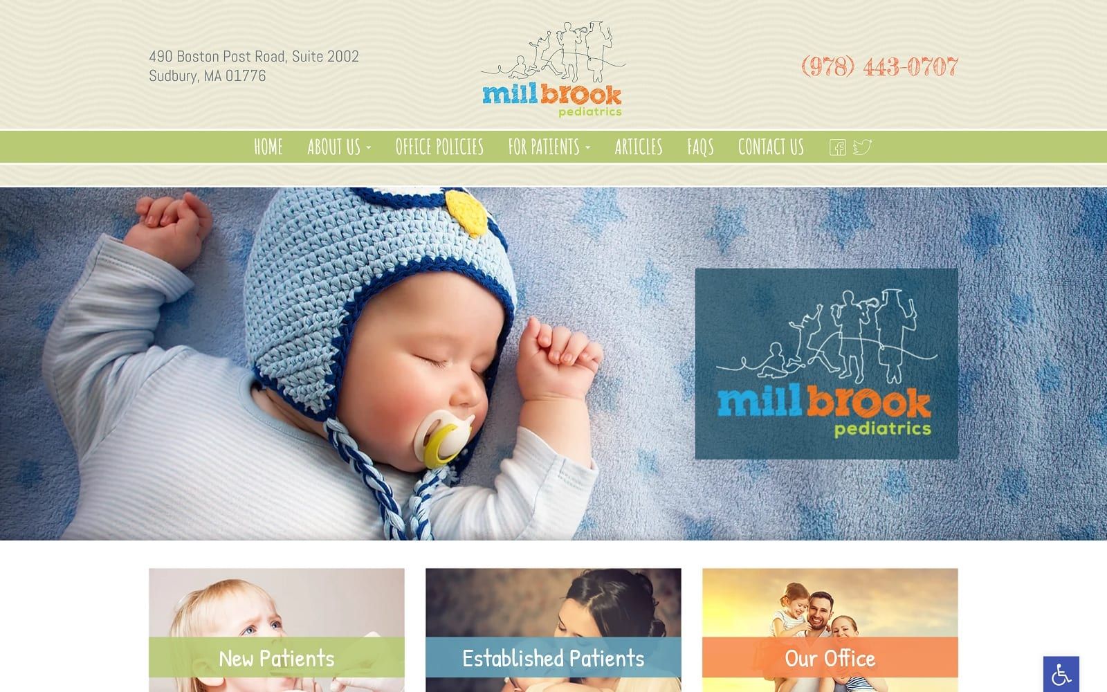
Millbrook Pediatrics was designed with a warm and welcoming appearance that is appropriate for its target patients. The design integrates elements that capture the whimsy and warmth of youth, including a logo that tells its own story of a journey to adulthood. The pastel tones that are used throughout the site echo the springtime of youth while serving to provide excellent contrast and actionability. Orange, in particular, is used to draw the eye to important points where visitors can take action and reach out to the website. The panel design is suited for use on any platform but shines on mobile platforms in particular, where it excels at delivering information in a useful format.
Click-to-dial functionality is integrated into the playfully presented phone number in the pediatric website‘s header. The sectioned design of the website helps guide patients to the information they need to address their health concerns. Patients of any level of ability will be able to make use of the site thanks to the accessibility options that are immediately available through the blue tab that appears in the bottom right of the page. Social platform connectivity to Facebook and Twitter targets modern parents who are digitally connected and interact with their doctor’s office through social media more than in years past.