New design idea
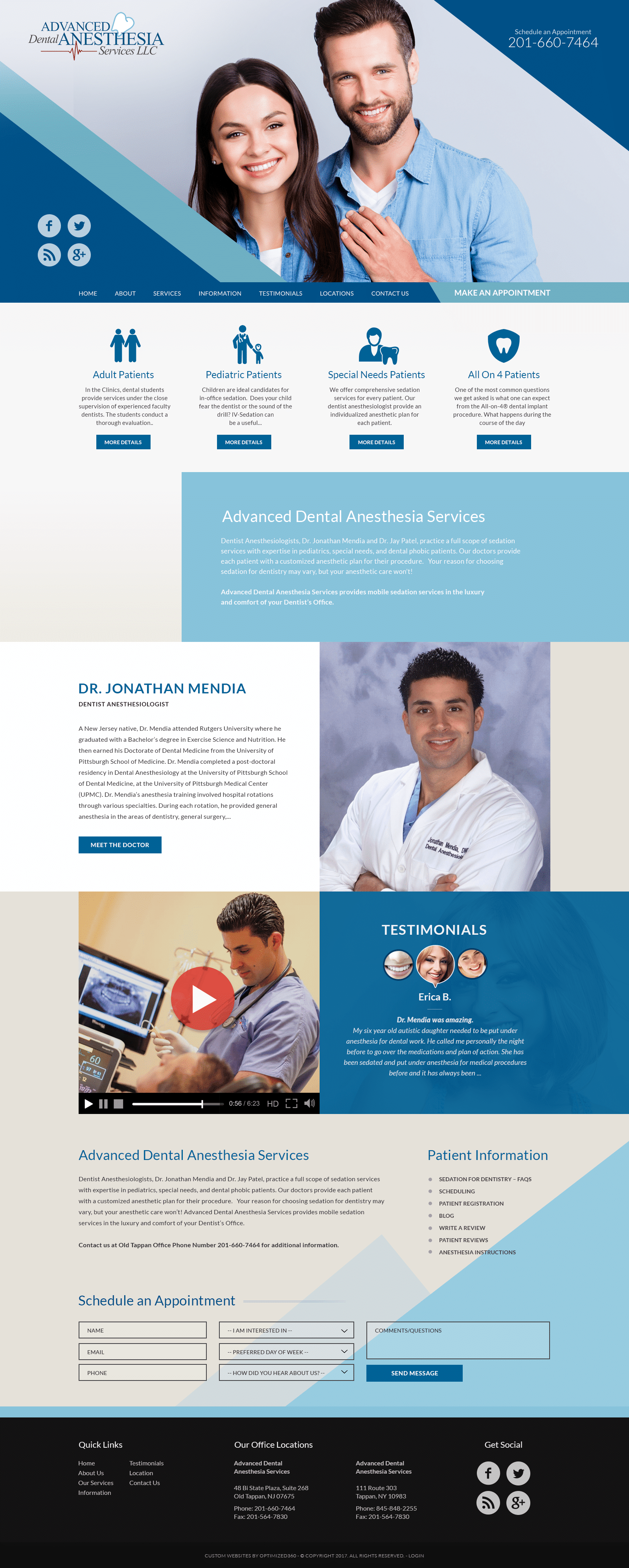
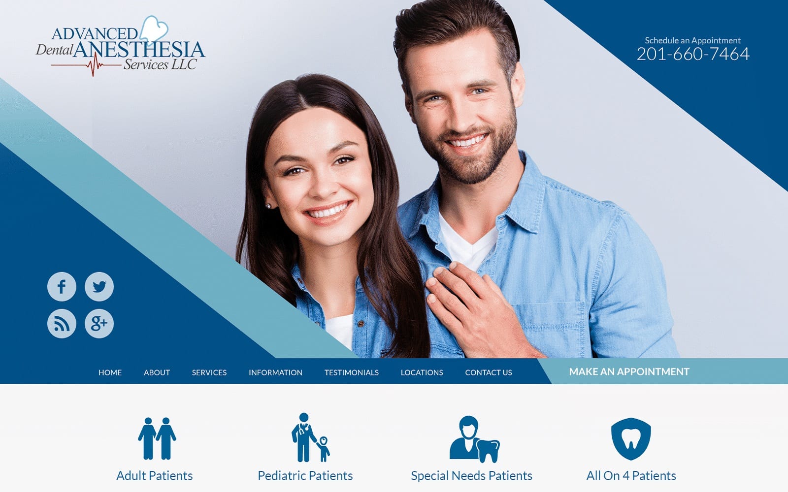
Advance Dental Anesthesia Services integrates diagonal design trends and combines them with a traditional color palette of dark navy blue, baby blue, and cool-toned beige to appeal to its web visitors. By blending in geometric borders with its imagery, its design is able to angle out and keep users of the website moving down along the page. Combining these borders with the authority of navy blue, the freshness of baby blue and the earthy tones of beige creates a multi-dimensional website that takes traditional dentistry and makes it exciting, eye-catching, and alluring. Advance Dental Anesthesia Services also incorporates a significant amount of icons and widgets to bring constant engagement for its users. Overall, the website’s choice in design makes it a highly-intuitive and creative web page, allowing the elements of the home page to connect with its viewers.
Advance Dental Anesthesia Services, instead of placing the header at the top of the page, places it at the bottom of the hero image. Its hero image contains its social media icons and click-to-call phone number along its geometric borders, with the business logo set along the left side of the image. Its header contains its main menu services and an action button for scheduling appointments and is used to lead users to its services. Its services are laid out with image icons for engagement and can be interacted with using action buttons. Its sections thereafter contain various elements with action buttons and video widgets, and at the footer of the page, the website includes its HIPPA secure form, social media icons, quick links, and click-to-call service numbers.
