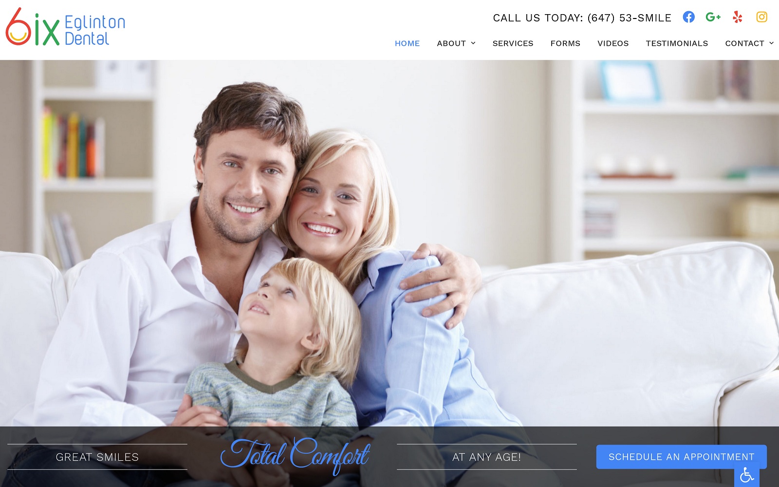
6ix Eglinton Dental presents an active and modern design for visitors while integrating a diverse color palette of red, green, and blue. These colors provide great action colors that attract the eye, an uplifting sensation of hope and energy, and the healing tones of green. Their logo is distinctive and unmistakable on stationary or correspondence while incorporating all their colors in its unique design. The slide-in action of the images used in the site gives a sense of action and movement that encourages patients to engage with the site and connect with the clinic. The slideshow testimonials appear on a high transparency black background to provide contrast against the images of happy patients found behind them.
The dental site‘s layout makes it easy to navigate and eliminates any frustration from trying to find important information. Patient forms are easy to locate and are an important tool for helping save time for both the clinic and the patient during their initial visit. The Contact Us section provides separate entries for each of the clinics under this brand’s umbrella and directs them to the website for the local branch so they can reach out to them. When patients have a pick of dentists, they can see without concerns over insurance, the Meet The Doctor page provides a valuable tool for building rapport with them before they ever enter the clinic doors. The footer of the page provides email contact information as well as office hours for visitors ready to take their next step with 6ix Eglinton Dental.


