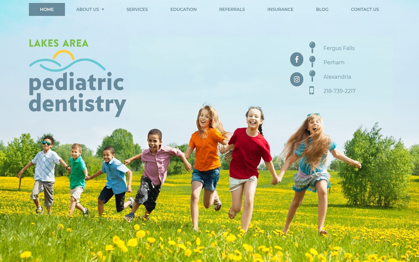
Lakes Area Pediatric Dentistry takes advantage of the available space throughout, using the hero image to immediately define and shape the website’s vision. Its hero image utilizes the space open to convey its energizing, youthful, and relatable appearance, all while surrounding it with a color scheme of dark pastel blue, turquoise, and golden yellow to accentuate these features. The dark pastel blue calms and soothes the user, and is used to direct the user towards various elements of the website, which include its click-to-call service numbers and main menu services. Turquoise helps to contrast the darkness of the blue, bringing a friendly atmosphere to the website’s content, such as its introduction and meet the doctor section. Golden yellow adds to the sense of youth and vitality that are experienced from the hero image and is incorporated into the action buttons and semi-flat panels for a dramatic, eye-catching feel.
Lakes Area Pediatric Dentistry appeals to its users by beginning with a transparent header containing its main menu services, various locations, business logo, and click-to-call service number. The hero image acts as the background for the header, showcasing its multiple colors and target audience, and below the hero image, people can find the pediatric dentistry website’s introduction text. After introducing its welcoming message, the site leads into its news feed, which contains hyperlinks to their news section. Near the footer of the page, visitors can interact with its services with semi-flat panels, and learn more about their services with indicated icons. At the footer, users can find the HIPPA secure form, along with their quick links and accessibility tool.