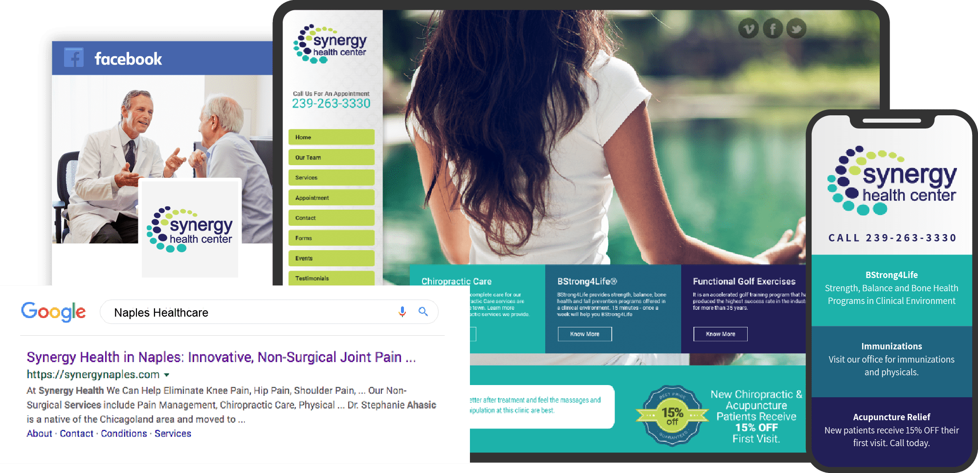
No matter what your place is in the industry, whether you’re a healthcare associate pairing with other companies or providing healthcare for consumers, you need a robust website that serves your office’s and your clientele’s needs. Good healthcare website design starts with presenting solid information about your practice in an immediately accessible format. The color palette should enhance readability while simultaneously commenting on your practice. Visitors should be able to find everything they need easily and be able to reach out to your office with a single click instantly.
The following Healthcare website designs run the gamut from minimalist and straightforward design to artistically orchestrated sites that are as functional as they are beautiful. Modern Healthcare websites require significant technological integration that caters to mobile browsing and business. You’ll find that each one takes a different approach to serving its customers while retaining many of the same central tenets that define an excellent website.
1. Factoria Women and Family Clinic
Visit Factoria Women and Family Clinic
Aesthetics
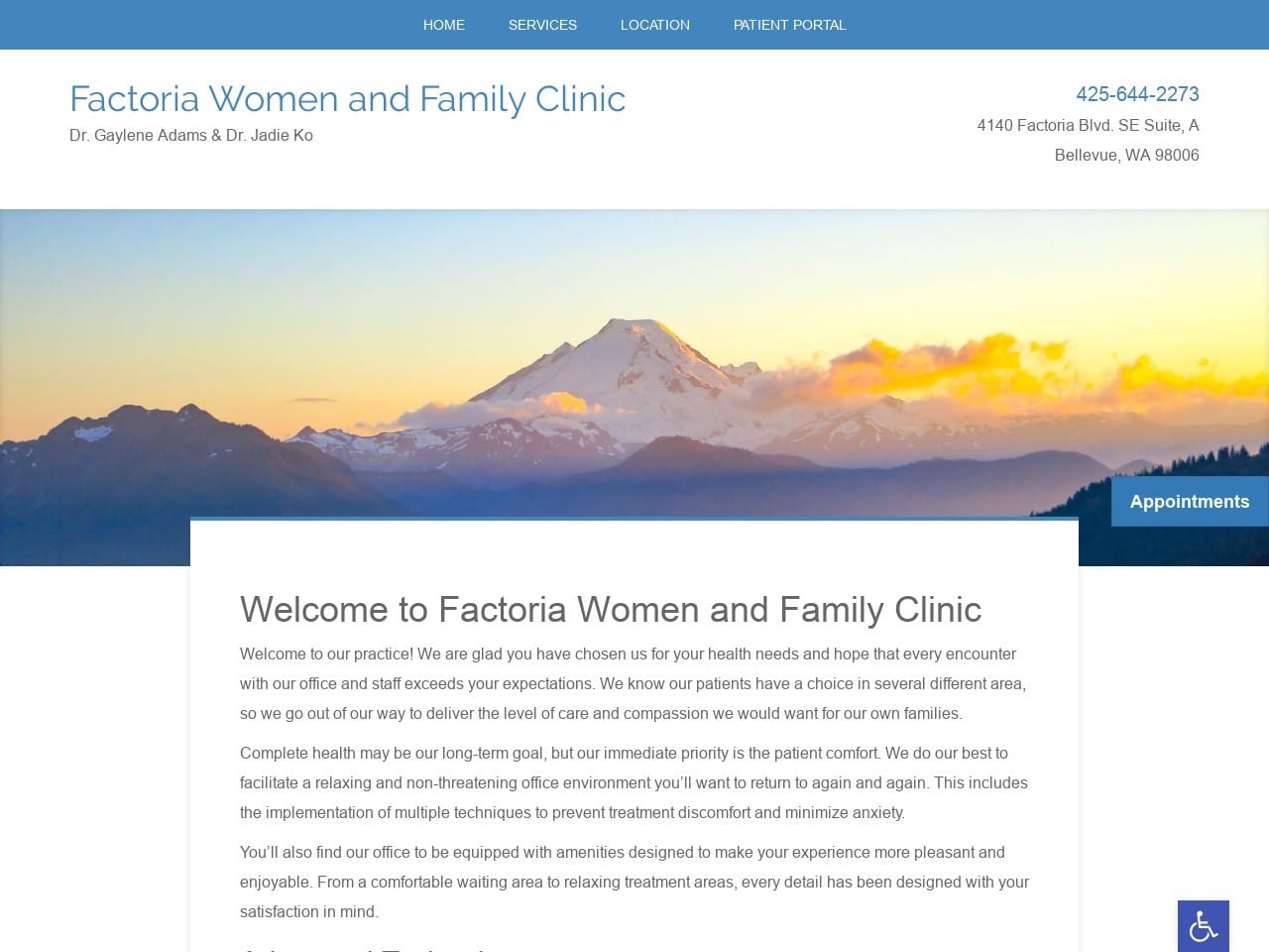
The website for this office is very clean and straightforward, providing an easy-to-use and streamlined experience. Information is prominently displayed, and visual clutter is kept to a minimum, resulting in an excellent use of space. The white and blue color scheme combines with local imagery to produce a website that’s stunning in its simplicity. This scheme is maintained from the main page to the services pages, ensuring that mobile and desktop users alike will have a positive experience during their time on the site.
Functionality
From a functionality standpoint, this site is wonderfully designed for those preferring a simple interface. The menu at the top of the page provides easy transportation around the website, while the text is laid out in a straightforward and easy-to-read interface. Contact information is prominently displayed at the upper right portion of the screen on every page. The blue accessibility button located in the lower right ensures all patients can easily use it. Included in the functionality of this website are a number of mobile-responsive elements, including a direct-to-map feature that gives patients one-click directions to the office. The Patient Portal is designed to provide safe and secure access to health information and the services provided by the practitioner and provide another method for patients and physicians to communicate.
2. Ancuram Care
Aesthetics
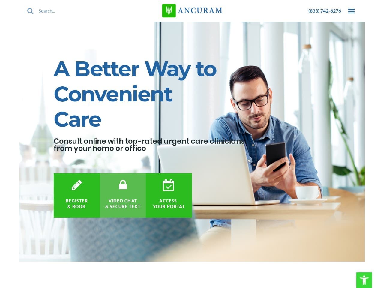
Innovation in healthcare is Ancuram’s calling. Their services represent a new frontier that is sure to proliferate in the years to come, online healthcare visits. The eye-catching nature of the verdant green used in their site guides visitors to those parts of the site where they can take action. Mobile accessibility was central on this site as online services comprise the cornerstone of their services. The resulting design is streamlined and minimalist for maximum effect and usability.
Functionality
Ancuram ensures that potential patients will always be able to reach them by providing contact information at convenient points throughout the site. Their services are explicitly for patients seeking convenience and time-saving elements in their health care. Security stands prominent as part of this site’s design due to the purely digital nature of its services. The video includes up-to-date information about medical practices, while text communication is possible, encouraged, and secure to protect the user. Registration, scheduling, and “arriving” for your appointment can be done at multiple points throughout the site.
3. Angela French Naturopath
Visit Angela French Naturopath
Aesthetics
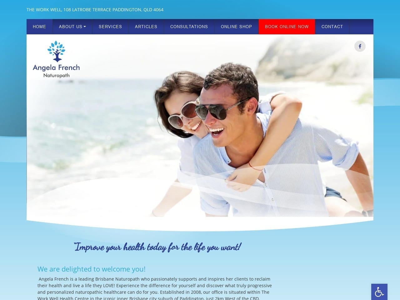
This site’s overall design is focused on a bright and blue color scheme that uses multiple shades to contrast with itself, accenting important portions with white and action points with red. The menu is prominently displayed at the top of each page and is easy and intuitive to navigate. The website is overall image-light, ensuring that it remains accessible for mobile viewing from any device. Those images that are used reflect the services provided by the clinic, presenting natural solutions, traditional methods of medicine preparation, and flowers. The services page leans heavily on imagery to demonstrate their services and the results patients can hope to experience when taking advantage of them.
Functionality
Immediately upon landing on the website, the clinic reaches out to make contact by offering access to a newsletter and guide related to its services. The images selected for the slideshow at the top of the page were selected to give a first impression of an active, healthy lifestyle, connecting time and cooperation with nature being a path to optimal wellness. Online appointment booking is immediately available, made visible with a striking red button on the menu. Mobile optimization is central to the design, focusing on easily readable content and scrolling convenience. The Online Shop provides options for getting refills of prescriptions and services, including Food Compatibility, making it easy for patients to arrange for care. Also integrated into the site are options for accessibility and a one-click connection to directions to their site.
4. Integrated Care Physicians
Visit Integrated Care Physicians
Aesthetics
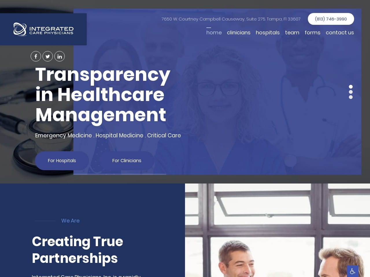
Integrated Care Physicians starts with a palette of hope, inspiring calmness, and warm, professional gray to create a website ideally suited for its target audience. Throughout the website, white accentuates points of action and provides easily readable text and clean, professional-looking topic transitions. The selected images emphasize collaboration between management teams, staff, and medical professionals to provide a sense of confidence that the company will be an effective partner. Visitors can immediately meet their management team through the related page, where each member is presented with an attractive and stylish image that reflects their personality.
Functionality
The site’s layout and design are aimed at busy professionals seeking immediate answers and opportunities to address their practice’s concerns. Contact information is provided at the top and bottom of information-packed pages, encouraging visitors to start their work with the site immediately. Contact by email, phone, and get directions to their office are all made one-click simple to emphasize usability on mobile devices. Connections to their social media channels provide instant access to their media presence, revealing their dedication to connecting with patients and providers alike. The team page provides comprehensive information about each member of the team and what services and experience they bring to the table to help you make an informed decision about choosing them as a partner company. This information is provided in a seamless pop-out format that gives the site a modern feel.
5. Precision Caregivers
Aesthetics
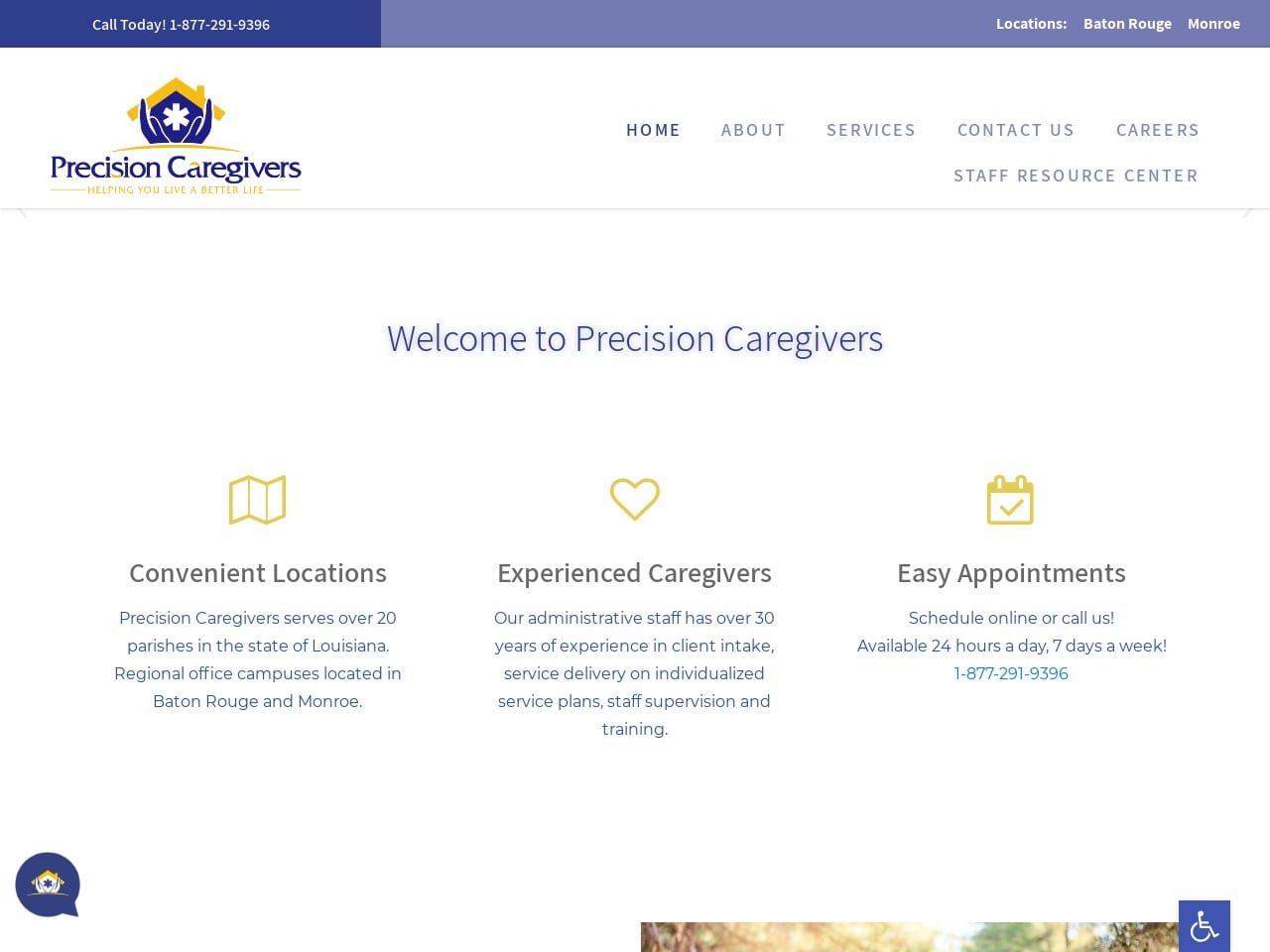
An attractive and clean minimalist style sets the theme for Precision Caregiver’s website. Blue, gold, and white are the primary colors in the scheme resulting in a beautifully balanced color scheme. Blue is clearly a highlight color on this site, used for text, menus, and buttons, while topic headers are presented using gold. The active transition design of the site, with the header sliding artistically into place when you change pages, gives the site a high-tech modern feel. Every portion of the site adheres to the concept of simplicity in design, focusing on providing information and not overloading visitors with images. The services page presents information about what Precision Caregivers can do for their clients in an easy-to-navigate card format, each card providing the name of the services provided and a quick blurb about what they include. Convenient, attractive, and effective all in one.
Functionality
Landing on the website provides you with immediate access to contact points and information about the staff that works at Precision Caregivers, including their service area. The menu at the top is prominently displayed for ease of use and collapses into a mobile-friendly hamburger menu on smaller screens. The website aims to serve not just its customers but their staff, as indicated by the Staff Resource Section on the site. Functionality like this is another valuable element your website can provide to your company. The light use of images throughout the site makes it easy to navigate on mobile devices and desktops alike.
6. Uintah Basin Healthcare
Aesthetics
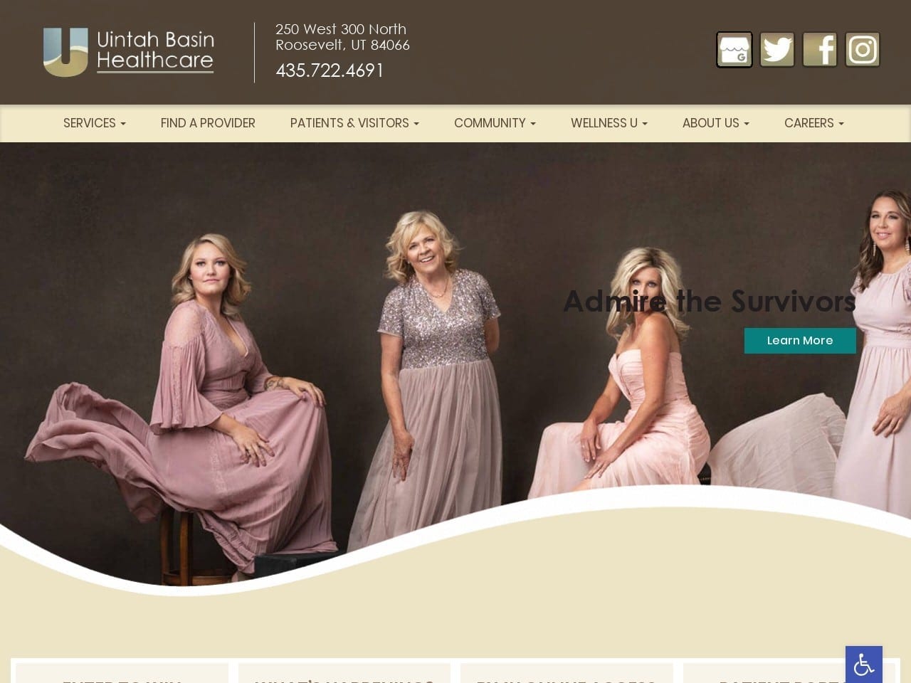
Patients who are battling cancer need convenience, ease of access, and hope delivered to them at every stage of their personal war. Throughout this site, the choice of images and color schemes come together to help promote a warm sense of compassion, security, and hope to those visiting. The color choices of beige and brown also represent the state where Unitah does business, giving it a home-town touch. The bright blue action color used throughout the site is known for its ability to evoke hope while mirroring the bright blue skies of Utah’s climate. Survivors and confident, beautiful, and healthy women are used in the hero image to bolster the belief that Uintah can help.
Functionality
Things that may seem simple to others can be a serious challenge for cancer patients, so convenience and ease of use are central to the website’s features. Visitors can use the patient portal to manage their accounts, check up on financial matters related to their treatment, and get their prescriptions refilled easily. Patients undergoing cancer treatment often have many questions, so UBH is certain to provide comprehensive levels of information for their clients. Information is abundant, from contact points and health tips to times and dates for battling cancer classes.
7. Yellowstone Naturopathic Clinic
Visit Yellowstone Naturopathic Clinic
Aesthetics
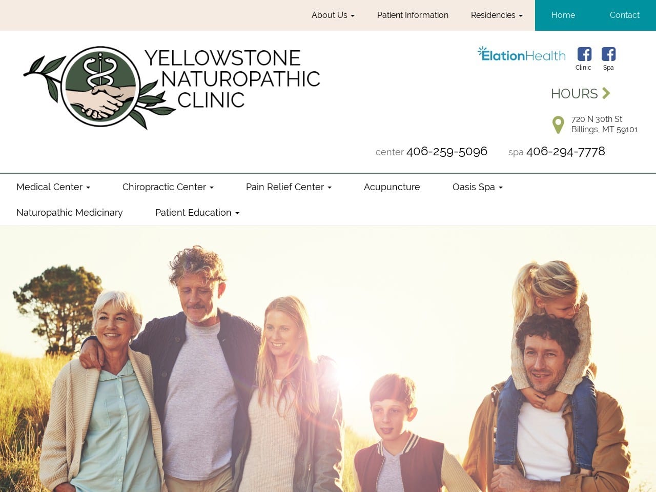
A subtle undertone of pink to the website’s color scheme gives it a soft, luminescent look that results in a very approachable site. Green partly plays into the site’s design due to its association with natural and healthy things. Connections to information within the site are indicated with stylized buttons that reflect the information available through that link. A gray-green shade is utilized throughout to create a background that is easy on the eyes and provides good contrast for text. The images used on the site reflect lush outdoor areas combined with peaceful, happy-looking families. This aids in creating an image of what the practice can offer to visitors who become patients.
Functionality
The buttons that link to service-specific areas of the site include direct options to information for the patients and an overview of that element of the practice, allowing the patient to make directly opt into the sections they want to visit. The videos on the site reflect its media presence and touch on the services it provides to the community and its relationship with its clientele. Information about classes available to the public is also prominently displayed on the main page, including dates and times. The form at the bottom of the page is straightforward and approachable, the prominent blue button is calling the visitor to action. Click-to-Direction functionality is provided in the map below the form. A comprehensive site-map breakdown allows the patient to go to any area of the site they need immediately.
Conclusion
Above, we have laid out a series of healthcare website designs from around the web. Each of them displays a unique take on integrating color, functionality, and design to serve their clientele best. A lot of decision-making goes into designing a website, and that’s before any security considerations. Security is essential to any website, but medical websites, in particular, have to ensure that the information provided by their users is secure and safe. This is often a task best left to the professionals.
If you’re looking into building your own website, it’s essential that you take some time exploring the web to see what’s already out there. Each website you visit has its own benefits to offer, and you may find some elements that you feel your website absolutely cannot live without. Before committing, take the time to compile a list of all these features and chew on them for a while. When it’s time to turn the concept into design, refer to this list and maybe get the help of a professional design company that can ensure it all comes together seamlessly. Your website is your business’s face and the first impression you may never even know happened. Make sure you take the time and steps needed to have it reflect your business’s personality.
