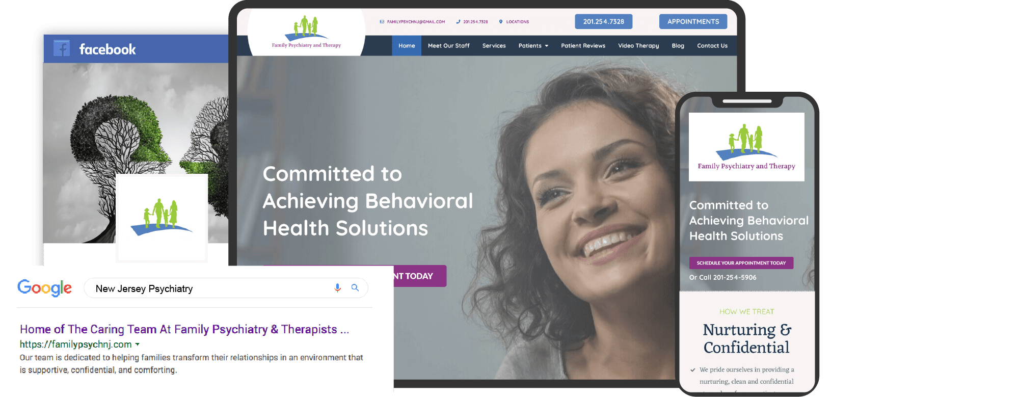
Challenging the stigmas surrounding mental health takes immense time, effort, and skill. Healthcare providers have begun prioritizing mental health services, and for many practices working in psychiatry, creating awareness for mental health can help those in need find better treatment options. In moments where serving your community is needed most, high-quality content and an efficient marketing strategy can meet those demands and connect with patients unaware of your services.

Marketing strategies can help new patients seek support, allow new patients to discover who they are, and help establish themselves as a trusted resource. Compassion, consideration, and reassurance all matter to patients looking for mental health services, and psychiatry website designs can help convey your practice in a professional, uplifting light.
Also, check the top principles of web design for psychiatrists.
Here is a list of some of the best mental health sites:
1. Psych Atlanta

How This Website Engages With Its Viewers: Psych Atlanta opens up with an image of hope, combined with a sophisticated logo and text, to create a modern, sophisticated, refreshing website. Throughout the website, blues and whites are provided for contrast, and its imagery presents a personal rapport with its web visitors to establish a sense of comfort and ease further. Information about the practice is placed alongside powerful images, and action buttons and hyperlinks are provided, forming a place of recovery that can be seen through its design.
2. Bloom Sooner

How This Website Engages With Its Viewers: Bloom Sooner mirrors the philosophy of growth and healing through a smooth and spacious interface. Designed to be inviting and welcoming, white is the primary color to expand the website’s interior and provide a sense of purity and professionalism. Green works as an accent and brand color, and the combination of these colors bring out a soothing, clean atmosphere that appeals to those needing treatment. Its bright and calming imagery, marketing Bloom Sooner as a place of tranquility and growth.
3. Enhance Psych
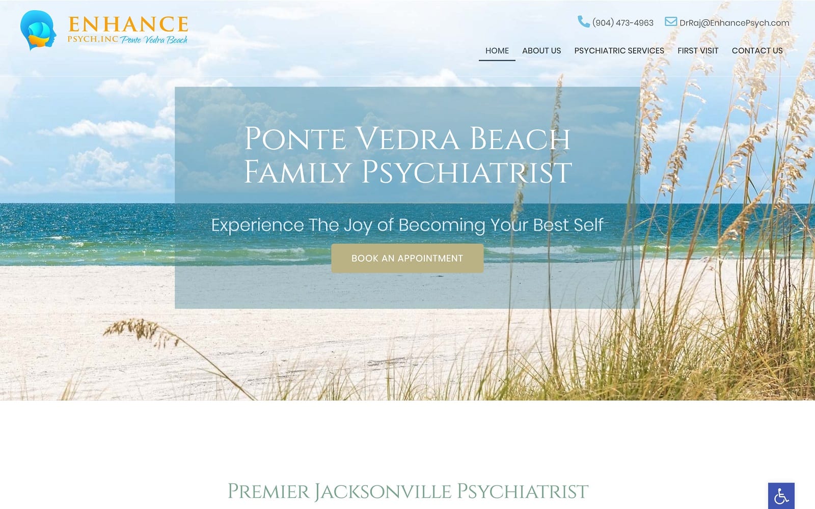
How This Website Engages With Its Viewers: Enhanced Psych of Point Verde Beach appeals to a more local audience through its connections with its imagery and family-focused perspective. Sea blues, seafoam greens, and beachside images help give visitors first impressions. Its use of transparent layers helps to emphasize the website’s services and action buttons, and videos are embedded to present the psychiatrist’s presence within their community and expertise in helping those with mental health conditions. Overall, it’s an iconic website that stays true to its roots, promising healing and growth for those who need it most. The relevant and useful content helps the site’s SEO and search result ranking tremendously.
4. Valeo Behavioral Health
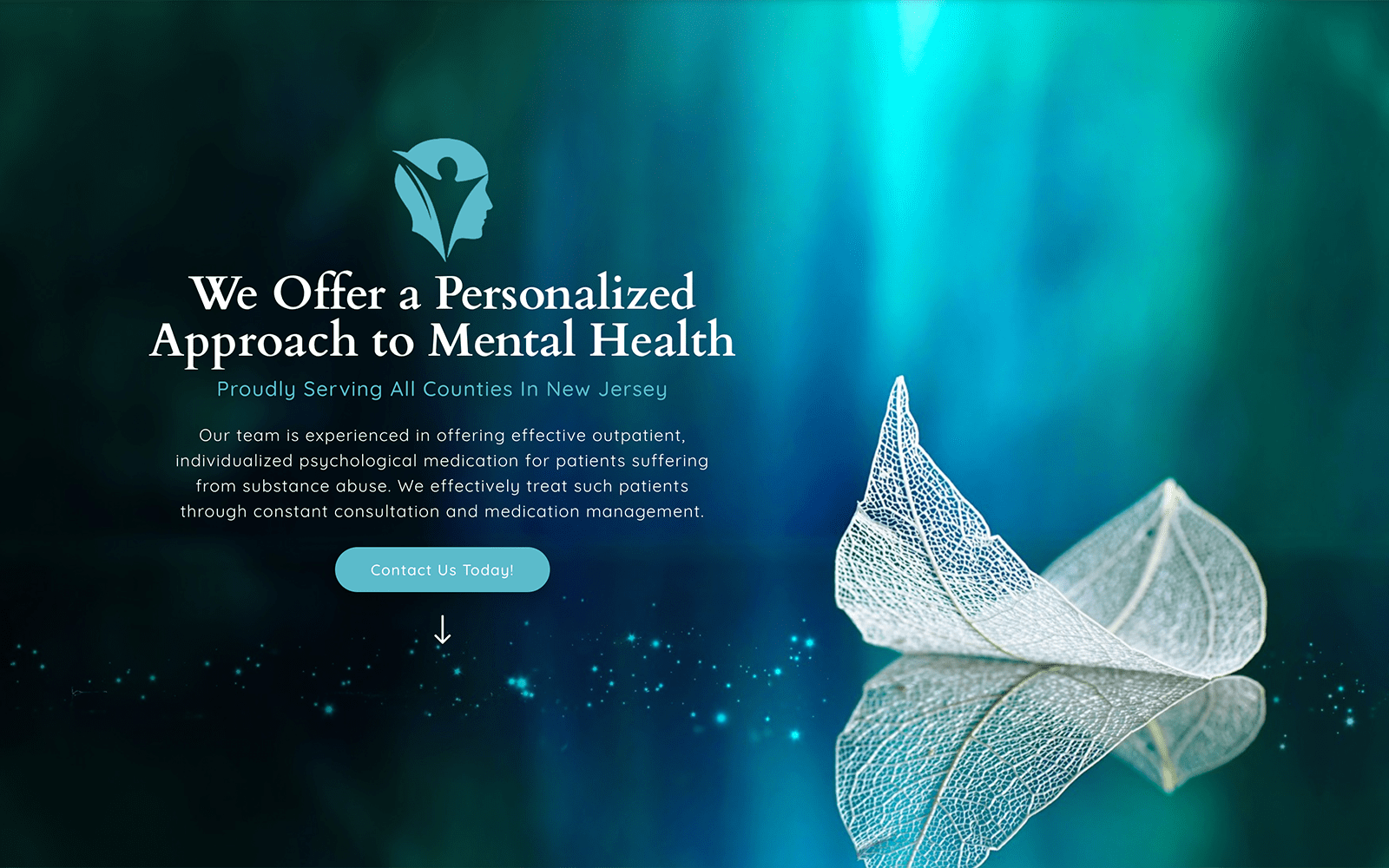
How This Website Engages With Its Viewers: Valeo Behavioral Health turns to aesthetically pleasing shades of blue, therapeutic images, and animated widgets to immerse visitors into the site. It’s a modern, sophisticated feel, all the while appealing to its tranquil qualities. By engulfing its viewers with deep oceanic blues, the website uses large headers, symmetrical boxes, and a center-aligned focus to keep viewers engaged, providing a professional environment where mental health can be addressed and met with the highest expectations. Overall, Valeo Behavioral Health takes on mental health care and places it at the forefront through its use of images, action buttons, and supportive disposition.
5. Stone Creek Therapy
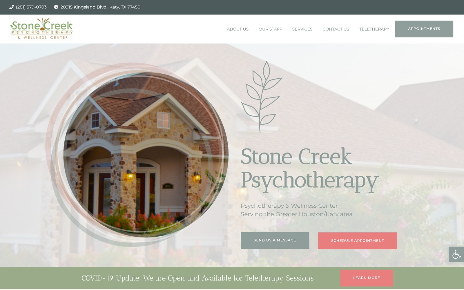
How This Website Engages With Its Viewers: Stone Creek Psychotherapy uses a unique color scheme of bright-tinted lime greens, cornflower blues, and salmon oranges to envelop its viewers. These colors all emit sensations of hope, invigorating its viewers will straying away from the use of traditional, calming blues. Its energizing and refreshing color palette helps accent the transparent layers, comforting home imagery, and serif text fonts accent the website’s information and headers. It also decorates with icons and action buttons to direct its visitors towards its internal links and cleanly directs new patients towards their mental health services.
6. Midwest Wellness Center Associates
Visit Midwest Wellness Center Associates
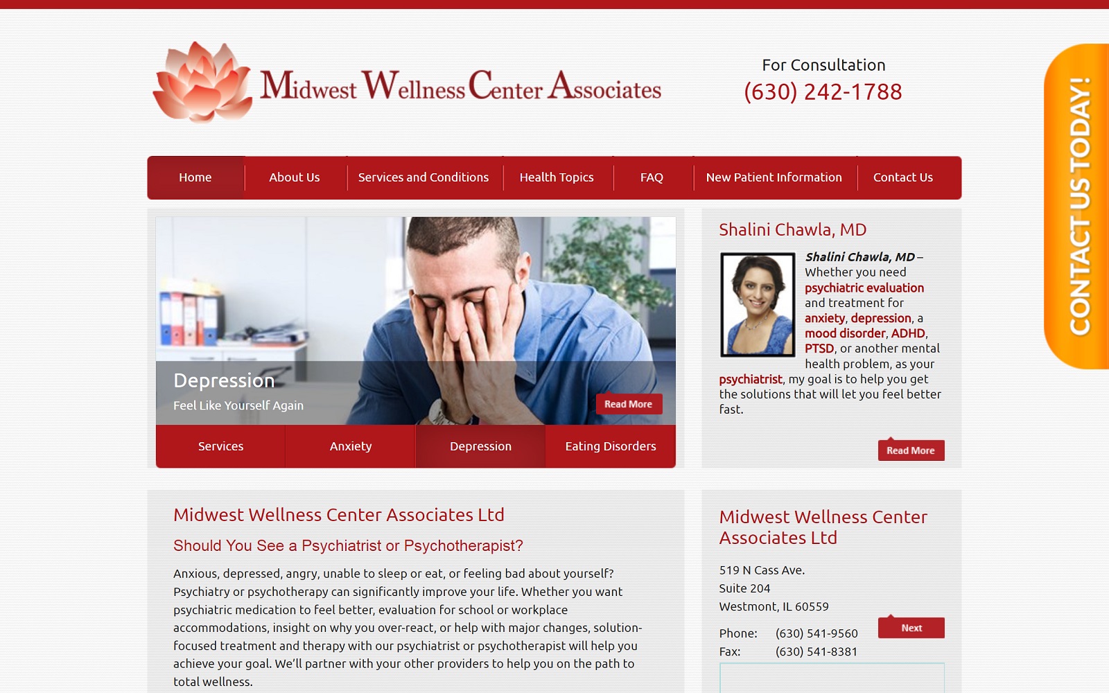
How This Website Engages With Its Viewers: Instead of using calming colors traditionally associated with mental health, Midwest Wellness Center Associates takes on a more active stance towards treating mental health conditions, using bright reds combined with extensive use of white space to form an energizing and engaging space for treating mental health. The website’s whitespace allows visitors to hone in on the website’s content, looking to the website’s action buttons, bullet points, and images for further information. Its simplistic yet professional design makes it an excellent representation of the practice’s goals and aspirations when treating mental health patients.
7. Child Adolescent and Adult Psychiatry
Visit Child Adolescent and Adult Psychiatry
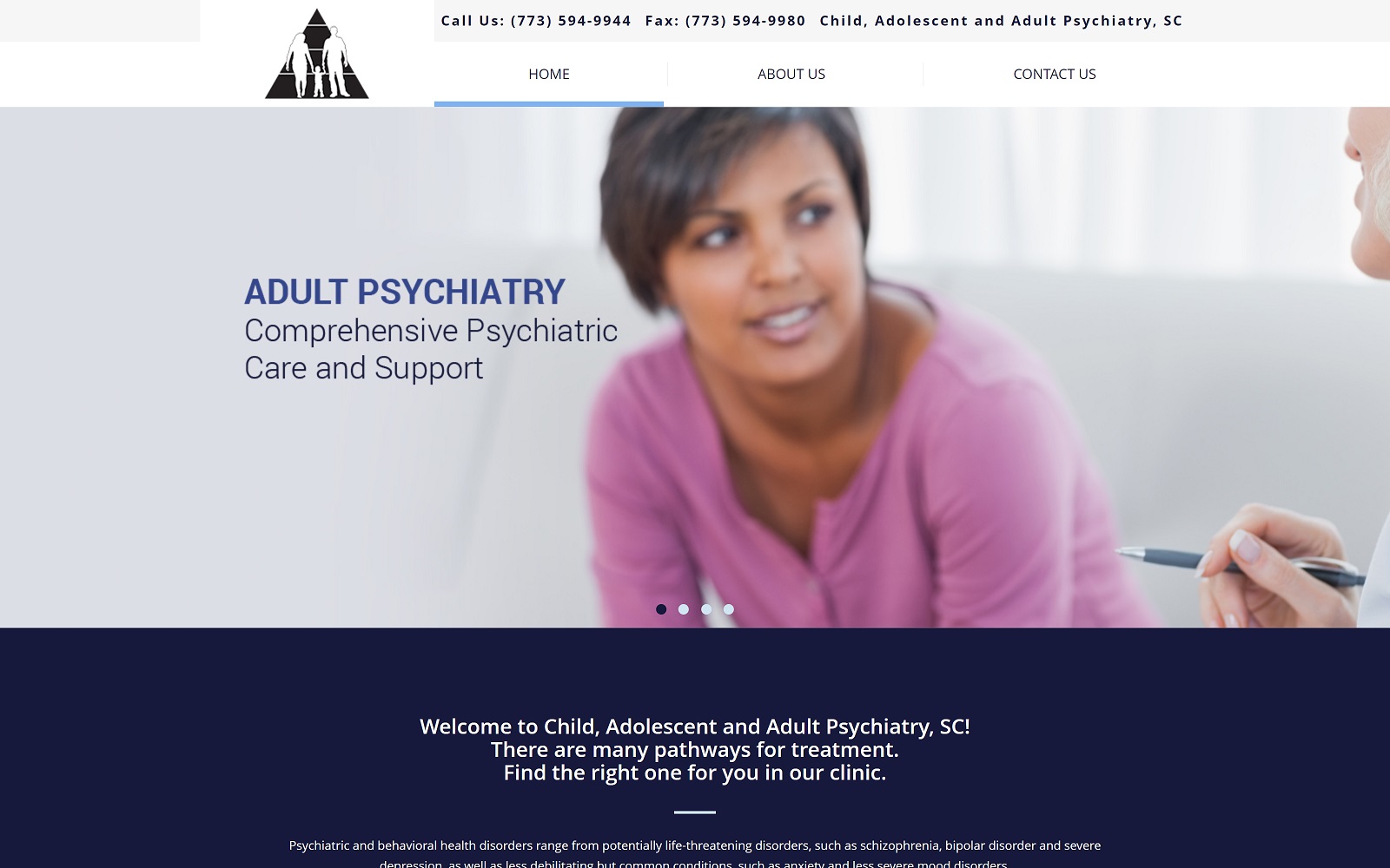
How This Website Engages With Its Viewers: Child Adolescent & Adult Psychiatry presents a neutral space using navy blues and whites to illustrate its core images and concepts. Directed for parents and adults, it greets its visitors with bright wide-screen photography featuring people in various stages. The slideshow and its minimalistic header help direct visitors throughout the homepage, leading them to read more about the website’s business, content, and physicians behind the practice. It implements a simplistic use of website elements through action buttons, separators, and widgets to create a realistic approach toward mental health care.
Redesigning Your Mental Health Website For Effective Performance
The average lifespan of today’s websites spans between one to two years because the trends and technology surrounding website design are constantly changing. Adjusting and redesigning your website can help translate the compassionate side of your practice and appeal to patients that need your services the most. Redesigning and updating your website makes your practice fresh and competitive, takes in all aspects of this changing industry, and places you at the forefront of your community. But it can also be expensive, taking away time and money from other areas of your practice into a strategy that heavily relies on an algorithm system that’s inconsistent and ever-changing.
Strategies work best because they accommodate those inconsistencies – they’re plans set out in a constantly changing digital environment that, while isn’t fool-proof, can still significantly improve your investments. Those resources can be found through a marketing agency like Optimized360, a medical marketing company with a full website portfolio ready to help you achieve your goals.
