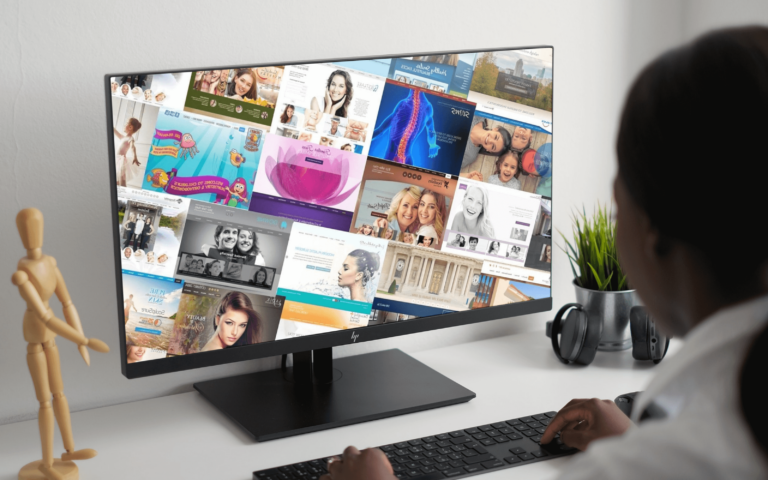
With 2025 well under way, the team at Optimized 360 set out to explore the designs that are making the biggest splash. We found the best urology websites the industry had to offer, and analyzed them to determine what they were doing right, and where they could improve. The result is the following list of 7 urology websites that stood out and provided important indicators of growing web design trends.
Our Picks For the Best Urology Websites of 2025

Precision Urology
How We Graded Precision Urology
Navigation (4.75): The navigation layout of this site is excellent, starting with using a roving top bar that stays with the user in both desktop and mobile layouts. Important navigation links are easy to find, and the site is agile and lightweight.
User Experience (4.5): The loading speed is a good first start. The book online button and accessibility features being prominently available compliment this well. When it comes to menus, the top bar roving menu is excellent for supporting convenience and navigation. The one place it falls short is no links to click-to-drive or click-to-call functions, and social media links are absent.
Visuals and Color(4.5): The site follows some excellent color principles for website design, with an eye to the psychology of color. The blues are soothing, black evokes professionalism, and yellow is uplifting and encourages hope. All good choices for a medical clinic, especially when used with the artistic skill they are in this site.
- Mountain Meadow Teal: cool tone, 37% brightness, high saturation, medium hue
- Gorse Yellow: warm tone, 65% brightness, very high saturation, low hue
- Shark Black: cool tone, 17% brightness, very low saturation, medium-high hue
- Dove Gray: neutral, 42% brightness, no saturation, no hue
- Prussian Blue: cool tone, 15% brightness, very high saturation, medium hue
Overall Score: 4.58
Why We Think It Stands Among The Best Urology Websites of 2025
This stands among the best urology sites of 2025 due to the excellent execution of fundamental web design techniques. Color, convenience, and functionality combine to create an excellent user experience that provides valuable information in an accessible format.
Integrative Urology

How We Graded Integrative Urology
Navigation (4.25): This site’s navigation is the bare minimum due to the static top menu on both desktop and mobile platforms. Its contrast is good, the menu is intuitive, but it loses points for inconvenience.
User Experience (4.25): The page loads quickly, and there are several convenient links when you first arrive. The accessibility features are available, and visitors can quickly request an appointment. From there, the site lacks important features. There are no click-to-drive or click-to-call buttons, reducing its mobile friendliness. Further, no links are provided to social media platforms, patient portals, or other features essential to a positive user experience.
Visuals and Color(4.75): The one place this site earns its place on our list of the best urology websites is in its visuals. The colors are beautiful, and the layout is polished and professional. Despite its other failings, this site’s overall design is a bright spot on an otherwise mediocre experience.
- Deep Cove Blue: cool tone, 13% brightness, high saturation, medium-high hue
- Granny Smith Blue: cool tone, 59% brightness, low saturation, medium hue
- Porcelain White: cool tone, 94% brightness, low saturation, medium hue
- Sepia Brown: warm tone, 41% brightness, medium-low saturation, very low hue
- Gray Chateau: cool tone, 67% brightness, low saturation, medium hue
Overall Score: 4.41
Why We Think It Stands Among The Best Urology Websites of 2025
To even get on our list, a website has to be an exceptional example of website design that hits all the basic notes. The experience must be welcoming and comfortable and easily provide the user with the information they need. Integrative Urology made it on our list of the best urology websites of 2025 because it hits all the notes. Its low score results from not reaching far beyond the baseline of a “good site.” But it’s still enough to get itself on our list.
New York Urologic
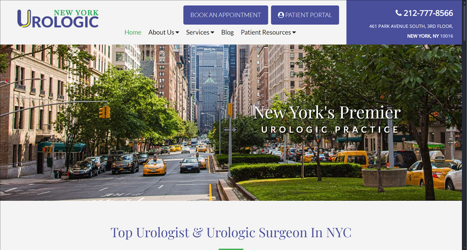
How We Graded New York Urologic
Navigation (5.0): This is a rare honor for us to bestow, but the navigation features of this site are perfect. Roving top menus feature on mobile and desktop views, the menu is clear and intuitive, and convenience options are immediately available.
User Experience (4.75): The user experience comes close to matching the navigation but falls short in a couple of areas. The immediate access to social media links, click-to-call and click-to-navigate, appointment booking, and patient portals were checked off every box. The design of the site and loading times are excellent. However, the lack of accessibility options immediately available on the landing page is a strong strike against it. Further, there’s no chatbot or link to live staff.
Visuals and Color(5.0): This design hits all the marks. The colors are clean, professional, and have excellent contrast, while the imagery connects the clinic with its community. Every page within the site uses color combinations well for contrast and highlighting critical information with an eye to readability. The imagery used is both uplifting for the reader and informative in the right places.
- Victoria Purple: cool tone, 45% brightness, medium-low saturation, medium-high hue
- Chateau Green: cool tone, 47% brightness, medium saturation, medium-low hue
- Golden Dream Yellow: warm tone, 57% brightness, high saturation, low hue
Overall Score: 4.92
Why We Think It Stands Among The Best Urology Websites of 2025
New York Urologic stands as one of the best urology websites we’ve encountered, and it’s all due to excellent design and an understanding of how patients engage with their doctor’s websites. The balance of excellent color with flawless navigation and an outstanding user experience earns it a much-deserved place high on our list. The only improvements we can see would be integrating a chatbot and ensuring accessibility options were available from the landing page.
Austin Urology Institute

How We Graded Austin Urology Institute
Navigation (4.75): Austin Urology provides a clean navigation interface that can be navigated seamlessly. Immediate connect options are readily available in the roving top bar. The site incorporates mobile mobile-friendly design by switching to a hamburger menu in the mobile layout.
User Experience (4.25): The site loads quickly, and their convenient links for calling and booking appointments are readily available in the roving top bar. However, there are a couple of glaring flaws after this promising start. A click-to-navigate feature is absent, and there is no chatbot available. These are minor, but that major black mark comes from accessibility options not being available on the landing page.
Visuals and Color (4.5): Austin Urology Institute provides a pleasant experience, with the cool greens balancing well against the neutral grays. The imagery on the site is informative and helps to put users at ease. While nothing truly remarkable, it doesn’t distract the user and the contrasting colors help visitors find what they need quickly.
- Atlantis Green: cool tone, 52% brightness, medium saturation, medium-low hue
- Carnation Red: warm tone, 63% brightness, high saturation, very high hue
- Charade Blue: cool tone, 21% brightness, low saturation, medium-high hue
- Japanese Laurel Green: cool tone, 33% brightness, high saturation, medium-low hue
- Cod Gray: neutral, 11% brightness, no saturation, no hue
Overall Score: 4.5
Why We Think It Stands Among The Best Urology Websites of 2025
Never let the perfect be the enemy of the good is an important adage, and it let this website find its way onto our chart of the best urology websites. Everything here is done a step above adequate, with some elements being stronger than others and an outstanding navigation design. Despite its missing elements, this site deserves a place on this list and a second look from those looking for excellent website design ideas.
Dr Alan D Garely, MD

How We Graded Dr Alan D. Garely, MD
Navigation (4.0): This site’s navigation is minimal, making it easy to find what you need, but there’s not a lot of versatility, and the top menu is static rather than roving. However, the site leans heavily into mobile-friendly design, emphasizing scrolling over traditional site navigation.
User Experience (4.25): While the site doesn’t deliver many standard options, this score derives from its convenient, lightweight, short, and sweet approach. This site is for making appointments and contacting the doctor. Text provides the barest of information, but this site’s focus is click-to-connect rather than as an information resource.
Visuals and Color(4.25): The color choices on this site are soft and neutral in their brightness. The choices ensure it won’t blind viewers, even on a cell phone in a dark room. The picture of the staff
- Victoria Purple: cool tone, 33% brightness, medium-low saturation, medium-high hue
- Cerulean Blue: cool tone, 48% brightness, very high saturation, medium hue
- Catskill White: cool tone, 97% brightness, medium-low saturation, medium hue
- Pale Sky Gray: cool tone, 45% brightness, low saturation, medium hue
Overall Score: 4.17
Why We Think It Stands Among The Best Urology Websites of 2025
This site makes it on the best urology website’s list for two reasons. The first is that to establish a great, you have to have a baseline of good. This site is fundamentally basic, but it also demonstrates how basic design can be effective if done with a specific goal in mind. Just because a site is focused and no-frills doesn’t make it a poor design. That’s what gets it on the list.
Urology Care Foundation

How We Graded Urology Care Foundation
Navigation (4.5): It starts strong with a roving top menu, making navigating through the desktop layout quick and easy. This menu type is often a strong choice for mobile-friendly design, but the roving top bar becomes static when viewed on a mobile platform. An unfortunate choice. The layout of the menu makes up for a bit with well-organized information and links.
User Experience (4.75): This site hits marks common among the best urology websites regarding their customer experience. Important access points are visible on the main page, including links to their podcast, donation links, and more. As is appropriate for this foundation, it also provides abundant convenience. However, the complete lack of accessibility options is bringing down the score for other websites.
Visuals and Color (4.25): Functional, inoffensive, and sterile would be the terms we’d use for this website’s color scheme and layout. While no professional website should be a visual circus, this site’s design feels uninspired and boilerplate to the industry. The design would have popped with a more interesting image selection and engaging color choices.
- Olivine Green: cool tone, 64% brightness, medium-low saturation, medium-low hue
- Blumine: cool tone, 32% brightness, medium-high saturation, medium hue
- Concrete White: warm tone, 95% brightness, no saturation, no hue
- Regent St Blue: cool tone, 80% brightness, medium saturation, medium hue
Overall Score: 4.5
Why We Think It Stands Among The Best Urology Websites of 2025
This site’s design represents a solid understanding of the best urology website’s designs and how to use them well. The site is excellent overall, with only a few oversites and an adherence to an uninspired visual approach bringing its score down.
Women’s Urology New York

How We Graded Women’s Urology New York
Navigation (4.0): This site uses a straightforward and basic navigation system to do the job. However, a static top menu on mobile and desktop platforms makes navigation inconvenient after leaving the landing page.
User Experience (4.5): The site is lightweight, loading quickly and smoothly. The landing page provides several useful links, and the site has abundant useful information. The schedule consult button and click-to-call links are great additions, but otherwise it’s convenience feature light.
Visuals and Color(4.25): The color palette used in this site is very neutral and pleasant. It delivers a clean experience and utilizes contrast to make navigation easier. The imagery helps encourage visitors and helps them feel confident and hopeful while considering treatment.
- San Marino Blue: cool tone, 43% brightness, medium-low saturation, medium-high hue
- Gallery White: warm tone, 94% brightness, no saturation, no hue
- Manatee Gray: cool tone, 57% brightness, very low saturation, medium-high hue
- Bossanova Purple: cool tone, 24% brightness, medium saturation, medium-high hue
Overall Score: 4.25
Why We Think It Stands Among The Best Urology Websites of 2025
Women’s Urology New York has great bones, delivering an aesthetically pleasing and useful website for its visitors. Its prominent use of images of people adds a depth of color to the site and provides information about its services in a whimsical but professional way. There are a lot of plusses here, but they need to implement better navigation features and customer experience aspects to earn a stronger place among the best urology websites.
Houston Metro Urology

How We Graded Houston Metro Urology
Navigation (4.25): The desktop site provides a roving top bar menu, which becomes a static hamburger menu on the mobile platform. It’s lack of mobile-friendliness hurts its ranking among the best urology websites. The site makes up for with its collapsing top-bar menu on the landing page that keeps it conveniently available so long as visitors are on a wider resolution.
User Experience (4.75): Regarding positive customer experience, this website comes in swinging. The robust navigation features are complimented by buttons for setting appointments and accessing the patient portal. The top bar menu collapsing is a great feature, ensuring maximum customer convenience and aiding site navigation.
Visuals and Color(4.5): The use of colors and imagery on this site is solid, providing a great visual experience for visitors. Contrasting colors effectively highlight important links and information, and the imagery used
- Mantis Green: cool tone, 60% brightness, medium-low saturation, medium-low hue
- Bahama Blue: cool tone, 29% brightness, very high saturation, medium hue
- Cerulean Blue: cool tone, 47% brightness, very high saturation, medium hue
- Botticelli Blue: cool tone, 86% brightness, medium hue, medium-high hue
Overall Score: 4.5
Why We Think It Stands Among The Best Urology Websites of 2025
This site is another great example of an effective website design that knows its target audience. Foundation website principles are in place, and customer experience is a central concern, making it one of the best urology websites.
Our Top 10 Urology Websites Coming Into 2025
This list highlights some excellent examples of website design throughout the previous year. Each reflects evolving design principles, technologies, and how users engage with the internet.
- New York Urologic: 4.92
- Precision Urology: 4.58
- Austin Urology Institute: 4.5
- Houston Metro Urology: 4.5
- Integrative Urology: 4.41
- Women’s Urology New York: 4.25
- Dr Alan D Garely, MD: 4.17
However, in any ranking, there can only be one best-of-show. For this list of the best urology websites, this honor goes to New York Urologic. Their site is an almost perfect execution of the art and science that produces the best urology websites. Optimized360 takes inspiration from ideas like this while innovating and incorporating new techniques in line with developing patient trends. Experienced the difference of a site that connects with patients, provides excellent information, and sets you apart from your peers; call today to hire the Optimized360 team for your urology website design needs!