Our psychology comes from unique, distinct perspectives, and for psychologists looking to help their patients and expand their outreach, website design and marketing have their roots in psychological elements. Websites are essential for any mental health practice, as these websites capture who you are, your style of psychological care, and your unique approach toward your patients. However, one of the biggest problems facing mental health practices is their lack of investment in their online presence, thus resulting in lackluster, bland, cookie-cutter websites.
Because of the unique challenges psychologists face, creating a website takes a huge amount of technical ability and understanding of these psychological elements to appeal to new patients. A beautiful, client-attracting website that hones in those challenges and turns all that hard work into a place of success. Here are some examples of psychology websites that stay true to their unique style while remaining grounded in their medical expertise:
BEST MENTAL HEALTH WEBSITES OF 2022
1. Lanham Neuro Psychology
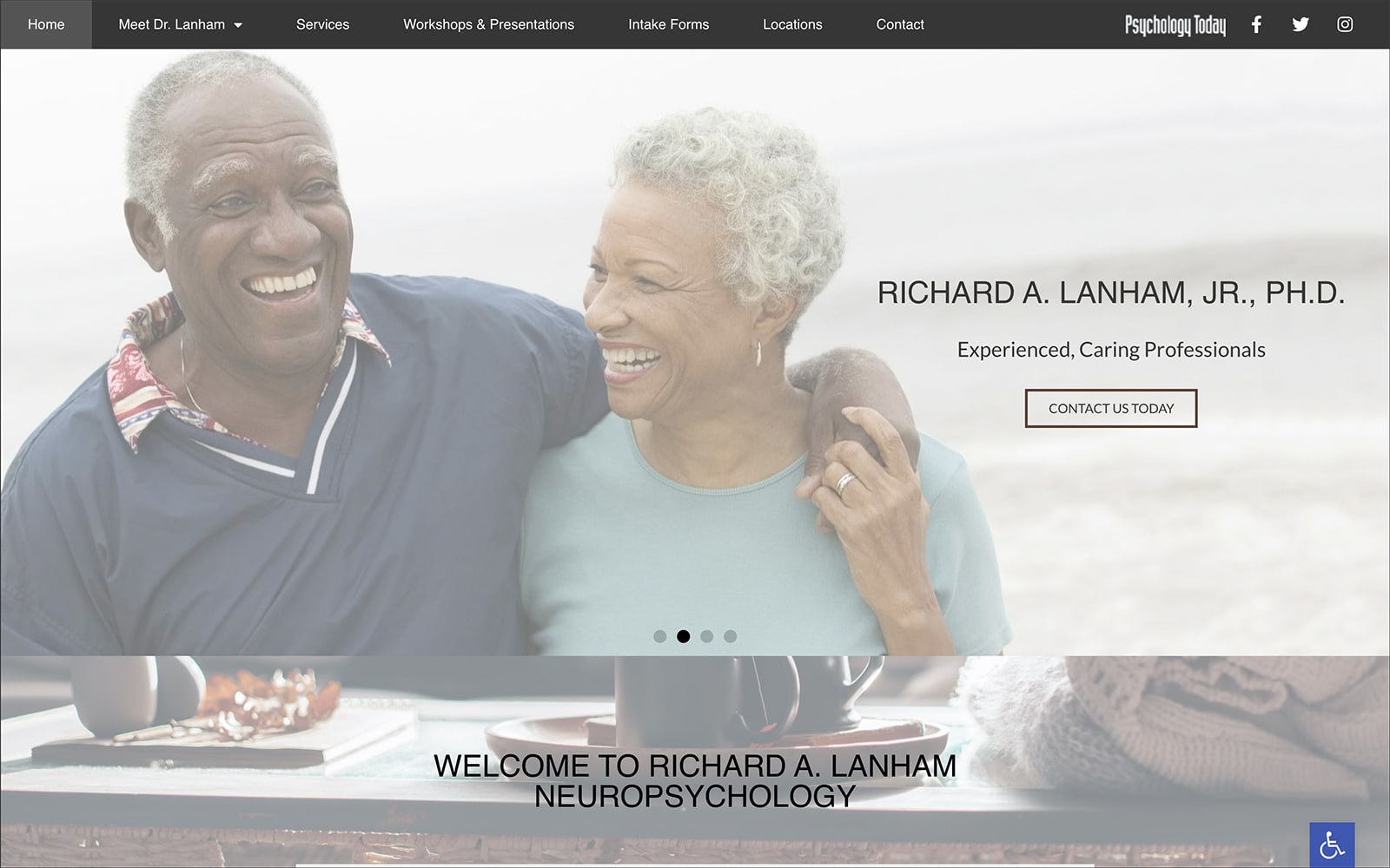
How Lanham Neuro Psychology Creates Their Image: Lanham Neuro Psychology focuses on its personable approach to neuropsychology, ensuring that they are skilled at helping patients find solutions to their mental health issues with their scientific approach. Through this approach, their website focuses on drawing patients in through its friendly, uplifting imagery on full display, while transition slides, action buttons, and color palettes are placed secondary. Because Lanham Neuro works with neutral colors, it heavily focuses on its images and icons to communicate its trustworthiness and sense of compassion while reaching out to new patients.
2. FIDI Therapy
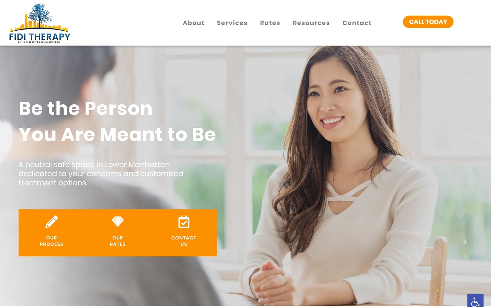
How FIDI Therapy Creates Their Image: FIDI therapy works with various colors amid its white space to communicate its focus on optimism, richness in health, and credibility. Orange is the primary color that attracts their patients to their website, and its imagery helps emphasize this sense of confidence and reassurance. Structuring the homepage, sections, icons, and action buttons are used to direct new patients throughout, helping them further engage with the website’s content. Despite its use of colors and images, it focuses on minimalistic elements that add to the website’s composition, making its website unique and attractive.

3. Recovery NOW
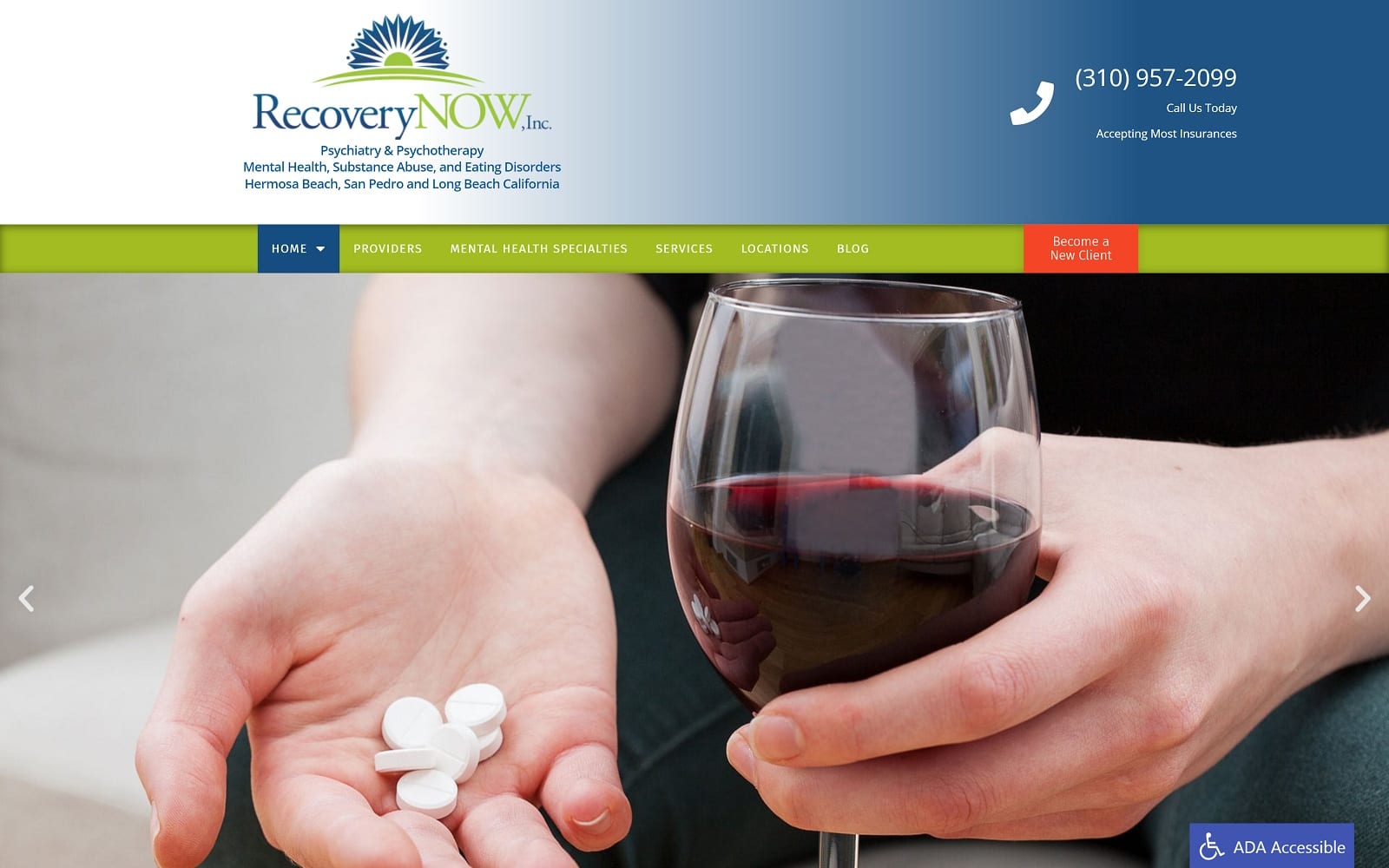
How RecoveryNOW Creates Its Image: Recovery Now greets its patients with bright greens and dark blues, creating an immediate sense of contrast that’s attractive and engaging. From there, its imagery works with the practice’s core themes of therapeutic recovery and rejuvenation, accenting the color’s impressions and directing their attention toward patients suffering from conditions of all types. Full large headers help accentuate the available content, and action buttons are located at the page’s footer to create an immediate sense of engagement with their audience. Overall, the website exceeds at design through a friendly, approachable, and professional appearance.
4. Hallandale Mental Health Center
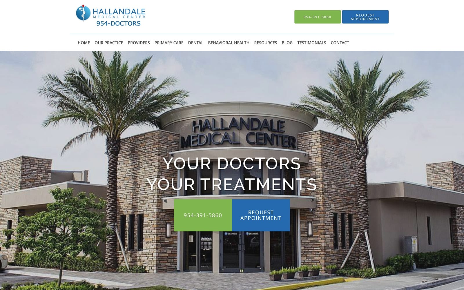
Visit Hallandale Mental Health Center
How Hallandale Mental Health Center Creates Their Image: As a multi-faceted practice, Hallandale’s mental health center works with cool blues, bright greens, and the available whitespace to provide a professional space for patients to receive treatment and care. Its cool blues help patients identify their practice, while bright green accentuates secondary information. Its structure combines images with sectioned text to create a sense of symmetry; through this combination of imagery and text, patients can easily access their services.
5. The Center For Healthy Minds
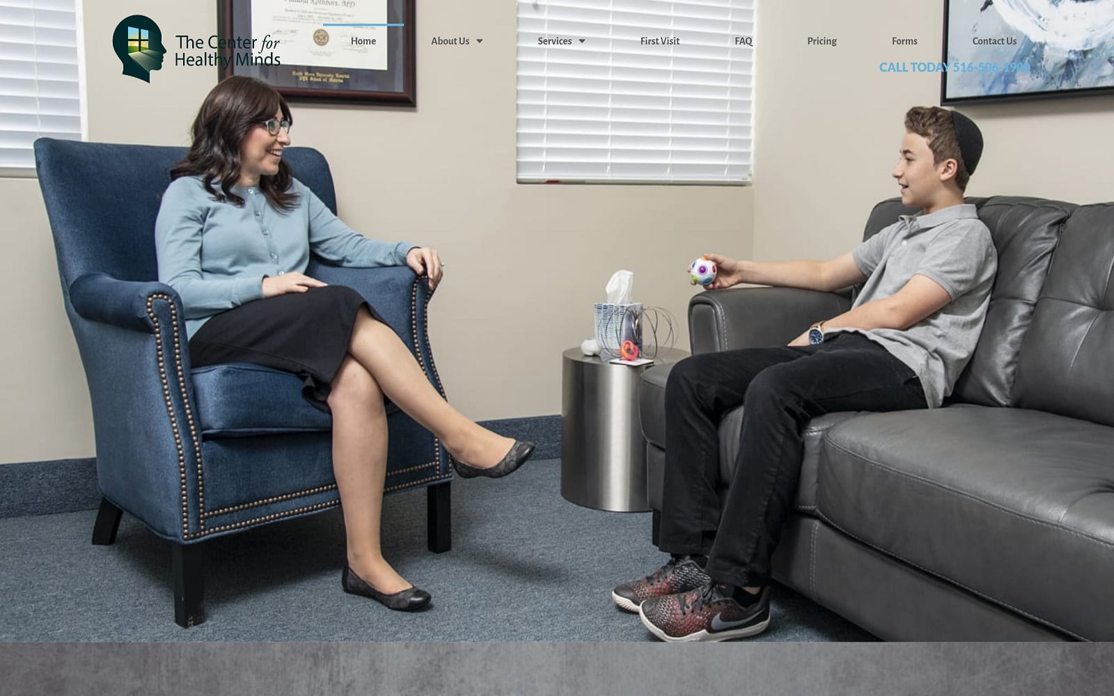
Visit The Center For Healthy Minds
How The Center For Healthy Minds Creates Their Image: Striving to be open and inviting as possible, the Center For Healthy Minds creates a website that’s easily approachable, attractive, and easy on the eyes. By demonstrating a friendly environment, the header image expands throughout the page and creates a sense of comfort and vibrancy to the website as a whole. From there, minimalist elements, including sectioned outlines, action buttons, and blocks of text, help expand on the practice’s services and mission goals, further legitimizing its image. Because of these design choices, its image-focused design makes them trustworthy and professional to its audience.
6. The Psychology Practice
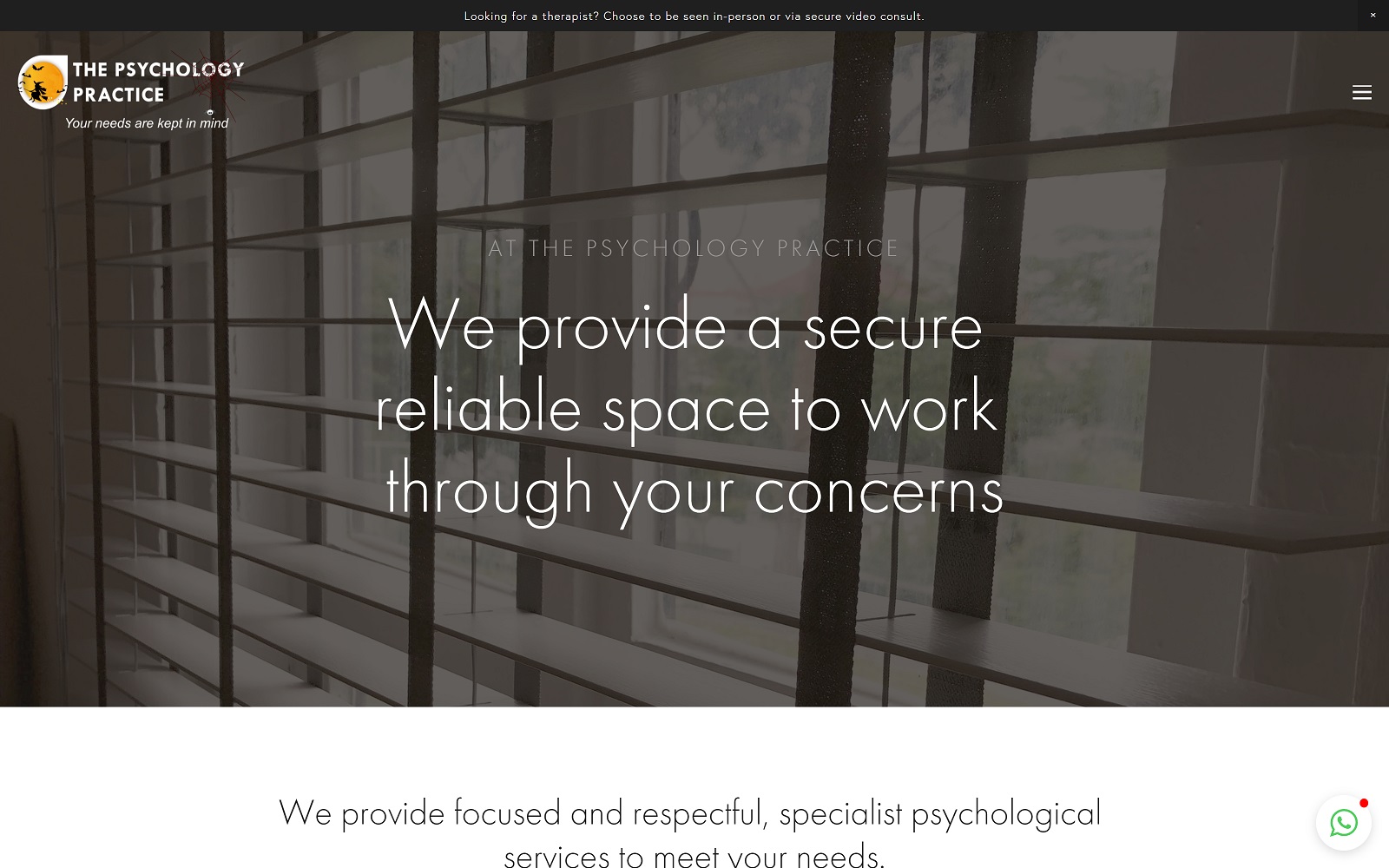
How The Psychology Practice Creates Their Image: The Psychology Practice uses minimalistic elements to appeal to their core patients, focusing on security and respect as their main aspects for treating patients. The Psychology Practice hones in on this by sticking with a monochromatic palette, working with white and shades of gray to emphasize the content present on the site. Its imagery provides a neutral space, giving patients a clearer view of the services and team behind the practice. Patients can easily expect a mental health consultation through this web design.
7. Mary Diorio Psychotherapy
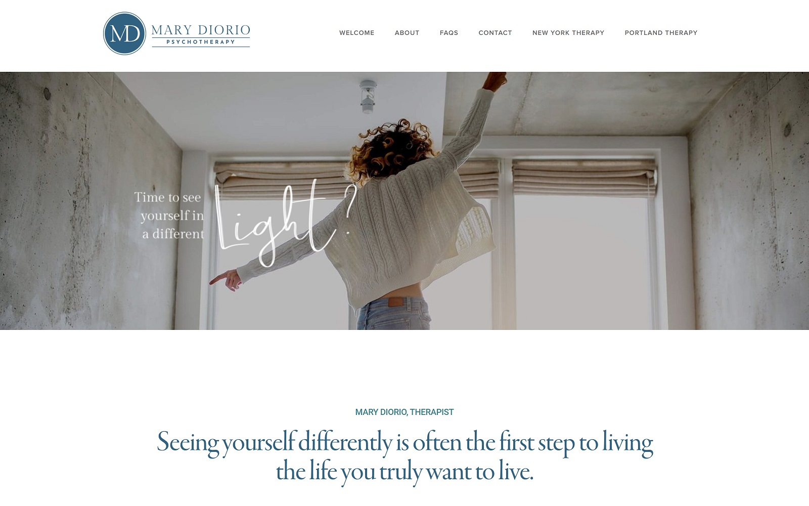
Visit Mary Diorio Psychotherapy
How Mary Diorio Psychotherapy Creates Their Image: Mary Diorio Psychotherapy greets its patients with an uplifting, softened image, establishing a soothing, personable tone that works to create an emotional response. From there, this bright and hopeful appearance works throughout the website’s color scheme, font choices, and areas of focus to create their practice as a place of inspiration and growth. Its available whitespace allows patients to explore the website further as the action buttons help direct patients further into the website. Overall, its classy design gives the practice an eccentric character that works.
TOP 7 PSYCHOLOGY WEBSITES OF 2020
Developing a website for your psychology practice can be enough to put you in therapy. Website design is a complicated profession involving multiple disciplines all working together to create a digital face for your business. Effectively handled psychology website design can create an aesthetically beautiful and functional site that makes a great first impression. While psychology website templates can be tempting, there’s a risk of winding up with a site that is clearly cookie-cutter and lacks the uniqueness to help you stand out from the competition.
Great website design starts with selecting a color palette and logo design that clearly represents your business while having good contrast and enhancing your site’s readability. Mobile-responsive design ensures that it can keep up with the demands of modern patients who are always on the go with their devices. Including click-to-dial and direct-to-map functionality makes staying in touch with your site a breeze. Educational videos can ensure you have an informed and involved patient base. Most importantly, your site must be equipped with HIPAA-grade security to protect your patient’s private information.
Below we have put together some of the best psychology websites of 2020, each of them standing as an example of efficient and effective web design:
1. Bloom Sooner
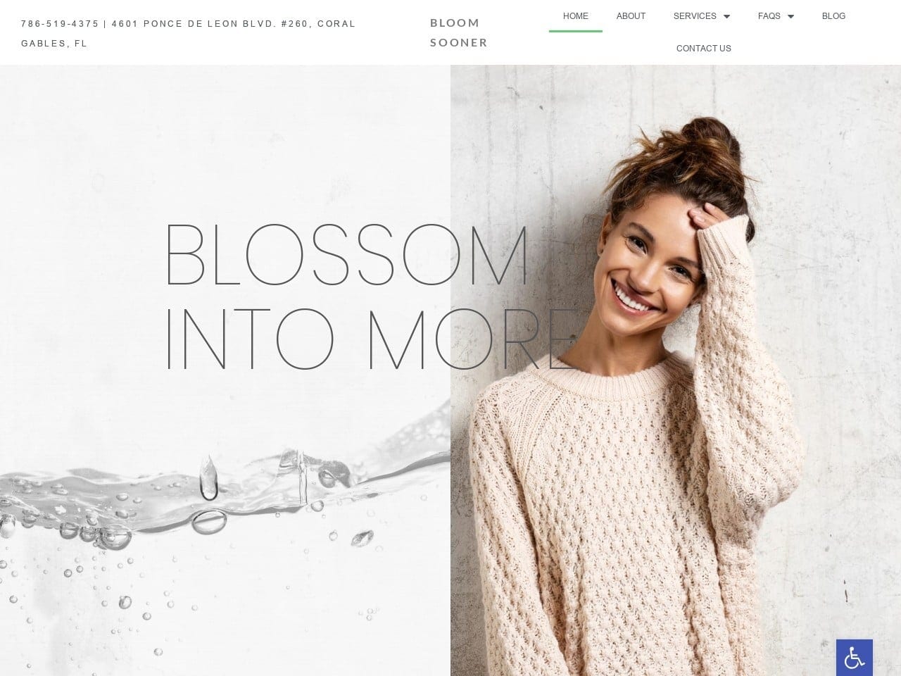
Aesthetics
The jade-green logo represents purity, supporting positive energy, and nourishment. Shades of medium to dark gray help tie together the ever-expanding white and soothing jade as the passive color. The white creates contrast, providing a breathing space for its visitors to take in information and be soothed throughout. The website’s use of space and sans serif font offers a modern, almost holistic take on mental health and thus allows visitors to take in the feminine qualities of their services.
Functionality
The website begins with the click-to-call number in the left-hand corner of the screen, and the logo and business stand at the top header, allowing visitors to have easy access to its main menu options. The website’s choice of pictures all have hyperlink buttons that the visitor can access to view services. At the footer, a HIPPA secure form and a google maps location plugin can be found for viewers for quick communication and location relevance. The accessibility tab at the screen’s bottom right-hand is also present.
2. Psych Atlanta
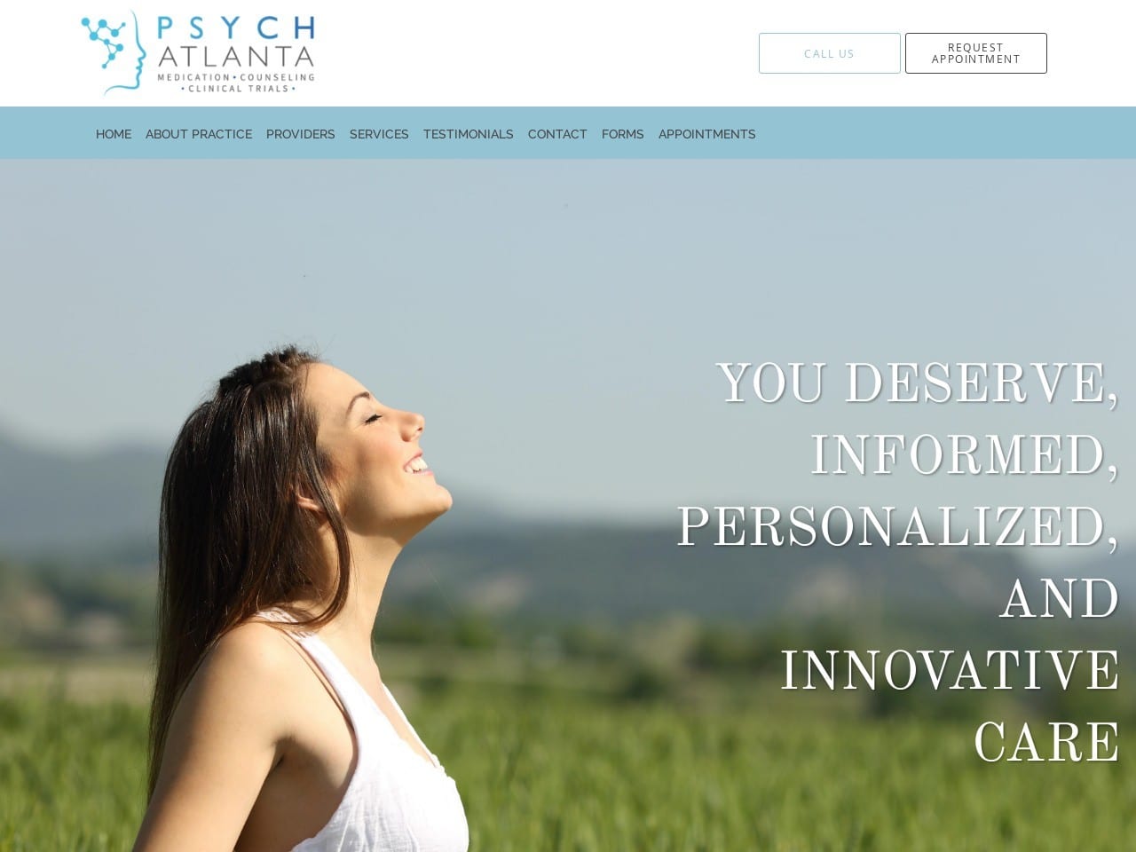
Aesthetics
Hallandale Medical Center uses bright blue to suggest authority, white as the website background for cleanliness and balance, and bright red as the accent color to grab the viewer’s attention and keep the visitor scrolling throughout the page. Its use of photography hones in on a specific focus, focusing on its various services and professionalism to convey its messages. It establishes itself as a place of trustworthiness, medical finesse, and healing while remaining stoic in its presentation.
Functionality
As the bright red highlights the phone number action buttons, the click-to-action buttons for calls and schedules are located at both the moving header bar and the center of the main page with the header image. Its services section uses images and text to hyperlink information to more pages on the site. At the same time, the bottom footer focuses on social media connections, types of insurance provided, blogs, and other information such as its locations and office hours. The bottom header also includes a google maps widget that expands across the page horizontally.
3. Enhance Psych, Inc
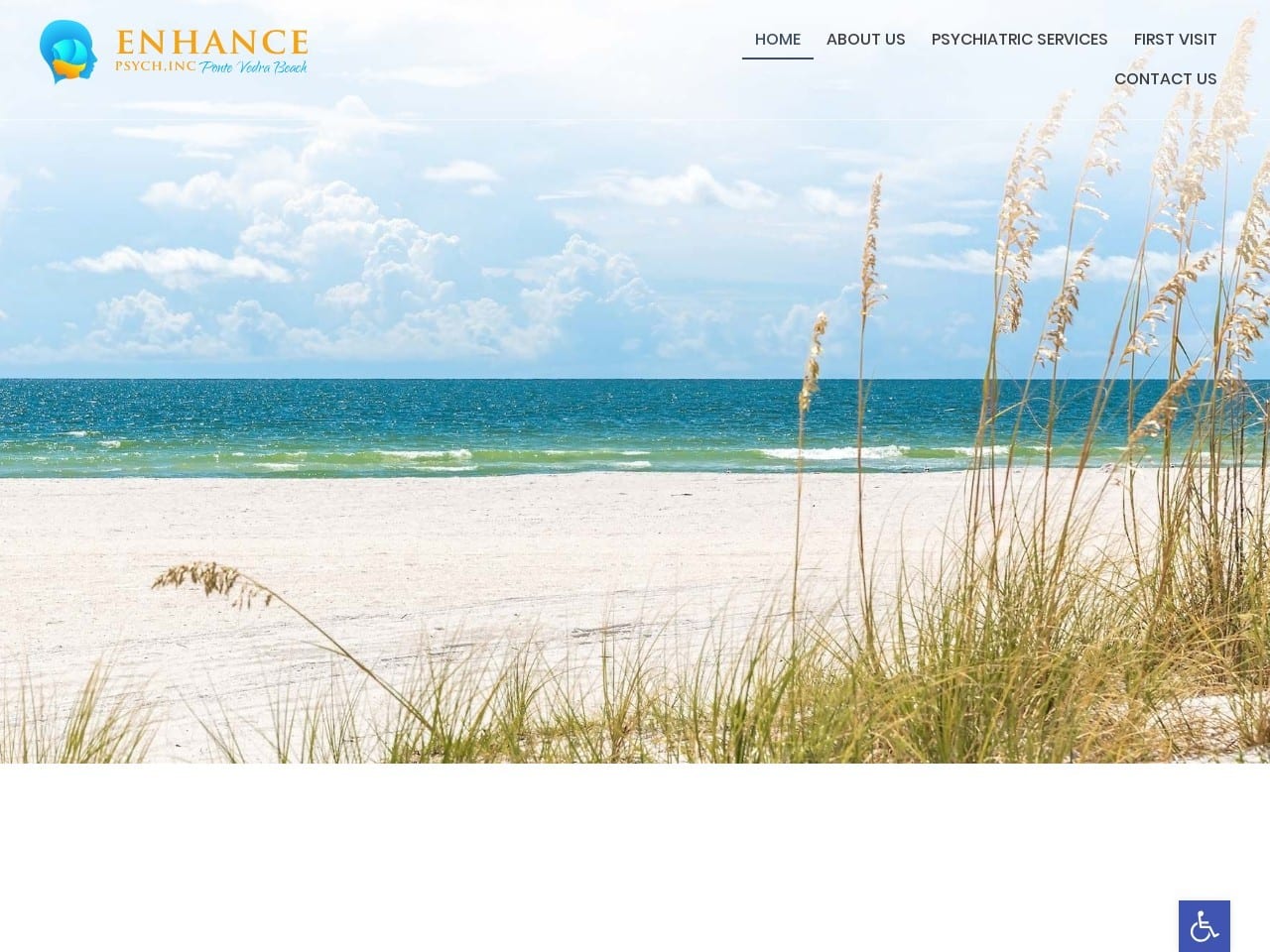
Aesthetics
Taking on a beach aesthetic, light teal, golden yellow, cool beige, and a soft mossy green create a peaceful yet also revitalizing ambiance throughout the website. Each photo transitions into the background as not a standalone picture but rather integrally part of the website’s structure. Its use of serif fonts for its head titles and sans serif for descriptive pieces allows readers to focus on the information present on the page rather than the imagery.
Functionality
The click-to-call function, located at the right-hand corner of the page, allows the viewer to contact the business, and the company logo also contains a click-to-action button for returning to the home page. In the header image, an action button for requesting an appointment is present, and its services section, an interactive rotating widget, presents an introduction section for each of its services. After dedicating a section to the business’s head psychiatrist and slideshow testimonials, the page’s footer contains the HIPPA contact us form, a list of locations and services, a general inquiries form, and an accessibility tool.
4. Attento Counseling
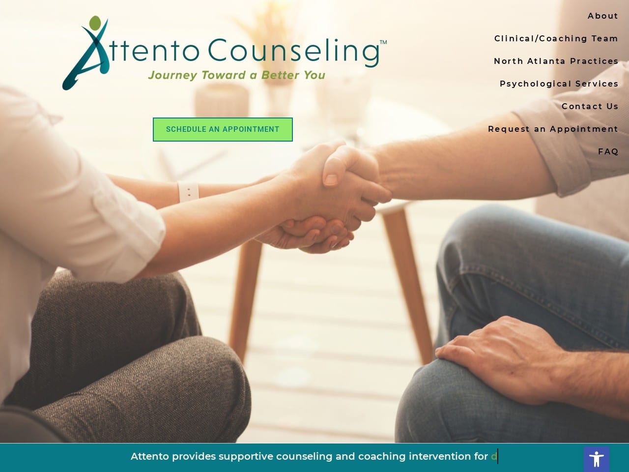
Aesthetics
Incorporating lime and turquoise green into its color scheme, Attento Counseling focuses on professionalism, initiating a stable environment, and a reliable connection between itself and its visitors. Its light green background acts as a neutral color, and its use of turquoise green accents the website, giving off a sense of authority while also remaining youthful and energizing. Its inherent structure sectioned out in rectangular shapes, helps to organize the information present and ultimately helps the viewer hone in on what the business can provide.
Functionality
Its main menu page is set off to the right side of the page. At the same time, the slideshow headers take up center stage, providing a unique opportunity for visitors to see the action button, located at the almost center part of the header underneath the business logo. Each section repeats multiple calls to action buttons, providing visuals for its various locations, its team members, and slideshow testimonials. At the page’s footer, google maps widgets can be interacted with, a quick links menu, and alongside the scroll bar, the accessibility tool can be accessed on the right-hand side of the page.
5. Hallandale Medical Center
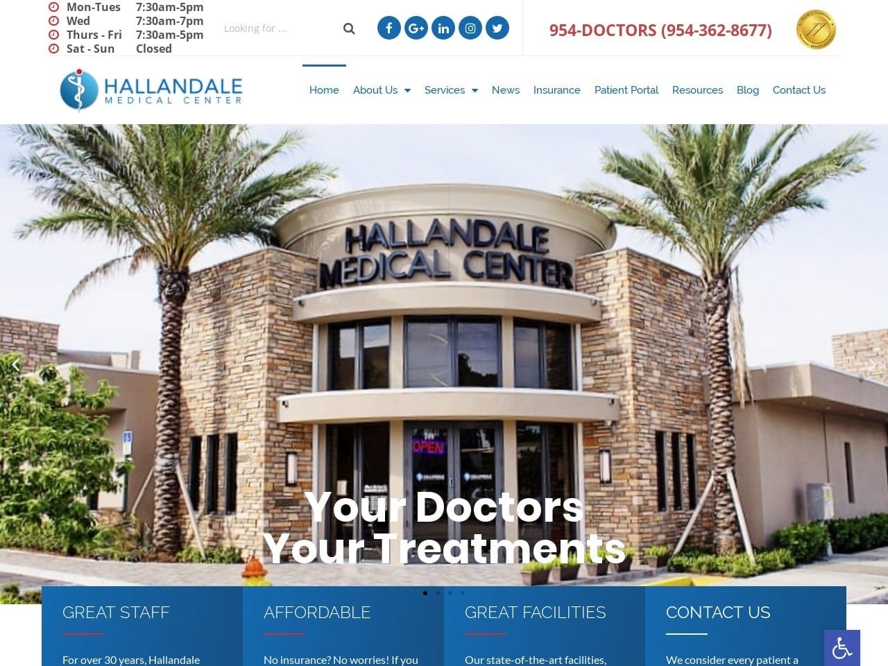
Visit Hallandale Medical Center
Aesthetics
Hallandale Medical Center uses bright blue to suggest authority, white as the website background for cleanliness and balance, and bright red as the accent color to grab the viewer’s attention and keep the visitor scrolling throughout the page. Its use of photography hones in on a specific focus, focusing on its various services and professionalism to convey its messages. It establishes itself as a place of trustworthiness, medical finesse, and healing while remaining stoic in its presentation.
Functionality
As the bright red highlights the phone number action buttons, the click-to-action buttons for calls and schedules are located at both the moving header bar and the center of the main page with the header image. Its services section uses images and text to hyperlink its information to more pages on the site. At the same time, the bottom footer focuses on social media connections, types of insurance provided, blogs, and other information such as locations and office hours. The bottom header also includes a google maps widget that expands across the page horizontally.
6. The Center For Healthy Minds
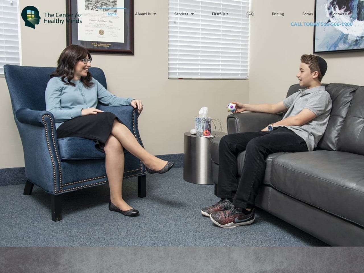
Visit The Center For Healthy Minds
Aesthetics
The Center For Healthy Minds combines professionalism with alternative text fonts to produce a wholly individualistic approach to mental health services. By focusing on neutral grays with medium bright indigos, the color scheme allows for the business logo and photography to stand out and redirect the reader’s attention toward the website information. The website utilizes a personal, productive, and sophisticated aesthetic to convey its services and helps to highlight the business as a solely-owned production.
Functionality
The header transitions from translucent to a gray border as visitors scroll through the page, highlighting the header image as the key focus for first-time viewers, with the click-to-call action button at the right side of the page. Its sections help organize the website’s information, and the use of light blue is a call-to-action for its office section for more information. The footer sections parts of information into two parts: the business address, HIPPA contacts us form, and google maps widget for easy access.
7. Blue Ridge Behavioral Healthcare
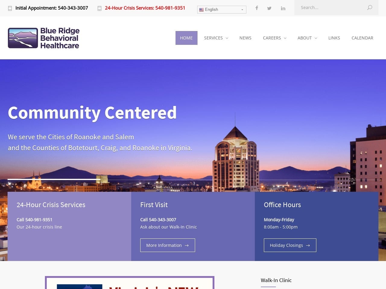
Visit Blue Ridge Behavioral Healthcare
Aesthetics
Analogous purples, from lilac to lavender, redefine this business as a soothing, regenerative place to heal. Because purple’s most often associated with wealth, Blue Ridge established its image as a place of opportunity for those wishing to heal and serve medical purposes. Purple’s also the color for the state of Virginia for political reasons and sophisticated format and use of sans serif text; the website focuses its aesthetic on community-building and service-orientated recovery.
Functionality
At the top header, prevalent information for contact, search, and language adjustment is utilized in the page above the main menu header. The main menu header contains a hyperlinked logo, and the home section of the main menu is highlighted in purple. With an interactive slideshow and sectioned boxes for information, action buttons help to focus the viewer’s attention on the internal links throughout the website. As the business is community-focused, the website details the latest news and blog posts about information related to medical health within the state. It turns their website into an interactive space for reoccurring visitors.

Growing Your Psychology Practice Through Website Marketing
Moving your practice into the digital age takes time and money, but there’s a fine balance between effective marketing that works and becoming a walking advertisement. Nowadays, psychologists working on expanding their practice must take on the digital platform. Some of the best marketing tools out there use platforms like social media and email to reach out to patients in need.
Website design is just one facet of becoming fully integrated. From what we’ve explored, each website incorporates its design by playing with colors, animations, call-to-action buttons, and other navigation techniques to reach patients beyond their local sphere. But if you still find yourself lost among all this jargon and need help, finding a marketing agency can help you expand your client base and reach out to more patients.
Conclusion
While each website strives to accomplish the same goal, they go about it differently. Each of them strives to include functionality that will be useful to their patient base while presenting a unique face that makes them memorable. The combination of color palette, layout, and mobile responsiveness creates a memorable first impression for newcomers while presenting long-term usability to returning patients.
During your web design process, watch for features that strike you as having a place on your clinic’s website and those that don’t. Keep a log of all of these until you’ve got an idea of what you’re looking for, and then reach out to a professional web design company to get the ball rolling. Even if you ultimately opt for in-house development, consulting professionals can help ensure you don’t miss any critical points. You can also find our 7 Best Psychiatry Websites of the Year here.
Also, read about the important principles of web design for psychiatrists.
