Best Practices for Layout Design
When selecting a medical or dental website layout, there are a few considerations to make before approving the design. These minor adjustments can ultimately enhance the user experience while interacting with medical or dental websites. After all, your website is the first chance to make a good impression on potential patients who are looking for a new physician or dentist in your city. Read the following tips to make essential design decisions on your website for a better conversion rate with new patients!
1. Design Real Estate
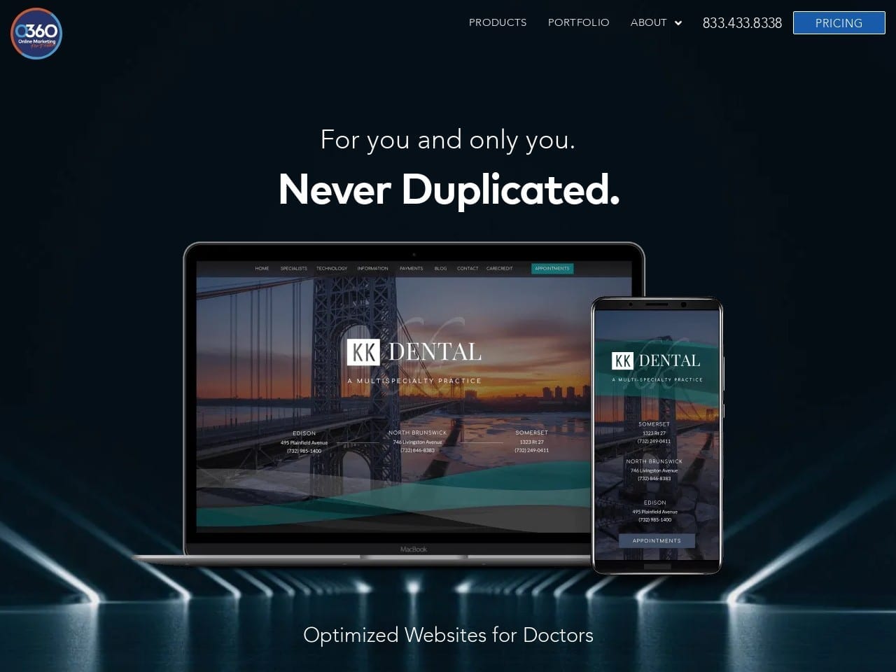
Example of a Dental Website That Uses Space Wisely
Making Good Use of Space on Your Medical or Dental Website
The home page is the first opportunity to leave a positive impression on potential patients. Making good use of your space is critical, considering that there is only a split second to capture your patients’ attention. Firstly, in the header areas, your practice name and logo should stand out from the rest of the home page. A good logo clearly states your physician or dental practice name, specialty, and city. Secondly, contact information should be readily available, signaling patients to contact for more information. That should include your phone number, office address, and social media icons so they can quickly connect.
2. Narrow vs. Widescreen Layouts
Example of a Narrow Dental Website Layout
Accommodating Your Patients
The average desktop computer screen ranges between 900 and 1200 pixels. It is essential that a well-designed website layout fits nicely between these parameters. Choose a narrow design layout if your medical or dental patients are older and more likely to have smaller computer monitors. New modern medical websites are typically wider because advanced technology has allowed us to have bigger, thinner, and faster processing monitor screens. Opt for the widescreen layout if you’re looking for a fresher, more modern take on targeting technologically savvy patients for your medical or dental practice.
Important standards of web design for healthcare websites
3. Organization
Example of a Dental Website that uses Varying Fonts
Controlling the Typography
The website layout has to be visually organized using proper typography. Every article or page should have a concise and clearly visible title. This font is typically larger in point to indicate what the following paragraphs entail. The paragraphs themselves should be in clean and easy-to-read fonts like Arial or Times New Roman. Having different size fonts can help break up the text of the medical or dental website to make reading and navigation easier for readers. Check out the best dental website design company in the USA.
4. Visual Eye Flow
Moving from Top to Bottom of the Medical or Dental Website
Controlling the visual flow of the eyes is based on size and hierarchy. Firstly, they need to know who you are and what you do. For example, the practice name or logo should be prominent and fairly sized. Patients should know that they are at your practice’s website. Secondly, they know what you do and why your medical and dental office is better than your competitors. Now is the time to impress them and win them over with your well-planned medical or dental website.
5. Clear Navigation
Example of a Dental Website with Clear Navigation
Easy To Navigate Directory
Excellent dental or medical websites are easy to navigate, with a clear menu bar highlighting key pages like contact us, locations, our team, our philosophy, and more. A good medical or dental website design would implement featured services, buttons, and sidebars to help patients navigate to specific pages. It should be common sense for any person new to the website to be able to find the contact information, doctor’s bio, and office hours. With this in mind, it will make it one step easier for new patients to sign up for an appointment at your medical or dental office! Check out the best 7 medical spa websites of the year.
How to design a website navigation
Conclusion
Now equipped with some dental website design tips, you can start making informed decisions on the type of layout that best suits you. Remember that space is limited, so make your decisions count, whether it is logo placement, contact information, or the appointment form. Discerning the needs of your patients who prefer a widescreen or narrow dental website layout will improve your chances of conversion. Ensuring your content is organized and easy to navigate will help your readers find the information they want. Lastly, the overall visual flow of your dental website needs to be logical in accordance with the hierarchy. These few tips will help guide your decision-making when choosing the layout of your dental website! Check out O360’s top Endodontic Websites.


