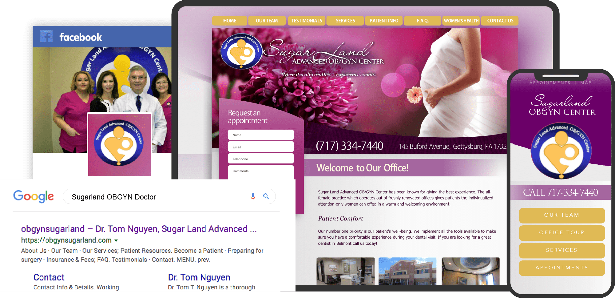
Gynecologists and obstetricians represent access to women’s healthcare, and women searching for these services show how deeply personal their choices are to their health and identity. Many women searching for OBGYN practices have to rely on providers throughout the internet for practices that meet their needs and care about women’s issues. For practices like yours, having an attractive and customized website can help represent your business and reflect your personal brand, which makes you unique among others. But if your website doesn’t match up, then it’ll be difficult to reach out to new patients in need.

THE BEST WEBSITES OF 2020
Websites are vital in building your practice from the ground up and represent an especially important milestone for women’s healthcare. We’ve collected some of the best OBGYN websites out there to showcase how they reflect their brand and will offer some tips to help inspire you to grow your business further.
1. Sunshine State Women’s Care
Visit Sunshine State Women’s Care
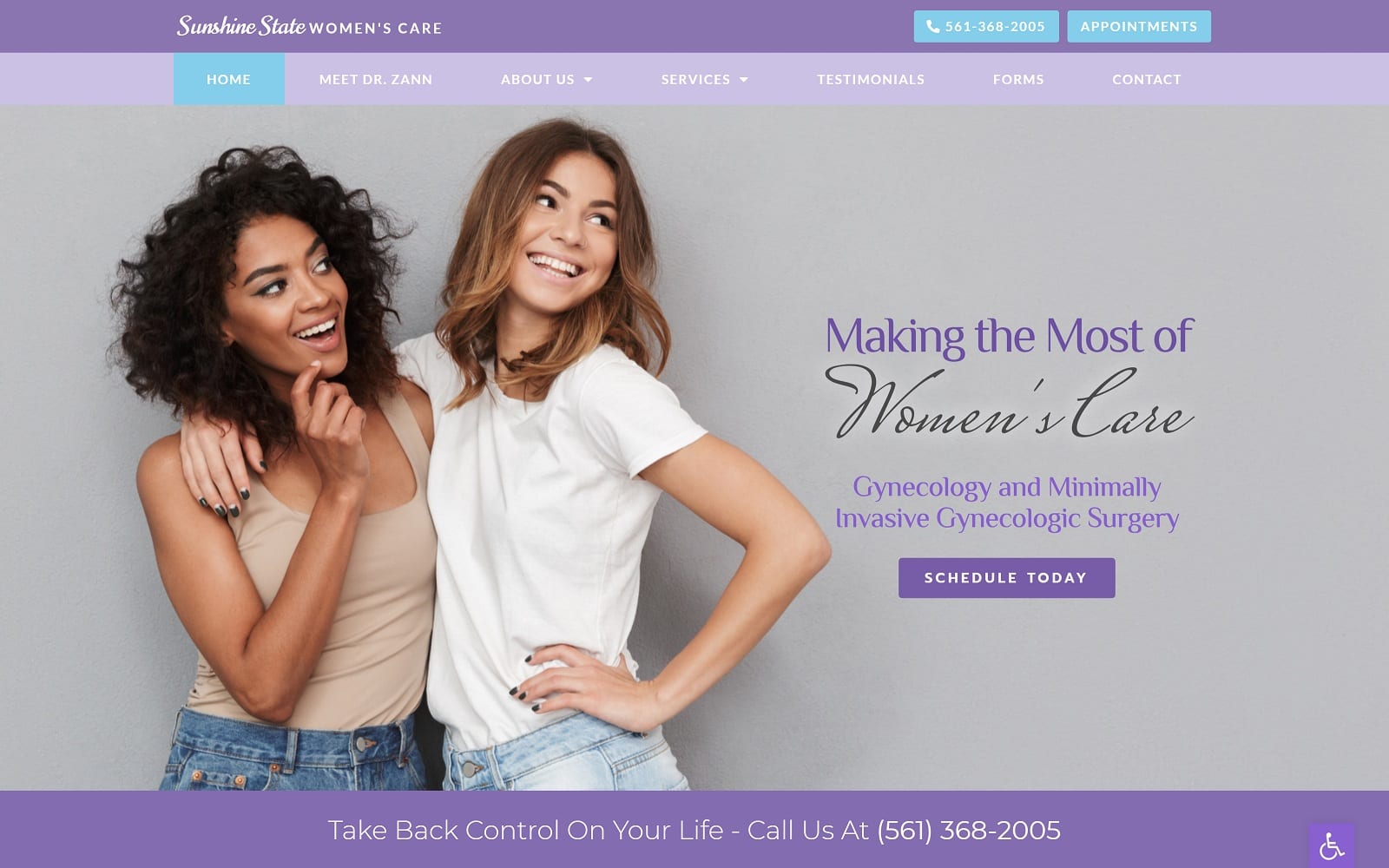
How This Practice Attracts New Patients: Sunshine State Women’s Care brings out feminine qualities, communicating tenderness and professionalism through periwinkle and bright purple. To emphasize its services, Robin’s egg blue and royal blue help to direct new patients and work as the action colors. Its smooth interface allows patients to interact with the website’s hyperlinks and action buttons, and its bright photography welcomes the patient, implying ease of accessibility and quality of women’s care.
2. George Fuller MD
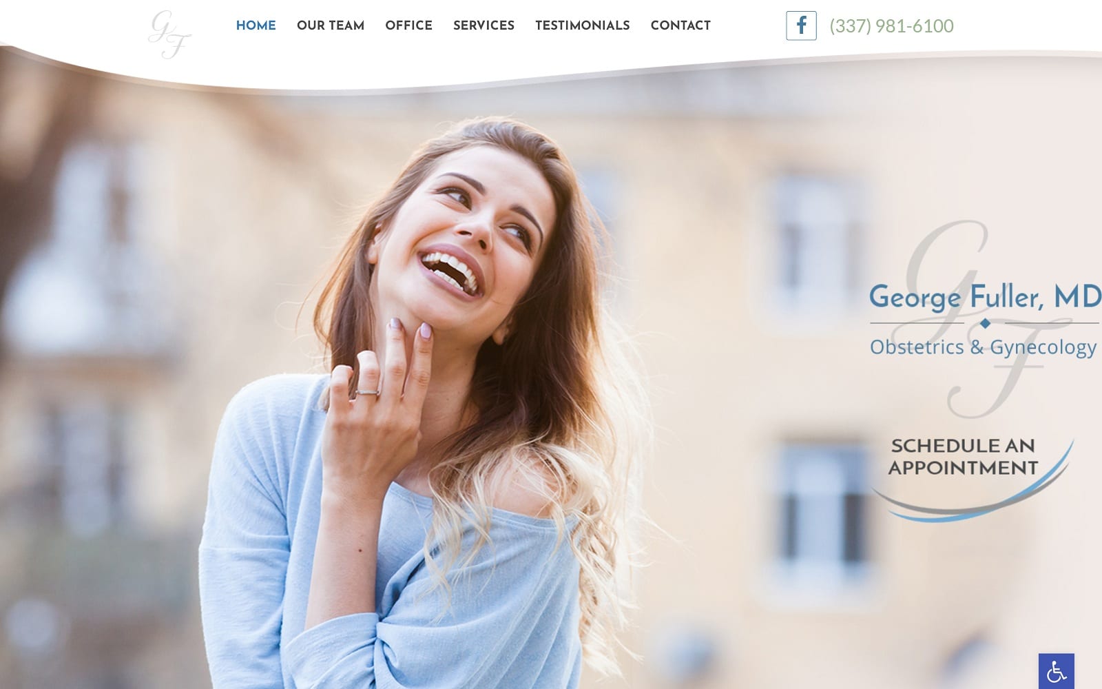
How This Practice Attracts New Patients: George Fuller, MD, works to convey compassionate women’s care by using soft blues and greens as accents and action colors, incorporating the white space to create a cheerful environment. Its imagery helps to remove anxiety for any new patients visiting the site and features interactive services, icons, and hyperlinks to allow visitors to engage with the website more fully. Its transition sections help to smooth out sections throughout the site, and its large text makes it highly accessible to women in need.
Get great reviews for your OBG practice

3. New Moon Center For Women’s Health
Visit New Moon Center For Women’s Health
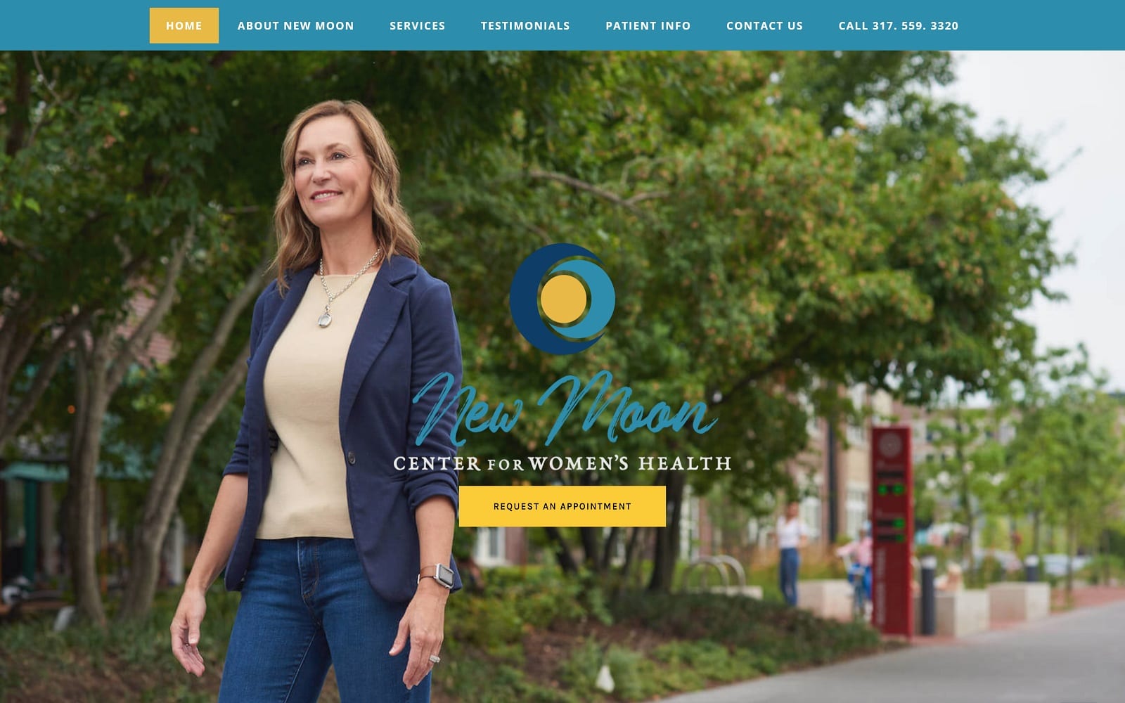
How This Practice Attracts New Patients: By working with bright colors and an elegant brand logo, New Moon Center appeals to a wider audience of patients through its use of imagery, color scheme, and transition pages. Its imagery represents the highlights of the New Moon, reaching out to an audience and using that imagery to represent their service to care for every woman. Bright blue accentuates the headers, sections, and footers, while bright yellow leads patients to the action buttons and hyperlinks. Because of these elements, new patients visiting the site can be assured that they’re receiving reputable and trustworthy care.
4. Miracle Orchids Medical Center
Visit Miracle Orchids Medical Center
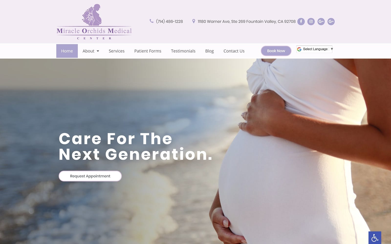
How This Practice Attracts New Patients: Miracle Orchids Medical Center uses soft, dreamy elements with lilac purple, robin’s egg blue, and soft cream white to showcase their dedication to women’s care. The website’s use of lilac purple works as the primary color to direct new patients throughout the website, and Robin’s egg blue works as the action color to direct patients toward their services. Its imagery presents highly feminized aesthetics, acting to bring new patients further into the site. Through a gentle disposition, Miracle Orchids Medical Center presents its practice through a feminized lens to appeal to patients needing more tender care.
5. Bucks County Women’s Wellness
Visit Bucks County Women’s Wellness
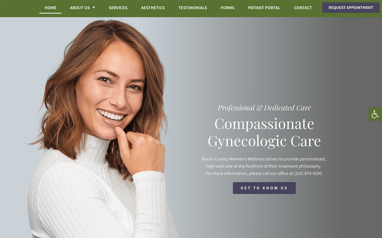
How This Practice Attracts New Patients: Bucks County Women’s Wellness removes itself from the feminized colors while still retaining its appeal to women’s care, using deep olive greens, blue-purples, and grays to create a more neutral website to represent its dedication to caring. The website takes advantage of the available whitespace and fills the page with friendly, cheerful, and clean imagery of women in all stages of life. To further appeal to new patients, action buttons are placed more strategically to help patients navigate the website further. Its color scheme and use of various design elements make it an excellent example of compassionate women’s wellness.
6. Woodlands OBGYN Associates
Visit Woodlands OBGYN Associates
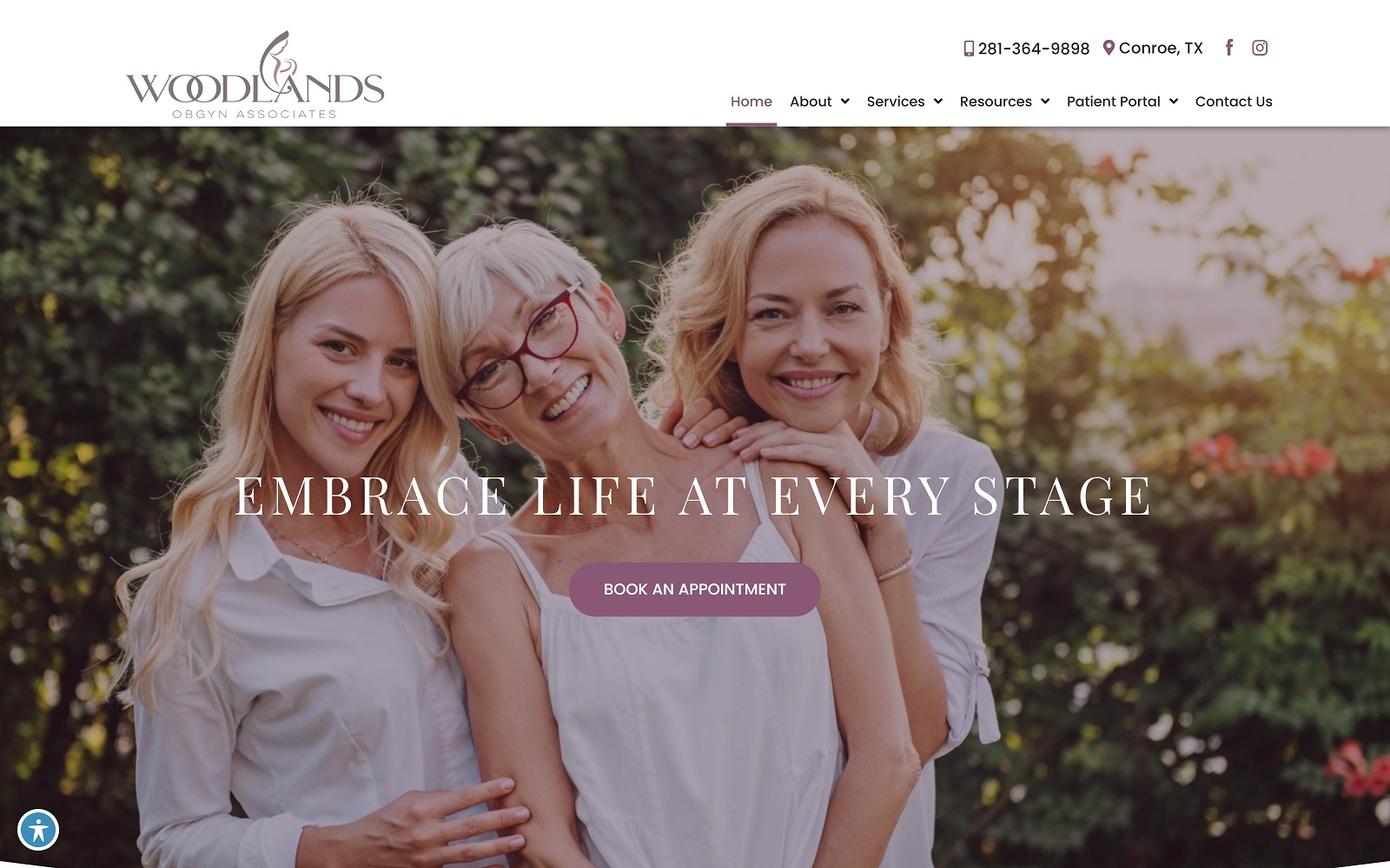
How This Practice Attracts New Patients: Woodlands OBGYN Associates works with more romanticized colors, using rose pink, pinkish-white, and mulberry purple to appeal to women of various ages, and relies on transparent layers to create seamless transitions throughout the site. Through large font text, action buttons, and hyperlinks, new patients visiting the site can easily navigate the website. Combined with its charming and idealistic aesthetic, Woodlands OBGYN Associates works to remove any source of anxiety for its patients by appealing to women’s needs within its framework.
7. Women’s Health Associates of Southern Nevada
Visit Women’s Health Associates of Southern Nevada
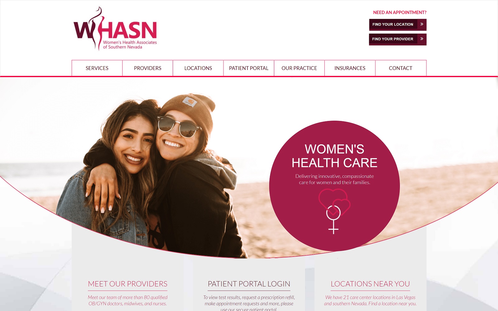
How This Practice Attracts New Patients: Similarly to Woodlands, WHASN delivers a highly feminine approach to conveying its services but focuses more on its technological innovation while delivering compassionate women’s care. As a group organization, the website uses transition slides, transparent layers, action buttons, and highly animated images to display its professionalism and expanded outreach. Through using deep rose pink and white, WHASN delivers a fully comprehensive website that’s clean and friendly.
TOP 7 OBGYN WEBSITE DESIGNS OF 2021
1. New Moon Center for Women’s Health
Visit New Moon Center For Women’s Health
Aesthetics
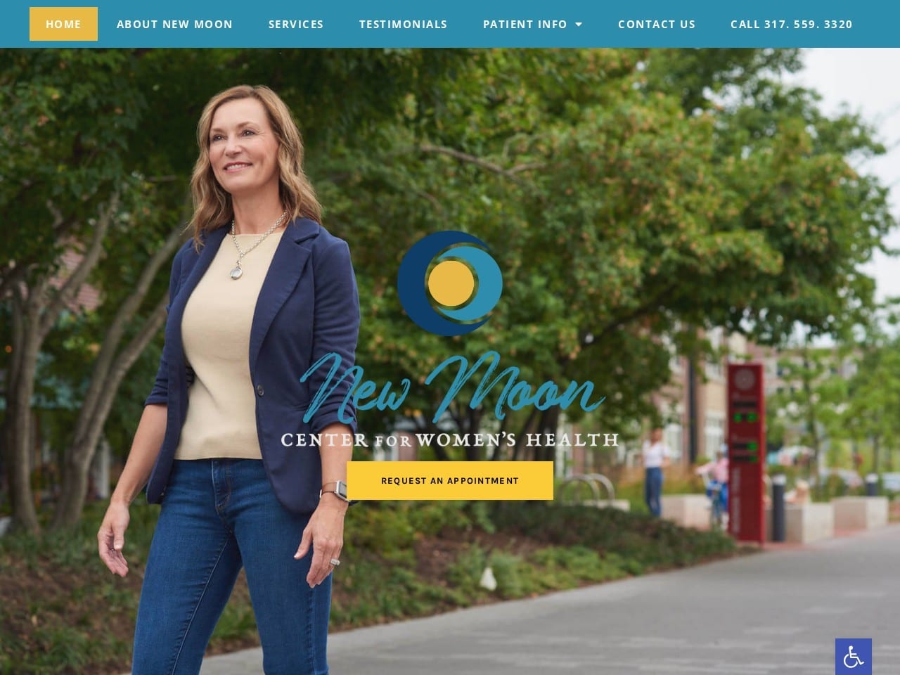
Vitality, life, and renewal, all of these concepts are present in the image presented to visitors to the New Moon Center. The choice of colors, in hope-filled blue and sunny yellow, are aimed at uplifting the viewer and inspiring positive feelings about the practice. Yellow is a striking action color in this palette, drawing patients’ eyes and alerting them to places they can take action. The imagery used throughout the site emphasizes the clinic’s aim to treat women through all stages of their life. The rest of the weight leans on a lightweight, airy, and open design that prompts ease in the viewer and works beautifully for both desktop and mobile designs.
Functionality
Functionality is a cornerstone of this website’s design. It starts with the immediate presence of the ‘request an appointment’ button found front and center on the hero image. Next are the accessibility controls present in the lower right-hand corner of the site, along with click-to-call functionality in the phone number in the header. The images encircling the ‘How We Care For You’ text all respond to mouse-over, providing more information about the services provided by the clinic while presenting a modern-looking design element. The introduction of Dr. Amy Moon is presented in a way that begins building rapport by introducing the physician, providing additional information about her, and using a clever approach (A message from Amy) to expand that introduction to the rest of her team.
2. Vivos Women’s Health

Aesthetics
The hero image selected to introduce Vivos Women’s Health incorporates several subtle features to set the tone for the site. The woman’s smile in the image is happy and inviting, with warm, soothing autumnal colors that mirror the site’s color scheme. Once beyond the prominent hero image, the rest of the site presents an open and airy design that delivers information in an easily readable and approachable format. The testimonial section is presented using a mother and daughter in a cheerful embrace, grateful for the life-changing experience that gives them more time together. The testimonials presented here reflect the positive experiences shared by the clinic’s patients.
Functionality
It’s human nature to smile when we see others smiling, and this played into the selection of the primary image for the site. Smiling lifts the mood, creating a positive association with its cause, in this instance, the clinic. The prominent menu located in the header instantly contracts when the window size is smaller, just one element of the site’s mobile-friendly design. The responsive nature of the buttons in the featured services section draws attention, causing the viewer to pause and take note of the motion. This, in turn, can have the visitor learn more about your offered services and consider what those services could do for them. The section highlighting the team is a simple introduction to Dr. Lisa Jambusaria and her qualifications and an invitation to learn more through the friendly “Click Here.”
3. Premier OBGYN
Aesthetics
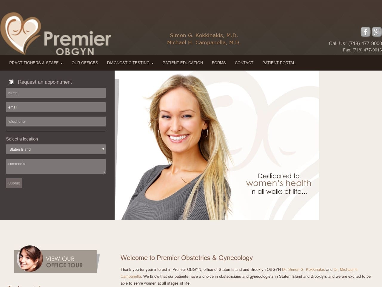
Premier OBGYN has a warm and earthy site with gray and brown as its primary colors. The overall design gives a very polished and professional feel, while the smiling face greeting visitors gets things off on the right note. The site logo incorporates the color scheme with a friendly and nurturing heart design that is instantly recognizable for use in marketing. The individual service sections use imagery and clean text to provide valuable information to visitors to the site. The brown palette really lends its warm, supporting, and earthy nature to the cool professionalism of gray to create a wonderfully beautiful site.
Functionality
The immediate presence of a patient portal link speaks to the dedication of this site to deliver full functionality and be presentable. Along with the patient portal can be found a cleanly presented HIPAA secure form for submitting a request for an appointment, with the ability to select a preferred location for the appointment. Forms are also immediately made available, allowing the patient to prepare for their first visit by arriving with forms already filled out. A series of striking buttons mark the button, each of them providing information about essential services offered by Premier OBGYN.
4. OB/GYN Specialists

Aesthetics
OB/GYN Specialists takes a fairly different approach to website design, focusing on an informative newspaper-like design packed with features. The brown and pink color scheme used for the site gives it a warm and welcoming feeling, combining the earthy feel of brown with the nurturing character of pink. This design scheme establishes in the visitor’s mind that this is a place to return to, an informative and authoritative source of information that they can rely on. It’s not a common aesthetic, but it is clearly an effective one. This aesthetic extends to all areas of the thought, with team members’ backgrounds being presented like a CV.
Functionality
This site is feature-rich, being completely packed with useful functions, starting with the patient portal being presented at the top; it doesn’t end there, however. Immediate access is provided to leave a review about your experience. Each point on the site is centered on providing information, whether in the form of the services page or in the ability to sign up for a regular newsletter delivered directly to the patient’s inbox. As this site represents a collection of locations, their site includes the option to receive directions to any of them with a single click for convenient navigation. Also found within the site are multiple sections, each dedicated to a different specialty. This is accomplished to ensure that the patient can easily reach any point of the site, even while investigating a point of interest.
5. George Fuller, MD
Aesthetics
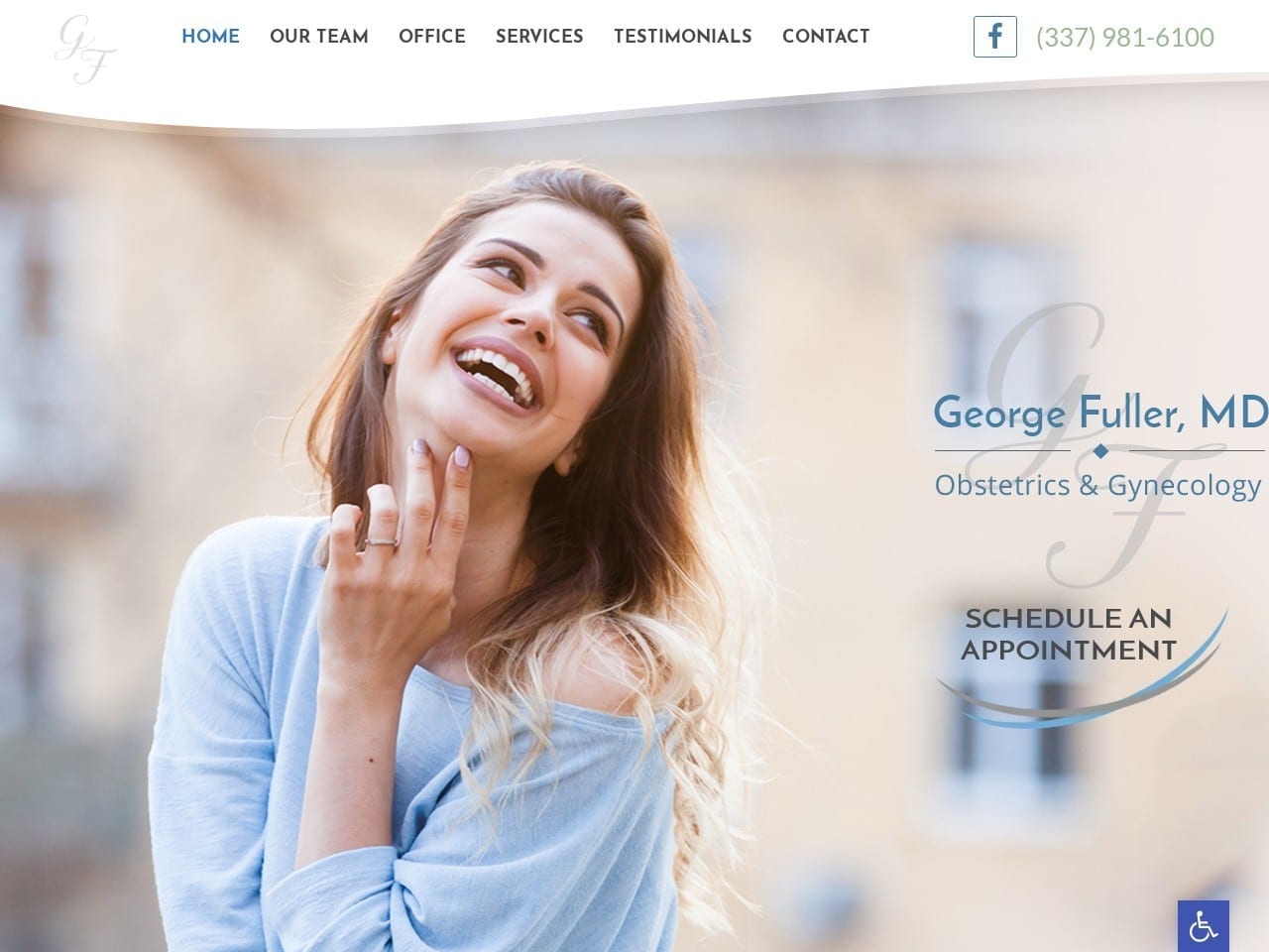
The landing page on this site clearly shows a woman who is joyous, healthy, and pleased with life, setting a standard of expectations for visitors. The pink, green, and white color scheme integrates several concepts of color theory in web design. Among them included the nurturing and feminine associations of pink, rejuvenation and healing associated with green, and the clean professionalism of white. As visitors scroll down the site, they’ll be greeted with images marking a set of concerns that are addressed by this clinic, each bursting forth in a beautiful blue that encourages the visitor to click. The static header gives the site an elegant and composed appearance that will make a solid impression on its clientele.
Functionality
This site is designed to amplify functionality, providing an immediate connection to social media through the Facebook link featured prominently in the header. The presence of a click-to-call-enabled phone number on that static header ensures that when a potential patient decides to become a patient, their appointment is only a click away. The testimonials portion of the site takes full advantage of the limited space by featuring a scrolling set of reviews from happy patients. Accessibility controls are located on the bottom right portion of the site, with the blue button featuring the classic handicap image. Located at the bottom of the site is a comprehensive list of the office’s contact information in the form of phone, fax, and address in combination with its office hours.
6. Miracle Orchids Medical
Visit Miracle Orchids Medical Center
Aesthetics
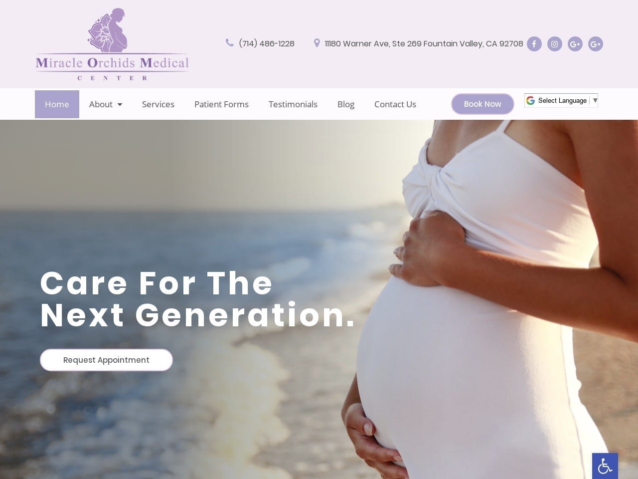
Purple and lavender are rarely used in website design, but we think you’ll agree their use in this design is stunning purple pairs well with the blue and white tones comprising the rest of the palette. Varying shades of purple, primarily in the lavender range, are used to highlight sections of the website. An unusual but well-executed website design uses multiple colors as action colors. Buttons throughout the site are white, blue, and lavender, each lending a striking contrast that draws the eye and urges the patient to action. Colors throughout the site are gentle on the eyes, a pattern that changes dramatically at the bottom of the page where testimonials and HIPAA secure form requesting contact can be found. This striking ensures that visitors are drawn to these important sections.
Functionality
Contacting the clinic is emphasized throughout this page, and nowhere is it more evident than the information-packed header. Here an address and phone number can be found, both of which are enhanced with click-to-dial and direct-to-map functionality that makes reaching out convenient. In addition to these elements, you can also find all of the social media contact points included here. As if to drive the point home, the Book Now button is prominently displayed before you even get to the menu that allows navigation throughout the site. In addition to making contact, patient convenience is emphasized by these designs. It is followed through with the availability of patient forms ready to be filled out by their first visit.
7. Vinay R Shah, MD Obstetrics & Gynecology

Visit Vinay R Shah, MD, Obstetrics & Gynecology
Aesthetics
The scrolling slideshow that serves as this site’s hero image perfectly communicates this clinic’s focus on treating women at every stage of life. From the delicate ballerina to the smiling woman in her August years, the patients for this site can run as broad of a range. This site’s color scheme, heavily pink, takes advantage of its gentle contrast with white and its associations with nurturing femininity. In both wide desktop views and on the narrow windows on mobile devices, the buttons to the services portion of the site are striking. Stylized imagery combines with mouse-over technology to catch the eye and deliver valuable information about what can be found by following the click.
Functionality
This site’s elegant design ensures that visitors can take advantage of contacting the clinic quickly and easily. Patient information forms are provided on the site to streamline the visitor-turned-patients first visit to the clinic by letting them prepare beforehand. The mouse-over technology used in the services button is an excellent way of using limited space and optimizing for mobile responsiveness. This same conservation of space can be found at the bottom of the page with a scrolling selection of testimonials that share the experiences of past clients of Dr. Shah.
TOP 5 OBGYN WEBSITES OF 2020
1. Staten Island Gynecologists: PremierOBGYN
Visit Staten Island Gynecologists: PremierOBGYN
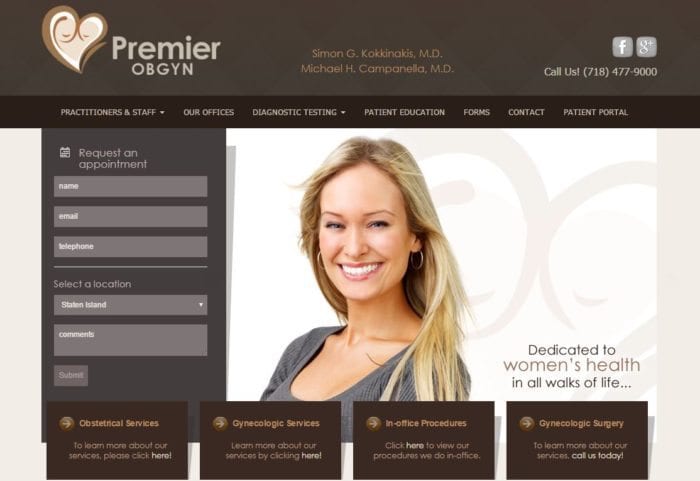
Staten Island Gynecologists features a brilliantly designed website that embraces both the best in desktop and mobile website design. This site sets an excellent example for all other sites because it emphasizes communication with the office and puts the most important information at the forefront on both desktop and mobile platforms. It’s easy to tell when a site, like the Staten Island Gynecologists site, was built with a mobile-first mentality: the desktop and mobile sites will feature the same content. The only differences between the two should be apparent and navigation-based. A slimmed-down mobile site is a thing of the past when mobile devices had tiny screens and lacked processing power. These days it’s common for people to have smartphones that overpower that 5-year-old desktop at home. With mobile sites, functions are more important than forms, so there’s less room for flashy design. The site features a little extra visual flare on the desktop site, but all the content is ready and easily accessible regardless of the device.
The Staten Island Gynecologists lead the pack thanks to its excellently executed affixed mobile navigation. The navigation is a small bar that always stays at the top of the screen regardless of where the site visitor is on the page. This design technique makes navigation from page to page a breeze on mobile devices. This site also offers a comfortable amount of descriptively-named sections. It’s easy to find what you’re looking for. The pages can run a little bit on the long side because there are so few of them; however, the affixed navigation more than compensates for this content choice. The site is also a notable example of using a comfortable color scheme to visually break up content to make the site easy to read. The only criticism of the site and its reach is that the appointment request form is not on its page but is available in several of its main sections. Check how O360 was selected as the USA’s #1 OBGYN web designer.
2. Vinay Shah, MD Obstetrics & Gynecology

Visit Vinay R Shah MD Obstetrics & Gynecology
Vinay Shah, MD Obstetrics & Gynecology is another prime example of a site built with a mobile-first mentality: all content is available on both platforms, and the design team clearly paid excellent attention to the mobile site. Both platforms feature an elegant platform with visual images that capture the style of the practice. The desktop site is enhanced with a scrolling animated effect, giving this website a different feel than most sites. The masterfully constructed desktop and mobile navigation with a manageable section count makes it easy to get around the site. Less is usually more regarding page count: sites like this don’t waste any visitors’ time with fluff content. The site also makes it easy to find more information on the wide range of services offered by using a simple menu in the top right corner instead of including links in overflowing navigation.
3. Saddleback Women’s Medical Group

Visit Saddleback Women’s Medical Group
The Saddleback Women’s Medical Group site also sports a clear mobile-first mentality. It sports a comforting white and green color scheme and features a top-notch mobile design. All content is available on both platforms, but the desktop homepage features some additional navigation tools. The images on the desktop site are much flashier than the mobile site, making it a great example of a site that builds up visual features to enhance the desktop site instead of stripping features to simplify the mobile site. Contact and social links are easy to locate on all platforms, and the mobile site’s navigation embodies the word “streamlined.” However, the desktop site navigation doesn’t fare as well, as its off-center positioning and smaller form factors conceal it from view. This site also features a lot of page count and a well-designed services page that houses links and keeps the navigation from overflowing.
4. New Jersey Urologist
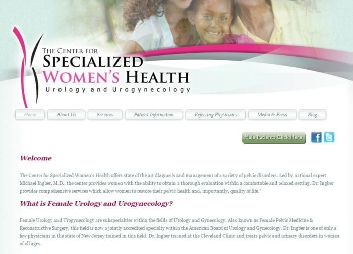
The New Jersey Urologist is a great example of making content work on a mobile device, thanks to its smooth implementation of button-based links. Another interesting addition to this site is that it features a regularly updated blog that creates a constant stream of information for existing patients and attracts new ones. While featuring many of the same excellent design points as the first three sites, this one ranks lower because its mobile-friendly navigation is burdened with too many links. The crowded content in the navigation makes it difficult to find the really important sections, and good content gets lost in the noise.
5. Boca Raton OBGYN
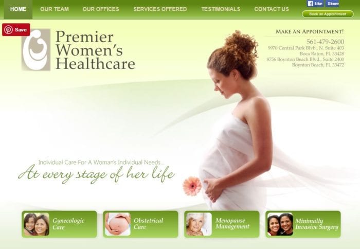
Boca Raton OBGYN features a well-designed desktop site that’s incredibly easy to access and presents an immense amount of information within just a few well-described sections. The site also works well on tablets but runs into problems on its mobile counterpart: there isn’t one. Fortunately, the site still operates well on a touch-screen mobile device thanks to its clear, large linking mechanism and lack of drop-down menus. There’s a lot of great content here, and everything is easy to find.
The Value of OBGYN Practices For Reaching Out To Women
Managing a practice catering to a specific target audience presents some unique challenges. Because of the value and necessity behind women’s healthcare, OBGYN clinics focusing on this form of outreach tend to cave in under the pressures of higher deductibles, malpractice insurance, and the ultimate demise of practice mergers with larger healthcare groups. In this complex area of healthcare, women’s health is necessary, but OBGYN care faces an increase in competition that hurts small practices wishing to provide these services.
While these issues will take time to change, practices focused on women’s health can improve their circumstances through digital marketing strategies, including website design, social media, and blog posts. These few sections can help you establish your goals as a business, plan for challenges ahead, and, most of all, increase new patient referrals to your business and strengthen your relationships with your current ones. This means doing the following:
- Asking Patients For Regular Feedback: If you have a large collection of patients, collecting surveys and asking for reviews can help patients provide two-way feedback that benefits both them and the practice.
- Monitor Online Reviews and Responses: Online websites such as Google Reviews, Yelp, and TrustPilot can help manage your online reputation and demonstrate your ability to listen to your patients, actively care about their feedback, and handle any negative feedback properly.
If you want to improve your website, take a look at what Optimized360 can provide for you by checking out their successful medical website designs.
Designing a website for a general medical practice can be challenging enough on its own, but doing OBGYN website design can be particularly difficult. Just like any specialty, you have to get the tone of your message to the visitor right and make the most of that first impression you may never realize happened. When you’re creating a website for an OBGYN clinic, you have to consider the specific community you’ll be speaking to and ensure that every element caters to their needs. The first step of beginning your website is understanding your clientele and how best to reach them through your site.
You’ll have to consider a few things to accomplish this goal. Choosing the right colors and logo design to reflect your clinic’s personality starts. Imagery and terminology should connect you to the local community, and that’s just the start of it. Functionality has to be considered as well. Features like Patient Portals, online forms to reach out for contact, direct-to-map directions, and click-to-dial calling are all things modern patients look for in their medical provider’s sites. After all, those elements are well in hand, and before your site goes live, you need to ensure that all relevant portions of your site are properly secured with HIPAA-approved encryption. To help get you started, we will feature a set of websites that accomplish all of these things while retaining a unique personality that suits your practice.
Conclusion
Each site is a beautiful example of an individualized web design built around a common theme and set of priorities. The character of each site is distinct, with no two looking alike or sharing many similarities on the surface. Under the surface, the design questions are all very similar, starting with ‘How do I speak to my clients?’. The sites above were selected for the sheer variety they represent while still sharing commonalities, such as the overwhelming presence of pink in many of these sites. Functionality was clearly a primary concern, as evidenced by the regular appearance of patient portals, payment options, and forms that adhere to the requirements of HIPAA standards for protecting information.
When you design your website, you should start with a list of features you want on your site. A good way to bolster these is by exploring competitors’ sites and seeing what options they’re providing to their patients. Themes and design elements should also be noted; anything that catches your eye or appeals to you must be recorded. Once you have enough, it’s time to design the site. This stage is often best left to the professionals due to the sheer number of disciplines required to establish a beautiful and effective site. Your website is commonly the first encounter potential patients will have with your clinic; it’s important that the first impression you never knew you made goes well.
Well-executed web design is an important element for a successful OBGYN website because the site needs to host a wealth of information in an easy-to-navigate layout. These sites serve three primary purposes: to attract new patients, provide existing patients with helpful information, and serve as a communication gateway. Unlike commercial websites that are constantly updated, medical websites have a bit more passive of a role with the practice itself: they’re set up and usually left alone. Because of this passive access situation, it’s easy for medical-oriented websites to fall behind on modern web design standards and practices: in particular, the current high emphasis on mobile-device traffic.
More people have been using mobile devices to access website content than desktop and laptop devices combined since mid-2014. Not only is your average site visitor reaching out to your business on a small-screen device, but they’ve been doing it for years now. Additionally, more people in the US are mobile-only users than desktop users, and mobile device traffic is trending at a 53 percent annual growth rate from 2015 through 2020. This shift in how people access websites means having a well-designed mobile site is essential for an OBGYN practice to have the best possible online presence. Potential patients often check out the practice’s site before making an appointment, so having a solid mobile site is a great way to entice women to schedule an appointment. Mobile sites are important for establishing new patient contacts because mobile applications are really only helpful for communicating with existing patients. The following five site designs are leading examples of excellent design for the industry.
