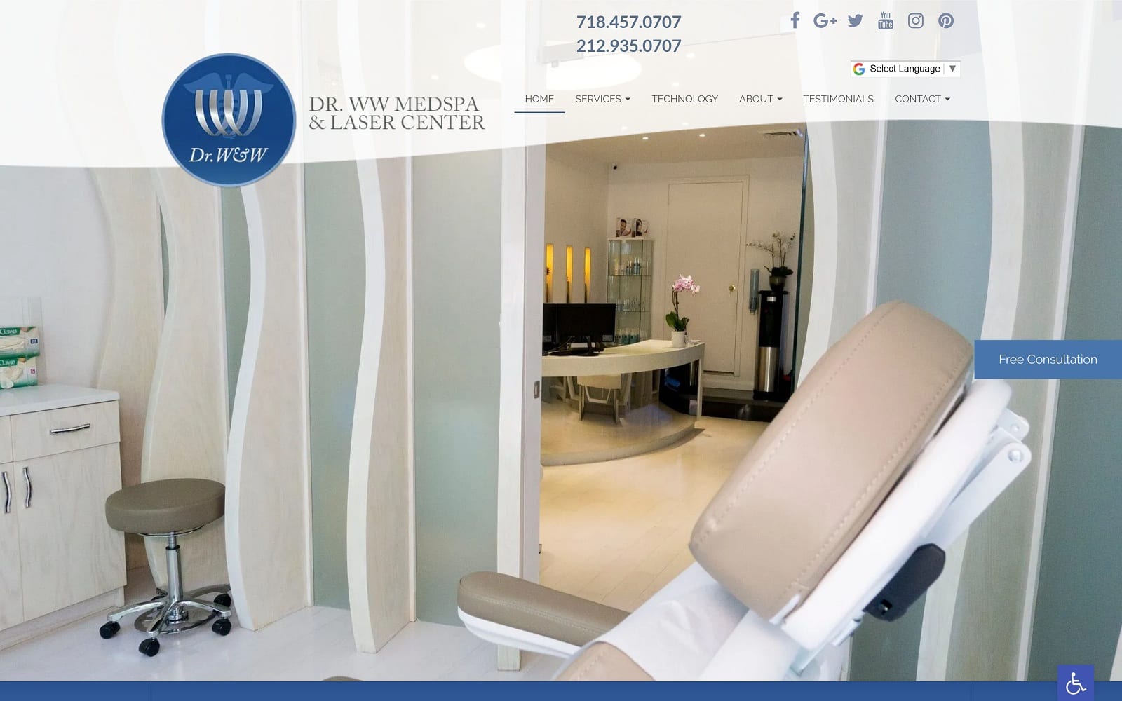
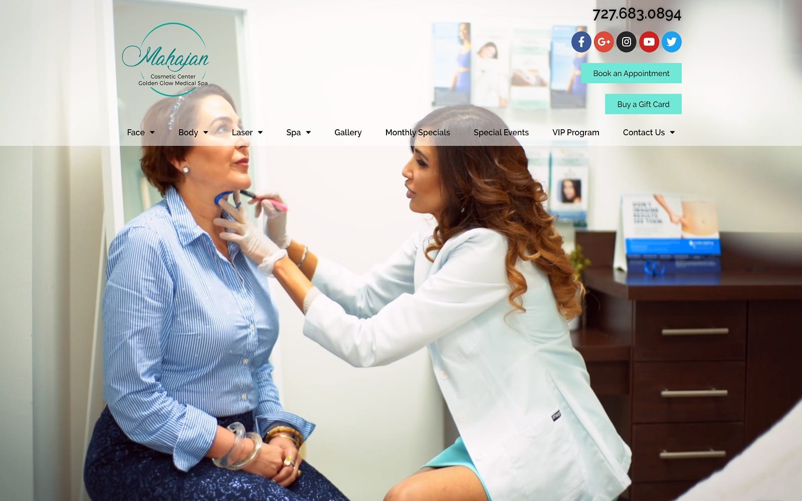
Medispa’s website design presents some unique challenges. Among them is answering a commonly asked question, “What is a medispa?” As a part of the industry, you know that question has many answers. The services offered by Medispas vary, and the website design for your Medispa needs to be as distinctive as the services you offer and the clientele you work with. Capturing these elements is essential when starting a medispa and continues to be as the clinic grows and evolves.
Good website design is about more than just providing great information. The imagery and colors used in the site have to mirror your clinic’s personality. A medispa focused on men’s health will have a much different approach than one focusing on post-pregnancy women or those in their youth.
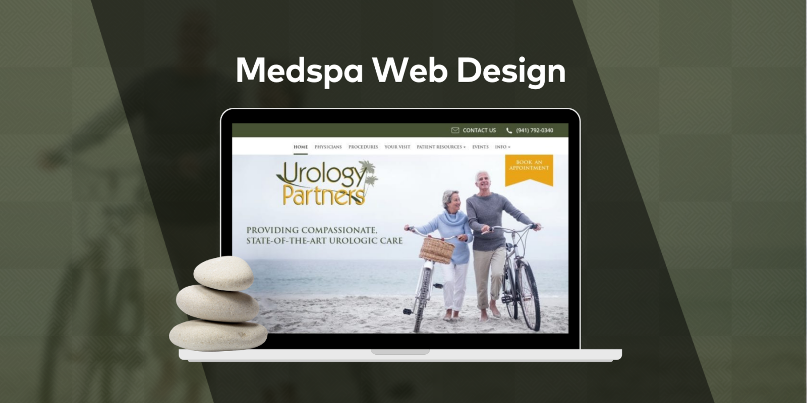
Every element of your site has to work together, from your logo to how your services are presented to the end user. If you’re looking into designing a website for your medspa or considering hiring someone to do it for you, you need to learn as much as possible. Below we will explore some of the most striking Medispa websites out there and examine what they do right and how they serve the clinic’s needs.
See O360’s Best MedSpa Websites
The list of best medical spa software
1. Dr. Susan Woods Dermatology
Visit Dr. Susan Woods Dermatology
Aesthetics
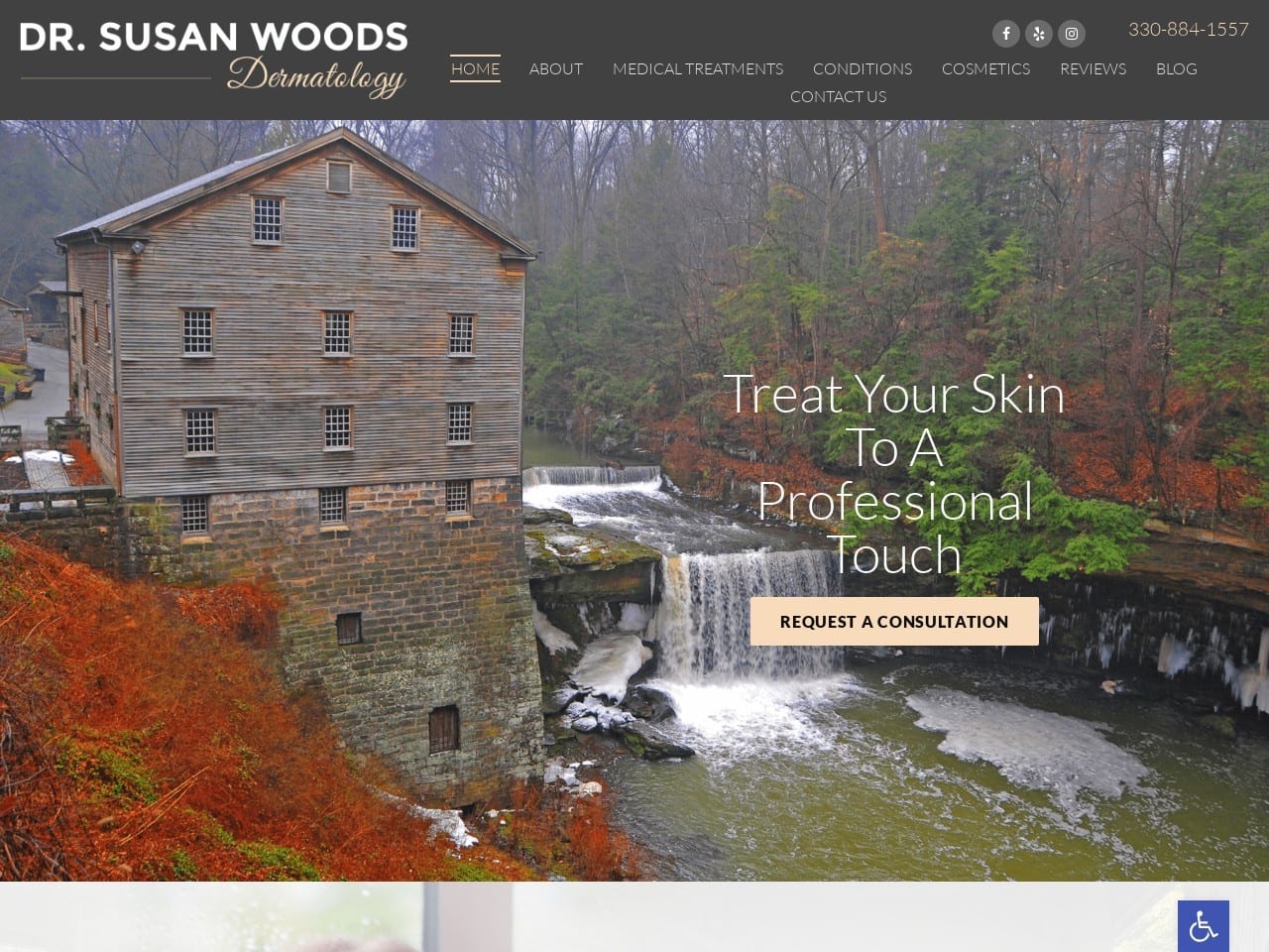
Flowing water and a glorious autumnal wood in its riot of red, green, and gold buffet the visitor with natural beauty on arrival at this site. Surrounding it can be found a subtle palette of pinks, grays, and white that creates a site as visually stunning as its hero image while remaining easy on the eyes and reminiscent of the locale.
The dermatologists are introduced with a softly diffused image, their list of qualifications is found alongside, and more information is available on the prominently displayed pink button.
Stylized images draw the eye to the buttons that direct users to the services covered by the clinic. As is common in dermatology designs, this site leans heavily on the visual aspect, using stunning models to present cosmetic surgery results.
Functionality
White and grey are tones that present a gentle scene to the visitor, utterly free from sales pressure or pushiness. The nurturing and feminine nature of pink combines with its association with youthful, healthy skin, serving the site’s purpose well. Through this design, Pink also sees function as an action color, ensuring the visitor’s eye lands where interaction is possible and desired.
The image selected for the hero image is from a location near the practice, forming a connection and building rapport with visitors on arrival. The forms included in this site are HIPAA secure to ensure they can safely reach an appointment without ever picking up the phone. Direct-to-Map design ensures an easy trip to the clinic, while prominently displayed contact information makes it easy to reach out.
Get your own medical spa website design by O360
2. The Gynecology Center & Medispa
Visit The Gynecology Center & Medispa
Aesthetics
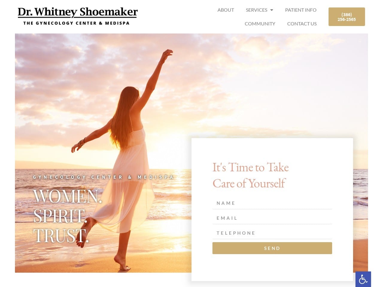
The warmth of a glowing sunset greets visitors to this site, and that array of pink and orange carries through the site. The warmth of the summer sun is echoed in the color choices, as is the pink and glowing, healthy skin of youth, both of which are gently contrasted against the beige used to highlight buttons and action points throughout the site. Images that reflect healthy glowing skin and youthful beauty represent the various services offered, each lighting a dream in the viewer’s mind. The image of Dr. Whitney Shoemaker is presented against a warm and flattering background, serving as a perfect introduction to the site staff.
Functionality
The site’s imagery isn’t just selected for its beauty; it is also selected to create a dreamy, hopeful state that will have the visitor thinking about what life after treatment at the clinic will be like.
Immediately upon landing, the site reaches out to provide an opportunity to set up an appointment using its HIPAA-compliant form. The site is expertly designed for mobile responsiveness, switching between desktop viewing and mobile browsing smoothly, with subtle aspects of the site changing to accommodate each (mobile responsive design). The striking images used to mark the link to each of the service pages uses a modern and stylish design that causes text to fade-in in a black box on mouse-over, adding to the ephemeral feeling of the site. For mobile users, this text is always visible and attractively displayed over the image of the link. The menu shrinks from being a standard text menu to a compact hamburger menu, and the images in the site adjust to being attractively displayed throughout.
3. Refresh Medispa
Aesthetics
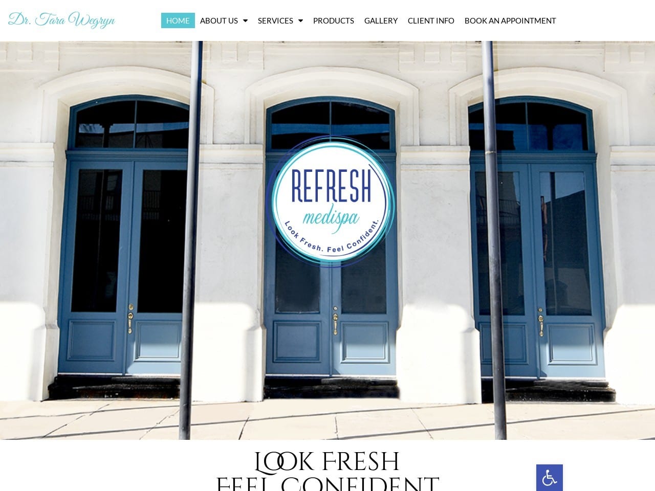
Refresh Medispa has a landing page that is decidedly striking and makes it stand apart from other websites of its kind. The clinic’s doorway is a beautiful work of architecture, so it is the centerpiece of its homepage. It also contrasts well, by design, with its logo, which combines swirling lines and clear text to create an easily recognizable symbol. That swirl of color around the outside carries through the site to highlight the physician and the services they offer, tying the entire site together seamlessly. Light blue and white are the cornerstones of the site’s aesthetic and perfectly contrast with one another, enhancing readability and navigation throughout the site.
Functionality
The menu for the site is prominently available at all points throughout the site, making it a breeze for visitors to navigate through the site and find what they’re looking for. The clinic’s featured image prominently sets the patients up to feel like they’re arriving somewhere familiar when they get to your clinic. Appointments are available through the use of the forms on the site or the conveniently located Book An Appointment Link found at the top of the page. Each service page provides an image indicating the service provided and additional information in a clean and approachable format. Image galleries are essential to clinics that provide services like these, as so much of what is done is about getting visual results. A well-designed gallery helps highlight what the clinic can offer its patients.
4. The Youth Fountain
Aesthetics
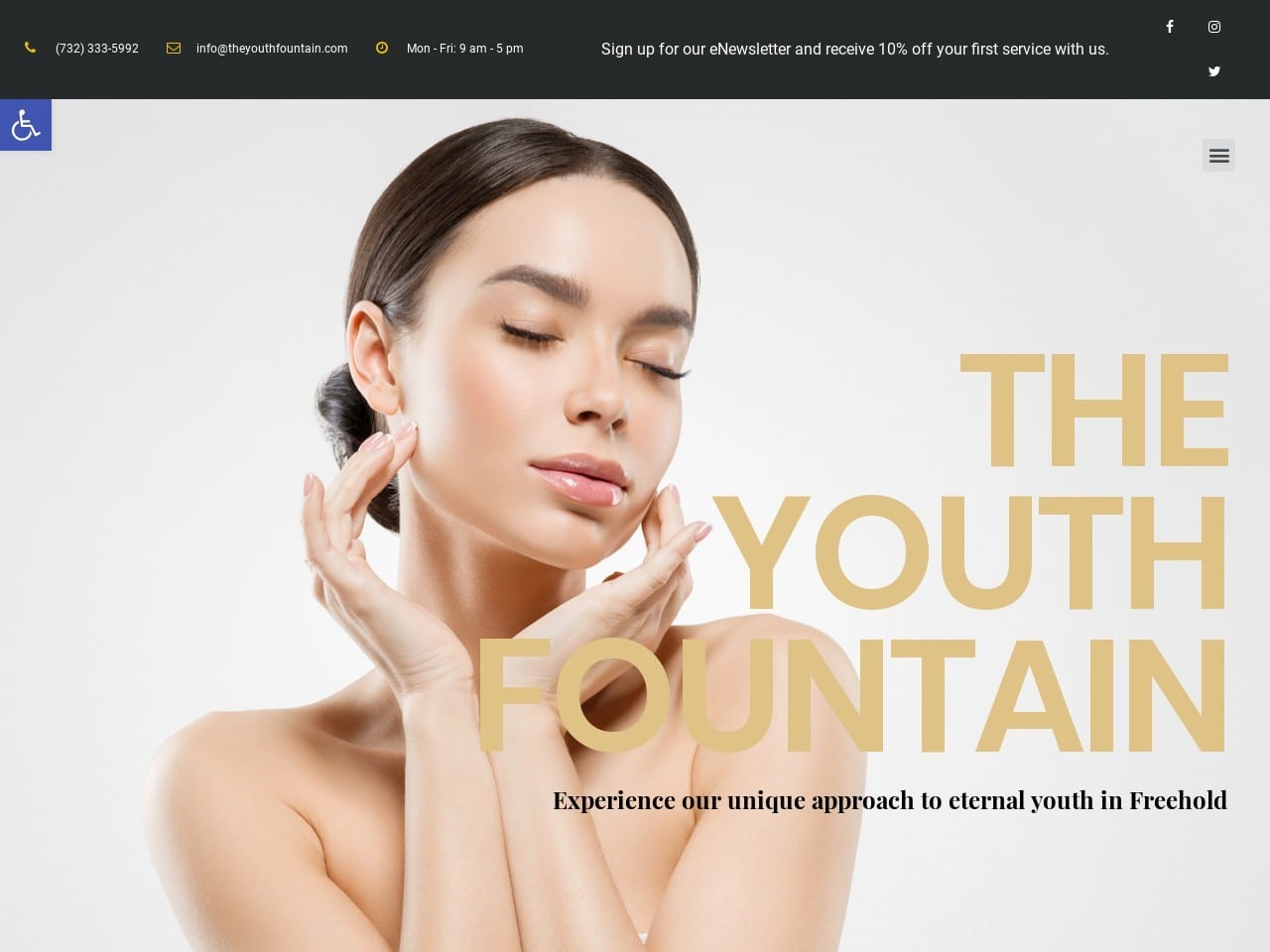
Sophistication and beauty meet in this website design, with the landing image speaking to a high class of beauty suitable for the runway. Using black and white in combination creates a powerful professional design accented with an almost playful beige. The imagery slides into view from the sides of the page as visitors scroll through, giving the site a modern high-tech look that generates confidence that the clinic is using the latest techniques. Patients are introduced to the clinic through the image in the ‘Our Story’ section, which reveals an inviting couch and coffee table with a dreamlike painting in the background. The images provided of the surgeons exude friendly confidence, reassuring the client that they are in the hands of professionals who care.
Functionality
For all the site’s beauty, functionality has not been left to take a back seat. Landing on the page immediately presents the visitor with contact information, including an opportunity to connect through the newsletter and social media platforms.
Read out social media marketing guide.
Office hours, phone numbers, and email ensure that the visitor can immediately contact the facility and begin taking advantage of what the office offers. The contact information remains available throughout the site in a block near the top of the screen displaying both the phone number and a contact us button. The sliding action of the images draws attention directly to the list of services that the clinic provides by attracting the eye.
5. 100% Beauty by MD
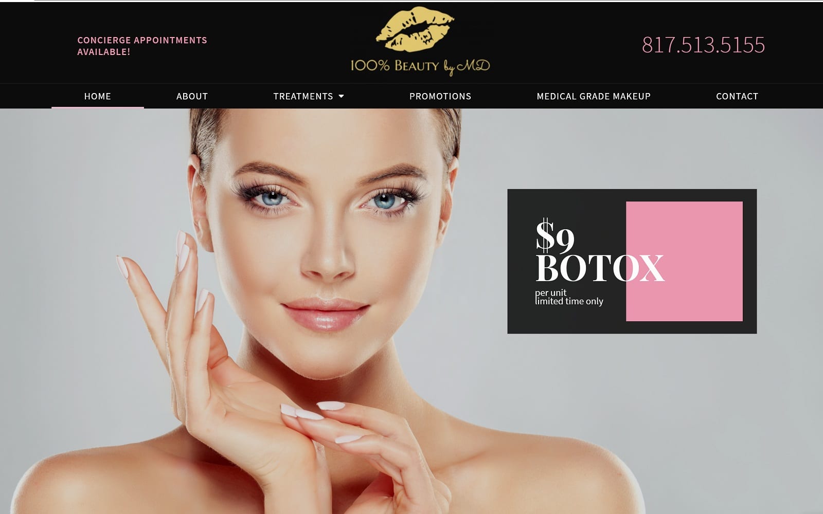
How This Website Masters Visual Content: 100% Beauty by MD incorporates a more classical approach to beauty, using silky, luxurious black to create a strong impact right from the beginning. To accent this powerful color, light pink and golden yellow work to accent the action buttons, text, and hyperlinks to emphasize its focus on cosmetic beauty. Its imagery presents a static yet visually appealing aesthetic that matches the website’s use of color and focuses on beauty and sexuality. To tie the design together, large serif fonts help outline each section an
6. Baja Medi Spa
Aesthetics
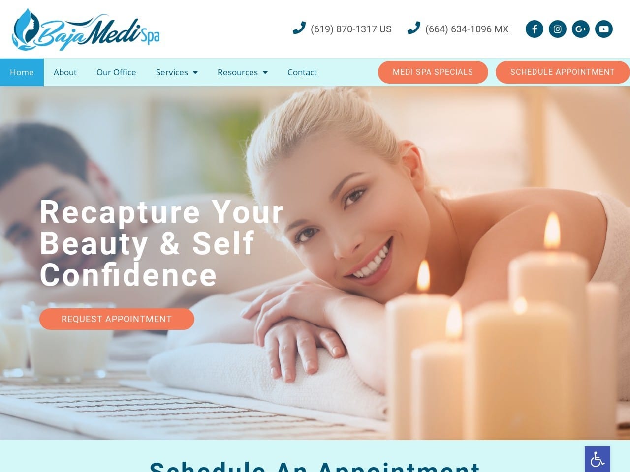
Arriving at the Baja Medi Spa website see a warm and welcoming smile and an ambiance of obvious leisure greet visitors. The palette is a soothing and warm combination of pink and orange, with a cool blue as an accent color. Light blue is an effective way of transmitting a message while removing any sense of pressure, and the schedule an appointment block under the hero image is a great example. The color scheme presents it as welcoming rather than demanding, and patients seeking a Medi Spa are definitely seeking a low-pressure experience. Striking colors and stunning imagery is used to highlight each service offered by the clinic, and they are effective and set visitors to dream about a trip to the medi-spa.
Functionality
The hero image on the homepage is intended to set the visitor in the right state of mind immediately. In the viewer, having them envision their own relaxing and invigorating experience at the spa. Orange is used effectively throughout the site to draw the visitor’s eyes to sections that require action on their part. Examples include buttons for the various services offered and the appointment scheduling form. This form is secured with HIPAA-accepted security, ensuring that the visitor’s data is safe and not at risk of being compromised. The social media links at the top of the page ensure an immediate link to the site’s social channel that visitors can connect with to get updates and see examples of other successes at the clinic.
7. Infinite Allure Medical Aesthetic Specialists
Visit Infinite Allure Medical Aesthetic Specialists
Aesthetics
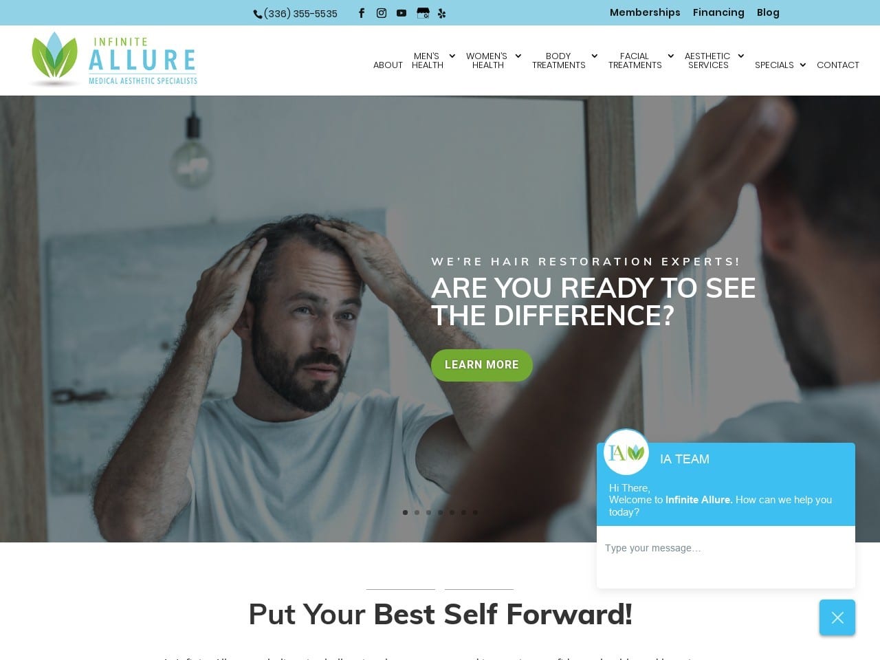
A light and gentle tone greets visitors to this site, a palette of blue, green, and white coming together to create a pleasant site to use and view. On standard window sizes, the menu along the top is accessible and blends pleasantly into the design. In contrast, smaller windows will see the hamburger menu appear, containing all of the same functionality. A series of striking images comprise the hero image slide show, each representing one or another of the services available through Infinite Alllure’s offices. Green makes regular splashes throughout the site, lending its association with nature and health to the messages delivered. The design layout takes excellent advantage of space to provide ample information in a limited, but not cramped, space.
Functionality
The website is designed with a gentle flowing design that is perfectly suited to transitioning between desktop and mobile devices. The social media links at the top of the page and the menu present immediate opportunities to connect further with the clinic. Their static position ensures that no matter where a visitor wants to go on the site, their destination is never more than a click or two away. Imagery is used heavily throughout the site to convey information, a common tactic for practice with products centered on appearance. The attractive forms available throughout the site are secured with HIPAA-level encryption to protect private information. Accessibility, security, and beautiful design are the hallmarks of Infinite Allure’s site.
TOP MEDICAL SPA WEBSITES OF 2021
1. Casas Aesthetic Plastic Surgery
Visit Casas Aesthetic Plastic Surgery
Aesthetics
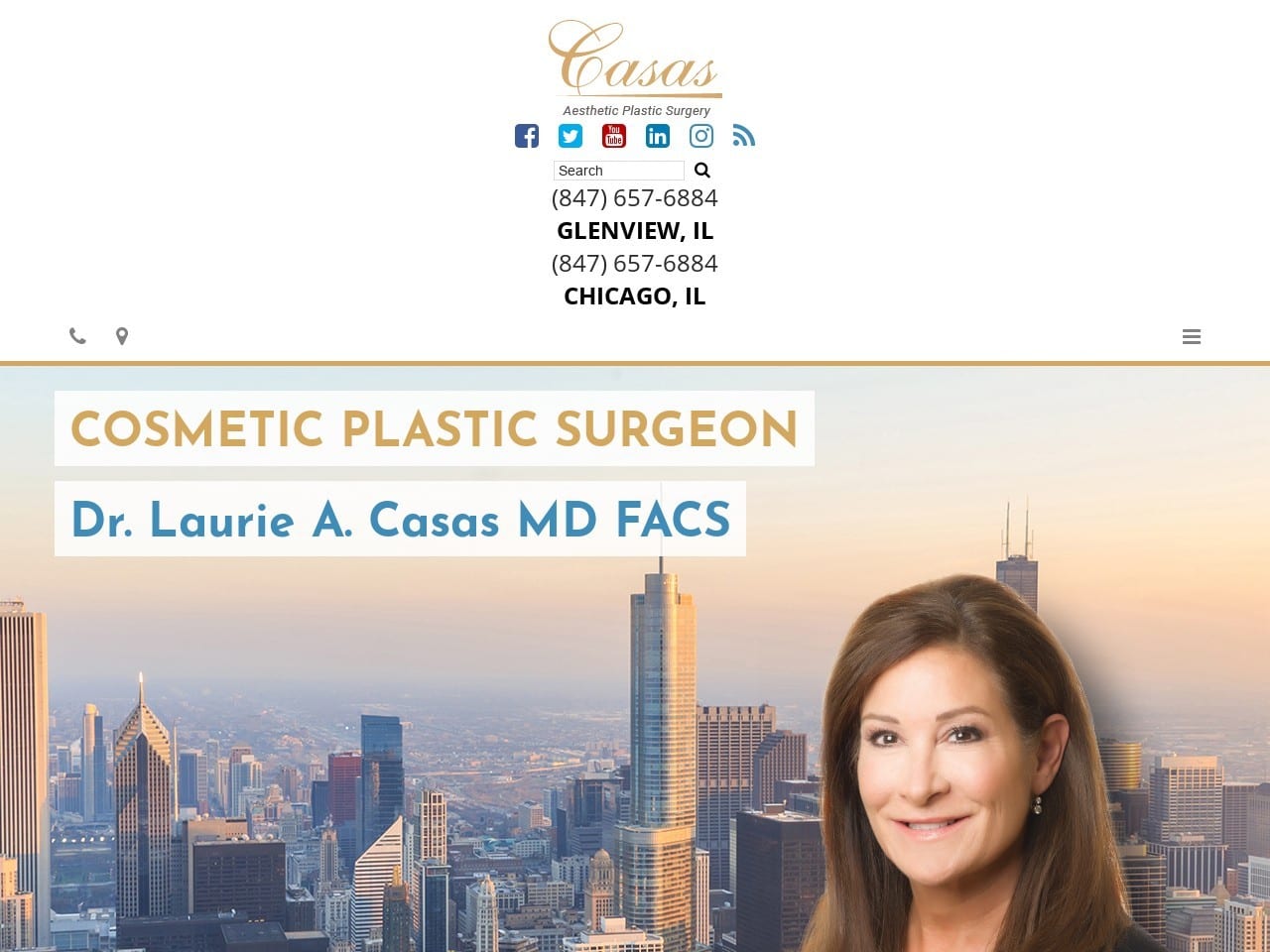
Landing on this site brings the visitor into a strikingly gorgeous design that best contrasts the bright color against myriad shades of gray. Orange is a central theme of this site, adding a warm welcome to balance against the sophisticated cool of gray. The slideshow presents the visitor with a vision of what the future can hold for them with beautiful imagery advertising the clinic’s services. Beautiful monochrome images are the buttons for access to the various services the medi-spa offers its clients. The logo for the site is very simple and direct while remaining instantly recognizable and attractive, the benefit of having a professionally designed logo as part of your site.
Functionality
The landing page is fairly minimal, making great use of space to pack a lot of information into a small area. There is a very ‘let the clinic’s reputation speak for itself’ approach, highlighting its mention in the media and providing testimonials from previous clients.
Information for visitors is provided in several formats, including informative services pages and educational videos about these services and the results they can bring. As one scrolls down the page, they’ll encounter HIPAA secure forms to gather patient information and set up appointments. The direct-to-map direction functionality makes getting to the clinic a breeze. Social media is integrated into the site to provide immediate access to the clinic’s feed and recent messages.
Conclusion
Each of the above websites is a striking example of how much variance there can be within a theme. While each clinic offers similar services, the clientele and community they serve are quite different. Each clinic has its own personality, reflected through color choices, imagery, and functionality. Hopefully, as you’ve gone through this list of Medispa sites, you’ve struck down some ideas that resonated with you. These ideas should be compiled together to establish your own design later on.
Don’t stop here; you can continue to research the thousands of sites out there that service clinics like yours. Each of them will have its own take and personality and can serve as a storehouse of ideas to draw from. When you’re ready to sit down and begin creating your website, you can reference this list or present it to the professionals you have working on it. Remember, color, imagery, functionality, and your logo all must come together to create a seamless whole representing your site. Your website is the first impression you may never know you made; ensure it speaks true to your practice.
