Growing your dermatology practice takes more than just a degree – it takes a strategic plan to follow through and reach out to patients who need your services the most. This is especially true for dermatologists focusing on a specific niche or specialty within the dermatology field. Reaching out to people can help find places of interest and help establish your audience. Asking questions about what your practice offers that others don’t can be a great start to building your business and bringing in more patients. But if your website doesn’t provide brand details, your business becomes lost in the algorithm.
One way to improve your listings is by modernizing your website. Your website is crucial to building a local reputation online and can help improve your influx of new patients. To give you a better idea, we’ve composed some of the top dermatology websites for this year to help you out.
THE BEST DERMATOLOGY WEBSITES OF 2022
1. Biltmore Dermatology
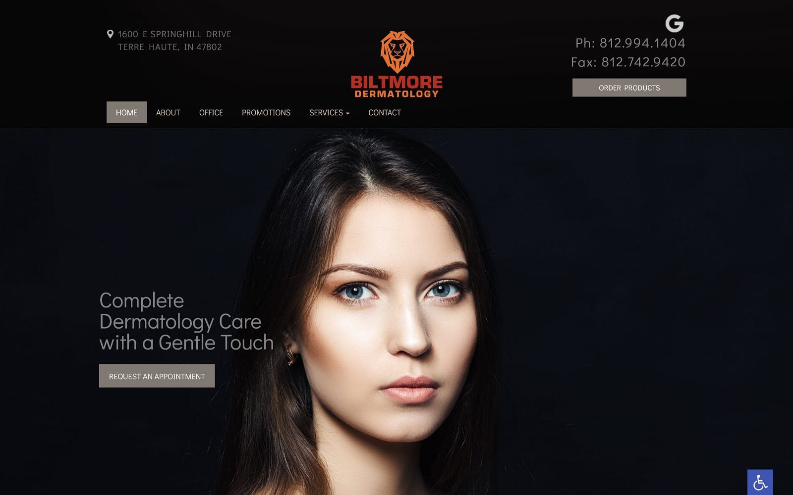
What We Love About Biltmore Dermatology: Biltmore Dermatology creates a cutting-edge website that strays away from the normal color schemes you’d associate with skincare, using elegant blacks, bright oranges, and neutral grays to appeal to new patients. Through lustrious imagery, opaque borders, and large text, this practice establishes a sense of extravagance with their services, implying a high-value experience. Overall, its use of neutral colors leaves its imagery as the highlights for patients to view and implies that their practice will leave patients feeling more beautiful at the end of their visit.
5 beautiful modern medical websites

2. Astoria Derm
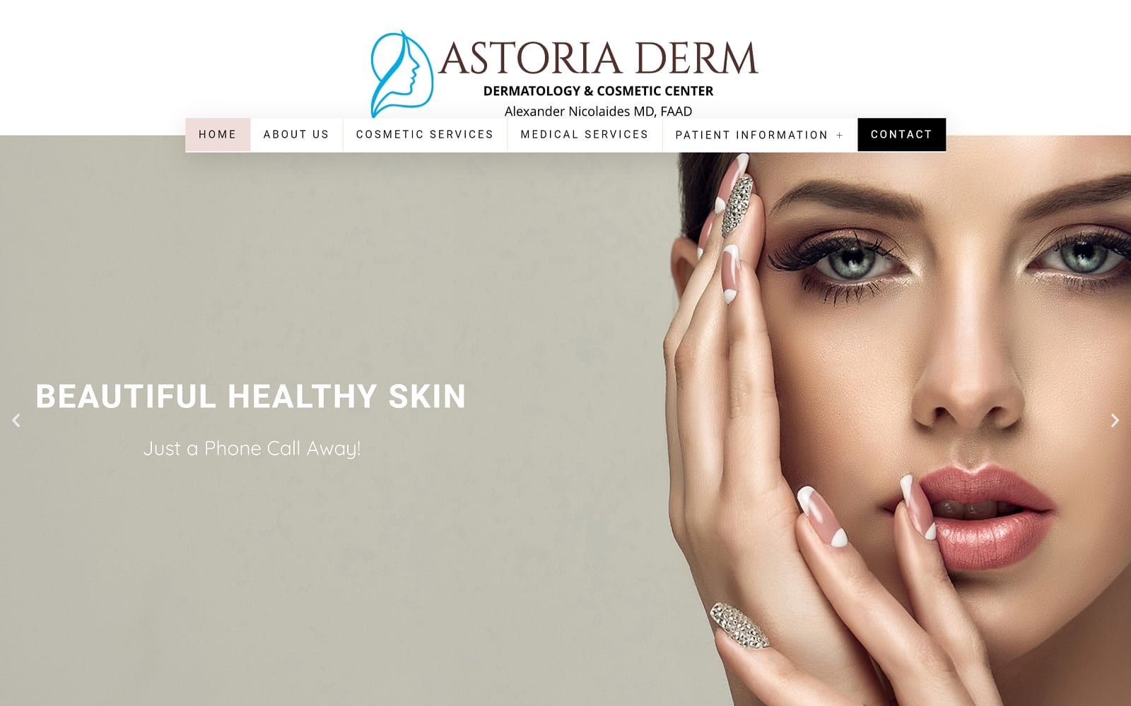
What We Love About Astoria Derm: Astoria Derm works with warm creams, bright browns, and light pinks to highlight its services’ illustrious and clean appeal. This cosmetic center focuses on its use of light for a spacious feel, working with transparent separators, thin headers, and icons to direct new patients throughout the website, making it easy to navigate and professional. Its pleasing aesthetic immediately helps new patients recognize this practice as a place to rejuvenate and unwind.
3. Skin Science Soul Medical Aesthetics
Visit Skin Science Soul Medical Aesthetics
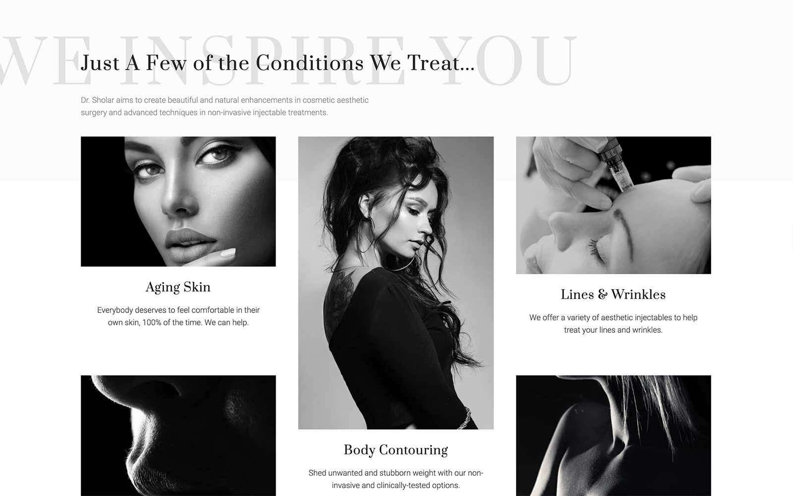
What We Love About Skin Science Soul Medical Aesthetics: Skin Science Soul plays with both monochromatic tones and soft magenta-based colors, highly appealing to a feminine aesthetic that focuses on inner and outer beauty as their focus. Through this elegant and graceful aesthetic, this website works with modern elements, including background imagery, action buttons, and slideshows, to draw new patients in and entice them to explore their services further. Marketing its emphasis on scientific ingredients, they work to fully enhance one’s beauty as the foundation of its skincare.
4. Susan Woods Dermatology
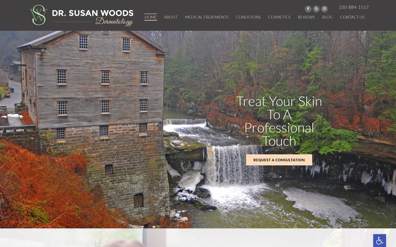
What We Love About Dr. Susan Woods Dermatology: Dr. Susan Woods Dermatology brings in nature-themed elements, using cool browns, bright tans, and soft creams, combining their focus on skincare with wood-themed elements for a highly elegant and engaging website. Beyond its imagery, action buttons, icons, and transparent layers are used to accent the website’s sense of harmony with these nature themes. Combining these elements makes the website’s color scheme personalized, appealing to new patients locally, and brings out an easy-to-follow website with great functionality and design.
5. Hawaii Dermatology and Plastic Surgery Centers
Visit Hawaii Dermatology and Plastic Surgery Centers
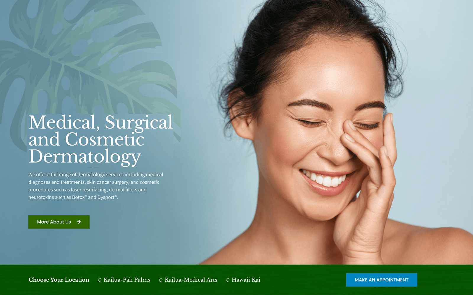
What We Love About Hawaii Dermatology and Plastic Surgery Centers: Hawaii Dermatology appeals to a wider audience but focuses on localizing its target audience using tropical themes and imagery. Through a color scheme of jungle green, white, gray, and bright blue, the jungle green brings users into their website and acts as the action color that helps visitors navigate throughout the site. From there, scenic tropical imagery combined with extensive use of white space allows for easy viewing, giving new patients a sense of professionalism with their practice.
6. California Dermatology Specialists
Visit California Dermatology Specialists
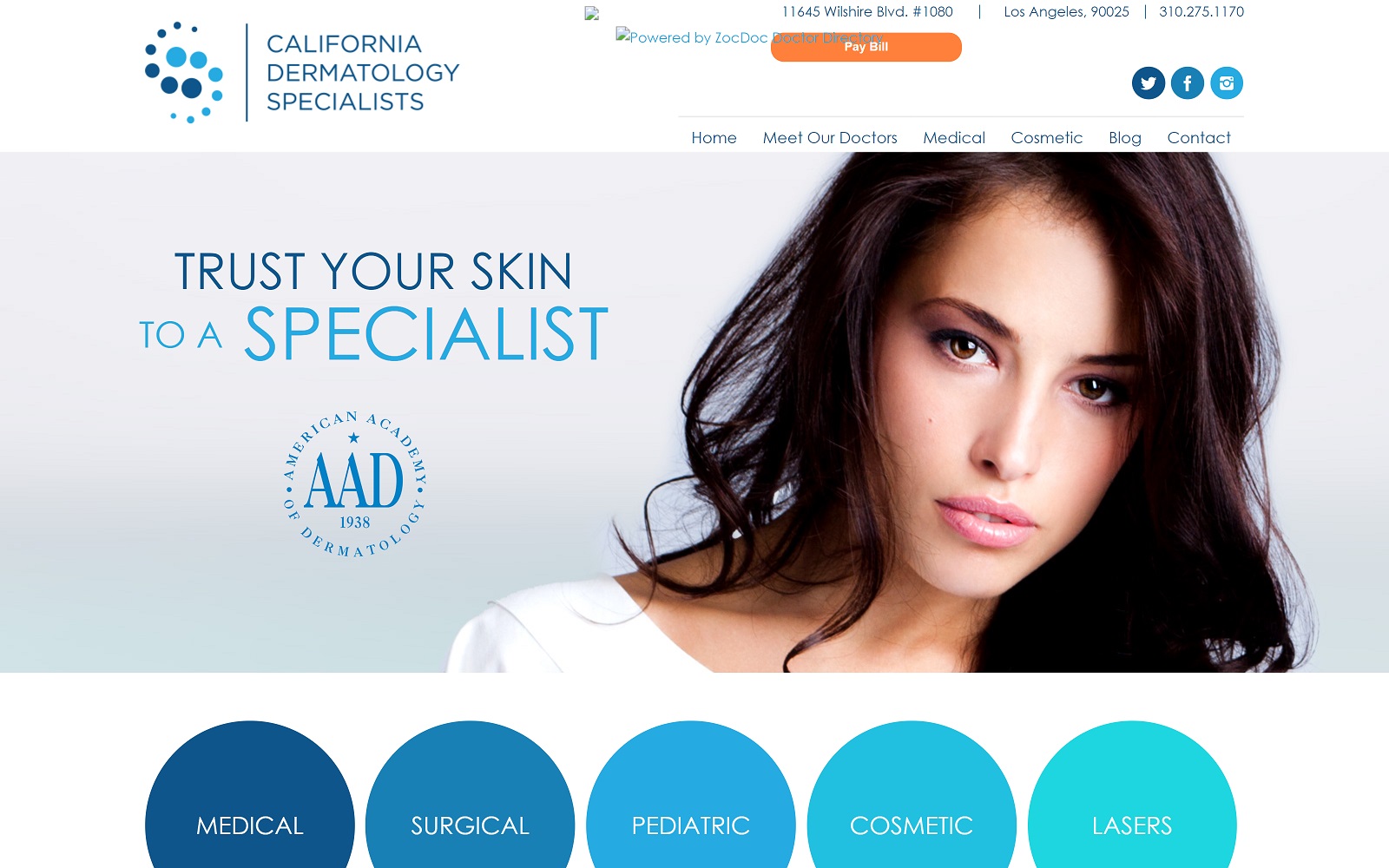
What We Love About California Dermatology Specialists: California Dermatology Specialists take full advantage of the available white space and utilize minimalist elements to appeal to new patients. By using shades of blue as their primary color palette, the colors accentuate the information on the site, creating a seamless transition that makes it easy to read. Throughout the site, action buttons are used to help lead visitors to essential information, and its clean, neat formatting provides a professional and easy-to-recognize feel to their practice, making them reliable.
7. Caren Campbell, MD Dermatology
Visit Caren Campbell MD Dermatology
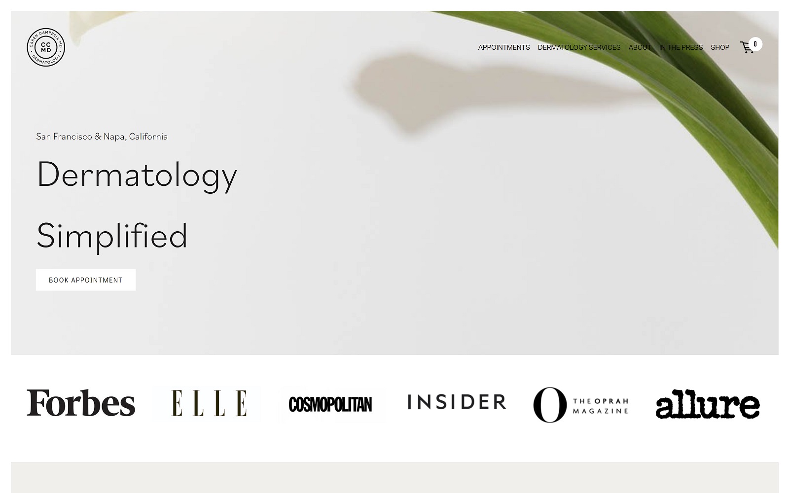
What We Love About Caren Campbell MD Dermatology: Similar to Biltmore and Skin Science Soul, Caren Campbell works with monochromatic tones, sticking with black and white as the main accents throughout the website. However, the website relies on large-scale imagery to bring in new patients, creating a more personalized touch. Its use of large serif fonts, action buttons, and hyperlinks help users easily take in information about the practice and their services. Through these elements, Caren Campbell creates a portfolio that showcases the personal touch of dermatology in everyone’s lives.
If you want to improve your website, take a look at what Optimized360 can provide for you by checking out their successful medical website designers.
THE BEST DERMATOLOGISTS’ WEBSITES OF 2021
1. Walla Walla Aesthetics
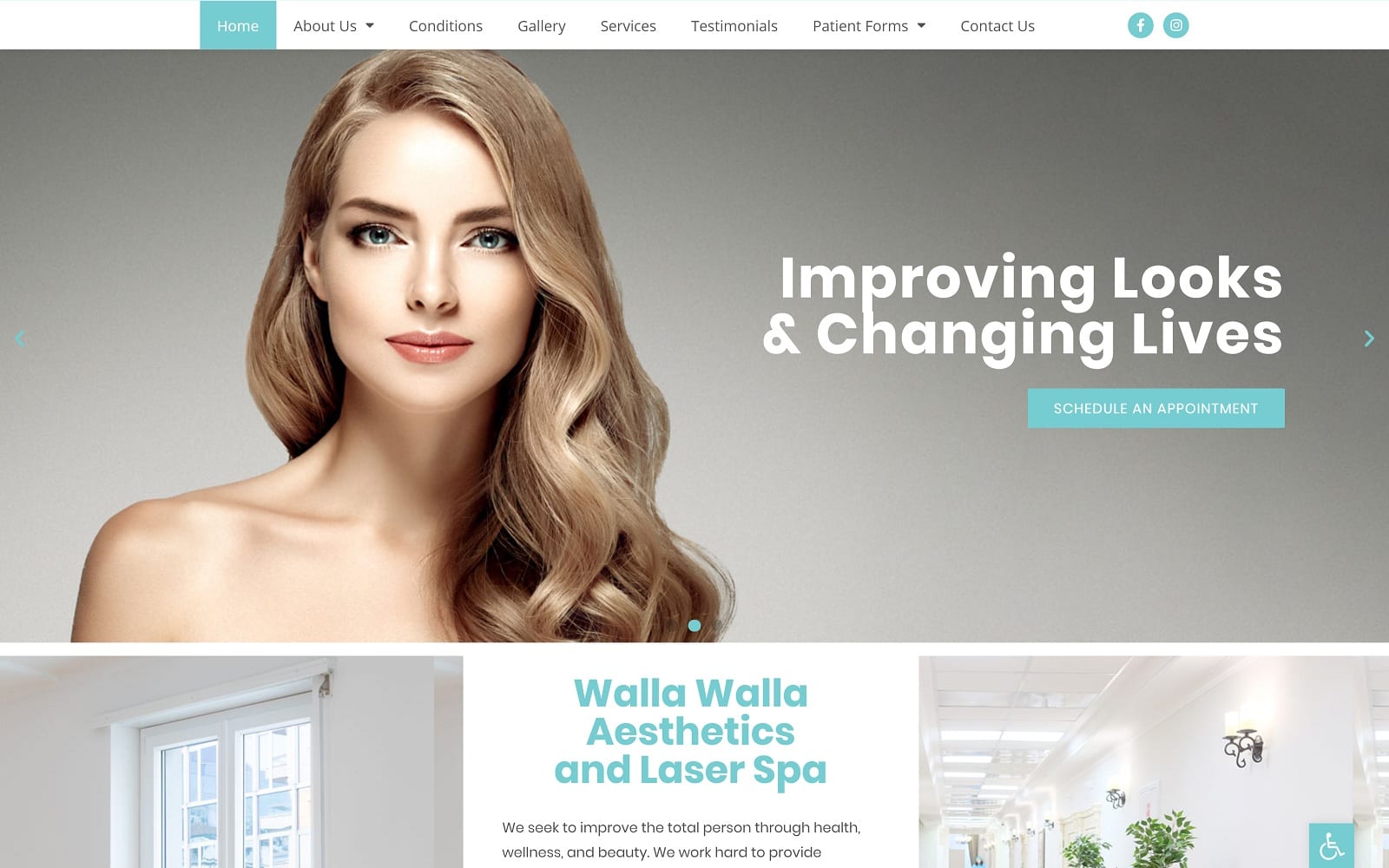
What We Love About This Derm Website: The twin aspects of the design of this site are minimalism and simplicity. From the moment the visitor lands, they’re presented with a clean interface and straightforward representation of the services provided at this location. This layout, with intention, is aimed at experienced dermatology patients who know what services best suit them. Tones of blue bring the viewer feelings of hope and serenity, while skin tones reflect the beautiful results they’ll experience from their visit.
2. Astoria Dermatology & Cosmetic Center

Visit Astoria Dermatology & Cosmetic Center
What We Love About This Esthetic Website:
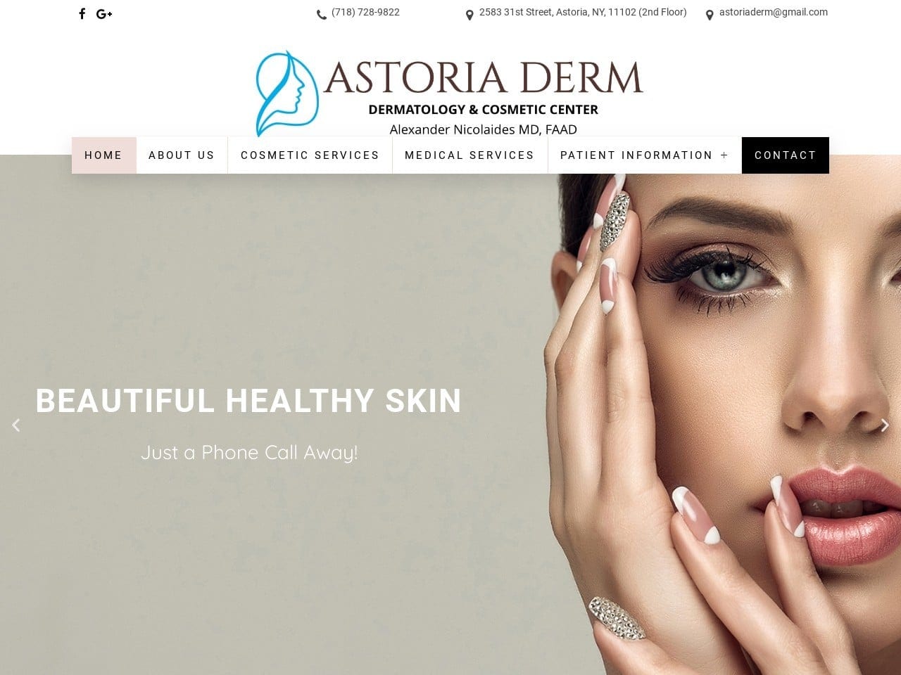
Visitors to this site are immediately invited into the clinic’s interior as presented on the home page. Beige combines with flesh tones and whites to create a clean and sophisticated appearance that speaks to their services. The scrolling slideshow on the landing page also presents a combined sense of medical sophistication and hedonistic indulgence with candles, incense, and the latest in medical equipment. Contacting the clinic with the menu and its links to at-a-click phone calls, directions, and email is a breeze. Navigating the site is simplified with the help of a top-and-center menu that provides easy access to the desired information.
3. Moore Dermatology Associates
Visit Moore Dermatology Associates
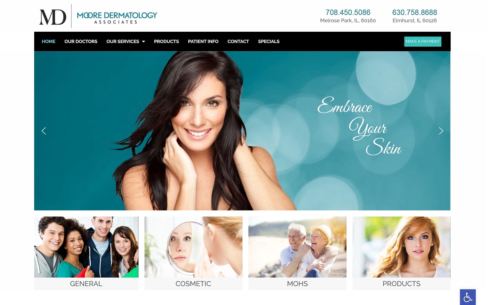
What We Love About This Website: Invigorating turquoise and uplifting teal are the foundations of this site’s color scheme. The bright smile of a woman with fresh and beautiful skin takes center stage, instantly drawing the viewer in. Connecting with the clinic is quick and easy, with the links provided at the top of the page while scrolling down provides further information. Gold makes a subtle appearance to provide a certain richness. Overall the site takes a minimalist approach providing well-structured content in favor of visual display. However, all aspects are balanced, with nothing sacrificed in design or functionality.
4. Rose Dermatology
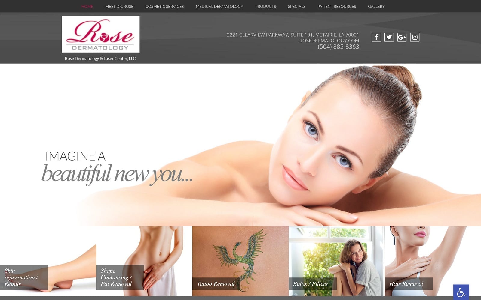
What We Love About This Website: Subtlety is the cornerstone of this site’s design, as is evidenced by its dreamlike themes. On landing on the site, visitors are greeted with an angelic, fresh-skinned face in a slightly diffused image. This dreamlike quality and sense of subtlety are mirrored in the clinic’s logo, where a stylized rose takes the place of the O. This otherworldly feel inserts the idea that the clinic can aid visitors in addressing their aesthetic concerns. But there’s more than just beautiful design here. Three methods of mobile contact are provided, along with six different social media platforms, which include a public profile of the provider.
5. Acne Concierge
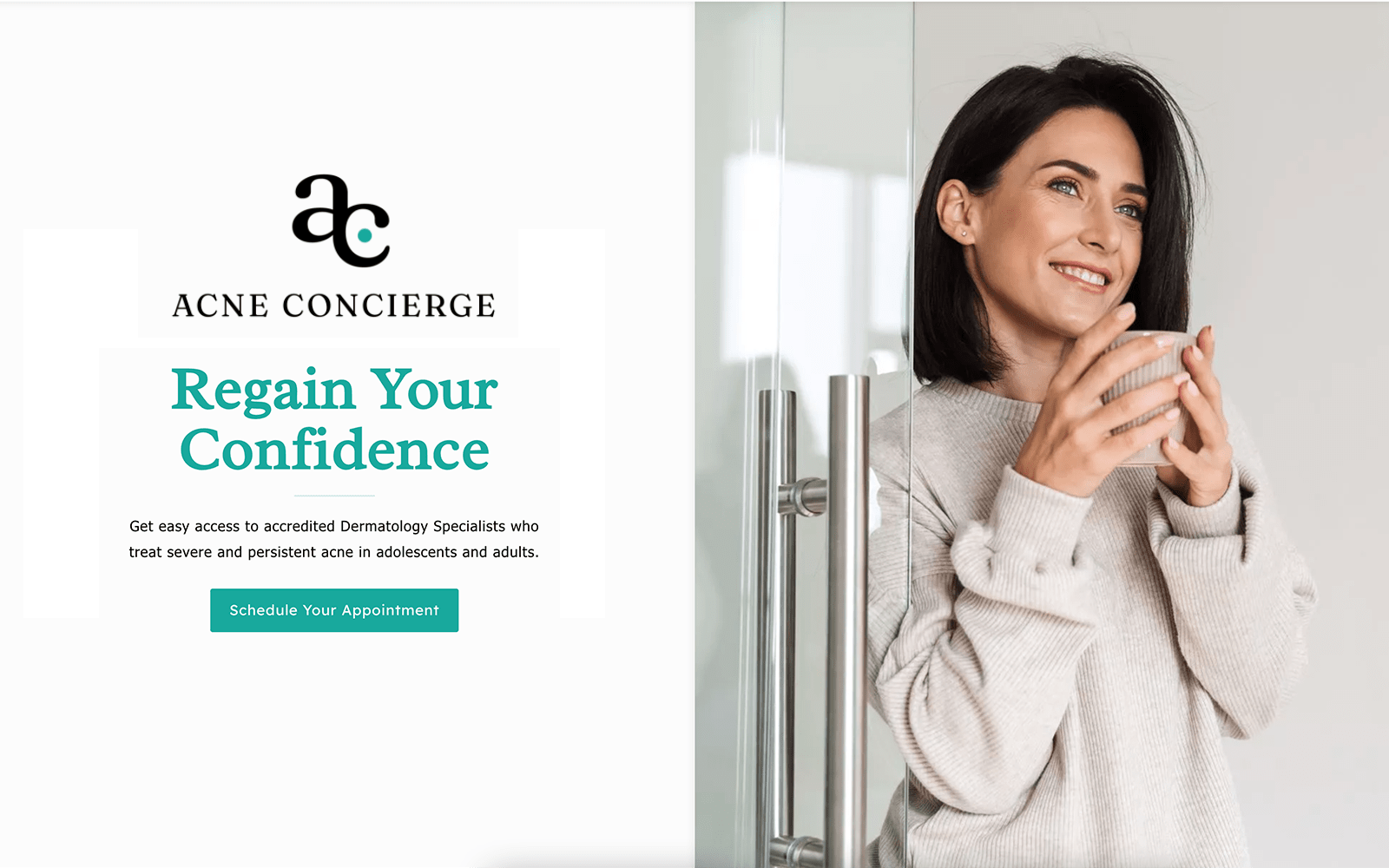
What We Love About This skin care Website: The open and clean landing page presentation makes this site stand out. There’s subtle practicality to this design that belays the often starkly artistic nature of sites like some of those above. Instead, this clinic is about providing solutions to people on the go. While further information is available by scrolling through the site, its design is focused on getting you into the office and speaking to their staff. However, as you scroll through the site, you’ll find information about their services, clinic, and staff. Each piece of this information is delivered semi-minimalist, using light visual elements such as photos. It’s a wonderfully balanced design.
6. Hollywood Dermatology & Cosmetic Specialists
Visit Hollywood Dermatology & Cosmetic Specialists
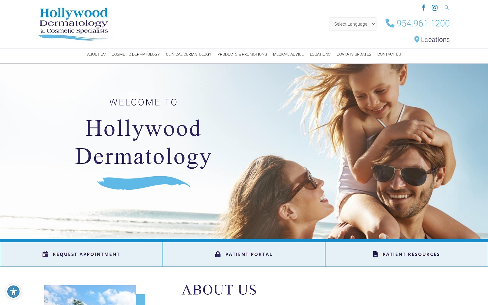
What We Love About This Cosmetic Website: Visitors to this site are immediately greeted by the beauty and freshness of the clinic’s service area. Warm sunny beaches, beautiful sun-kissed skin, and stylish visuals speak to life in the valley. Knowing their target audience also means emphasizing results and easy-to-access information. Links to patient resources, an appointment setting feature, and a patient portal to keep in contact let visitors know this clinic knows how to serve them. The blues and whites of the site’s color scheme reflect the sands and skies that are regular parts of the locals’ lives.
25 marketing ideas for dermatologists
7. Pacific Skin and Cosmetic Dermatology
Visit Pacific Skin and Cosmetic Dermatology
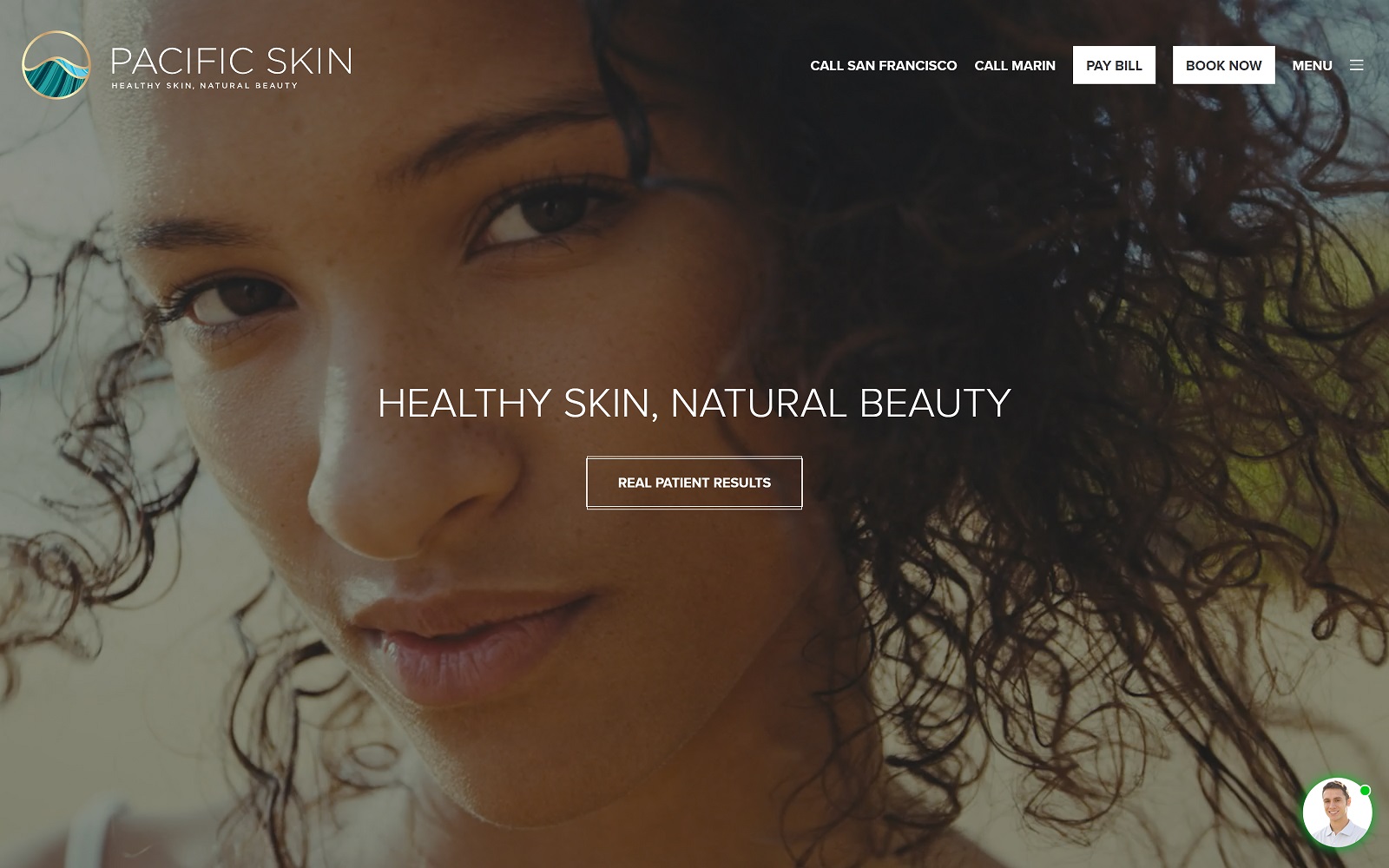
What We Love About This dermatology Website: Sometimes less is more, and sometimes it pays to go all out. Pacific Skin and Cosmetic Dermatology took the latter route, and it clearly paid off. They connect quickly with their community and area using stunning visuals in video format. A scrolling slideshow emphasizes getting to know the staff and seeing the results from other patients before being shown specials offered by the clinic. Convenience is emphasized with on-site bill pay, booking options, and a virtual assistant available to answer your questions. It’s a beautiful site with a significant impact that connects patients with the clinic.
BEST DERMATOLOGY WEBSITES OF 2020
When designing a website for your dermatology practice, a lot needs consideration. Every business can benefit from a great site, but it can be a waste of time and effort if you don’t know how to put it together. A poorly configured website can leave a poor taste in the mouth of potential patients, while striking logos, attractive color schemes, and an easily navigated layout can turn them into fans. “You can’t make a first impression twice” is especially true in the digital age when you may not even be aware that the first introduction has occurred.
Patients today expect a website that can provide great information and add convenience and accessibility to their care. Access to convenient yet secure forms, patient and payment portals, immediate access to GPS-guided directions, and more are all considered standard features by today’s patients. You need reliable HIPAA compliance, integrated direct-to-map and direct-call apps, and more to provide all this. Below we’ll present a series of websites that use these features significantly and have attractive and usable designs.
1. Dr. Susan Woods Dermatology
Visit Dr. Susan Woods’s Dermatology
Aesthetics
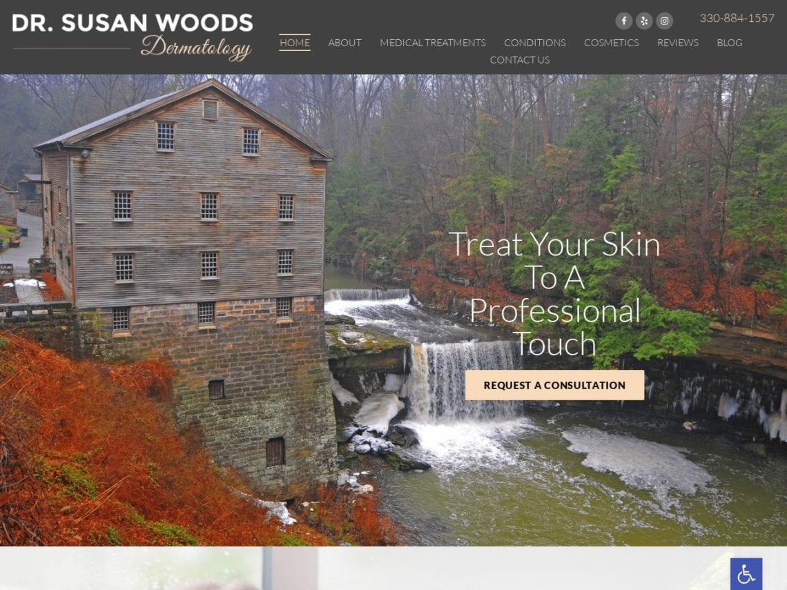
Prominently featured when visitors arrive at the page is a beautiful nature scene featuring a flowing river and beautiful woods. Combined with the gray, pink, and white palette, create a subtly contrasted beauty that is soothing to the eyes and welcomes locals home. The introduction to the dermatologist uses a softly diffused image alongside a list of their qualifications, and the opportunity to learn more is presented gently on a pink button. The treatment buttons use stylized images to show what each section covers. Vivid photos that feature attractive models are used throughout the cosmetic surgery section of the site to indicate what can be done for the patient before they even click through.
Functionality
Grey and white are soft tones that ensure visitors don’t feel sales pressure when they arrive on the site. Pink is known for its association with the feminine and nurturing. It also represents clean and healthy skin, delivering the site’s message well. It is also used as an action color on this site, drawing the eye to where visitors can provide information or learn more. The image of the building and river are from a local source and helps to connect the site and practice with the community it serves. The treatment buttons provide visual information and encourage viewers to click with a bounce-over response. At the bottom of the page is a HIPAA secure form that allows visitors to reach out to the office for an appointment and to receive additional information about their concerns. Below can be found in the Direct-to-map integration that makes directions available on-demand, as well as office hours and contact information.
2. Astoria Derm
Aesthetics
Astoria Derm is built on a black, white, and rich brown palette to create a visually striking site with excellent contrast. The website uses soft imagery to portray a sense of cleanliness and subtle beauty, such as the branch that highlights the site’s mission statement. Beautiful black-and-white imagery presents information about the services and products the practice offers its clientele. Rich brown is used for buttons that direct to more details and which respond on mouse-over with what they can find when they click through. Beneath a charming three-heart section separator are client testimonials pleasantly presented in boxes that rise on mouse-over. Further down is shown a link to the blog using an attractive image that serves as a lovely backdrop.
Functionality
The whole site utilizes a mobile-first design on a single page that is easy to scroll through while providing options for getting more information elsewhere. The combination of black and white often gives a sense of sophistication, while brown is an earthy, warm, inviting tone and makes for an excellent action color in this site in all its shades. The prominent placement of an appointment button under the hero image makes getting started with the clinic more comfortable. The mission statement provided immediately under this appointment statement tells inquisitive visitors the goals of the clinic and its service to its patients. The mouse-over option on the buttons maximizes available space by providing additional information in a relatively compact area. The bounce-over used for the testimonial images helps center attention and adds an interactive feel to the website, keeping visitors engaged.
3. Biltmore Dermatology
Aesthetics
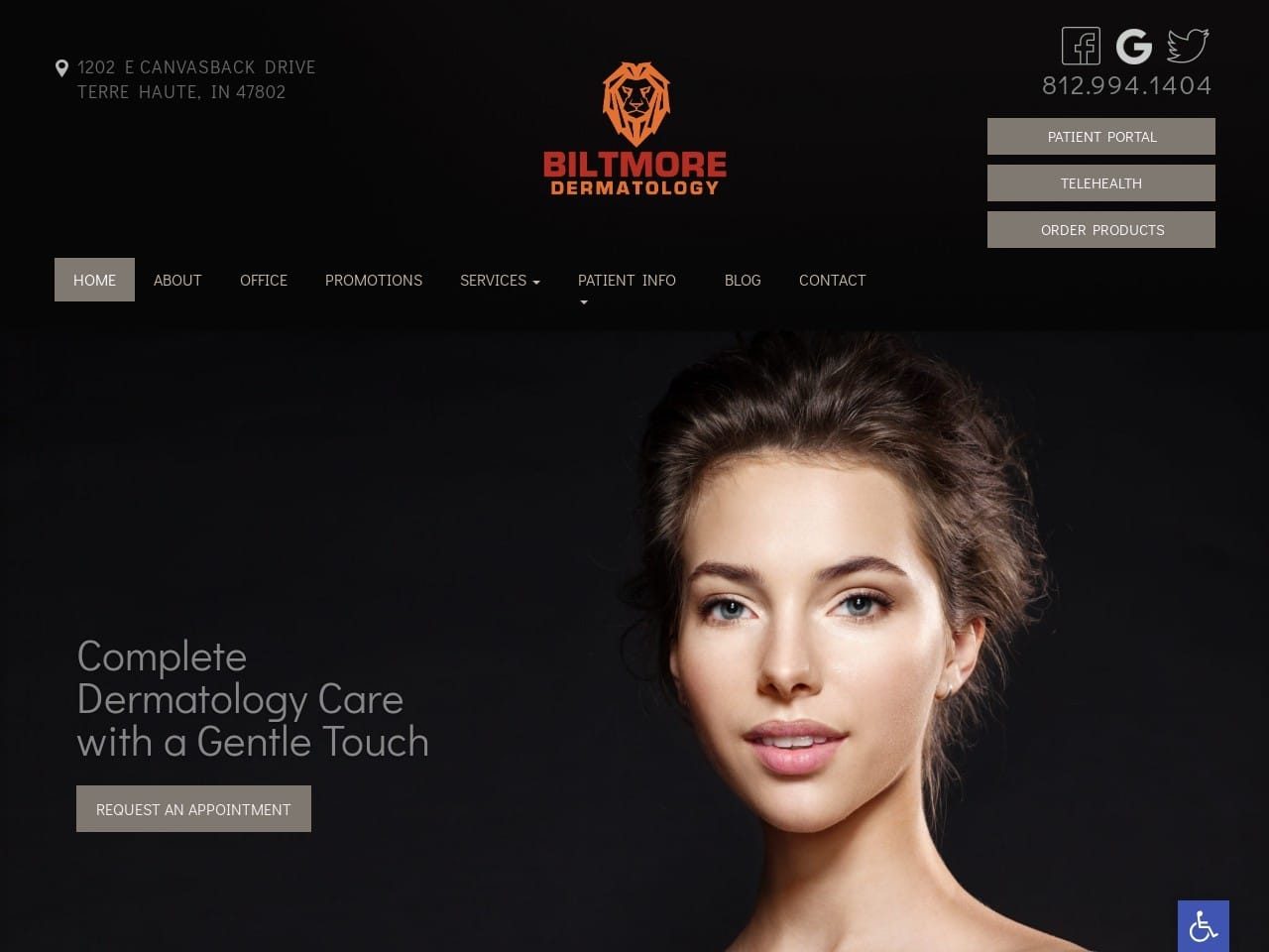
Biltmore Dermatology went for a site design that uses a darker approach, focusing on highlighting the imagery used throughout its site. The black and gray coloration helps to give the site a very clean design scheme that allows guide images to really pop. Gray is used to creating attractive and eye-catching buttons to help guide visitors through the website. The services section of the site uses images that reveal the service information they direct to on mouse-over, helping to maintain the overall image central focus of the site’s design. A picture of the practice is subtly worked into the background, revealed only by scrolling.
Functionality
Focusing on using imagery to deliver a message is a good move for a dermatology site. Patients of these kinds of clinics are primarily concerned with issues that affect appearance and how they are perceived. Images help them start thinking about what their future could be. Black is a color that is commonly associated with sophisticated professionalism, engendering a sense of trust in those viewing the site. Gray has an association with proper formality and also serves to contrast the stark black background beautifully. It also serves as an action color used in buttons and other areas where the site desires visitors to take action. Maximum use of space is made with the scrolling testimonial area of the page, allowing the text to be delivered in a functional size while still incorporating multiple reviews. The bottom of the page includes valuable contact information, direct-to-map directions, and office hours in a convenient place.
4. Rose Dermatology
Aesthetics
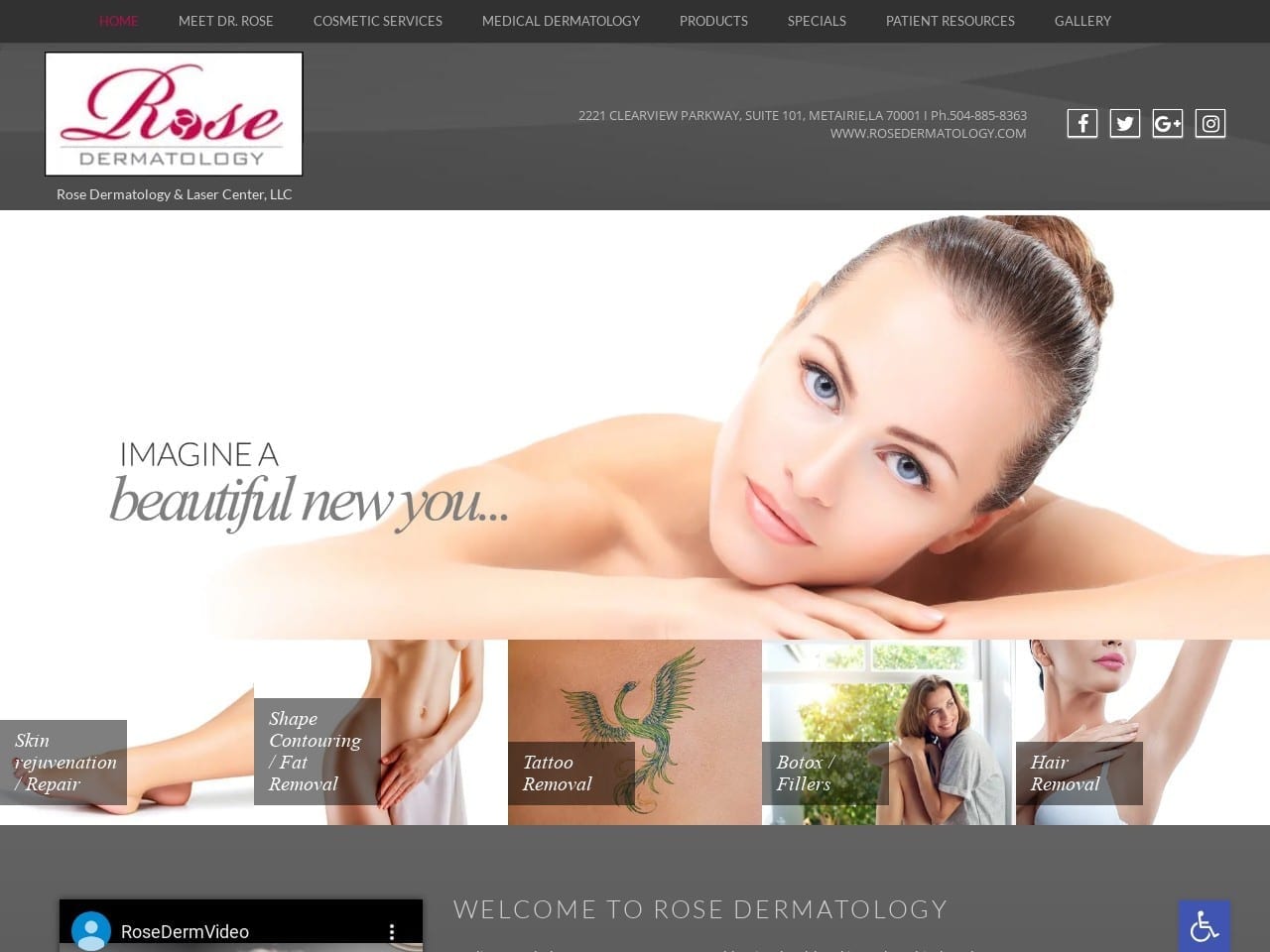
Rose Dermatology has a beautifully minimalist site that uses imagery, video, and a gray, red, and white color scheme. The soft gray background and white text are attractive and easy to read, while red is an action color that stands out from the gray background with surprising subtlety. The diversity of gray is shown here in various shades that contrast wonderfully with the light gray background while using white text to create attractive buttons and forms. The site gallery presents various results, and each image pops thanks due to the subdued hues used in the website’s design.
Functionality
The minimalist and streamlined design of this site emphasizes mobile usage. This aspect emphasizes the menu’s ability to contract into a hamburger menu on smaller windows. Red is the primary action color on this site, drawing attention to areas the user can get more information. The availability of patient resources, including easy-to-use forms, official notices, and what insurance is accepted, make the visitor’s time on the site productive and convenient. The site also places itself in the community by offering solutions for local concerns, including providing physicals for the many immigrants that come to the area. This kind of community awareness helps build rapport with your future patients before they even step into the office.
5. Kentucky Skin Cancer
Aesthetics
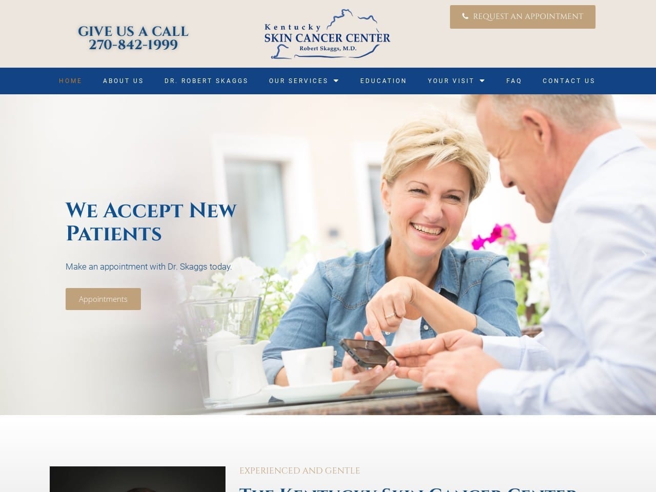
This website’s white, blue, and beige color palette is bright and uplifting, an essential element for a site dedicated to helping patients during a harrowing time. The images used in the main slideshow are selected to show patients going through this time that there is a reason for hope and positivity. A well-framed image of the dermatologist is included as an introduction; his warm and friendly smile adds to the site’s aesthetic. Beige appears as the background for buttons throughout the website, with the white text contrasting pleasantly. An active elderly couple is a backdrop for their featured services section, showing that there is hope for the future for those battling skin cancer. The blue footer presents contact information, phone number, and address, followed by additional contact information and a form for requesting an appointment.
Functionality
White and blue are colors of purity and hope and tend to uplift the viewer. Beige appears as a safely neutral color that contrasts well with the rest of the site’s design. It also acts as a subtle action color that catches visitors’ eyes and encourages them to engage with the website. The image of the doctor is an outstanding touch and continues the trend started in the slide show at the top. Both of these serve to play off of a trick of psychology in which seeing someone else smiling typically stimulates a response that improves our mood; this is essential in building a positive association with potential patients. Convenient accessibility to services is demonstrated with the prominently placed “Request an Appointment” button that is available without being pushy. This site’s mobile-friendly design ensures all necessary information is available on the main page, while the hamburger menu provides easy navigation to any desired information.
6. Bloom Dermatology
Aesthetics
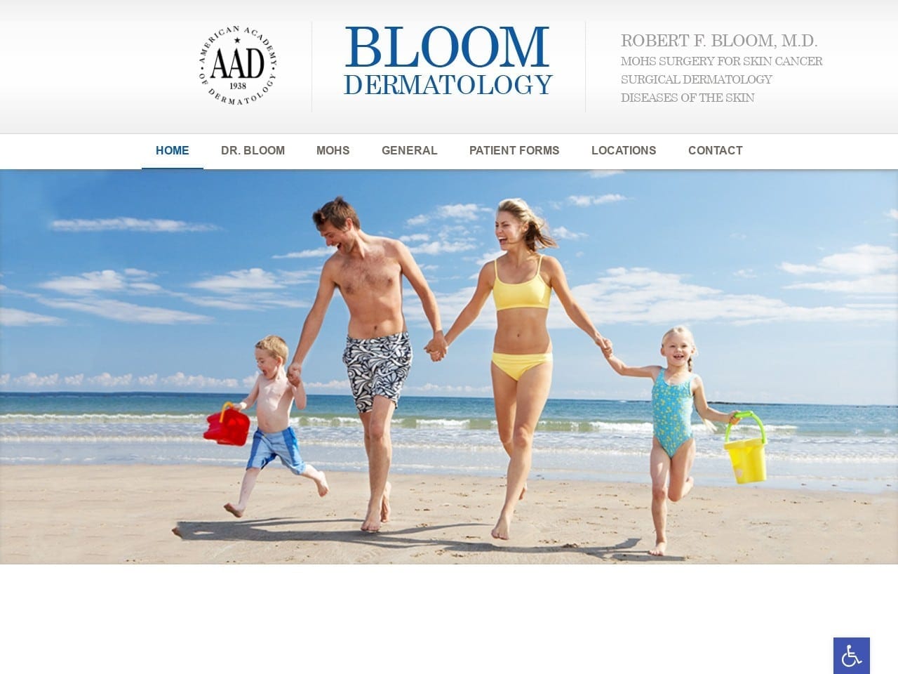
This site is very minimalist in its design and uses this element to significant effect. The color scheme is primarily an immaculate white with black text, and while images are prevalent, they don’t overburden. The site is sleek and efficient no matter the window viewing size, with the menu collapsing down to a hamburger menu in a way that seamlessly fits into the site’s design. The About Us page presents a charming picture of the physician with information about his background and qualifications in a format that doesn’t overwhelm him.
Functionality
The images selected show attractive people in an active environment, with bare skin central to the site’s subtle message. The website features a minimalist, mobile-device-centric design that speaks to a growing body of internet-savvy patients who are always on the go. Access to patient forms ensures that no additional time gets spent filling out paperwork at the office, allowing patients to make the most of their appointment. Each section of the site provides valuable information with images to ease patients’ worries or alert them that it’s time to come in. Contact information is immediately available at the top and bottom of the website.
7. Healthy Skin Dermatology
Visit Healthy Skin Dermatology
Aesthetics
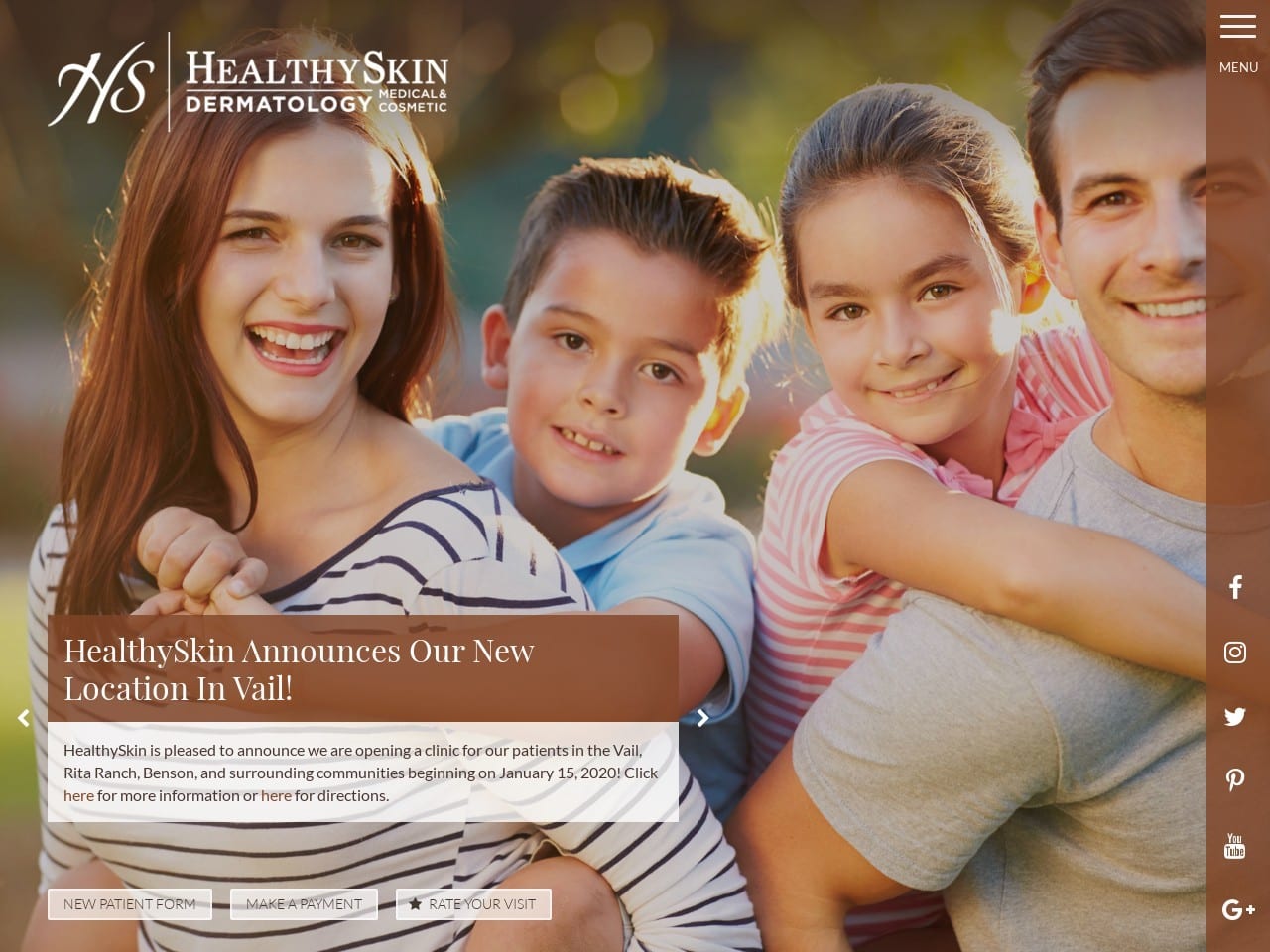
Arriving at the site for HS Dermatology presents you with a warm family with healthy glowing skin. The palette is a comforting brown and white palette with blue used as an action color. These tones create an imminently pleasant website to view and scroll through. The clever side-menu design makes the site perfect for mobile-device and desktop users, creating an exceptional unity of appearance. Images throughout the site are used to convey information to the visitor. The site makes excellent use of space, providing information in an open, breathable format that doesn’t feel overcrowded.
Functionality
This site has several powerful features that make it optimized for mobile users due to layout choices and functionality. The website was designed to make scrolling natural at any window size and ensure that communication channels are reachable through the side menu. Integrating a hamburger menu and social media links was a clever design. At the bottom of the page is a feature-packed portion of the site. Links to the site’s news, payment portal, and patient portal are all clearly available to boost convenience for visitors. Each address links directly to contact information and maps features for that location.
Great First Impressions For A Cosmetic Dermatology Site
Cosmetic dermatology is a practice firmly centered on aesthetic appeal. As a result, it’s essential that a focus on this aspect of the clinic is emphasized front and center. Visitors need to see beauty coming in the virtual door, backed by effectiveness and convenience. The following features are centerpieces you should ensure are present on a site designed for cosmetic dermatology:
- Great Visuals: The first impact your site brings should emphasize aesthetic results. Visitors should get a solid feeling of hope and dream of what your services can do for them within moments of landing. This means a beautiful site, eye-catching color schemes, and images that send a message.
- Proven Results: Seeing is believing, meaning a good gallery is necessary. You can tell your patients what your clinic can do for them, but nothing like photos of past clients will sell it. Discretion is best, even when the patients whose photos you use indicate they don’t mind their faces being shown. If you can show the results while using angles and imagery that provide anonymity, so much the better.
- Functionality: Every site needs to provide meaningful functionality to the end user. This means your patients should be able to reach out to you with ease from the site. Patient portals, payment options, and educational videos should also be just a click away. Most of all, navigation needs to be seamless and intuitive.
These are just a few of the things that make cosmetic dermatology sites provided by Optimized360 stand out from the crowd.
How To Reach Your Demographic With Customized Website Design
For those who are passionate about medical aesthetics, it’s essential that your marketing team understands the ins and outs of your specialty. Dermatology presents unique marketing challenges, especially because the demographic for this area often varies by gender, race, and income, impacting how dermatologists reach out to patients needing treatment. However, understanding your specialty and your current demographic can help you market your business toward new patients and reach out to those faced with these disparities.
One of the best ways to reach out to these patients is to understand what makes you unique as a practice. Asking questions related to your specialty, including cancer diagnosis, facial reconstruction, acne treatment, and tissue infections, can help narrow down where you want to focus your input, and your website can come into play through:
- Blog Content: As the main voice for your business, sharing information about the topics that pertain to you can not only help legitimize your practice but also reach out to a larger demographic
- Social Media: Your social media presence can provide those outside of your target audience receive more access to your services.
- Web Design Elements: Being selective about your choices in color schemes, imagery, and overall web content can give your demographic a better understanding of how you operate as a practice.

Conclusion
Each of these sites provides a great example of a robust web design. Throughout, we’ve touched on how color gets applied to stir emotion, bring hope, and accent essential parts of your website. The functionality of varying applications and website features was addressed, as well as the need for mobile-responsive design in the modern age. Constructing a website that is tailored to the particular challenges your patients face and provides easy and convenient ways to contact your office is essential. Little touches like these let your patients know you want to supply them with the best care and patient experience possible.
