The business world for dental laboratories is constantly changing. As businesses continue to digitize their image, many dental laboratories catering to local and national dental practices cannot often organize their marketing strategies, leading to an insurmountable loss in income.
Digitization does present its challenges, but website design is considered one of the key ways dental practices can communicate and learn about their laboratories in a new and unique way. However, dental laboratories attempting to market to their intended audiences may face some challenges with web design. Luckily, we’re here to help show off some of the best designs featured across the web to help you better build your brand and reach out to your dentists.
1. Pacific Dental Arts
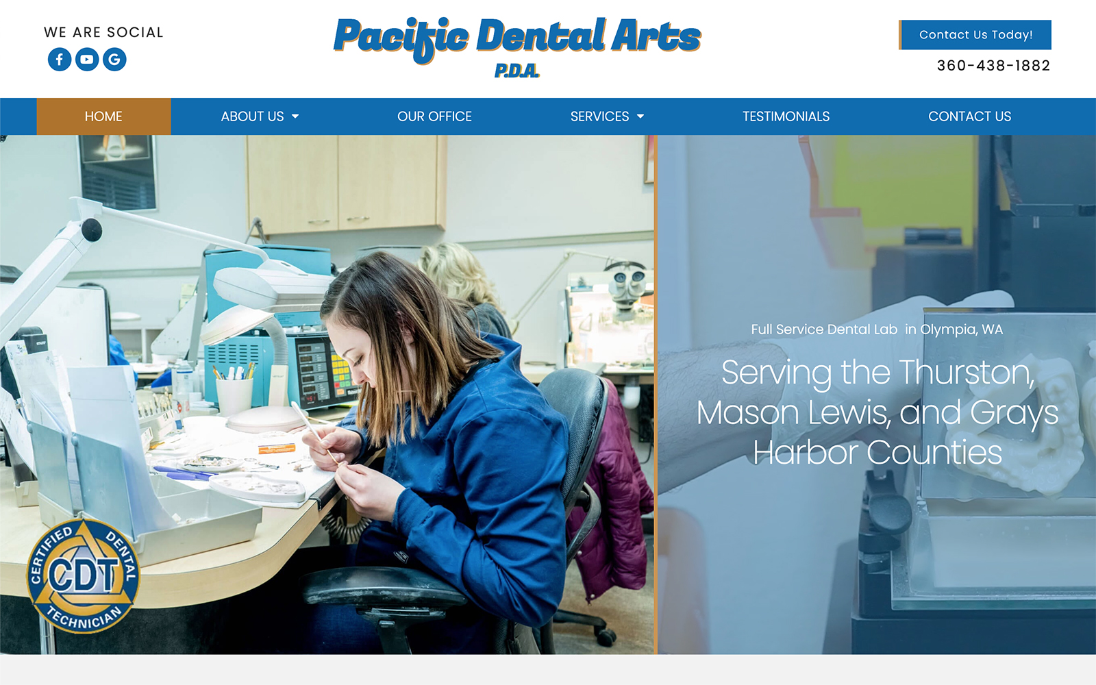
What We Love About Pacific Dental Arts: Pacific Dental Arts is true to its name, honing in superior service with a sense of community. Located in the eccentric town of Olympia, their website showcases their business as one of a kind with its orange and blue color scheme and scenic imagery of their hometown. Pacific Dental Arts market itself as a unique business with local dentists in mind through these various aspects.
2. AMR Dental Ceramics
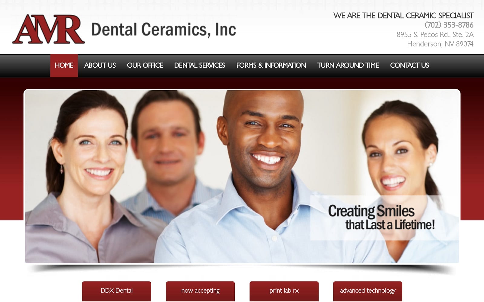
What We Love About AMR Dental Ceramics: AMR Dental Ceramics conveys reliability and professionalism with its red, white, and gray color scheme. Its website design focuses on center-aligned images and text to convey information more easily to its audience. Through this, it uses hyperlinks to internally lead its audience through its website. By using thin borders and smaller text, their design is a nice touch from the traditional blue of the medical industry.
3. Young Dental Lab
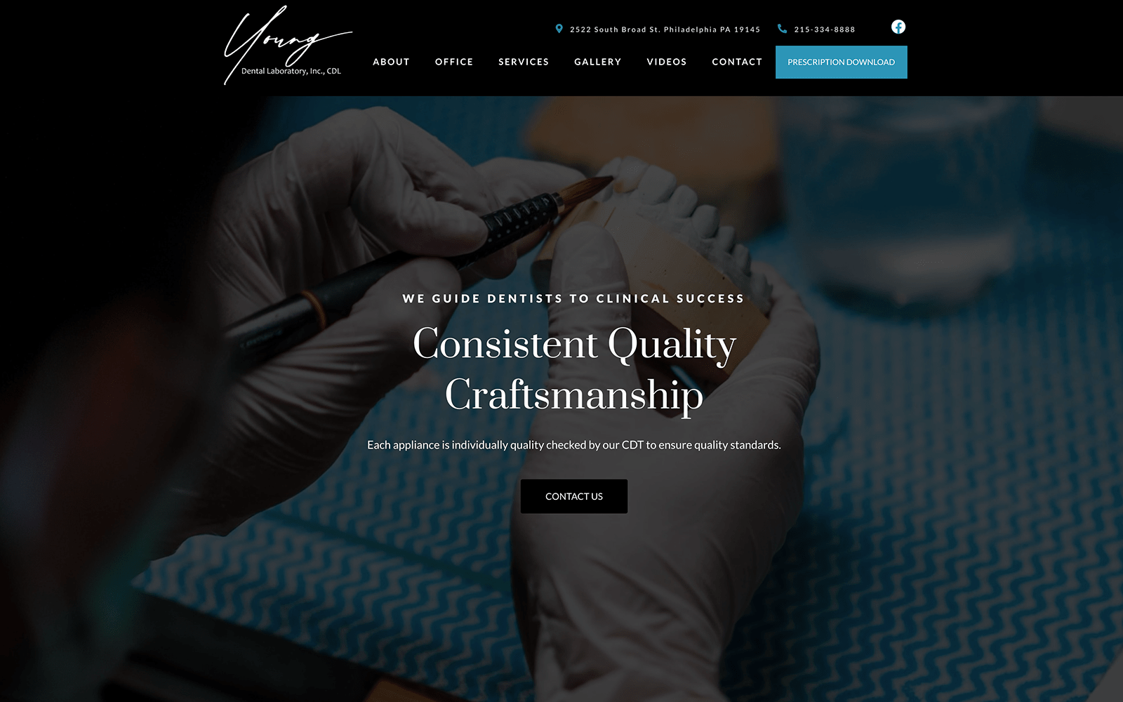
What We Love About Young Dental Lab: Young Dental Labs defines itself from the competition by showing its clinical success in designing quality restorative prosthetics. It conveys trust and grandeur to its audience through a color scheme of luxurious black and white and hints of sky blue. They use neutral images with transparent backgrounds to show their interest in detail and quality assurance.
4. Hex Dental Lab
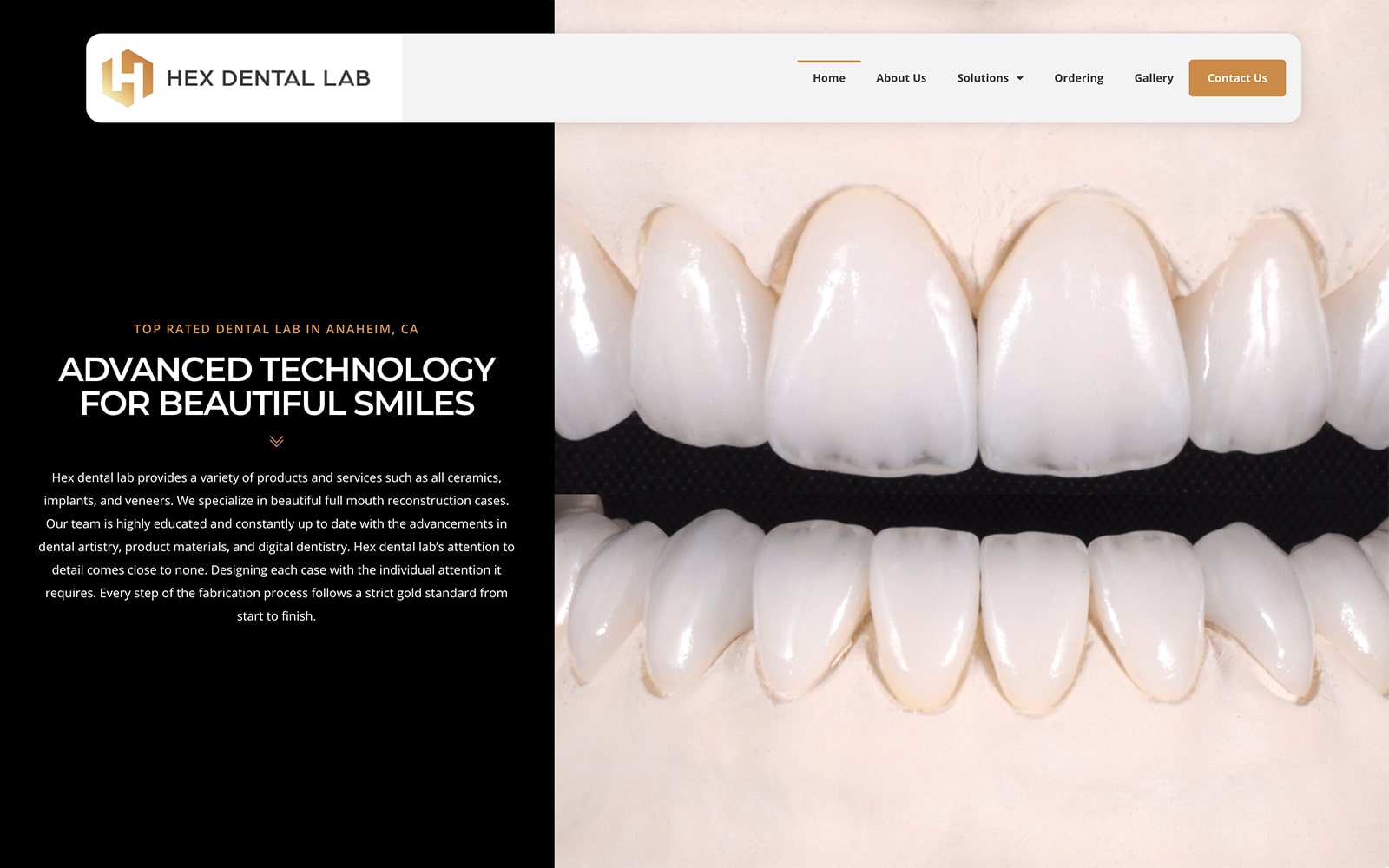
What We Love About Hex Dental Lab: Hex Dental Lab focuses on its technological advancements as its center key point for defining who they are, using bronze golds, blacks, and creams to illustrate its website’s attention to design. The company also uses custom images of its products to provide a sense of realism, placing them throughout the website’s homepage to let their products show the quality they can provide. In focusing on the materials they use, their practice makes it well-known that their restorations are overall reliable.
5. CB Dental Laboratories, L.L.C.
Visit CB Dental Laboratories, L.L.C.
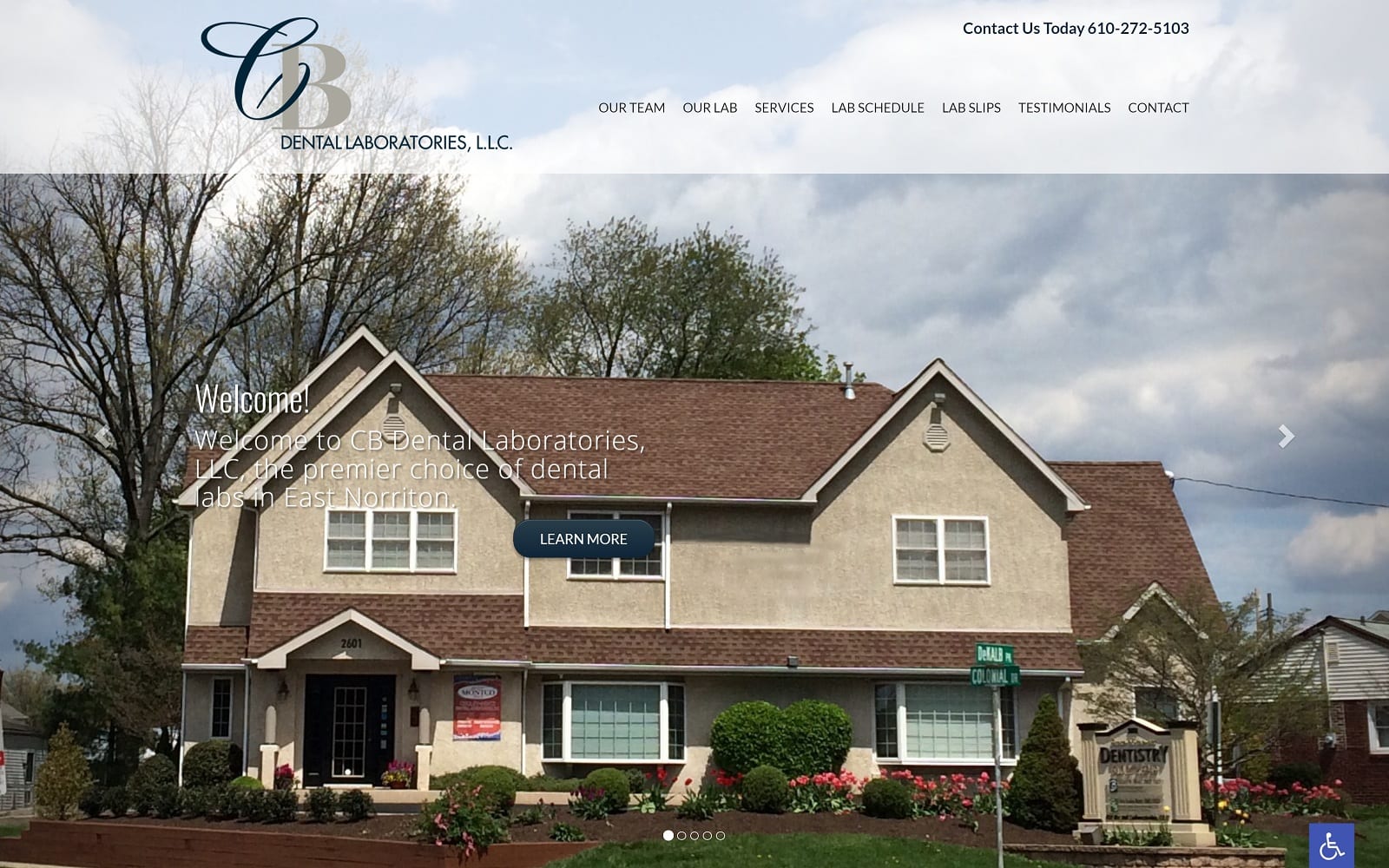
What We Love About CB Dental Laboratories, LLC: Through envisioning their website, the company focused on its relatability to its audience, localized sense of community, and the pride they take in its technical skill. By incorporating a neutral color scheme of navy blue and white and using transparent borders, they let their images speak for them to show an insider’s look into their business. Information can easily be accessed through this, and local and national dentists can rely on their services.
Pros and cons of dental lab website templates
6. R-Dent Dental Laboratory
Visit R-Dent Dental Laboratory
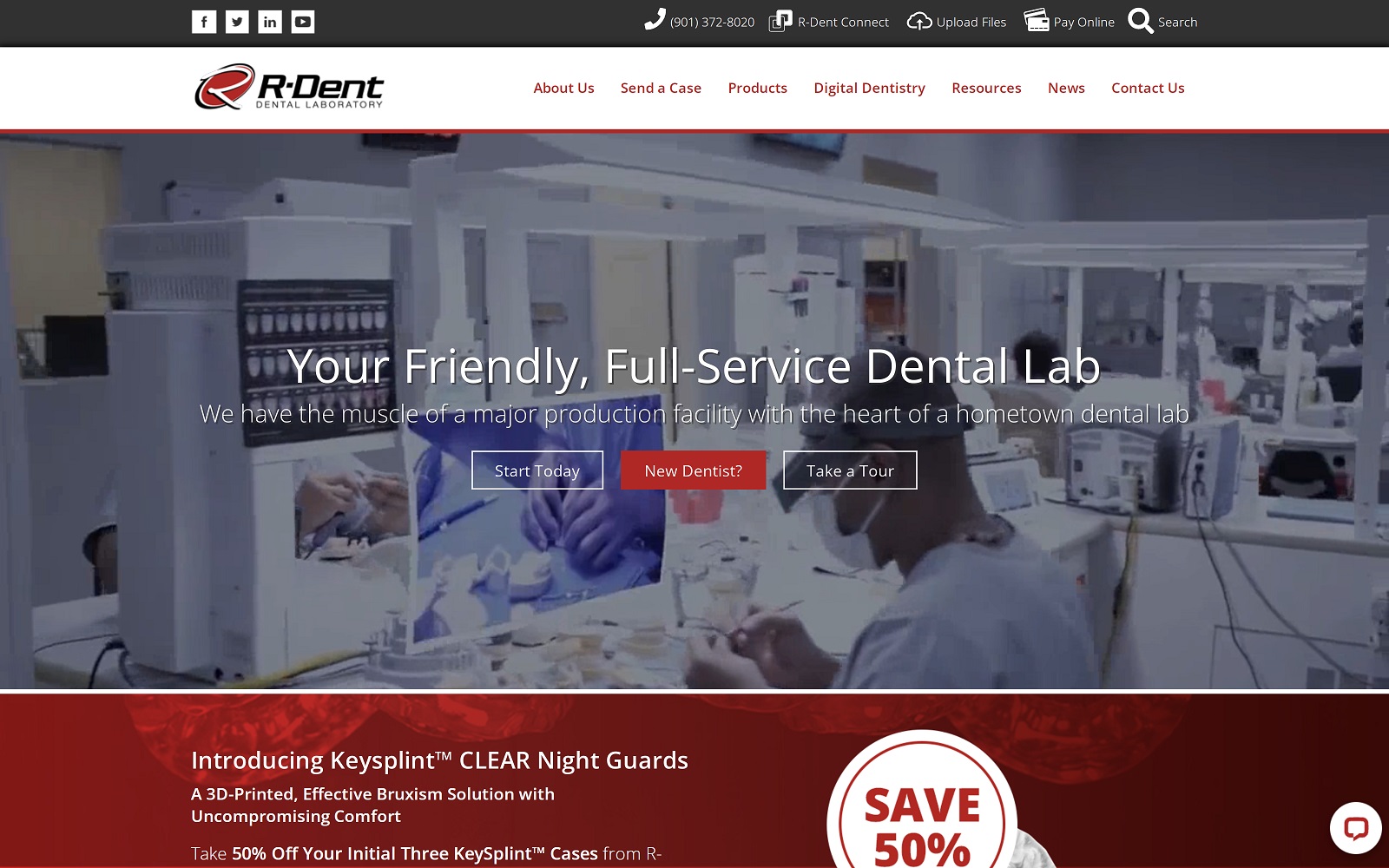
What We Love About R-Dent Dental Laboratory: Servicing multiple states, R-Dent Dental Laboratory works to bring out what it can provide to its audience. Their website incorporates various design elements, including icons, a text-to-chat plugin, a wide-screen video header, and action buttons to keep their viewers consistently engaged with their company. They created a unique brand image that stands out through bright red, medium gray, and off-white.
7 modern pediatric dentistry websites
7. Selser Dental Laboratory
Visit Selser Dental Laboratory
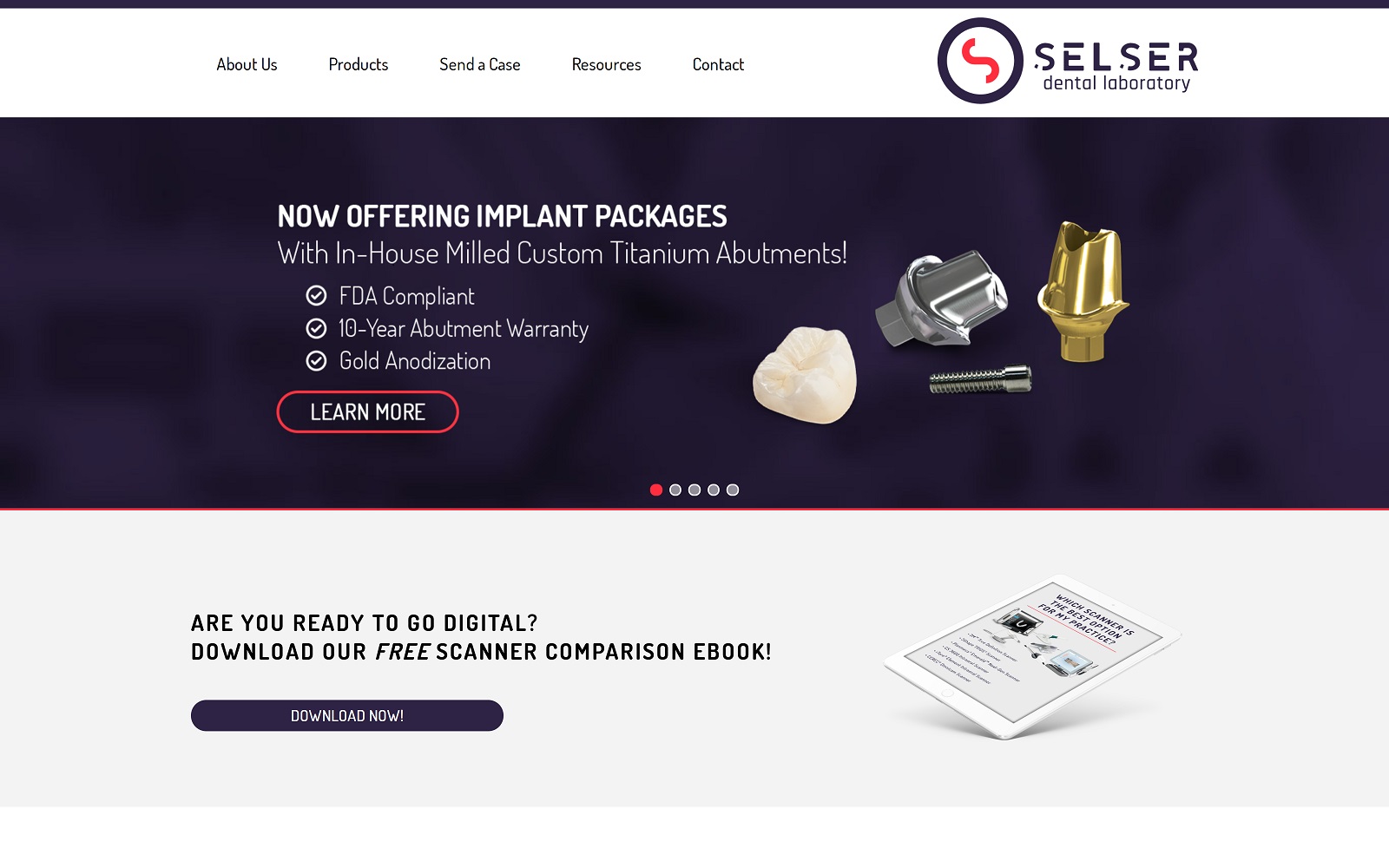
What We Love About Selser Dental Laboratory: Simple yet elegant, Selser Dental Laboratory uses deep royal purples and whites to take advantage of the white space throughout its homepage. They also include bright red as the action call to contrast against the deep purples, making it dynamic and engaging. Through their layout, they showcase their technology and skill through previews of their products and allow their viewers to engage with their website more fluidly.
7 beautiful cosmetic dentistry website designs
TOP 7 DENTAL LAB WEBSITES OF 2020
If you’ve been digging through dental lab website templates and looking for a design that suits you, you’ve realized that custom-built sites make a far better first impression for your clinic. Dental lab website design has to do more than showcase what you can do; it has to set you apart and remain in the minds of your visitors long after they’re gone. The best dental lab websites include a striking color palette, a well-designed logo, and functionality that helps make the physician’s visit streamlined and straightforward.
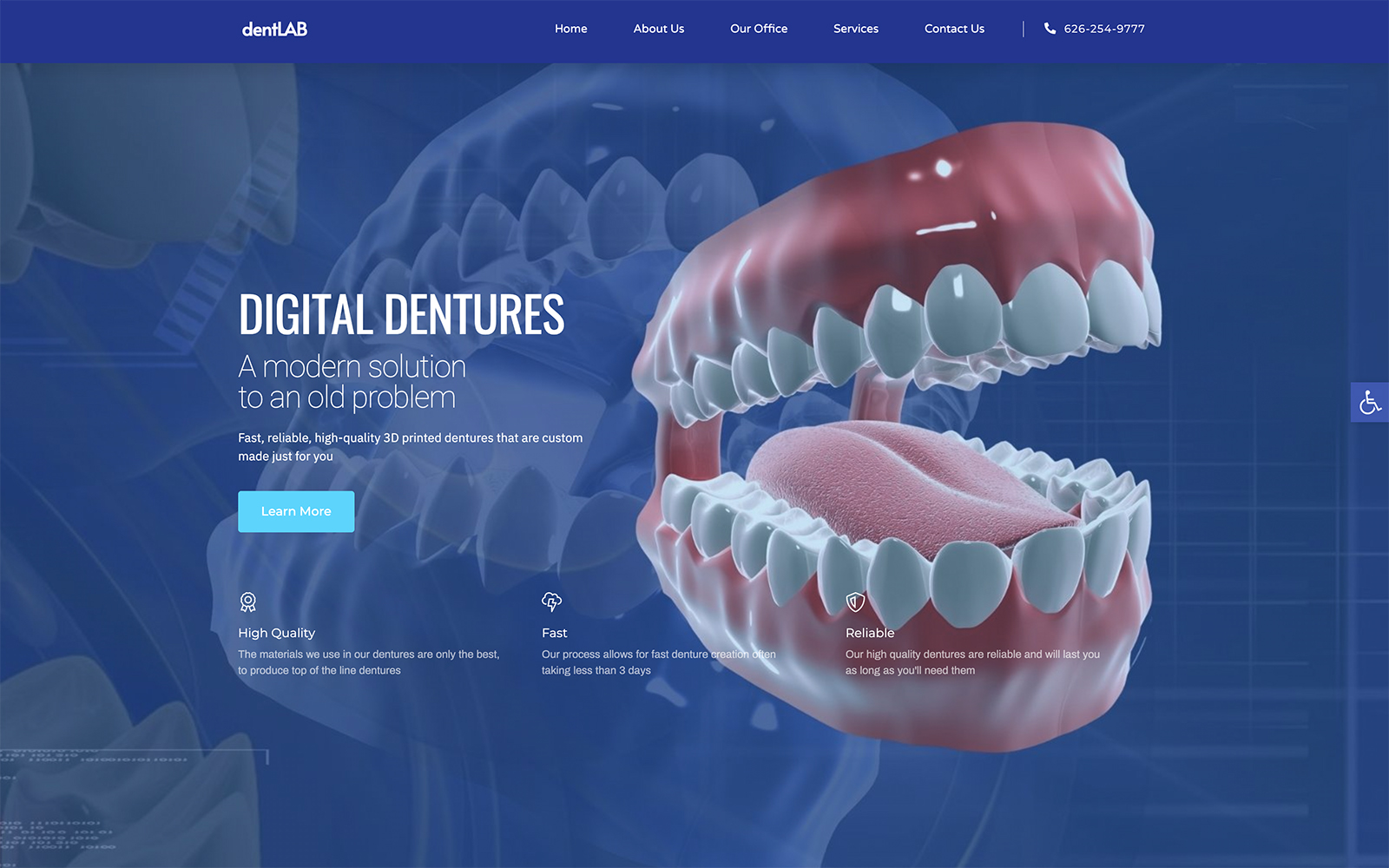
When looking into creating a website for your dental lab business, it’s essential to understand the needs of your visitors. The vast majority of them are going to be dentists looking for quick, accessible, and affordable solutions for patients that need dental prosthetics. These busy professionals want to be able to get to the necessary forms, know how to send molds or transmit digital files, and get a feel for your work quickly and easily.
Below we’ve put together a list of sites that accomplish this goal exceptionally well, each one having a strength of its own that makes it stand out from the crowd:
1. Reflections Dental Laboratory, Inc
Visit Reflections Dental Laboratory, Inc
Aesthetics
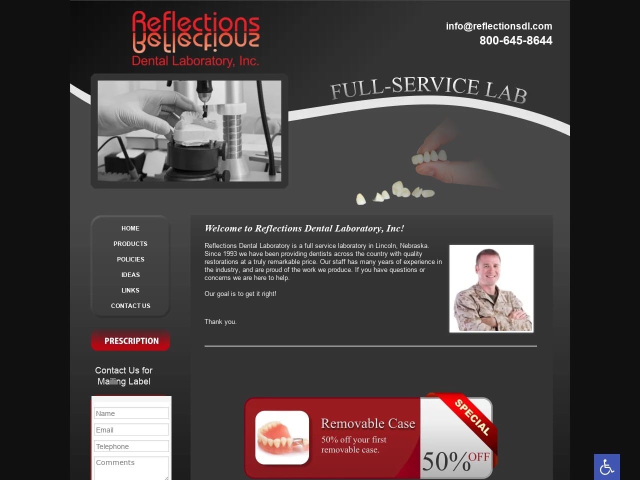
Reflections Dental Laboratory has selected to use a color scheme that speaks to authority and professionalism, blended with a touch of ambition and cool sophistication. Black is known in web design for evoking a sense of sophistication and professionalism, as does the cool gray tone. Red, for its part, is an effective attention-getter that drives viewers to act, making it perfect for use as an action color at interactive points of the website. Their logo has an easily recognizable design that plays off its name and color pattern to produce a striking image. The site itself is very lightweight throughout, never using too much text or too many images, instead of creating a perfect balance that makes for an incredibly approachable design.
Functionality
The overall design of this site leans heavily on function, providing links to their email and click-to-dial integration right at the top of the first page. The compact and minimalist design of the main page includes only the essentials, including recent deals offered by the clinic and a HIPAA secure form for submitting requests for a mailing label. An easy-access printable prescription form is also linked from the main page, further streamlining the dentist’s interaction with the site to emphasize efficiency. A very compact menu on the left side of the screen is perfect for desktop and mobile viewing sizes.
2. Verch Dental Ceramics
Aesthetics
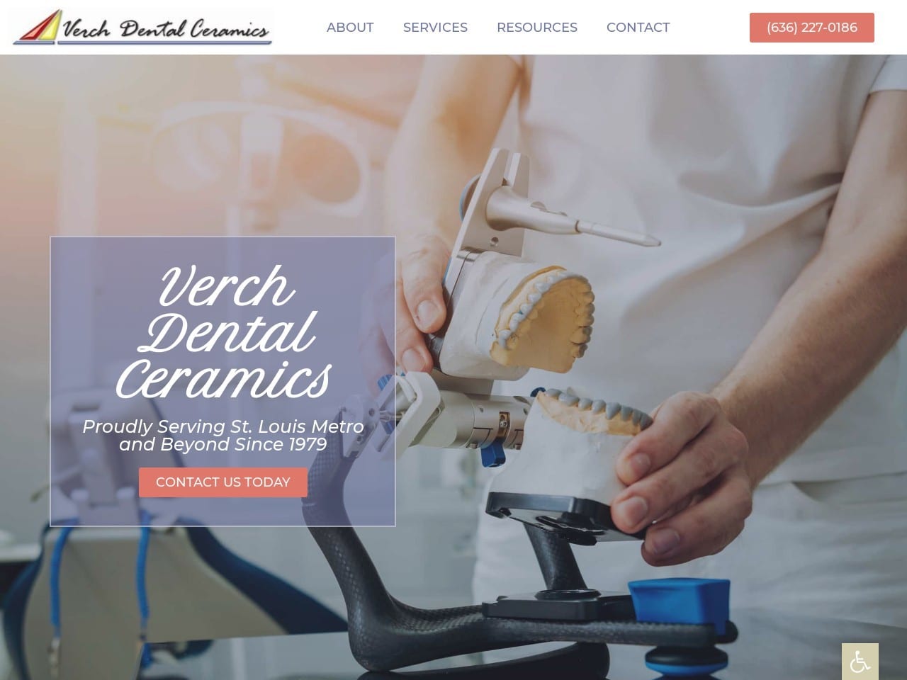
Verch Dental Ceramics focuses immediately on demonstrating the heart of its business by presenting a slide show that illustrates the various stages of its work. Orange and blue aren’t common partners in web design, but this site shows that the combination of warm, engaging orange and hope-filled blue pair together quite well when handled properly. The home page relies heavily on imagery to convey information, a logical choice in a business centered on getting results. The pages presenting their products use an even more minimalist approach than the homepage, displaying information as a series of bullet points rather than using prose. The entire site comes together to present a viewing experience that is both visually appealing and useful. At the bottom of the page can be found a HIPAA secure form for requesting information from interested parties, and it uses a streamlined form to make it seem more inviting.
Functionality
Form meets function in the design of the Verch Dental Ceramics website, following the common theme of click-to-dial integration at the top of the screen for maximum efficacy on mobile devices. The menu at the top of the page works well on desktop screens but shows its strength when it collapses to a hamburger menu thanks to mobile responsive design. Orange effectively attracts the viewer’s eye to buttons directing visitors to areas they can learn more or take action on the site. Patient instructions and forms are available to help visitors understand the steps they need to take and have the right paperwork right at their fingertips.
3. New Horizons Dental Laboratory
Visit New Horizons Dental Laboratory
Aesthetics
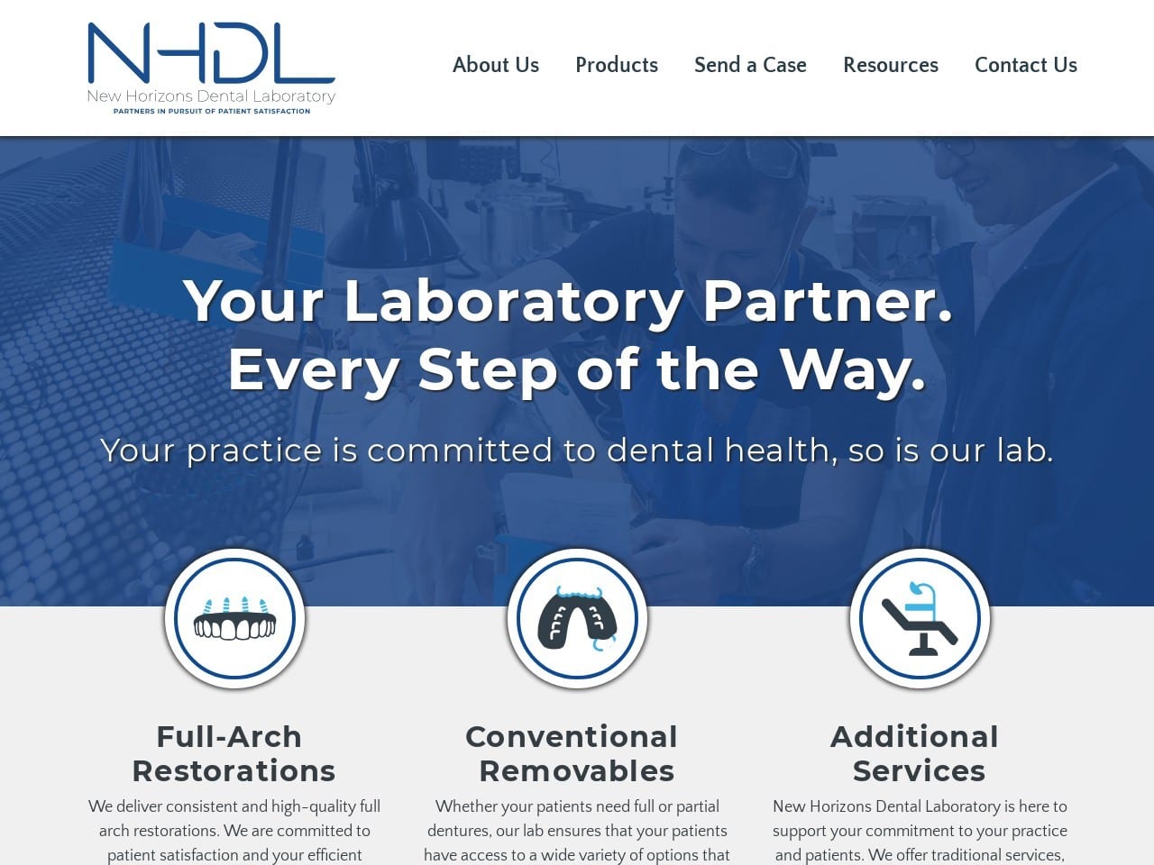
A sharp, well-designed logo combines with a simple color palette to produce a highly professional website that gets down to business immediately. Blue and white are great contrast colors, and blue can contrast with itself quite while throughout a range of shades. Stylized buttons create a sleek and high-profile appearance that is simple yet striking. Each menu section moves smoothly to reveal additional options that give the site a well-polished feel. Images are used where they count throughout the service section. Each section presents a clear set of images showing what the dental lab can do, accented by just enough text to get the necessary information across.
Functionality
New Horizon Dental Labs uses a great balance of text, images, and color to create distinct sections throughout the site, making locating the information you’re looking for a breeze. The ever-present contact form located in the footer is an excellent innovation that means reaching out to the lab is never more than a flick of the scroll wheel or finger away. Beneath that form is easy to access to the dental lab’s social media presence. More in-depth communication can be established through the Contact Us page via fax, phone, email, or the full-detail contact form found there. All points of the website are secure for the transmission of patient data, including the forms.
4. CB Dental Laboratories
Aesthetics
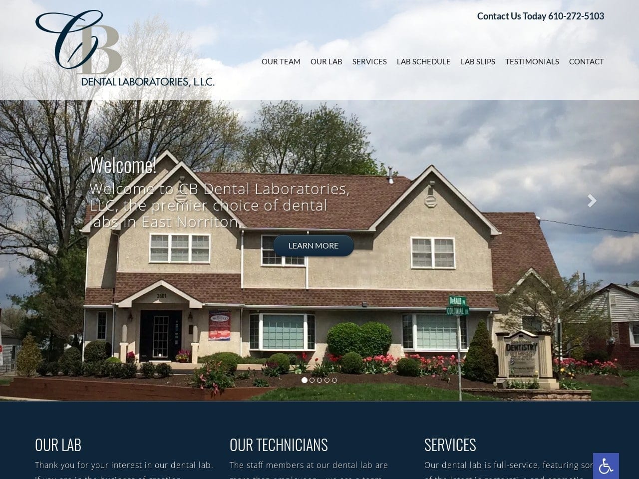
CB Dental Laboratories takes an interesting approach to its business, emphasizing the unity of business and customer care in a family-like atmosphere. The slideshow that greets visitors starts with a shot of the home-like lab location followed by images that introduce the viewer to the clinic staff and their work. Especially emphasized is the hands-on nature of the dental labs’ work, showing each piece to be hand-crafted. The Navy blue used in the site’s color palette delivers a subtle undertone of professionalism and sophistication, deliberately off-setting the ‘family-oriented business’ with a solid business feel. This combination of elements creates a site that delivers its message “Professional laboratory results from a family-oriented atmosphere.”
Functionality
The website’s layout isn’t incidental or purely artistic but serves a functional purpose. The framing of the home-like lab is intended to deliver a message. That message helps to begin building rapport with both visiting patients and family-oriented clinics alike. The prominence of the clinic’s qualifications and associations combined with the professional appearance of the Navy Blue and White palette to boost credibility. Forms are easily obtained through links at the bottom, as is access to the clinic’s phone number and email address. The lab stands by its work, which includes an easily accessible testimonial page. Receiving testimonials from patients and physicians shows that the lab cares about the opinion and results received by its clientele, a testament to its accountability.
5. Crown Depot Dental Lab, Inc
Visit Crown Depot Dental Lab, Inc
Aesthetics
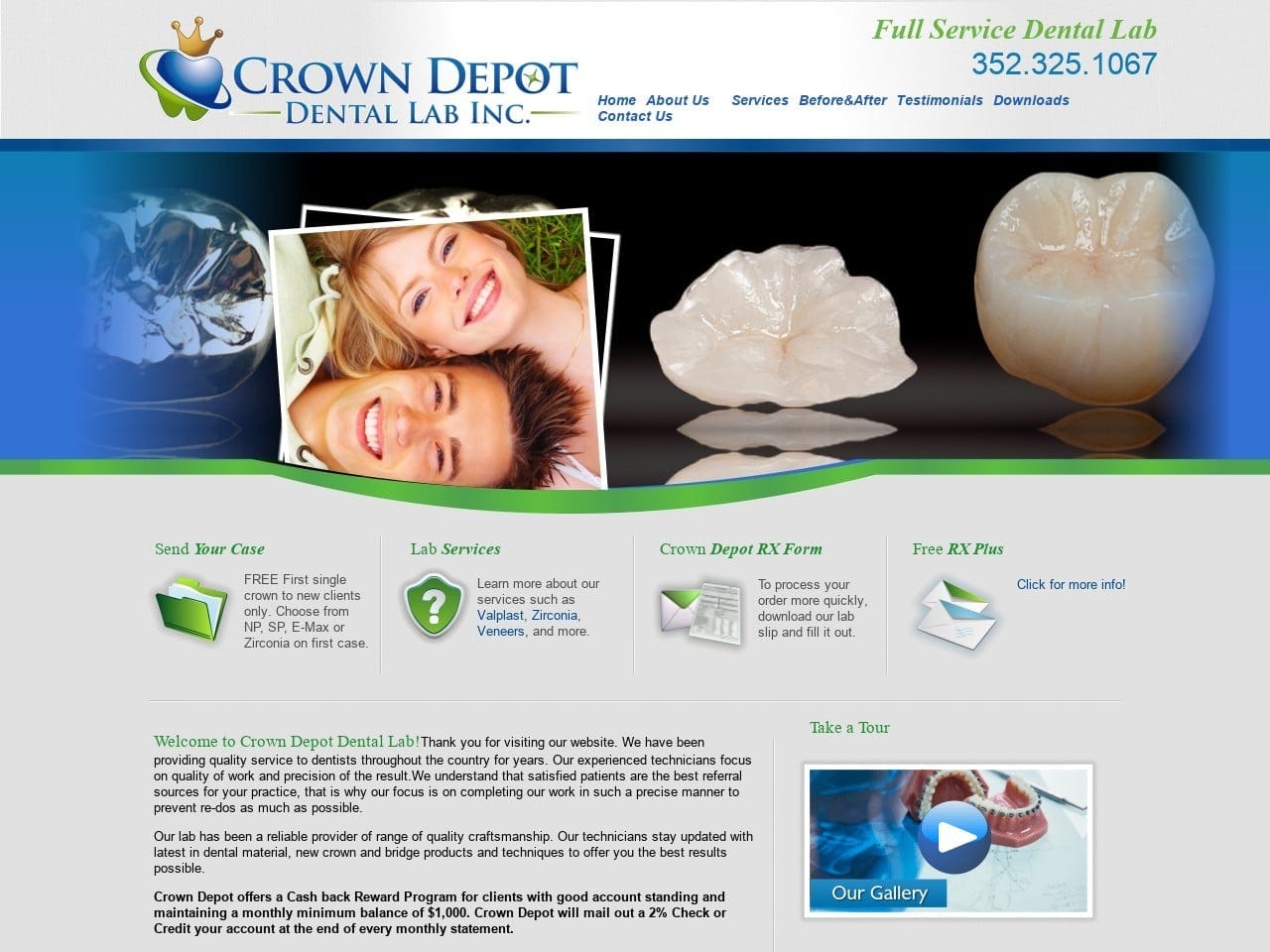
Crown Dental Lab uses static and dynamic imagery on its site, creating a technologically up-to-date appearance that instills confidence in its visitors. The blue, green, and white color palette is particularly striking, and the subtle use of the stronger colors makes it look sleek. Green and blue see equal use as action colors on the site, drawing visitors’ eyes to points where they can provide and request information from the clinic. The main page doesn’t overstay its welcome, using a short single-page format to pack in ample amounts of information while respecting the use of white space to create an organized and readable design. The presence of Before & After galleries and testimonials proves they stand by their work. This is accomplished by giving visitors a direct view of what the lab offers.
Functionality
A surprising amount of functionality is present in a very small space. We see another instance of click-to-dial technology, a piece of mobile integration, included in the page’s header. From there, the site offers access to the forms, information about lab services, RX forms, and other essential paperwork useful to both returning and first-time visitors. They use integrated video technology to demonstrate their work and information about their lab and build rapport with their potential clientele. As the website’s footer is reached, we find a direct-to-map option for local providers to the lab. A subscription form is also available to help clients stay in contact with the lab. A quick navigation menu and office hours are also prominently displayed at this point on the site.
6. 5 Axis Dental Lab
Aesthetics
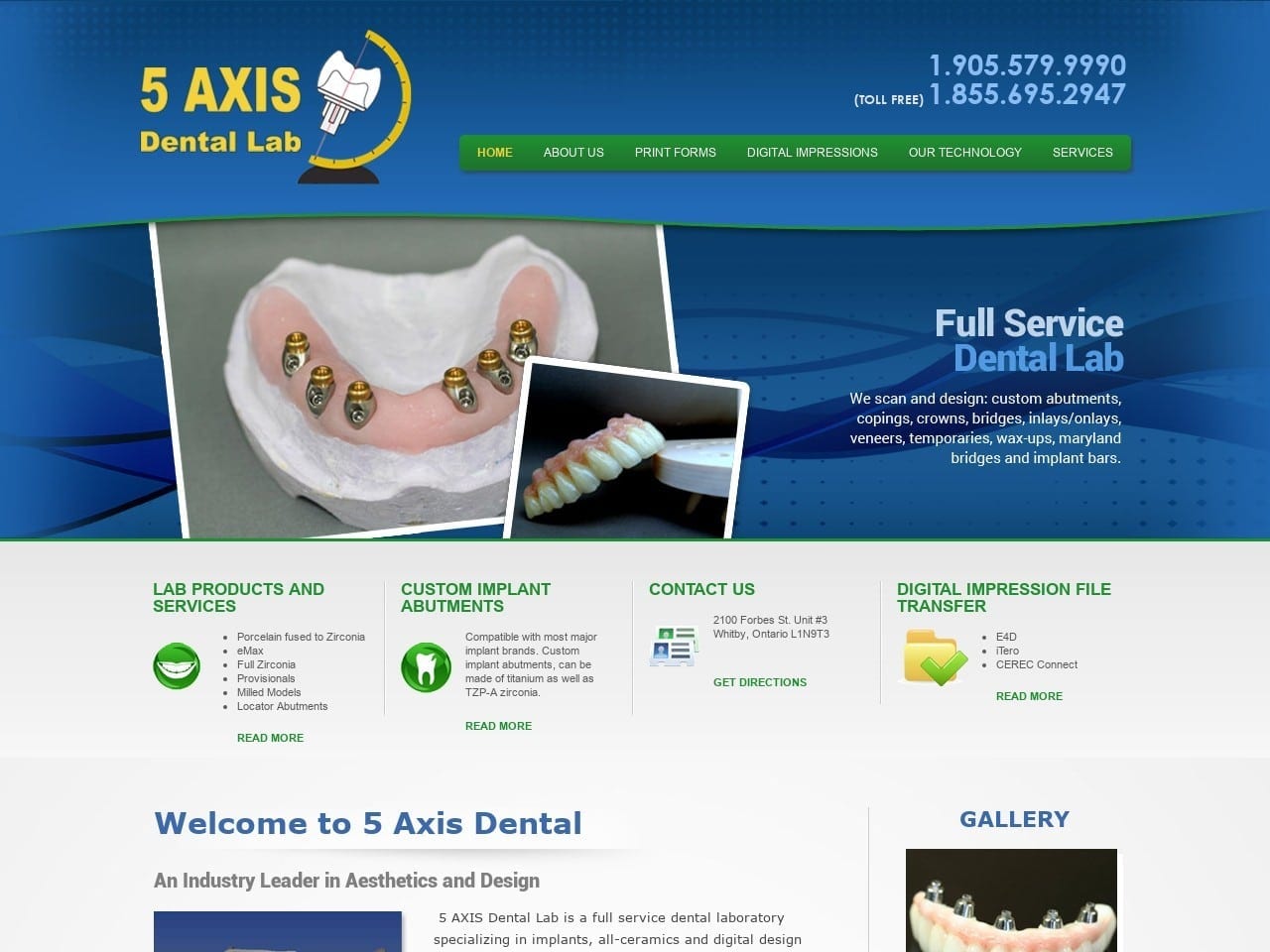
5 Axis Dental Labs makes excellent use of imagery on its website to transmit information about the services it offers. The main entryway to this page is remarkably similar to that demonstrated in Crown Depot above, and we have to admit it’s quite effective. This design scheme elicits a professional and small-scale industrial feel that is appropriate for a dental lab. The striking green, blue, and white palette is also familiar and effectively highlights important areas, such as the menu and action points throughout the site. The drop-down menu provides easy navigation while adding a polished feel to exploring what it offers.
Functionality
There’s a lot of functionality packed into this site’s lightweight design. Information about Lab Products and services, Custom Implant Abutments, and how to contact the lab are all prominently available. Digital Impression File Transfer functionality is made accessible and explained thoroughly on the associated page. Accessibility functions can be set through the easy-to-identify handicap symbol located at the bottom of the page, providing multiple options to aid visitors with related issues. Each service page provides information about its offerings in a combination of text and imagery that is comprehensive and easily understood by the target audience. Also available on the site is a thorough list of forms that physicians can download to smooth the ordering process.
7. AMR Dental Ceramics, Inc
Visit AMR Dental Ceramics, Inc
Aesthetics
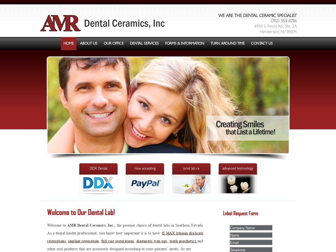
AMR Dental Ceramics makes a solid impression when the home page loads up with its red and white color palette that uses black as an undernote. The gradient coloration of the red and black creates a sleek design that feels motivated and sophisticated. The slide show that plays center stage runs through a series of bright smiling faces demonstrating the results clients can expect from their patients when working through AMR. The main page is quite short, which is part of its strength as it aids loading times on mobile devices and desktops alike. The rest of the site stands on this same emphasis, with nary an image to be found outside of that main page.
Functionality
The lightweight design of the page makes navigation a breeze, seemingly seamless as visitors move from one section to another. Information is provided in concisely composed sets of prose on each page, the design foregoing images almost altogether. The features on this site are as lightweight as the design itself, focusing on the essentials. Payment portals are available, along with printable lab RX forms. Regarding easy-to-access sites focused on efficiency and quick issue resolution, this site stands out as a no-frills, down-to-business example.
Promoting Your Dental Lab Through Web Design
Having a sound marketing strategy is crucial. As your first opportunity to make an impact on your customers, your website design means everything. But if you don’t know what you want from your design, these are the features that you should look for:
- Visual Design: People value visual design. The visual design combines numerous aspects, including color theory, photography, animation, and more. Having a visually appealing website that conveys trustworthiness and professionalism can create the maximum effect you need.
- Content: Just as important as visual design, your content should efficiently convey who you are, as it is the backbone of your website. All information on your website should be easy to read, concise, and help build customer trust.
- Navigation: To engage with your website, your website should be easy to navigate and make all information accessible. Plugins such as Google Maps, text-to-speech capabilities, and header menus can help organize information for easy access.
- SEO Friendliness: As the underbelly of the website content, no matter how visually appealing your website is, if your website’s pages don’t have SEO optimization, then your viewers won’t likely see your website on Google’s search results.
- Pay-Per-Click: Another aspect of web design is its pay-per-click advertisements. Running PPC ads on your website will allow you and your social media platforms to target your audience more and help retain customers.
- Branding: Similar to visual design, your brand should be easy to remember and reliable. Any logo you use to identify yourself with should allow your audience to have a mental connection to your business and thus improve your website’s overall image.
Marketing your dental lab to your potential customers can help you grow and expand your business to new heights. It generally starts with having the base core of your strategy, your website, looking professional and clean. If you need an agency that specializes in digital design, then Optimized360 may be able to help. Visit our dental lab website gallery to learn more.
Conclusion
As you end this list of sites, one thing should stand out loud and clear. Each one is a testament to web design that captures the essence of the business and strives to serve the needs of dental lab clients well. From easily accessible forms to compact designs, dental labs’ website design often doesn’t lean too heavily on frills or gimmicks. Dentists want to take care of their business quickly and inexpensively while providing their patients with the highest possible quality dental prosthetics.

As you begin planning your dental lab website, make sure you take the time to research your competition. Each of them is going to have things they do well and things they do poorly. Take notes about each so you know what you want to avoid and what you want to emphasize on your site. When it comes time to develop your site, reaching out to a team of professionals often pays. Website design is a multidisciplinary project that requires knowledge and experience in color theory, digital marketing, and website back-ends that takes years to perfect. Whether you hire a team to do the work or merely pay for a consultation, it’s not a step you should skip in your design process.


