For those in neurology, showing off your knowledge and expertise is crucial to creating a professional image that matters. In these cases, physicians specializing in these areas must expand beyond traditional marketing practices to reach these patients. As the healthcare industry attempts to expand more digitally, neurologists looking for the upper edge might also need to use marketing techniques to appeal to patients with these conditions. However, many often neglect website design, leaving many practices in dire circumstances.

To solve this issue, many marketing agencies can customize and create neurology and neurosurgery websites to reach patients online. Website design plays a crucial element in strategic marketing practices. Today we will look at some of the top neurology websites designed and provide you with some more useful tips to help expand your practice.
1. Cascade Brain And Spine Neurology
Visit Cascade Brain And Spine Neurology
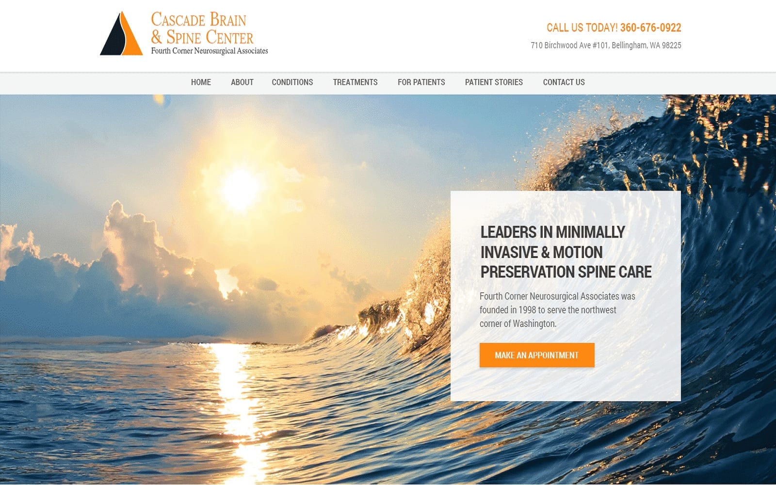
What We Admire About This Neurology Website: Cascade Brain and Spine Neurology focuses on creating a place of healing and trust, building its reputation through comforting imagery and warm colors. Its use of bright orange and mellow browns helps rejuvenate patients, bringing them further into the website through action buttons and transparent layers. However, these colors are minimally used as the website uses the available white space to create smooth transitions between information for a more professional and personal feel.
2. Forth Worth Neurosurgeons

Visit Forth Worth Neurosurgeons
What We Admire About This Neurology Website: Forth Worth Neurosurgeons plays with a widescreen expansion for its design elements, using clean borders and seamless transitions to play into the dream-like aspirations for healing and growth. Its imagery plays a vital role in providing the website with a natural feel, and its use of indigo blue helps to soothe and calm new patients throughout the site. To help navigate new patients, action buttons and hyperlinks are used, thus creating a trustworthy, professional feel that’s engaging and active.
3. Premier Neurology & Wellness Center
Visit Premier Neurology & Wellness Center
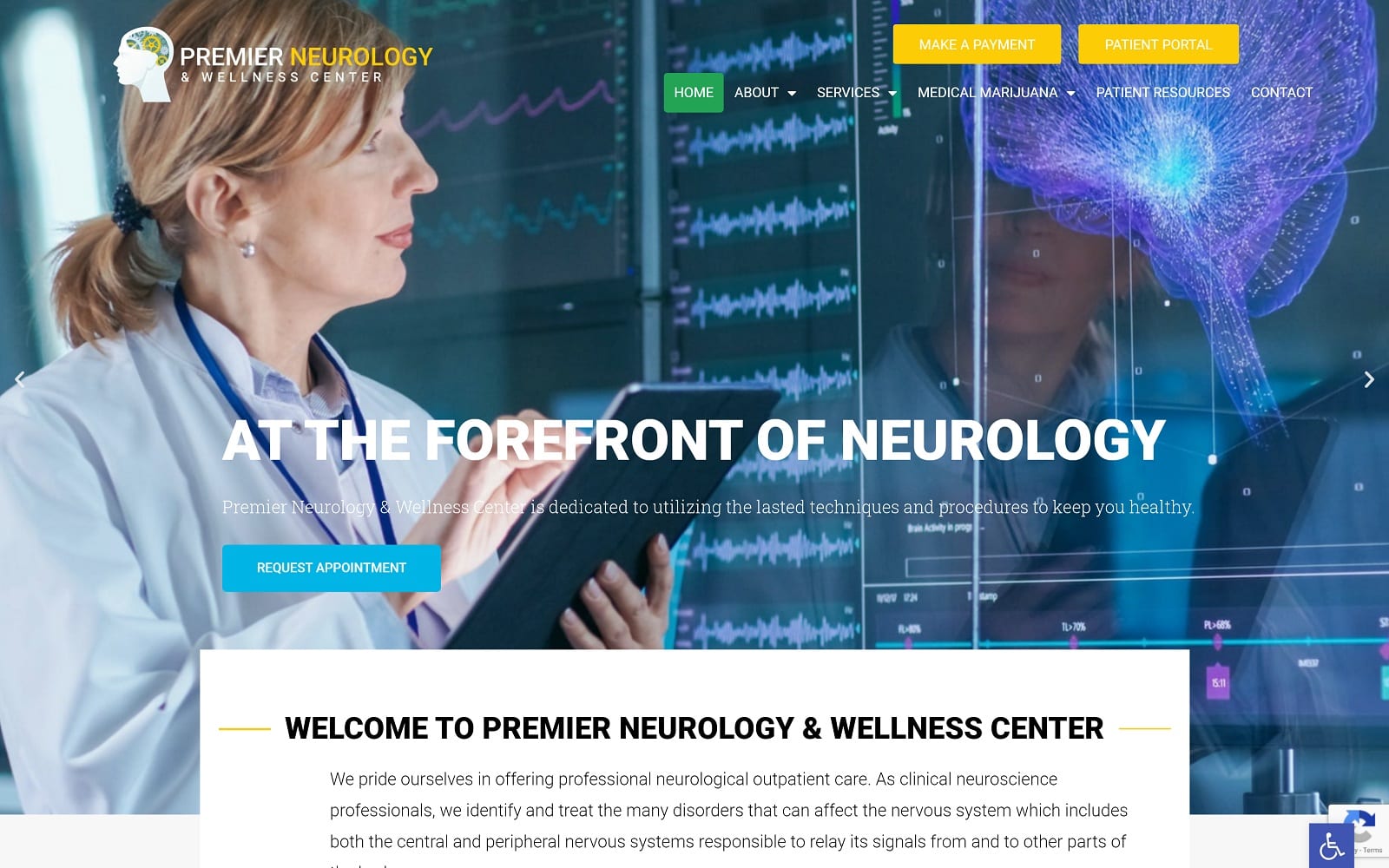
What We Admire About This Neurology Website: Premier Neurology & Wellness Center plays with vibrant, energetic colors and imagery to present a liberating feeling for new patients, bringing a sense of intensity and urgent action to new patients. Instead of working with cooler, calming colors, bright yellow acts as the action color to bring new patients in, alongside red and green to complement the use of yellow throughout the home page. To prevent patients from becoming overwhelmed, invigorating imagery acts as background layers throughout the website to counteract this use of color. Overall, their unique take on their website design makes them highly engaging in a whole new way.
4. Michael Chen MD

What We Admire About This Neurology Website: As both a portfolio and practice, Michael Chen MD sticks with an elegant look, utilizing the power of black, blue, and gray to appeal to new patients. Its imagery plays well with the seamless background transitions present and acts as the story-telling element that brings new patients in. Through the use of action buttons, hyperlinks, icons, and widgets, each image help accentuates his professionalism and presents this neurological clinic as a diligent, trustworthy place to receive care.
5. Adaptive Neuropsychological Services
Visit Adaptive Neuropsychological Services
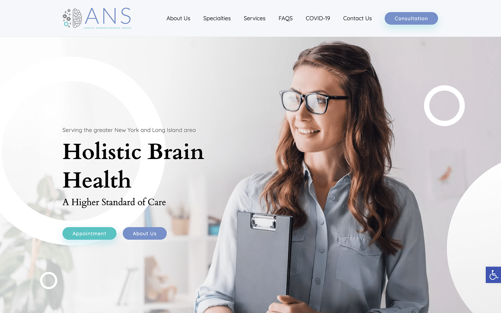
What We Admire About This Neurology Website: Adaptive Neuropsychological Services brings neurology and psychology together, helping those suffering from neurological conditions better understand behavior and learning. Because of this unique specialty, clear white space combined with bright, clean imagery makes way for new patients to be engaged and interested in the topic. To emphasize this unique component, teal and lilac blues compliment the webpage through its action buttons, icons, and hyperlinks. Its professional transitions give this website a one-of-a-kind appeal to patients needing a different form of treatment.
6. Cherry Creek Neurology
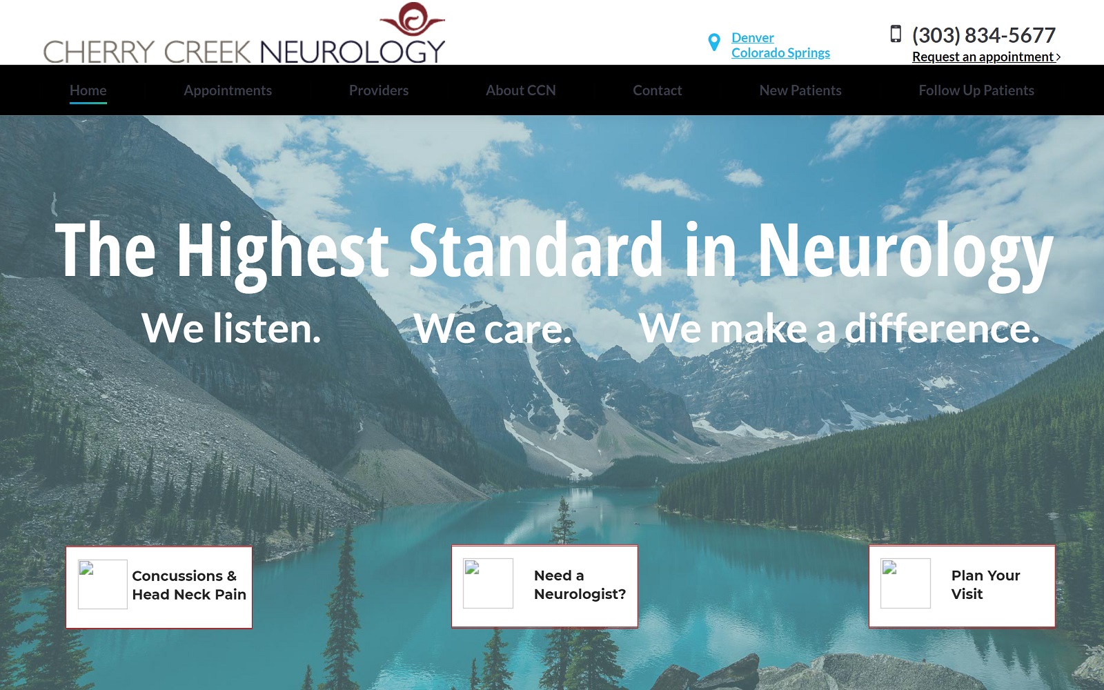
What We Admire About This Neurology Website: Cherry Creek Neurology works to provide a professional outlook while also staying in touch with its distinctive image, working within its color scheme to provide comfort, ease, and reassurance. By working with contrasting colors such as cherry red and sky blue, these colors work to highlight sections and lead new patients toward hyperlinks and accent icons. Its imagery provides a calming atmosphere, and presenting its information through large sections makes for a simple, straightforward presentation for their practice.
7. Andrew M Lerman MD
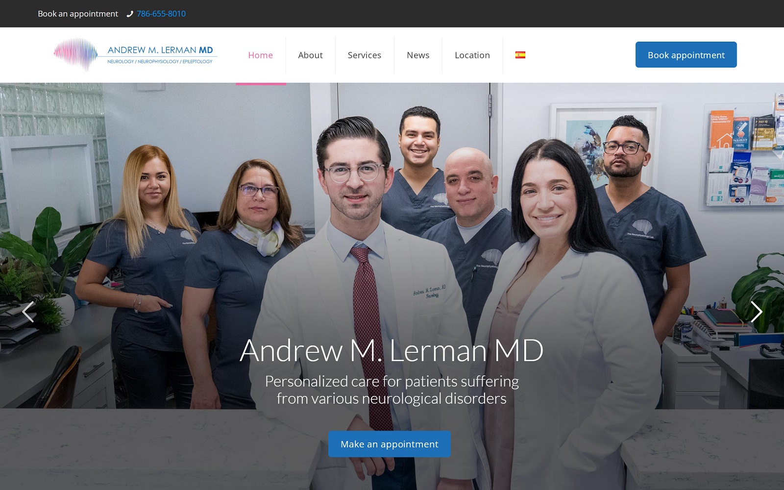
What We Admire About This Neurology Website: As a practice focusing on personalized care, Andrew M Lerman, MD, plays with a pink and blue pastel aesthetic to accent icons and action buttons, leaving the remaining white space to provide patients with an insider’s look into the practice itself. Through slideshow images, boxed sections, and the following header, this website work with the professional feel of blue and the charm of pink for a more creative touch to their website’s overall image.
Neurology and Neurosurgery Marketing Ideas

Every practice will have its own goals and objectives, but in neurology, defining who you are in your field can be laborious, especially considering the time, effort, and investment you’ve placed. Neurology practices tend to focus less on their identity and focus more on achieving a reliable, stable, and knowledgeable disposition. But this often leads to some issues down the road. Neurologists are a vital aspect of the medical industry, but for those who lack guidance on their brand image, their marketing goals tend to suffer as a result.
Defining your expertise and expanding on it is the key to reaching those who need your services the most. This means that your practice should include a mixture of both a trustworthy disposition and your specialties. This includes:
- Technological Innovation: If your practice works to keep up with technology’s latest, or your practice partners with specific brands, then expanding on these technologies can help reassure your patients.
- Define Your Specialty Focus: If you look back on your past and current education, expanding on the conditions you treat and niches you work within can help your practice narrow down your audience and reach out with greater impact.
- Understand Your Demographic: Migraines, scoliosis, and Parkinson’s disease often require physicians versed in various treatments. For your demographic, looking at your current patients and their conditions can help you connect to new patients by appealing to their specific needs.
If you want to improve your website, take a look at what Optimized360 can provide for you by checking out their successful examples of neurology and neurosurgery website designs.


