In cosmetic dentistry, your website should be the immediate resource they need to correct their teeth and bring out their beautiful smile. While looks are always subjective, having a cosmetic touch to your services should extend beyond your practice and should also be included in your web design. Your aesthetic approach can be most shown through how you present yourself to the world at large and should complement how you approach your services.
Ultimately, every patient wants a gorgeous smile, but a beautiful dental website should reflect your experience in giving them the smile they need most. Below, we will look into the aesthetics of some of the most popular cosmetic dental websites out there and give you some clues on how your website should complement your aesthetic approach to dentistry.
1. The Sadati Center For Aesthetic Dentistry
Visit The Sadati Center For Aesthetic Dentistry
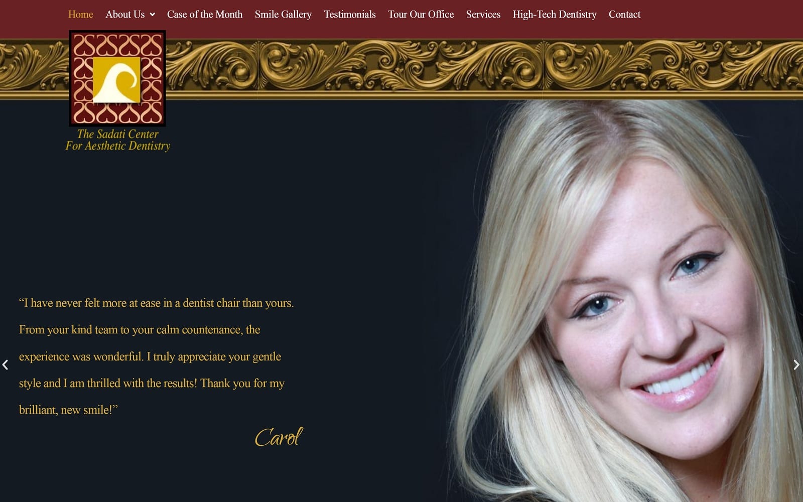
What We Love About This Cosmetic Website: The Sadati Center brings in royal red and elegant gold to illustrate their appreciation for beauty and taste. Through French motifs, graceful borders, and script text, the Sadati Center focuses on the interior design of their practice. Their use of testimonials and a smile gallery throughout the website header helps give new patients a better insight into their practice and ultimately conveys a sense of high-quality care that helps you feel relaxed, pampered, and in excellent hands.
2. Smile Line Dentistry
Visit The Smile Line Dentistry
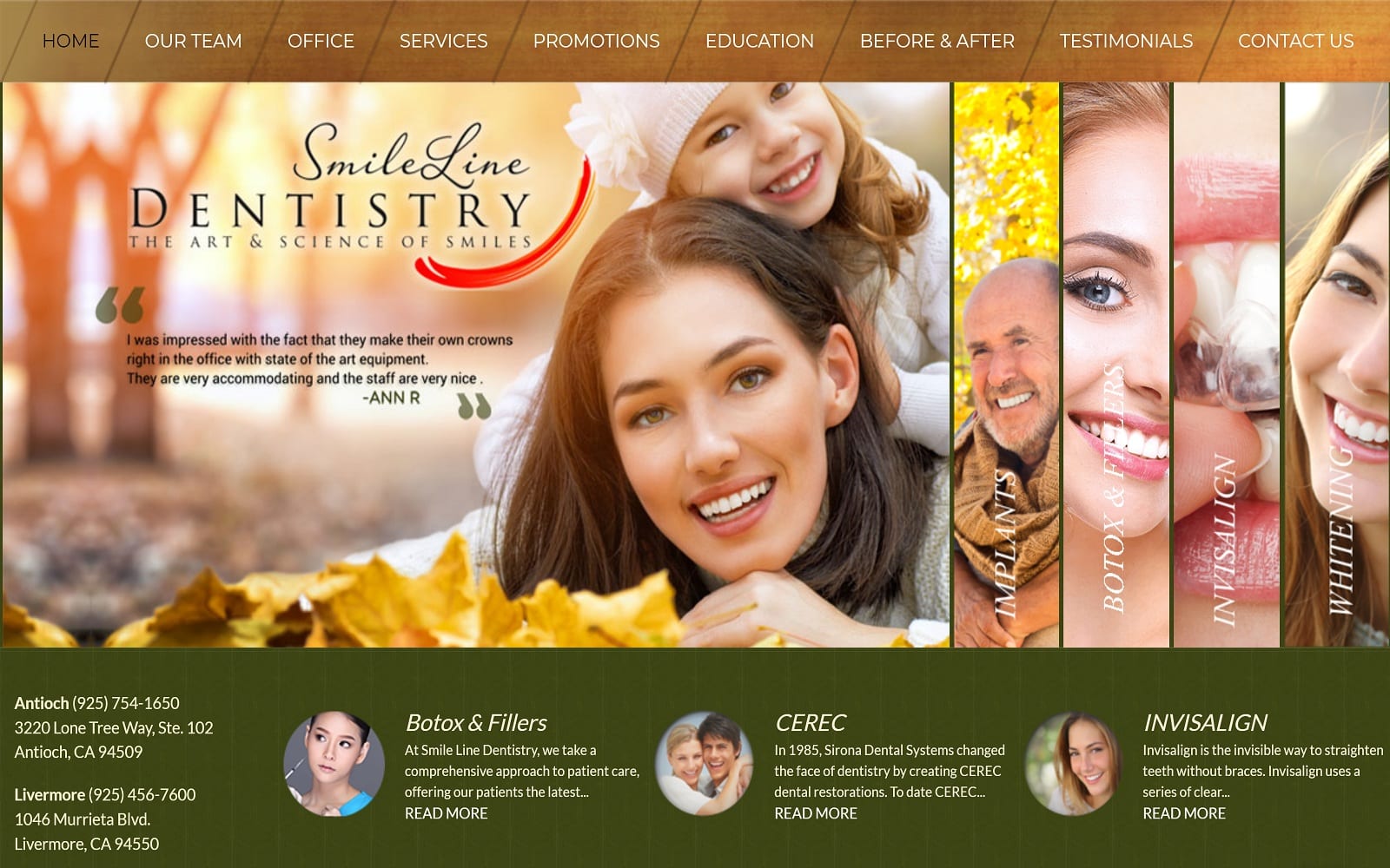
What We Love About This Cosmetic Website: Smile Line Dentistry combines nature-themed elements to convey a sense of collectiveness while refining these elements to portray a simple yet artistic vision of beautiful smiles within. Its center-aligned design elements, featuring its services and testimonials, present all of the practice’s main features upfront while outlining it with warm browns and cool dark greens. Because of these elements, this cosmetic practice appeals to people of all ages within their community to provide services to those who need them most.
3. Neil Hadaegh Dentistry
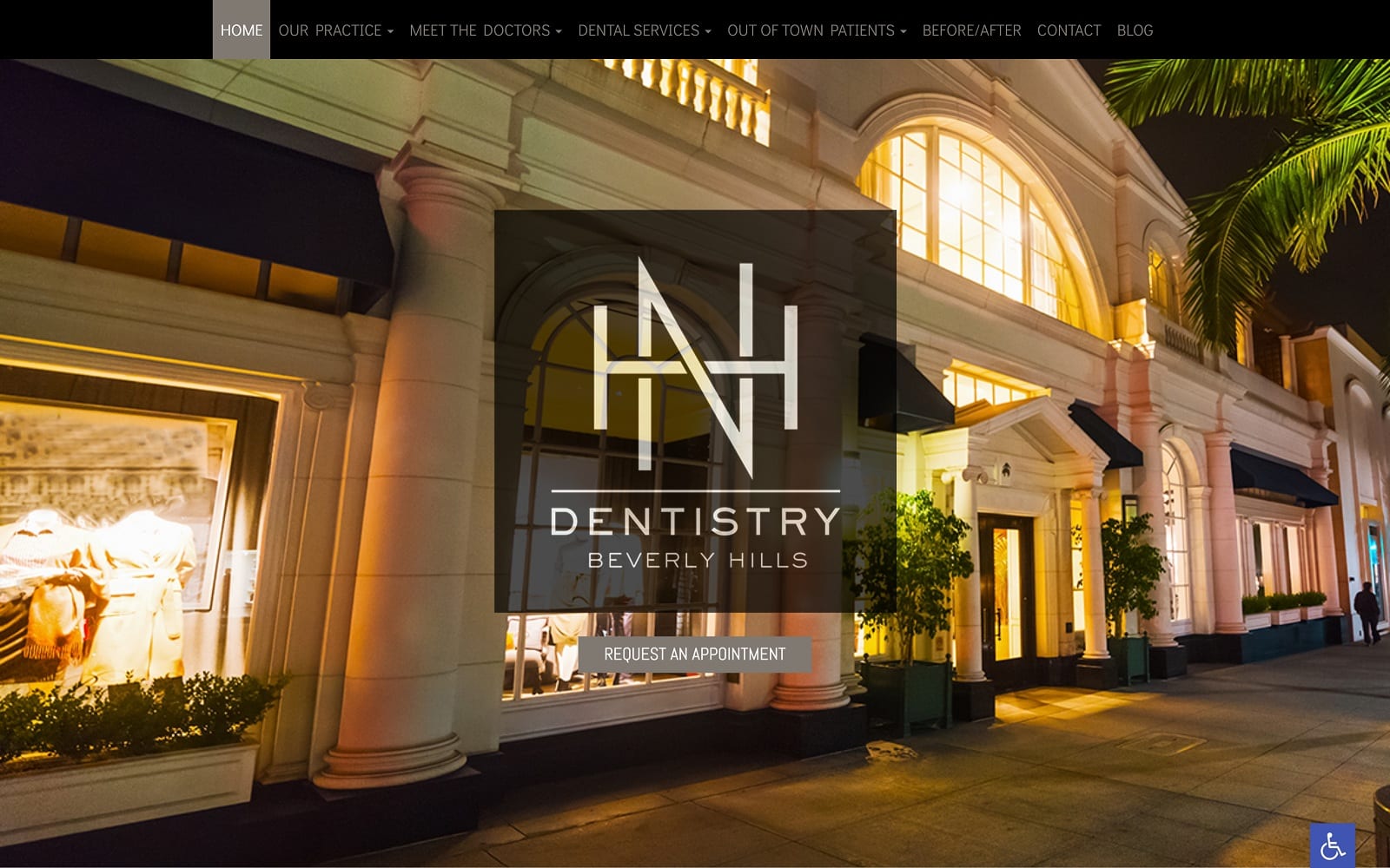
What We Love About This Cosmetic Website: As a cosmetic office competing in Beverly Hills, one of the cities best known for its appeal to aesthetics, Neil Hadaegh challenges to stand out by working with a clean, professional look using monochromatic colors and sleek, elegant themes. Using only black, grays, and whites avoids the flashy colors and draws patients into a practice that focuses on refinement as its key distinction above all else. Overall, this practice’s website uses Hollywood glamour with a personal touch, appealing to a youthful audience ready for their first session. You may also be interested in looking at some Cosmetic Surgery Website Examples.
4. Aesthetic Dentistry of Palm City
Visit Aesthetic Dentistry of Palm City
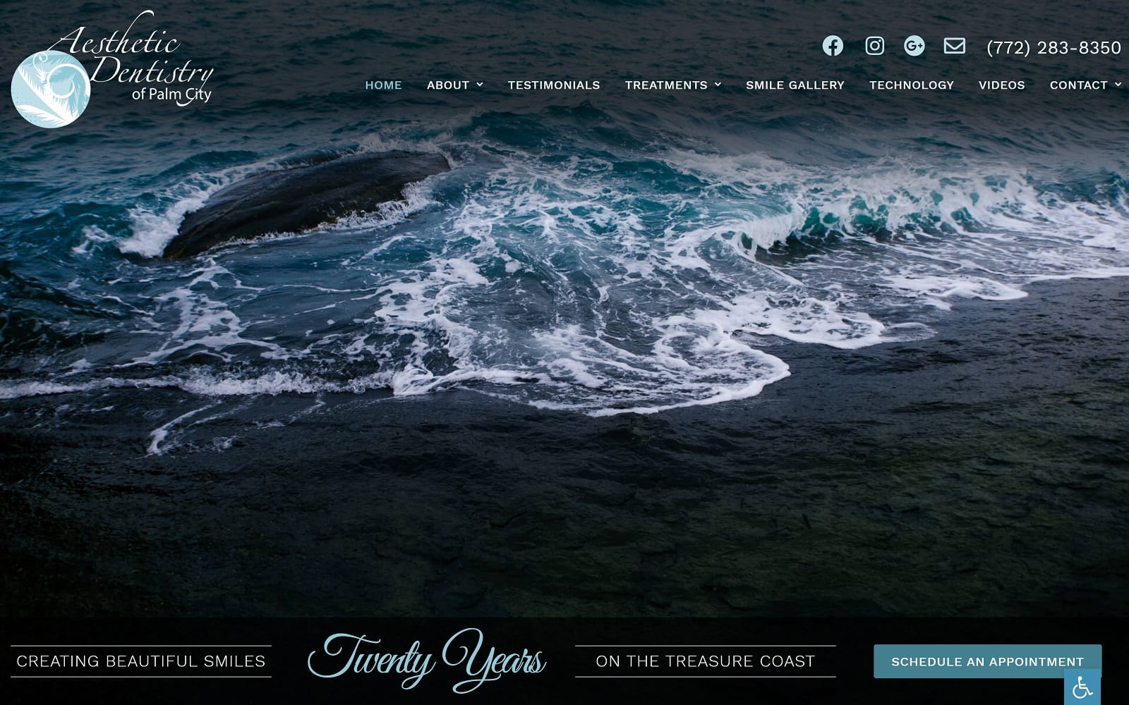
What We Love About This Cosmetic Website: While those in Hollywood want film-ready beauty that looks good in all light, the Aesthetic Dentistry of Palm City focuses on its soothing blue ocean atmosphere and reassurance to appeal to its older audience. By using monochromatic photography combined with ocean blues and whites, their philosophy that beautiful smiles are for everyone reigns true. This practice creates an actively engaging website that works by appealing to its audience and location.
5. Artisan Dental Madison
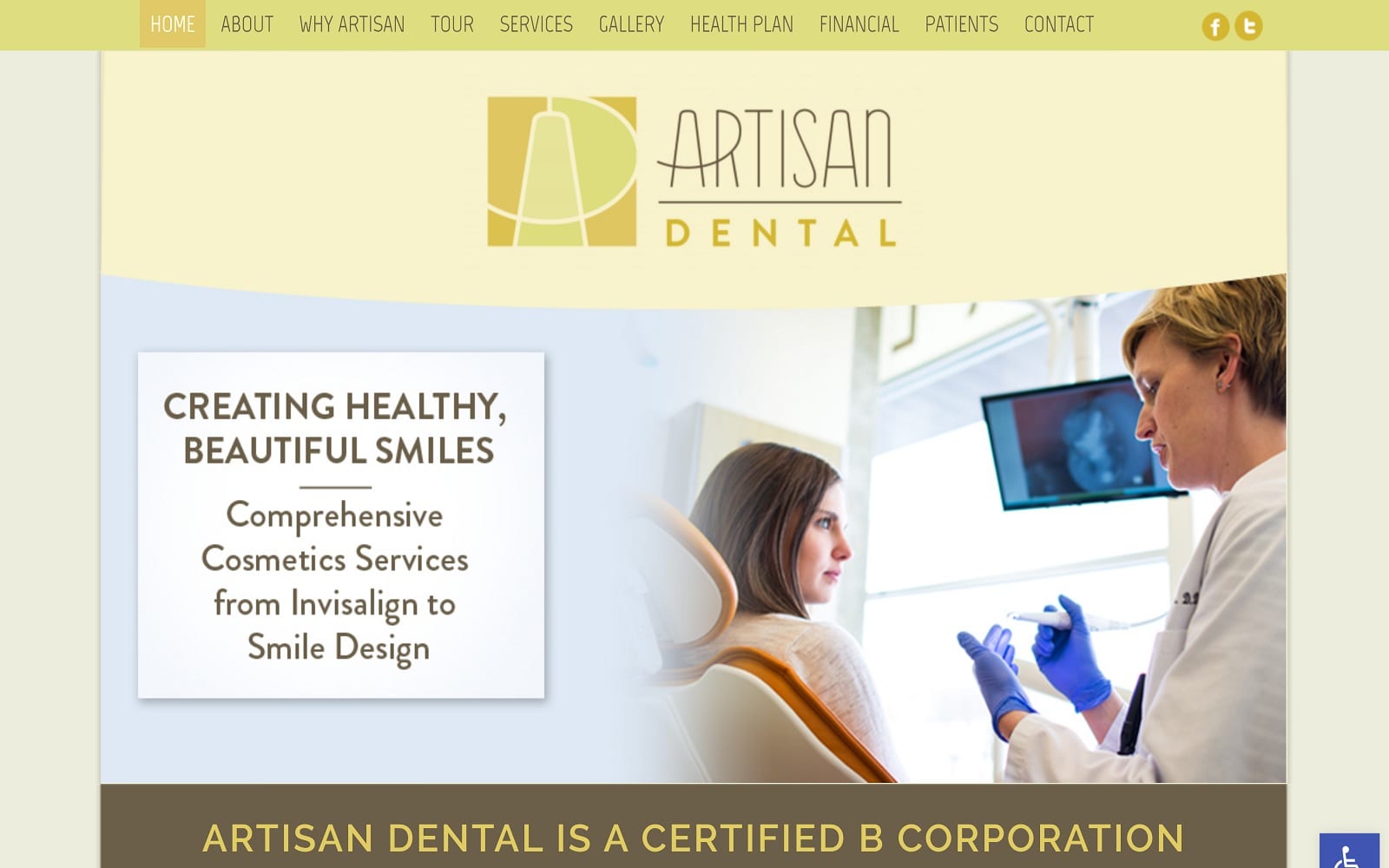
What We Love About This Cosmetic Website: Artisan Dental appeals to a wider demographic and thus designs its website through a simple yet efficient color scheme of warm browns and yellows to structure it in an easy-to-read format. Their results come from understanding their local community and thus reflect their understanding with bold text, action buttons, icon images, and friendly header images to convey their services to adults, both young and old. With this in mind, Artisan Dental makes its impact by appealing to those who wish for fully-encompassing services with care in mind.
6. Alexandria Dental Health & Smile Studio
Visit Alexandria Dental Health & Smile Studio
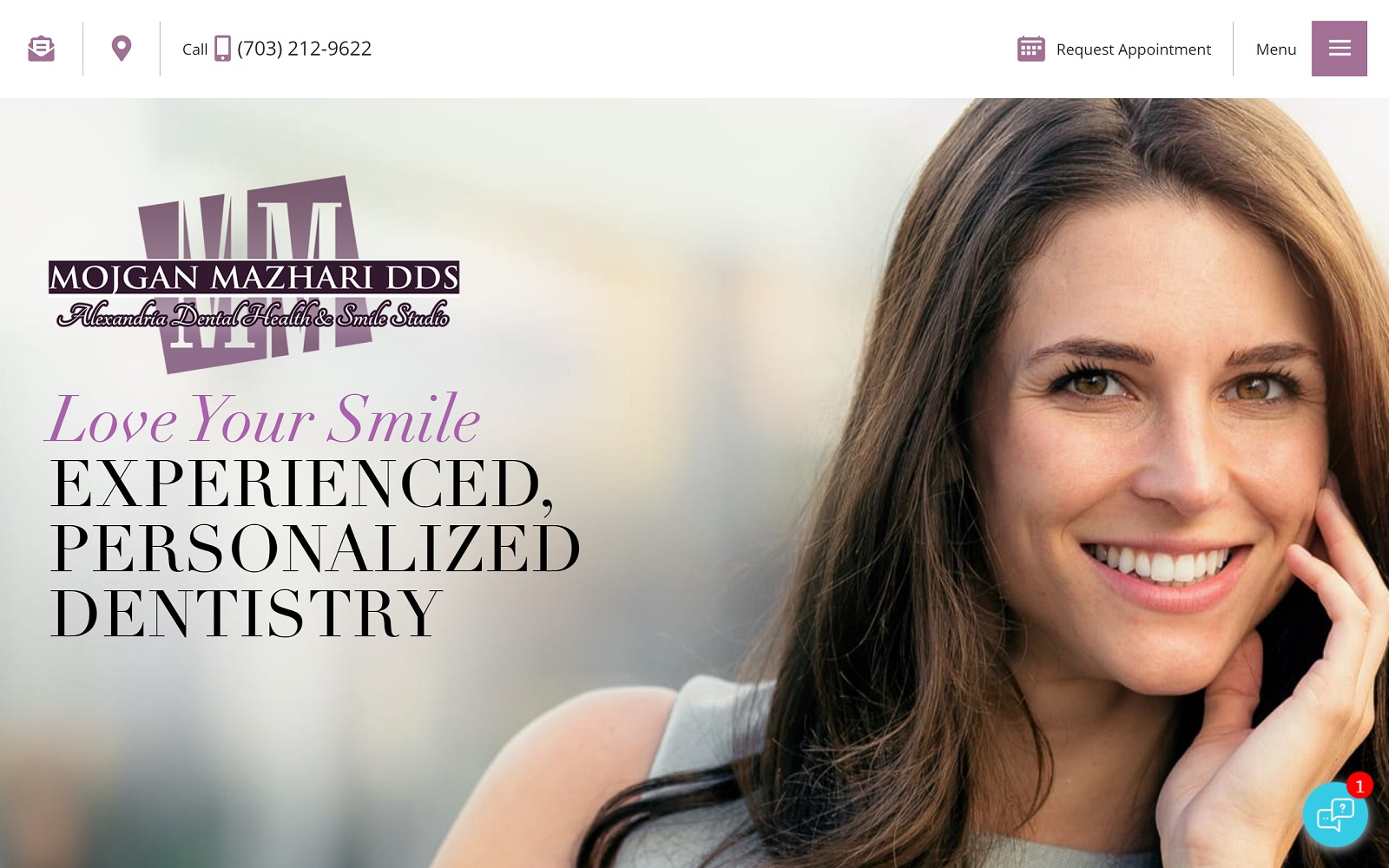
What We Love About This Cosmetic Website: While most practices focus on appealing to traditional aesthetic design, Alexandria Dental Health focuses on personalization as their main focus for cosmetic procedures. Shades of purple accent the website, bringing in sensations of grandeur and making it accessible through its white contrast. From there, bold ranges of text sizes and fonts help accent the page, providing an affordable and comfortable cosmetic experience. Because of these elements, Alexandria Dental Health makes patients’ dental health a one-on-one session with experts to provide them with full mouth restorations that exceed expectations.
7. Designer Smiles
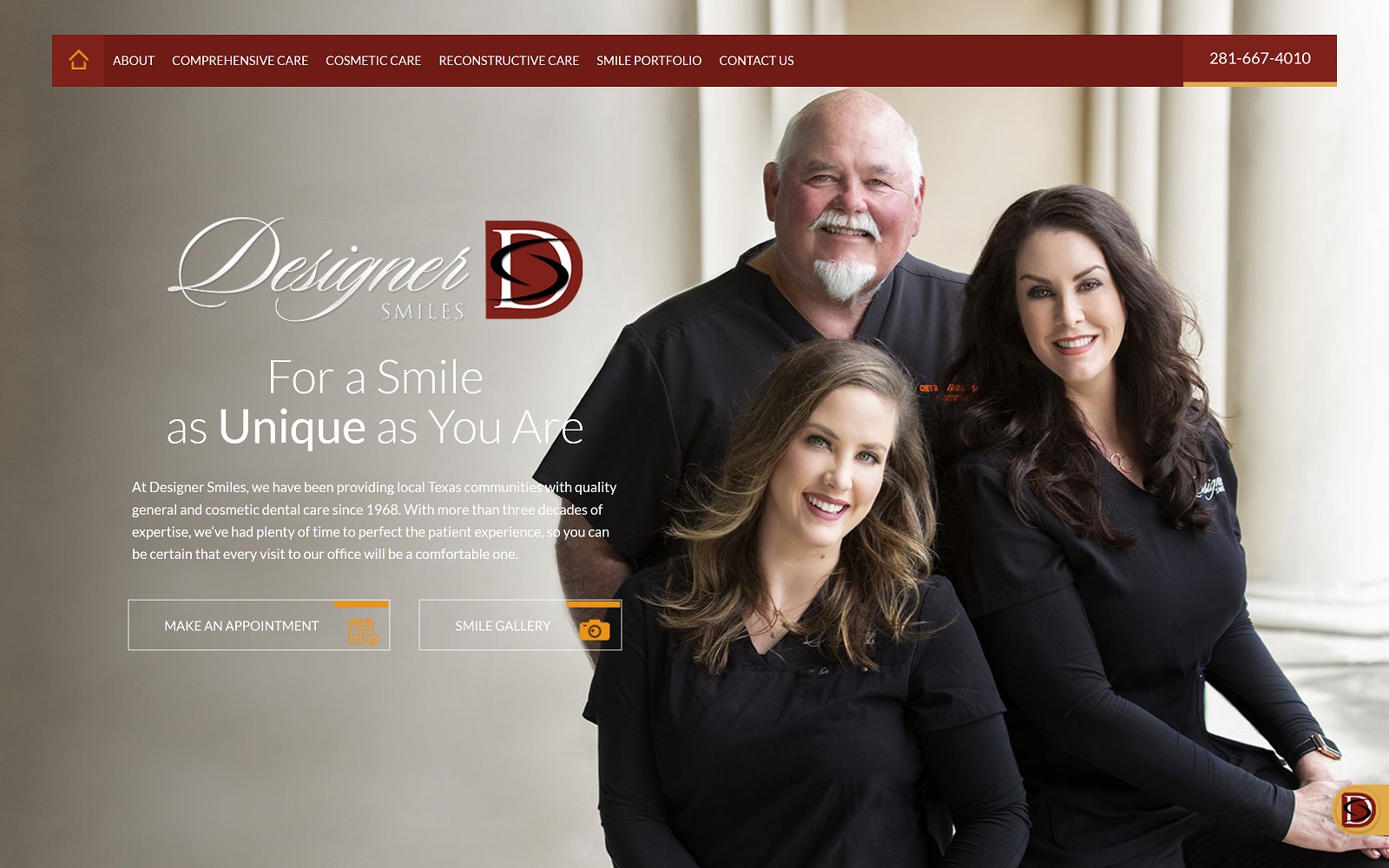
What We Love About This Cosmetic Website: Designer Smiles chooses bold, bright reds, stark whites, and golden yellows as the action color to construct their cosmetic care and accents their web design with faded, flowing transitions and glowing imagery to convey their focus on aesthetically pleasing smiles and quality dental care. Through the use of hyperlinks, action buttons, chat display sessions, and smooth filters, Designer Smiles makes cosmetic dental services appear easy to access for members of their community. Their distinctive color choice and other personalized elements make them recognizable as a qualified practice ready to serve.

What Truly Makes A Beautiful Cosmetic Dental Website?
Is beauty all there is to it to make a good website? While beauty only matters to the eye of the beholder, cosmetic dentistry has to tackle this subjective topic and make it accessible to everyone. This means that functionality also plays a significant role in how dental websites work to bring in patients. The first impression matters, but if your website isn’t mobile-friendly, then your practice will suffer tenfold from this impact. Seeing real-world examples of beautiful dental websites can help inspire you to think more about your own website and ask yourself about the value your website has to your practice and its image.
When it comes to observing your website in a new light, you can consider these tips to help you design them better:
- Form Compliments Function: Beauty shouldn’t be the primary goal – functionality helps promote your aesthetics and conveys your professionalism and integrity when helping your patients.
- Knowing Web Design Principles: To improve your website’s functions, basic concepts such as contact forms, mobile-friendly design, testimonials, headers, footers, and image placement can help you succeed along the way.
- Your Website is For Your Patients, Not You: A website can be a great portfolio for your business, but it’s not doing its job if it doesn’t market to your patients. Communicating with your new patients is key to appealing to those in need of your services, and keeping your website updated can provide them with reassurance and trust.
If you want to improve your website, take a look at Optimized360, the #1 dental website designer in the USA.
