New design idea

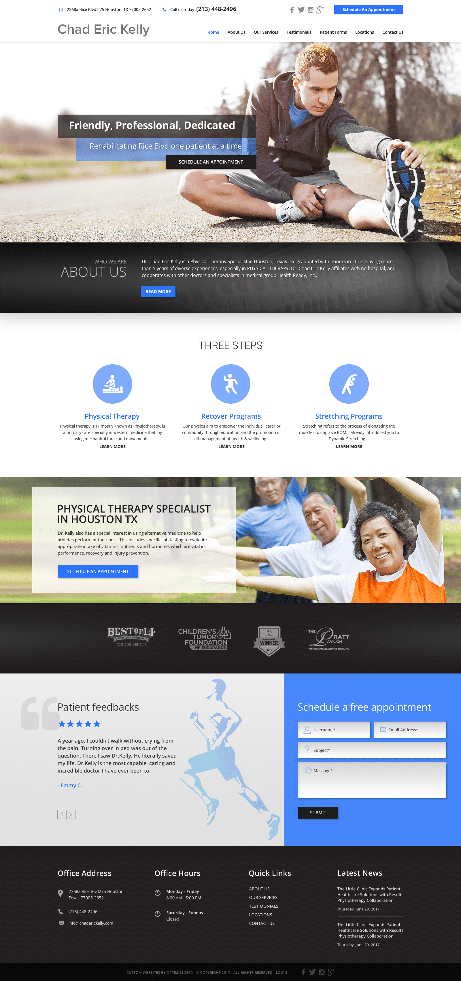
Dr. Chad Eric Kelly uses vivid colors such as royal blue, gray, and black to highlight its trustworthiness and authority as a physical therapist. By aiming to empower and build trust, the website uses royal blue to create small amounts of intensity throughout the web page. Royal blue’s integrated with different shades for organizing the information present, and thus fuses the qualities of royal blue with neutral colors such as black and gray, to accentuate these qualities. Its imagery helps to communicate the business’s services and qualifications by showing active figures in proper states of health. Because of the medical associations with blue, the webspace allows for its palette to thrive, implementing design elements such as layers, action buttons, banners, and icons to encourage the user to interact with the website.
Dr. Chas Eric Kelly introduces users to this physical therapy website, beginning with a solid white header containing information related to their services, business logo name, and social media icons. The header also includes an action button and click-to-action service numbers and location addresses. Its hero image encompasses one-quarter of the page, presenting its introduction text and action button for further emphasis. Through thin banners, each section presents opportunities for the user to connect with more action buttons related to the website’s content. Its programs section contains icons for visual decoration, and about three quarters down the page, another action button for scheduling can be engaged with for contact. Near the footer, the HIPPA secure form can be found alongside the testimonials, and at the footer, various click-to-action links for its service number and main menu services can be seen.


