New design idea

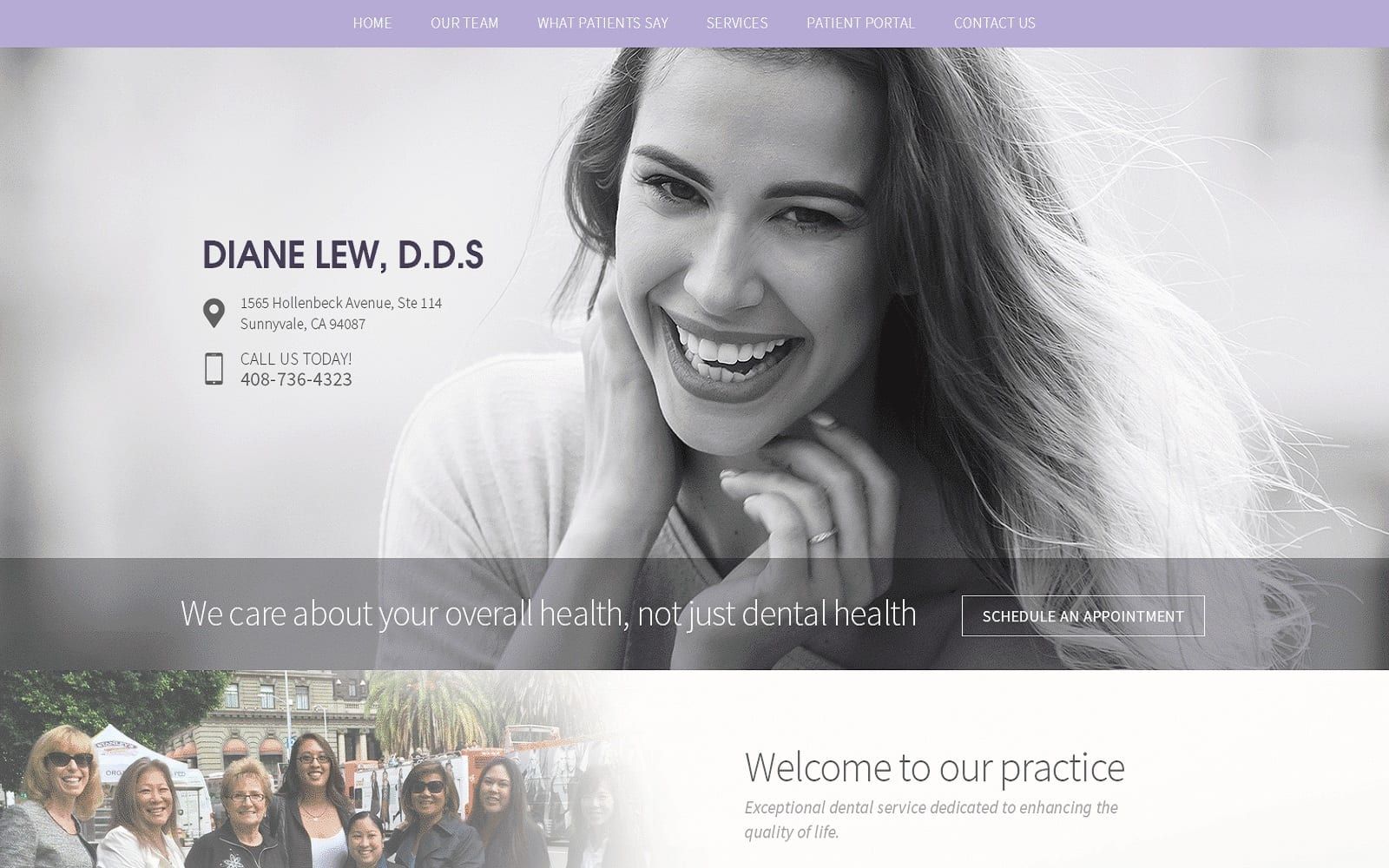
Dr. Diane Lew shapes its web space to accommodate the demand for simple, clear thinking, capitalizing on the effects of purple and monotonous photography to create a distinct, unmistakable website. Its color scheme includes colors such as purple, gray, white, and black to bring clarity, focus, and efficiency to its web image. Purple is its primary color, symbolizing tenderness, creativity, and respectability. Because purple is used as the only bright color, it is incorporated as an accent to the overall design and functionality of the dental website through gradients and action buttons. Its monochrome photography adds a sharp edge to the flowing impact of the purple background and helps neutralize the effects of purple to create a sleek, elegant design. Its use of large sans-serif text and design applications, such as action buttons and semi-flat panels, creates a seamless and smooth interaction between the user and the website that’s notable and distinct.
Dr. Diane Lew begins with a subtle, white header that contains the main menu services and the home page business logo. In the upper right corner of the screen, an action button can be interacted with for scheduling appointments, along with a click-to-call service number. When the page is shrunk, the header adjusts to the center of the page, presenting the action button and service number while fading out the hero image in the background. The hero image expands across the page, containing its introduction testimonial text. Near the bottom of the page, semi-flat panels present its feature core services that highlight the photography’s color when hovered over. The contact information can be found at the footer, along with social media icons and the accessibility tool.