Developing a logo, brochures, and a dental website are the basic elements for marketing your dental practice. As 70% of potential patients begin searching for dentists practitioners online, creating an effective web presence is very important. You need a carefully crafted online image, and brand, with your logo at the center of it.
First, please note that there are several types of logos to consider. The most important aspect of logo design is that the finished product should be engaging, fully represent the business, and be dynamic.
Another important consideration is that it should appeal to women. Women are responsible for 90% of the healthcare decisions that affect their families. With this in mind, the logo should not appear dark or masculine. It should convey a feeling of trust and authority yet remain inviting. This can be a bit of a tightrope walk, but with input from friends and staff members, a logo that conveys the values of the practice’s brand can ultimately be created.
That means more than a tooth icon or a free dental logo from a stock image website. Fresh-looking logos for dental practices will do more to draw potential patients in than a quickly drawn logo that is a tooth icon on stationery and business cards.
When beginning the design process, meet with team members and discuss the type of image everyone wants to convey. For instance, is the practice focused on children? Is it family oriented? Is using humor a good approach, or would it be more professional, business-like tone be more appropriate?

These are decisions that will significantly affect the type of logo that is designed to represent the practice. Suppose the results of these conversations are incorporated into the logo design process. In that case, potential patients will develop a general idea of what to expect when they engage with your dental practice.
Hiring an Expert
When developing a new logo for a dental practice, it is a good idea to retain the services of an expert in the field. Input from friends and acquaintances can provide valuable insight into the feel of a logo, but, let’s be honest, they are not marketing experts. While a logo might be attractive, it may not achieve the overall marketing goals of the dentist. It is best to rely on those with industry knowledge and dental practice logo design experience.
It is also important that whoever is engaged to create the logo is someone who has experience working with the special needs of dental practices. Many people, who may not have any negative feelings toward other healthcare providers, may experience a certain level of fear about dentists. Creating a friendly and inviting logo can lessen their sense of apprehension. That means a dental logo template may not give you what you need.
As the dentist and the staff begin to define the image they want to project, a part of the research and exploration should include spending some time looking at professional logos online. For example, you can check the O360 logo designs. This can generate many dental clinic logo vector ideas that can be translated into ones that work for your marketing plan.
It can also give some idea of things the dentist wants to avoid. Looking at various logo samples, websites, and newsletters can help refine staff’s ideas. Ultimately, dental clinic logos need to perform multiple functions. They must accurately represent the dental practice while appealing to potential and current patients. The logo also needs to distinguish the practice from others in the area. A creative dental logo can achieve that. The design process takes time and lengthy consideration, but the result will be worth investing time and effort.
Types of Logos

Several types of logos are used in today’s marketplace.
Lettermark Logos

The first is the letter mark or typography-based logos. Good examples of these are IBM, NASA, and HBO. Each of these businesses used a logo that is essentially a monogram of their business name using a font that conveys a feeling about their brand.
This type of logo is particularly useful for businesses that have lengthy names. Imagine having to say NASA’s full name every time you refer to the organization.
Wordmarks Logos

The next type of logo is wordmarks. These are similar to letter mark logos in that they use the company’s name as the logo but more actively incorporate a unique font to further create the company’s brand image. A good example of this is Google’s logo. It’s clean and instantly recognizable, yet it conveys a sense of modernity and fun.
Pictorial Logos

Pictorial logos work well for companies with established, recognizable brands. For instance, Target uses a red bullseye that is almost universally recognized. Apple and Twitter also use pictorial logos that provide instant recognition.
Symbolic Logos

Some companies use symbolic logos. Think about the abstract symbol of the swoosh from Nike and its ability to convey movement and freedom. Another example is the divided circle logo from Pepsi. These are both abstract symbols that, while being used as logos, have come to present these companies. One benefit of using an abstract symbol is that the company can communicate emotion across different cultural perspectives. This can extend their marketing reach.
Mascot Logos

Creating a mascot as a logo can also effectively communicate a message to potential and current clients. Examples of this include the logos of Colonel Sanders (KFC) and Mr. Peanut (Planters Peanuts).
Combination Mark Logos

The combination mark type of logo incorporates the company name into an abstract mark. Doritos logo is a good example of this. Burger King is another one.
Emblem Logo

The last type of logo is the emblem. Emblems incorporate wording into a seal or crest. These can have a very traditional feel which is why many universities use them. Examples to consider are Starbucks’ and Harley Davidson’s logos.
Not every logotype will convey the image and feel a business may want to communicate, but it is important to understand the range of options available in logo development.
Developing an effective logo will engage current and potential clients. Given ample consideration, it is a valuable tool in complementing your existing dental marketing strategies.
How to design a professional dental logo?

Your dental practice’s logo says much about who you are and what you believe. Simply put, your logo should speak to your brand’s essence. Its colors, texture, and arrangement should all complement the uniqueness of your practice. Unfortunately, designing a quality logo is much easier said than done. After all, when looking for a team to help with your dental branding, finding someone with experience in the industry is important.
This is because while dentists perform similar tasks (depending on your specialty), every practice differs. Some practices cater to women or young families, while others focus on upper-income single people. Whatever your target market and marketing goals, it’s important that your logo appeals to that segment. So what does a good logo look like?
25+ Medical Marketing Strategies | How to Get New Patients?
Color
The colors used in your logo are incredibly important. Colors are about more than what looks good. They bring out different feelings and communicate ideas. For example, red is commonly used by fast food restaurants because it is said to stimulate the appetite. Whatever colors you choose for your logo should clearly communicate who and what your brand believes about how to practice dentistry, treat patients, and run your business.
Additionally, it’s important to think about how your logo will be used. Sometimes it makes sense to create a couple of versions that can be used across various mediums. For example, you might have a color logo for your website but a grayscale logo that is used on t-shirts.
Avoid Cliches

Fads come and go. And while most of us think of these fads as something that is solely found in the world of fashion, the world of design isn’t immune. Every few years, a new design trend comes out that designers use repeatedly. While these designs might look pretty, they do nothing to set you apart from the competition.
A logo does nothing for your brand if it looks like every other logo out there and is only unique to you because your business name is on it. Instead, hire a designer that is skilled in dental logo designs. They can help pinpoint your target market and create a logo to speak to them.
Make It Unique

Your logo should be unique but still make sense. Tooth dental logos are overused. You want your logo to set your practice and dental marketing apart. It should be memorable and recognizable. Usually, when looking at dental logo samples, the first idea you like is one that everyone else has had. By working with a designer experienced in logo design, you’ll see several concepts that might work for your business. Ultimately, you’ll get a design that is uniquely yours. One way of doing this is new 3d Dental Logos.
Choose a Font
When choosing a font for your logo, you want it to complement the feel and tone of your business. For example, you wouldn’t choose calligraphy for a dental practice. It’s too formal and hard to read. You want your font to be readable and transferable to various mediums, including web and print. Your font and typeface make an impact on your audience. Read Learn more about medical fonts and typography
Keep It Simple
This is perhaps the most important rule to follow when you’re looking at having a logo designed. Sure, it’s fun to look at detailed designs. However, the best designs are those that are simple and clean. White space (also known as negative space) is your friend when it comes to both logo design and website design.
Stay Flexible

Throughout the branding process, it’s important you maintain a flexible outlook. This will help you keep an open mind and be more perceptive to designs that might seem outside your comfort zone. Once you start in a certain direction, it doesn’t mean it’s set in stone. You can always opt to move in another direction or take elements of your current plan and implement it into an even better design.
Be Patient

Give the project enough time. You will be stuck with your logo for years.
The difference in Designing a Logo for Dentists
For decades, people have trusted healthcare providers to offer life-saving services in their time of need. As a result, medics have accumulated lots of responsibility to save and sustain life at all costs. However, the healthcare sector has transformed into a thriving enterprise worth trillions of dollars over the years. Besides, diversification has led to the emergence of medical branches such as dentistry and optical, among others.
When business comes into the picture from a medical point of view, then the rules change as ethics and principles guiding the trade ought to conform to the delicate business. Companies and individuals advertise their services, hoping to win many new clients. Designing logos and advertisements for a medical or dental business gets different as you sell life-saving services and must comply with the existing rules. Unlike in conventional industries, where the primary goal of a logo or advert is to catch the eye of your potential clients, medical ones have a slight difference in appearance, content, and intention.
Critical Differences of a Medical Logos
- The colors of the advertisement and logo
- Intention and content
- Communication
The dental industry is one of the medical fields that have experienced plenty of change compared to other sectors. Technology and the changes in the mode of operations account for the differences making the business entirely different from the conventional ones. The landscape keeps on changing, making it difficult for a practitioner to keep up. The slightest failure to keep up with current trends often causes a loss of clients, as they want to shop for the best.
What Should Be Communicated Through the Use of a Logo?
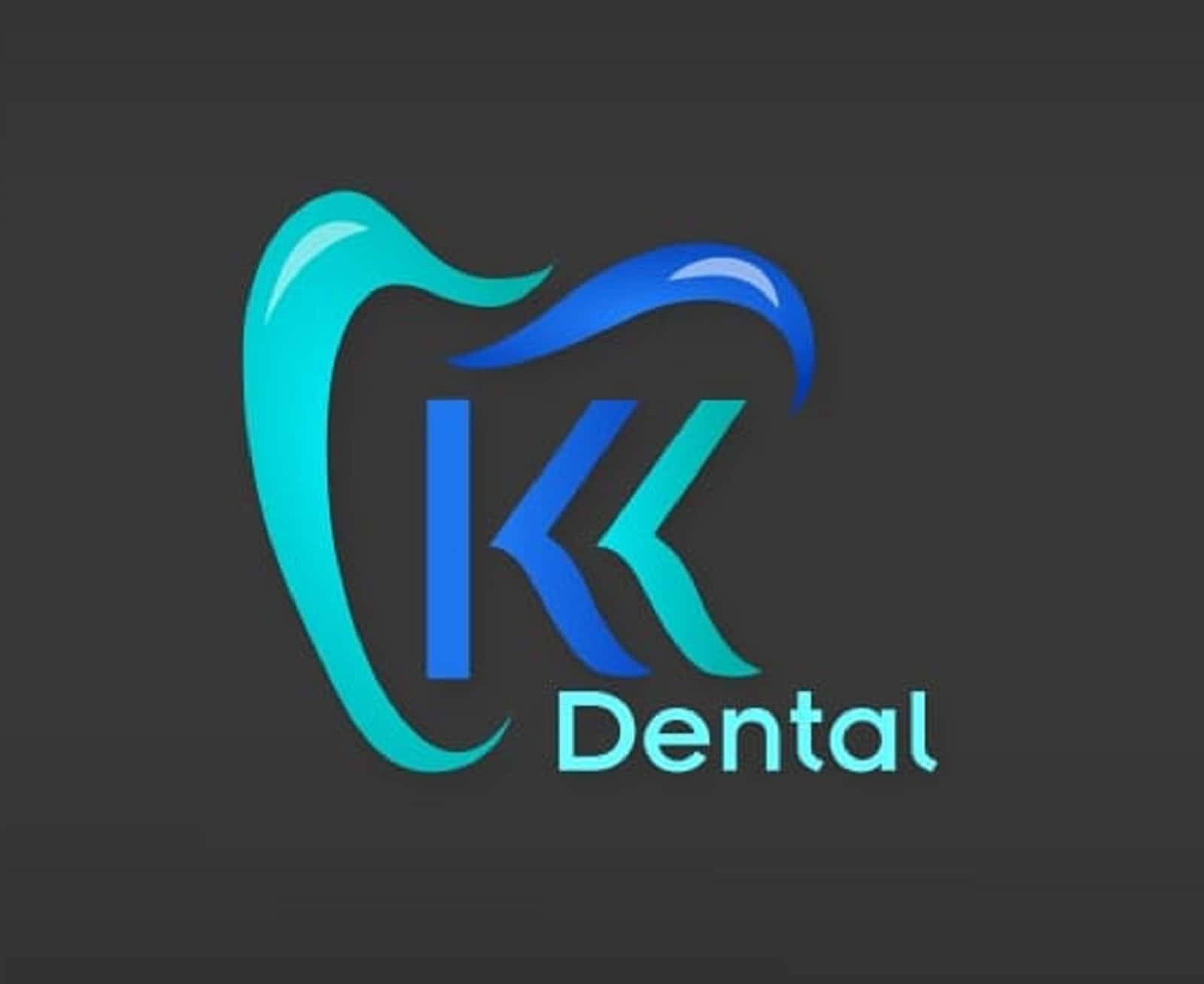
It is essential to note that customers worldwide will judge a business by their brand’s content. When an ad, marketing material, or even a logo lacks creativity and fails to showcase all the services offered, it becomes less attractive to a consumer. Besides, customers will review the quality of services rendered, and the slightest variations from what has been advertised lead to a loss of business.
The color of the Logos
If you are keen on checking ads, you will notice logos and other advertisement materials in the medical sector use blue as their primary color. Blue appears as the primary color in more than 85% of the logos. The choice of color makes medical ads more distinct and more comfortable to distinguish from other businesses.
Blue, in most cases, is linked to trust, perfect knowledge, tranquility, and security. Thus, the colors communicate the above, making it easier for the clients to trust the facility and the doctor offering the services. It is for this reason; the pricing structure in the medical field appears different from the typical businesses where clients will want to save every coin. Industry leaders in the sector tend to use the blue color in nearly all their documents to showcase their competence and mastery of the trade.
Hygiene
One of the most important aspects to consider while choosing a health facility is checking on the general hygiene of a clinic. As a result, the choice of bright colors, such as blue, that do not harbor dirt is appropriate. Clients can determine the cleanliness of a facility by observing the colors used in the logos. Besides, the bright colors tend to be more welcoming.
When you narrow down to the dental industry, you will consider the following points as distinguishing factors, unlike the standard business logos.
Dental Tooth Logo
When offering dental services, though it is common to want to communicate about the tooth and nothing else, it is essential to incorporate lots of creativity in making the logo include a tooth. Colors and slight variations in the tooth’s shape, among other creative moves, can make the advert appear modern and convincing. Besides, creativity is a viable tool to showcase a personality and competence.
More Than Just a Logo
Though it is typical for logos in the dental industry to showcase a tooth, it should be more than just the tooth. Creativity and instilling the business’s values should be natural to identify and associate with patients.
Logos To Illuminate a Smile And Cultivate Hope
Making clients smile due to the quality and content of a logo distinguish a medical and a business logo. Medical institutions are responsible for instilling hope and confidence in people’s lives before breaking even. So they ought to communicate that in their logos to win patients’ trust. The ads should incorporate a happy mouth before everything else to get the best results.
Patient-Doctor Relationship
One more distinct feature a medical ad should communicate is the cordial relationship between the doctor and the patient. When a potential customer examines the link, they can establish the seriousness of a facility. Thus, a medical logo should communicate more than the services rendered by a facility and tell the world about the existing relationships. For these reasons, the medical logos not only speak about the existence of a facility but also communicates about the relations between a doctor and a patient.
Finally, it is important to note that your medical logo should communicate your unique services and personality and reveal something about your competence and hygiene. Besides, the ads should be precise. If you are selling tooth services, ensure it is very clear in the logo to avoid customers mistaking it as the “jack of all trades and a master of none.”
