Overview of the Design
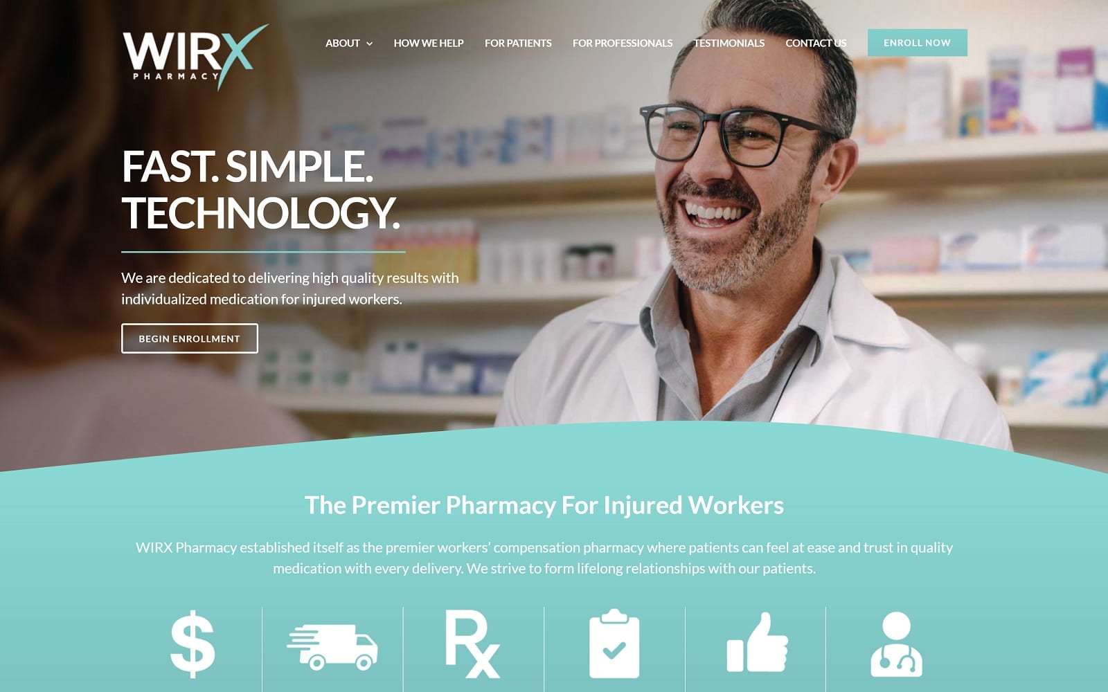
Given that this pharmacy serves a niche market, the goal for this site was to make it easy for visitors to quickly draw inferences about the services offered. The colors blend seamlessly with the site logo, which is accompanied by bold toll-free and local phone numbers in the header. Because there are several pages on the website – some for doctors and some for patients – the navigational menu is kept traditional, yet understated so as not to command the attention of the viewer. Instead, users are directed toward the bold home screen images, which redirect site visitors to pages about the practice and the testimonials of people who have used the services of WIRX Pharmacy in the past.
Also on the home screen, we included a brief explanation of what WIRX Pharmacy does: personal pharmaceutical delivery for workers compensation patients in the Philadelphia area. The remainder of the website essentially explains why switching from a traditional pharmacy to pharmaceutical delivery is more beneficial for patients.
Use of Colors
This custom pharmaceutical website is based on a classic color palette of white and light blue. This keeps the appearance light and positive – something people who have been injured may appreciate despite their circumstances. Blue and white are also cool and reserved shades that can indicate to referring medical professionals that the pharmacy is trustworthy and respected.
Analysis of Design Elements
The WIRX Pharmacy website is created to be user-friendly and visually appealing. The home page contains highly responsive features, including four large header images that double as a hub to the site’s other pages. When moused over, these images expand over each other, revealing the topic for which they represent. The goal is to sort out the patients from the medical professionals and direct them to the information most relative to their purposes. Also, the Philadelphia area is diverse, which is why we included a translation tool directly on the website.
Marketing Aspect
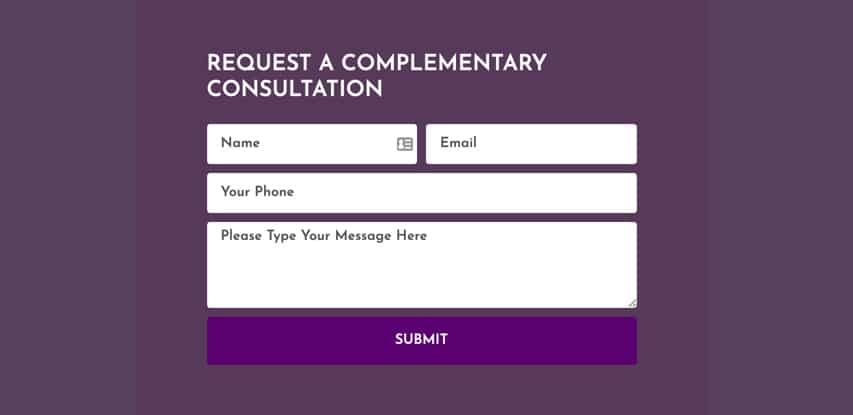
There is a great deal of marketing required for a pharmacy that only serves a small group of patients who might not otherwise want to switch from the perceived convenience of a traditional pharmacy. Our job was to create a custom pharmacy website that articulately and succinctly explains the benefits of pharmaceutical delivery. We also included integrated enrollment buttons and a contact form that lets users submit questions directly to the team at WIRX. As an added feature, we also included a direct call option, in which site users can launch a phone call directly to the pharmacy online.
Image the Website Represents
The images on this website speak to the components of this pharmacy’s services. There are images of physicians, patients, and most importantly – workers. We also included a subtle background image of a discreet package being delivered, which one would perceive to be prescription medications.
Pharmacy Websites Designed by Optimized360
