The New Era Medical Aesthetics and Laser Center needed a website that was as forward-thinking and innovative as its name implies. As we approached this opportunity we considered some of the current trends in web design and applied some classics together with some of the newest trends to produce this engaging and undeniably modern website.
Overview Of The Design
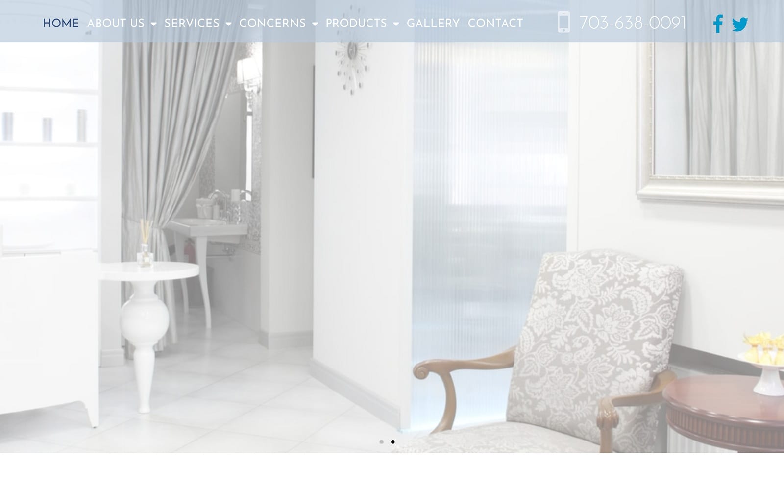
When a visitor first arrives at the New Era website they are greeted with a soft palette of colors that, while being classics of medical website design, are presented in a way that’s reminiscent of a future worthy of Gene Roddenberry. The use of moving imagery, soft white lighting and transparencies, and an elegantly composed design came together to create a website that’s ahead of its time.
Use Of Colors
This website’s design relies heavily on white and blue as its primary constituents, both colors being a prominent part of plastic surgeon site design and medical sites in general. These colors are softened throughout the site by the use of transparency and powder blue tones.
• Contrast – The wonderful thing about both the colors used in this design is how easy it is to create a consistent yet creative variety of contrasts. Throughout the site, blue is used to draw the eye to important pieces of information and action points.
• Action Oriented –Blue is the action color for this site, as can be seen here below the doctor’s biographical section. Whether you’re looking for information from the visitor or want to provide it to them, eye-popping contrast is key.
Analysis Of Design Elements
There are a number of design elements that make your website a pleasant and engaging place to be, and those factors are what help set a visitor at ease with your facility before they ever set foot in it. An attractive website makes a distinct impression that lends credibility and legitimacy to any business, even in the medical field.
• Space – Any artist will tell you that the use of white space can help make an image pop, and the same is true for your website. White space, when cunningly used, helps to frame your information, highlight important parts of your site, and otherwise make use of your site easier.
• Navigation – Next on the list is navigation, having your information easy to read doesn’t mean much if they can’t easily navigate around it. The streamlined design of New Era’s site means that the most immediately important information can be found on the first page. The menu at the top of the site means visitors looking for specific information have a quick way to get there. The box navigation area in the middle of the site, where images are used to direct visitors to pertinent information rounds it out.
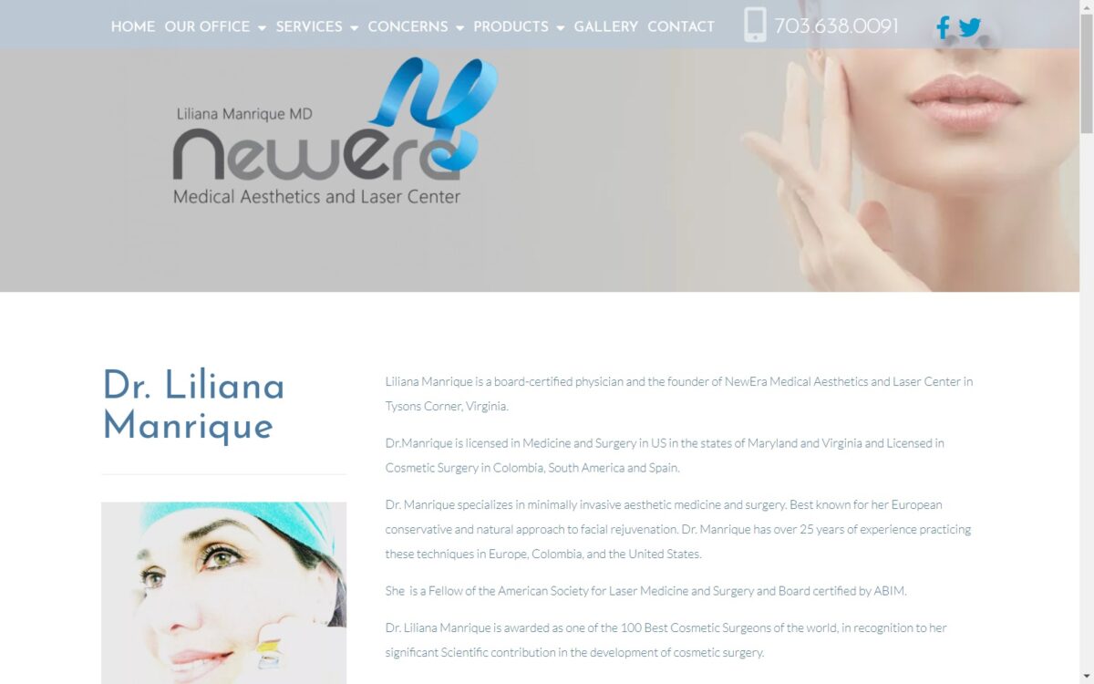
• About Us – While New Era contains an About Us page, it also features the cosmetic surgeon’s profile on the first page, right next to two buttons that provide their full bio and the opportunity to request an appointment.
• Contact Information – The menu, which is located at the top and bottom of the page, contains a direct link to the practices contact information. Additionally, a number of opportunities are presented throughout the page to make contact with the physician.
Marketing Aspect
Ignoring the marketing angle of your website is a good way to ensure that your valuable skills go unused and your lobby remains empty. Especially in today’s digital world getting your patients in front of your website can be your most important first impression. That means making sure your website is both appearing on web searches and is good at driving conversion, the industry term for the moment a visitor becomes a customer.
• Use of Images – Seeing is believing, and that means there’s no substitute for images on a website. This is especially true in a line of work that relies on transforming peoples appearance and restoring youthfulness.
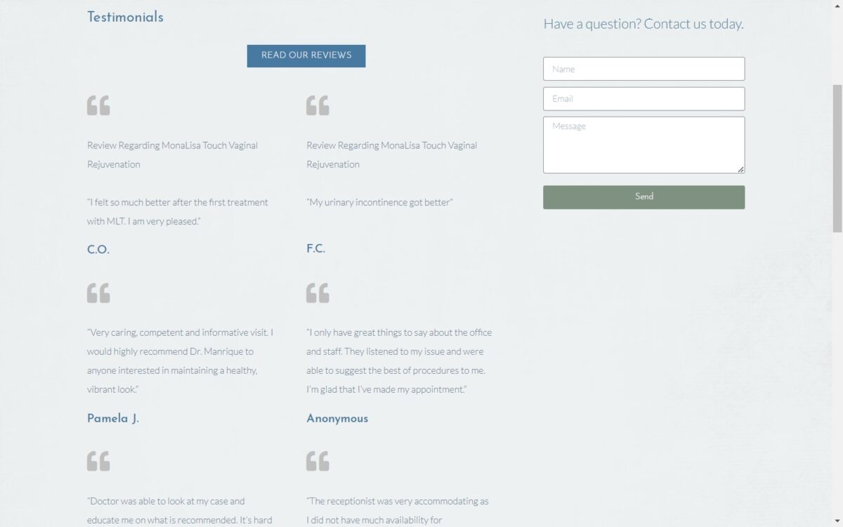
• Testimonials – Word of mouth is still the best form of advertising, and in the digital age that means using testimonials from happy customers on your site. Providing good reviews from your customers is a great way to drive conversion.
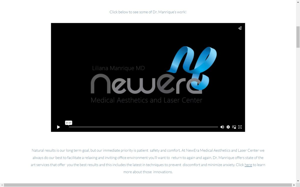
• Video Integration –While images will always play an important role in the marketing element of a website, video is the new king. Just as moving pictures took the place of simple photography, the introduction of high-speed internet has made videos the new paradigm. The videos on this site help take some of the mystery out of cosmetic procedures and aids in easing the patient’s worries by seeing what happens when they’re ‘under the knife’.

The Image this Website Reflects
This website reflects a modern and forward-thinking cosmetic surgeon facility that provides cutting-edge procedures tempered with years of experience and tradition. Throughout there is transparency created by the use of videos of procedures and results from past patients that helps to instill a sense of comfort and reliability in visitors that will be sure to drive conversion.
