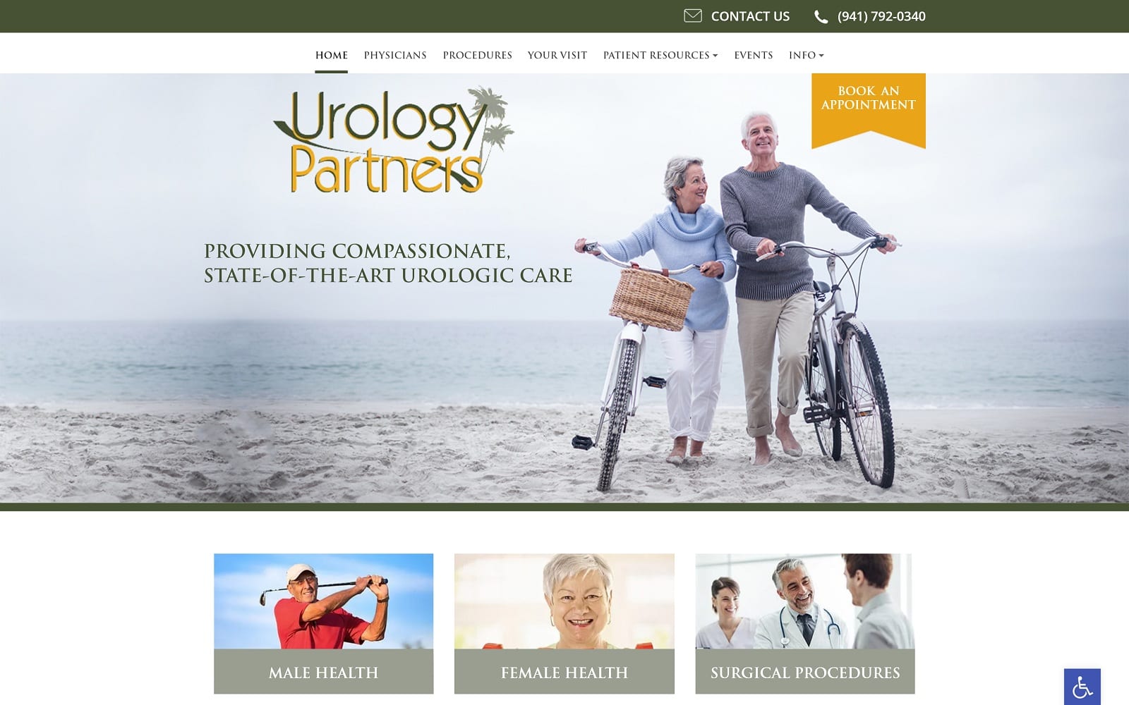
Urology Partners provides compassionate, state-of-the-art urological care in the state of Florida. Their patient base is comprised of older clientele. To adjust accordingly, we designed a website that would be appealing to the older generation, while keeping core, modern design elements as well. We created Urology Partners a website that perfectly matched compassion with modern design.
Design Overview
The site is more of a traditional design with plenty of depth, color, and texture based on the client’s wishes. However, a traditional design does not have to be a particularly boring design. We managed to integrate a professional and sleek design to match the specialty at hand. When you enter the home page for the first time, you are immediately greeted with a feel-good image along with a button to book an appointment. The homepage is simple but effective in giving readers a great first impression of what the Florida natives had to offer.

Use of Colors
We used a combination of olive green and yellow for this particular website. The color green adds a feeling of comfort and contrasts well with yellow. Yellow was our go-to color for highlight call to actions and certain buttons and borders. The green paired with nature-inspired photography also provides a feeling of tranquility as well. When used in combination (as seen in the logo), green and yellow make for an outstanding blend of authority and comfort!

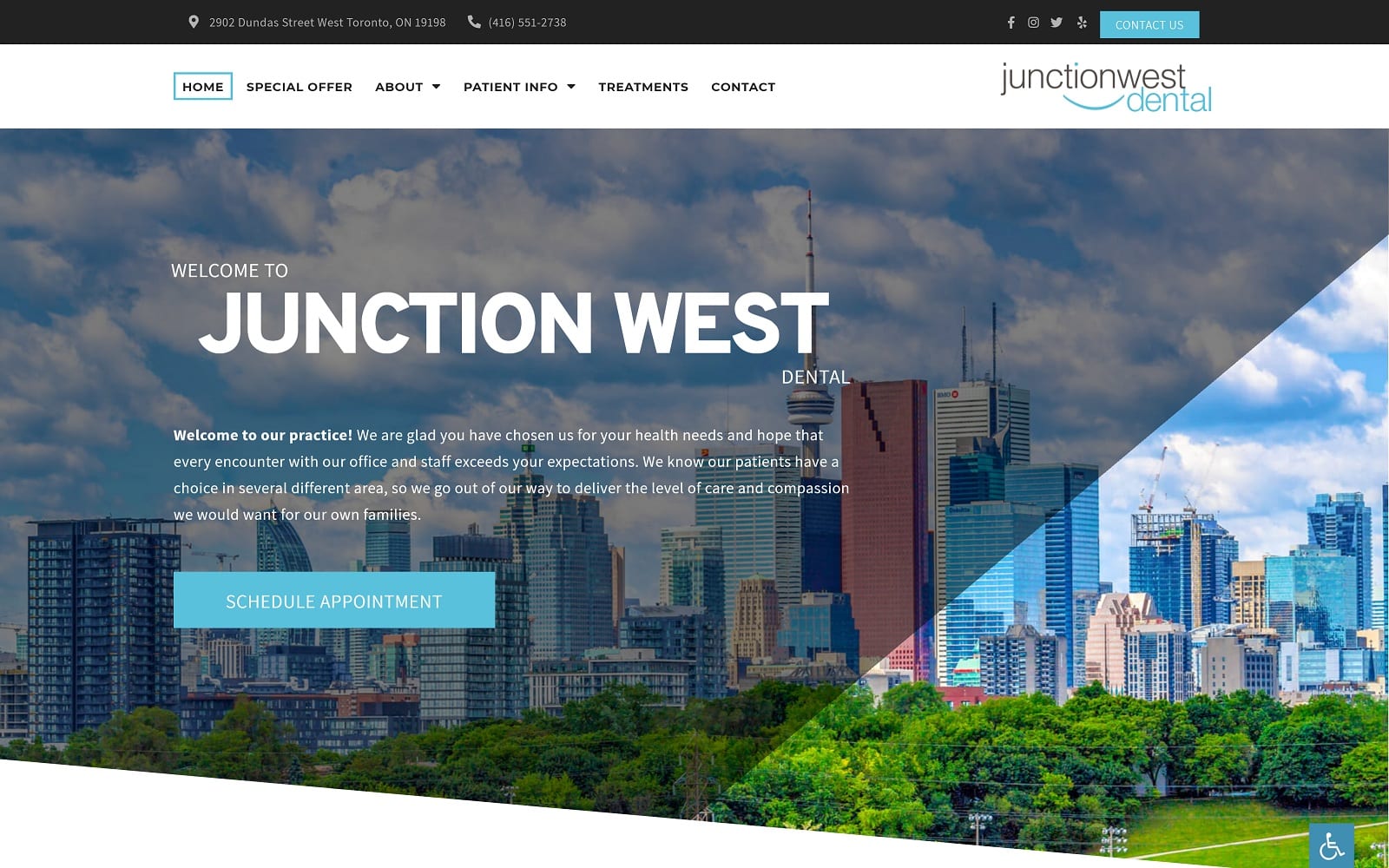
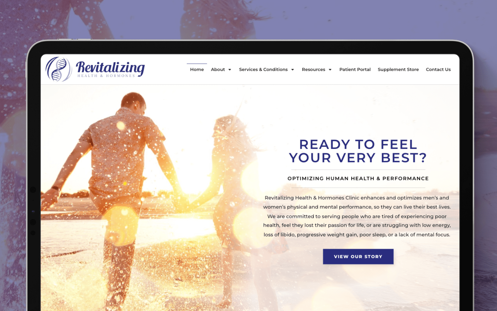
Here are some other examples of websites Optimized360 has successfully delivered to their clients that implement the color green.
Children’s International Medical Group
Analysis of Design Elements
From the text of the website to the warm, welcoming color scheme, everything about this site’s design is intended to gently encourage the visitor to make an appointment and start feeling better about themselves. Unlike a typical healthcare approach, this website’s approach is all about encouraging the patient to feel better about themselves, to spend some time on self-care and beautification that’s more than just ‘maintenance.’

Text and images are spaced appropriately with square borders that keep everything in their respective place. We also applied a subtle gloss animation over some of the images to attract the attention of the readers. To ensure that we did not forget about the younger audience in need, we also made sure that the site would be responsive and mobile-friendly.
Marketing Aspect
The urology experts understand that security is an evergrowing issue. They have taken the necessary steps to ensure that all of their patients’ information is protected with SSL Security. SSL Security encrypts important information such as credit card numbers and home addresses before they are sent off to the actual database.
Urology work is also not commonly found. A lot goes into the thinking process before a patient commits to a particular doctor. To help increase case acceptance rates, we also included an info and patient resources tab to educate those who may be curious or skeptical about the procedures offered.
Quick links to help navigate through the web pages are also always available near the bottom of any web page. To top it all off, we integrated an interactive Google Map for easy access and driving directions! We always make sure to invoke the client’s vision when designing the website.

Image the Website Reflects
Overall, the website represents the professional manner displayed by the urology professionals. The green and yellow color theme harmonizes perfectly and add a friendly vibe to the entire site. There is also a representation of credibility on the website through their list of trusted, qualified physicians as well.
Urology Partners Urologist Website Designed by Optimized360


