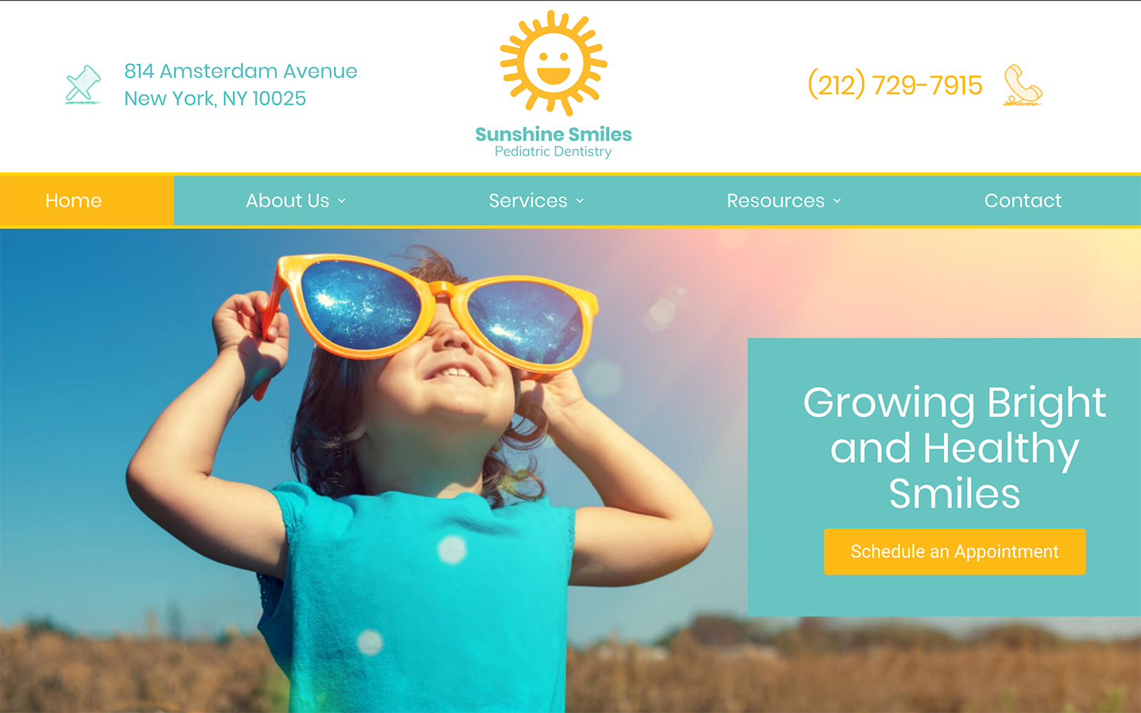
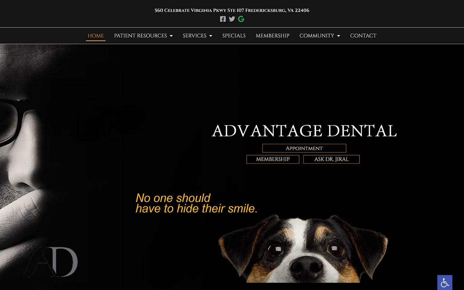
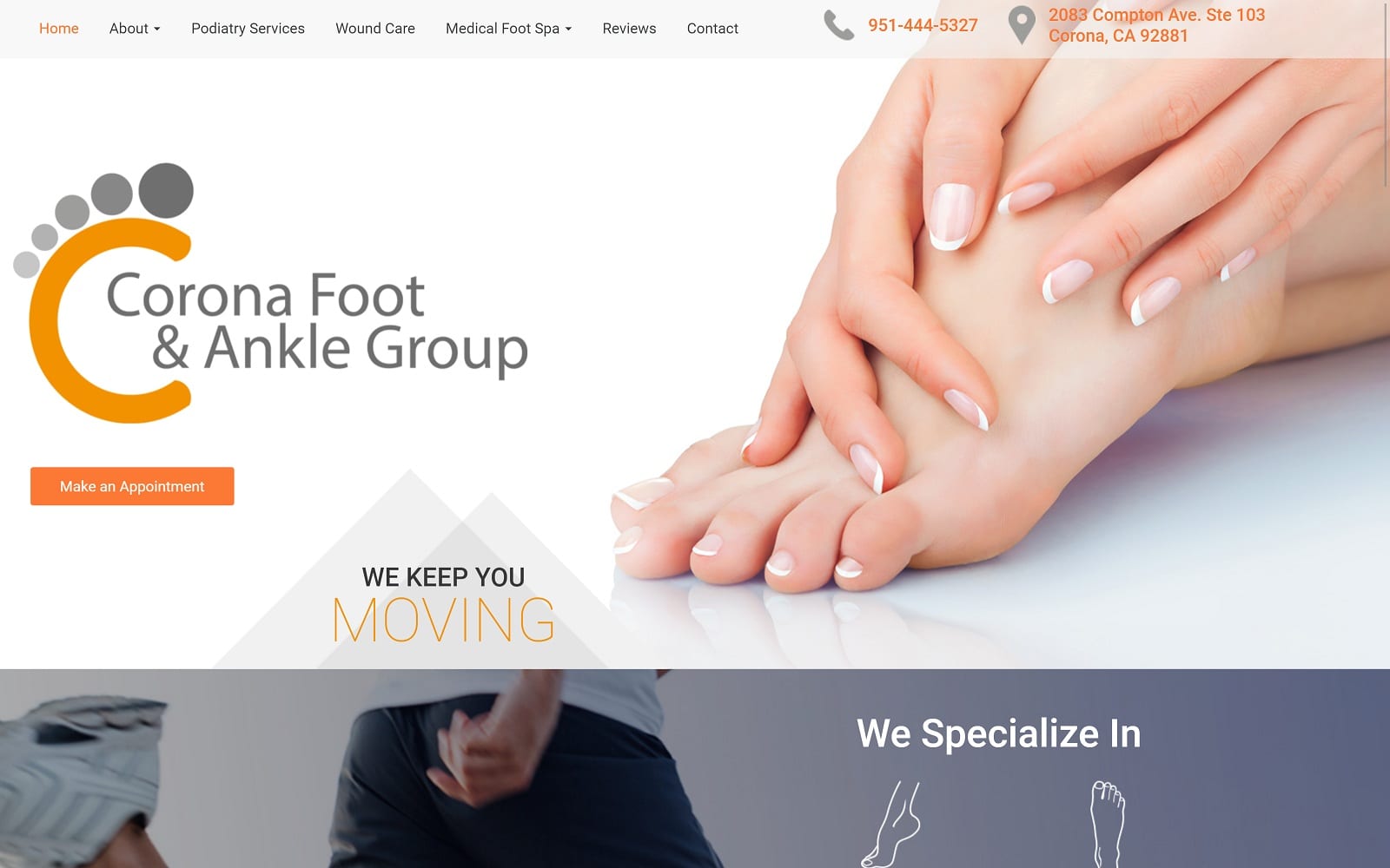
Designing a pediatric website is about more than just the parents; it needs to be approachable and welcoming to its patients as well. Sunshine Smiles integrates its name into its logo design, featuring a brightly smiling sun with the clinic’s name to create an unmistakable icon for the clinic. Blue, orange, and white come together to create a fun and visually engaging color palette that is used to great effect on this site. The orange tone is used as an action color to draw visitors’ eyes to important points on the site where they can interact. Stylized line-art images are used to direct patients to valuable information on the site, while the clinic’s logo is integrated throughout the background of the site to aid branding.
Bright colors are a great way to engage little patients and help to convey an understanding of their needs to parents. Security is often a concern of parents seeking care for their children, and the HIPAA secure contact form serves this need. It also ensures that busy parents without time to make a call can schedule an appointment without ever picking up the phone. Visitors also have the ability to book an appointment online and prepare for their first visit. Filling out forms at the clinic can be difficult for parents managing children, so being able to print out the forms ahead of time and filling them out in quiet hours is a critical service for them. Videos featuring popular children’s characters help set nervous patients at ease as familiar faces tell them what to expect.


