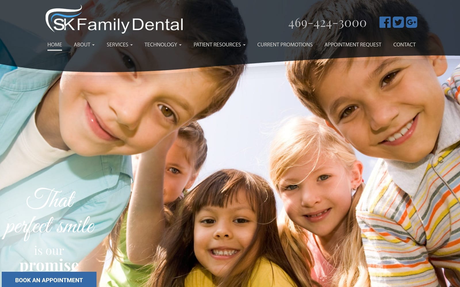
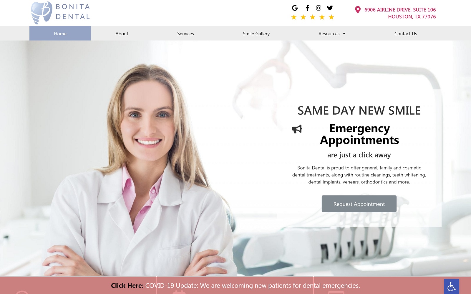
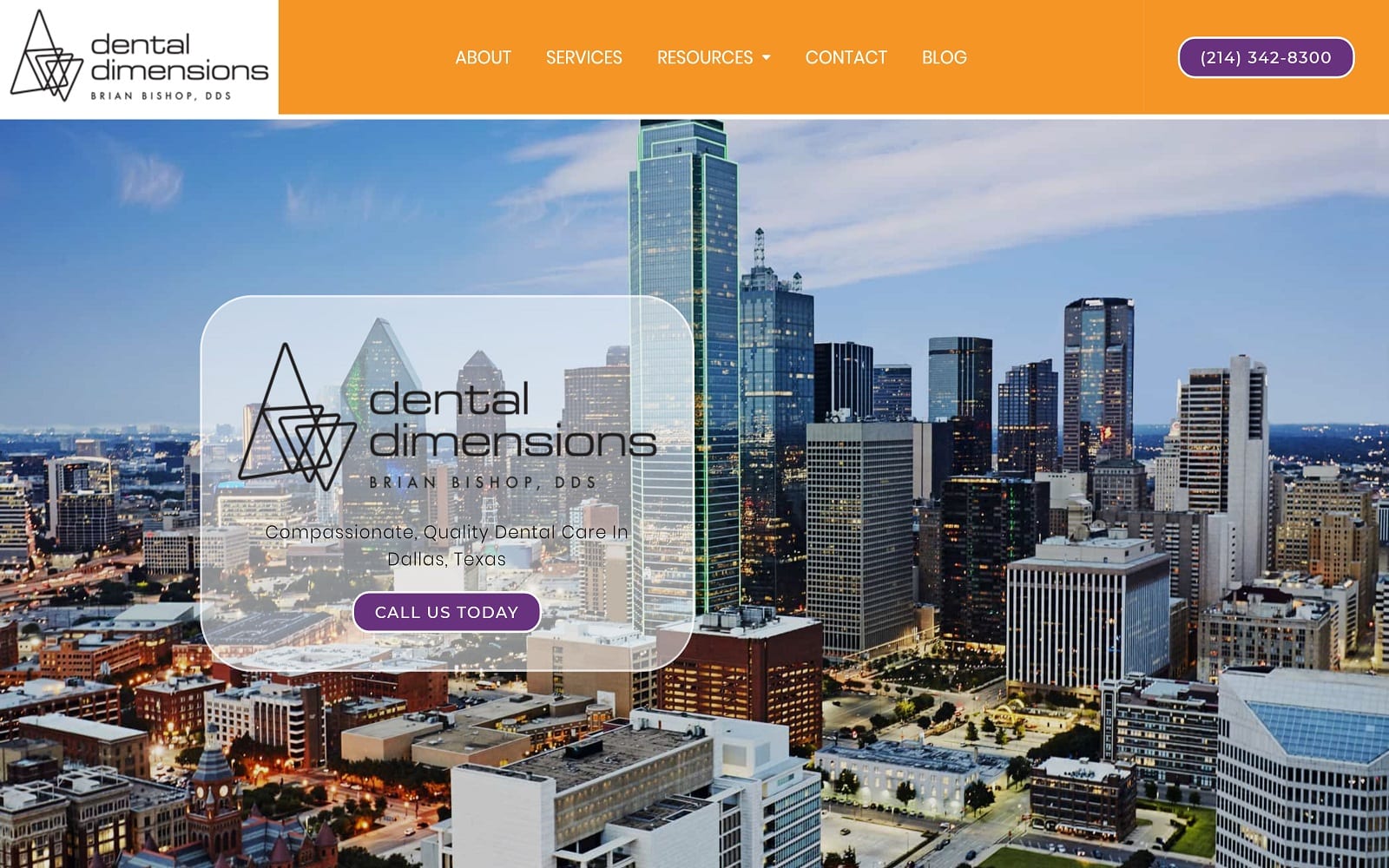
Our stylish web design is not only professional in paying homage to a doctor but also manages to incorporate modern design and integration all over the design elements. From the concise navigation toolbar to the easily accessible social media widgets, SK Family Dental meshes personality with professionalism to create a stunning website that proves that dentistry can be much more than just drills and bills.
Design Overview
The overarching design of the page is modern and interactive. Throughout the website, you will find patient educational resources and special effects to enhance user engagement. We wanted to incorporate just how much knowledge the dentistry knew, on full display on the home page. When you scroll down the home page, you will find an interactive featured services page, a biography, testimonials, and even a map to display directions to her office.
We tied everything together by utilizing different boxes and section sizes to highlight the different promotions, forms, and resources found on the website.
Use of Color
Along with all the images featured on the website, we also lightly used blue to highlight the certain call to actions throughout the website. When you blend blue with a wide white background, you create an aesthetic contrast that works well with the specialty at hand. The blue meshes well with the imagery on the website to create a feel-good, family-orientated impression for incoming patients.
The pictures featured on the website using our square-shaped outlines can help calm anyone’s nerves as well. As we all know, a picture can tell a story just as well as words can. We went out of our way to find the best child-friendly photos to display on her website to welcome a younger audience as well.
Design Elements
An additional bonus that SK Smiles holds is the smile gallery. Here, Dr. Saboowala displays before-and-after pictures that can attract skeptical users. There is also a technology section that offers more information about the latest technological advances used in the practice. There is no point having all the best dental gadgets if your website does not properly represent that, right?
We also made sure that the branding throughout the site was consistent and abundant throughout. There are tons of family dentistries around the Texas area. If your website does not hold an overarching theme or any lasting presence, you are essentially tossing money out the door to your competitors.
Marketing Aspect
Patients should always be the dentist’s first priority. With all the patient resources available, we made sure everything was easily accessed through our dropdown menu at the top of every web page. We also conveniently included the practice’s social media platforms and office number on the header as well. This can help transition from the website to the office line in a heartbeat. We also included quick links and an interactive Google map on the footer to increase web engagement.
Image the Website Represents
When you combine modern technology, sleek navigation, and the soft color palette that SK Family Dental has to offer, you get an awesome, professional website. The Texan dentist’s personality and talent work well alongside our integrative design to engage the viewers accordingly. To see more family dentistry examples by O360, please view our gallery.


