Dr. Miyamoto reached out to us to help design a website for her office that would capture her mission to provide compassionate oral health care for patients from every walk of life. While serving the Torrance area they had been looking for the web design company that could provide them with a digital presence they could be proud of. Optimized360 was happy to oblige.
Design Overview
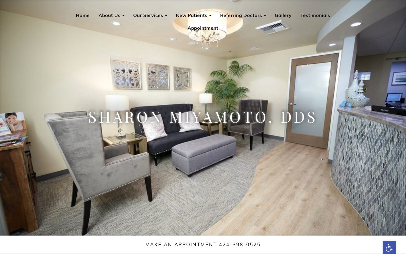
This site is soothing and welcoming from the very first approach, an intentional design goal we reached through the clever use of color and a welcoming image of the office space. The website is easy to find your way around. In addition, one of the first things you see as you scroll through it is an image of Dr. Miyamoto and an outline of the goals and focus of her clinic.
Use of Colors
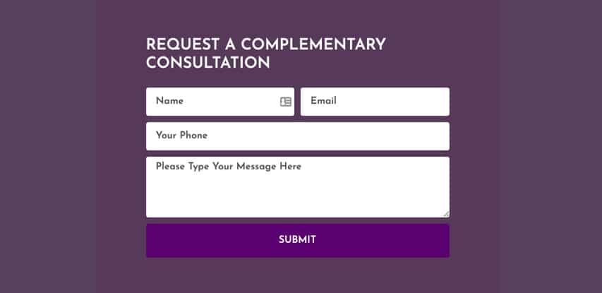
We used a blue and white color theme throughout the website to match the profession at hand. Blue provides a sense of hope and calming while the white background provides a professional tone throughout the website. In addition, we also integrated a splash of black for a hint of lux on the contact forms!
The color palette chosen is the optimum combination of soft and bright giving a soothing essence to the whole website. It gives a sense of security and at homely vibe. It represents the very nature of Dr. Miyamoto and how she treats the patients at her facility. The positive color selection and happy expressions from the images send out a sense of assurance to the visitor about the website as well as Dr. Miyamoto’s practice. The whole vibe symbolizes. Miyamoto way of working.
Design Elements
Design elements take the basic idea and color scheme of a site and tie it together into something engaging and beautiful.
• Space – The use of space throughout the site gives plenty of elbow room for each element to strut its stuff. An open design like this is relaxing to view and makes everything easy to find and read.
• Navigation – The presence of a menu at the top of the screen makes navigating throughout the site easy, on mobile devices this menu becomes a hamburger menu to ensure it’s always just a finger stroke away.
• About Us – You’re invited to meet Dr. Miyamoto on the homepage of her site, which takes you to an area of the page that introduces the viewer to her with a stunning image and a clear view of his office’s front door. Here the visitor is also provided with his credentials and a personal statement from the doctor.
Marketing Aspect
Marketing your clinic is vital to ensuring that the visitors that arrive at your site convert into customers, and this website uses a few subtle elements to help drive conversion. The constant presence of contact information at the top of the screen, as well as in the footer, ensures that your visitor is just a phone call or email away from beginning their relationship with your clinic. An informational footer is a vital way of providing information that will help your potential patient make decisions and schedule appointments.
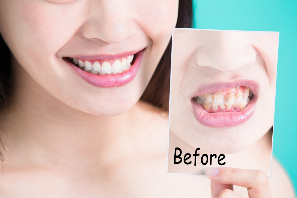
The gallery tab on our navigation menu features before-and-after treatment photos of previous patients. With any doctor, commitment and trust play a huge role in the decision process. You need to properly persuade and convince your web-visitors why you are better than the competition. We also featured an additional tab for testimonials to help with this as well.
Image the Website Represents
The website of Dr. Miyamoto’s clinic reflects a clinic that is focused on providing a comfortable and compassionate experience in the doctor’s office. These are important components for nervous patients and those looking for someone who will take the time to be understanding rather than rushing the patient through to make room for the next client.
Sharon Miyamoto DDS Website Designed by Optimized360
