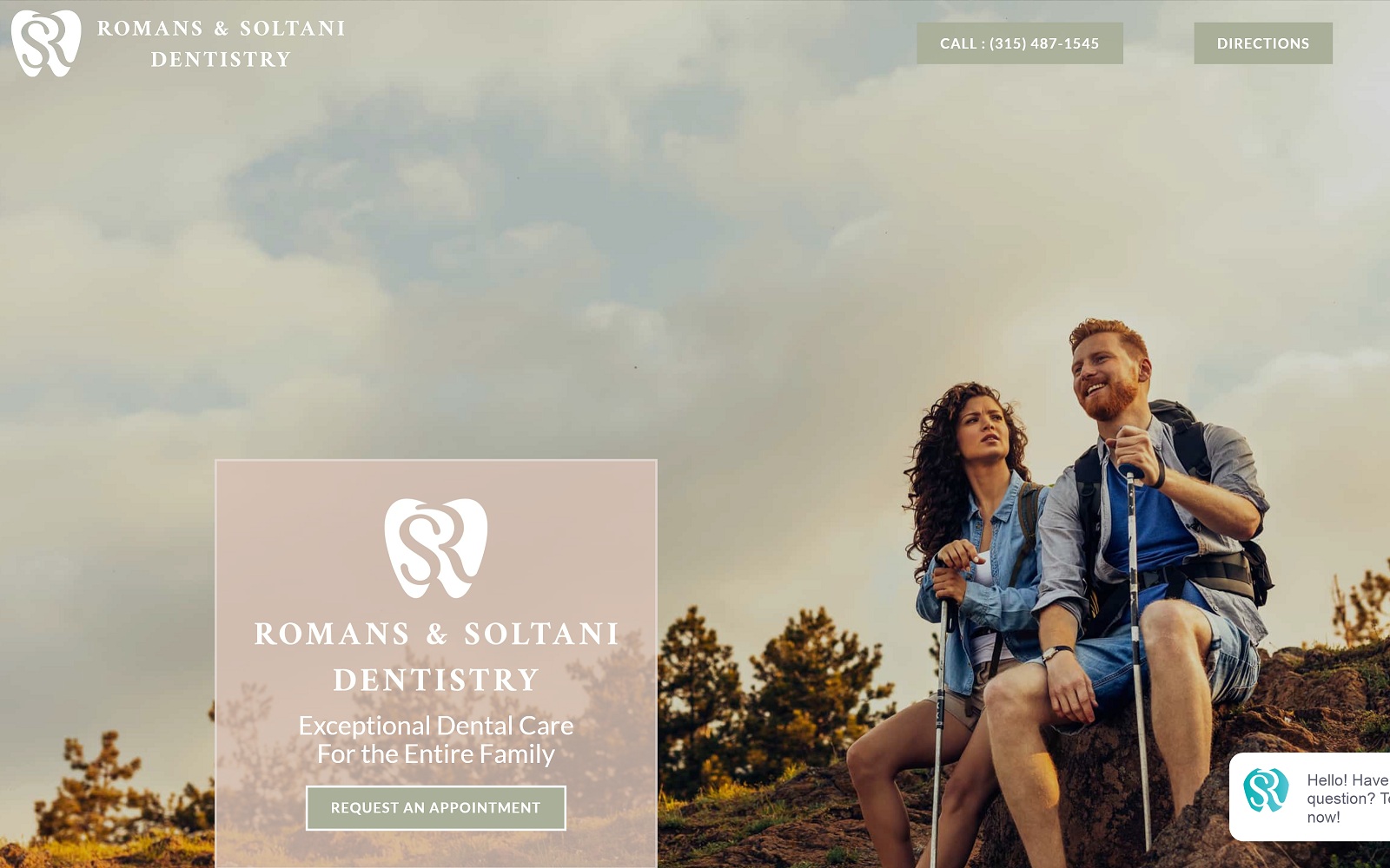
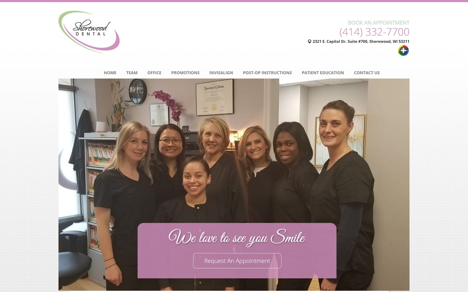
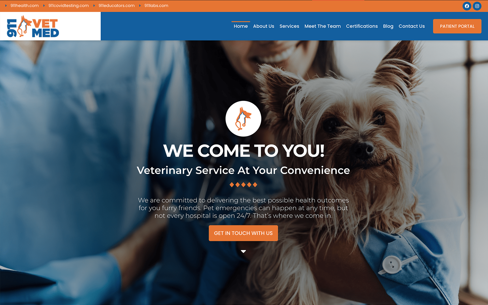
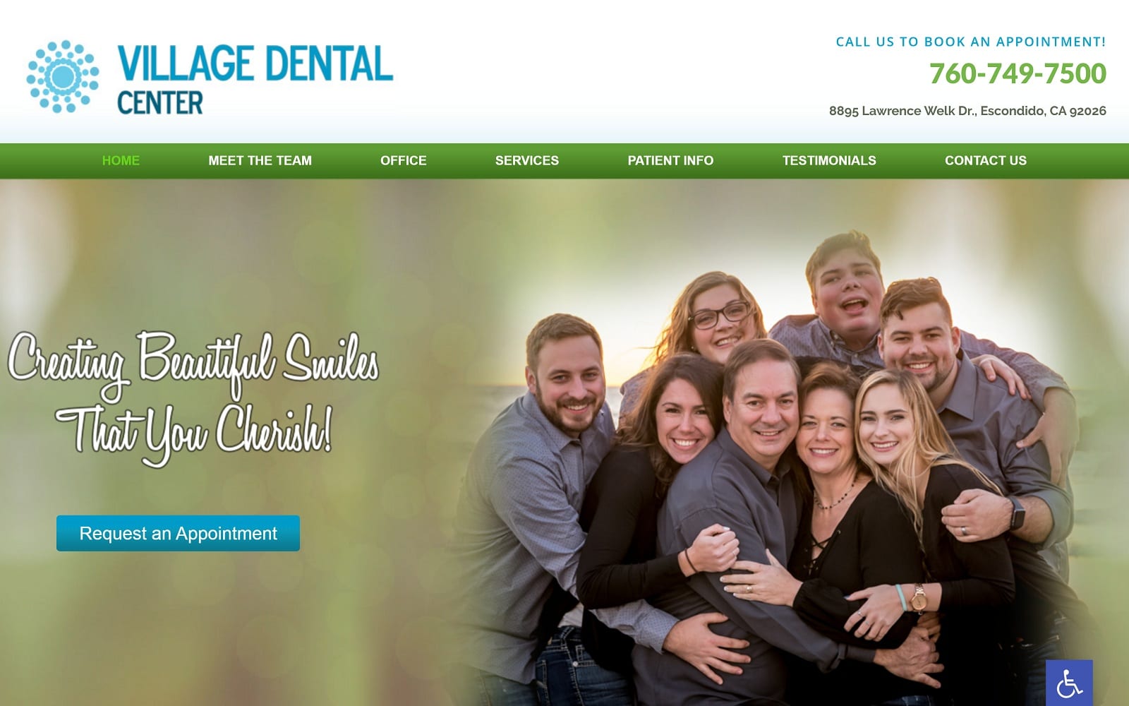
Roman and Soltani Dentistry’s website opens with a selection of hero images that connect the viewer with the clinic and the lifestyle of its community. Soft pinks, grays, and white are used to create a website that is soothing to view and easy to read, and these colors are reflected in their images to tie it all together. Imagery plays a central role in the design of this site, highlighting the staff and location in a positive image. Each dental page is relatively compact, providing critical information without overburdening the viewer. This element serves to make the site equally pleasing to view on both desktops and mobile devices alike. This minimalistic approach adds to what the website has to deliver, making it easy to navigate and information easy to find.
The aesthetic qualities of Romans & Soltani Dentistry’s website go beyond mere appearances. These elements were selected to ease the mind of the viewer and make the site easy to navigate. While hamburger menus are typically reserved for use in sites responding to mobile screens, it was determined that it’s compact nature complimented this design in all formats. While gray is typically an understated color, it stands out in this website thanks to the subtle color palette, making it an effective action color that draws the eye to important points and information. Important information is easy to locate at this site, including how to manage getting your dental claims paid, and what insurance they take. Patient forms are easy to locate as well, making it simple for new visitors to prepare for their visit in advance.


