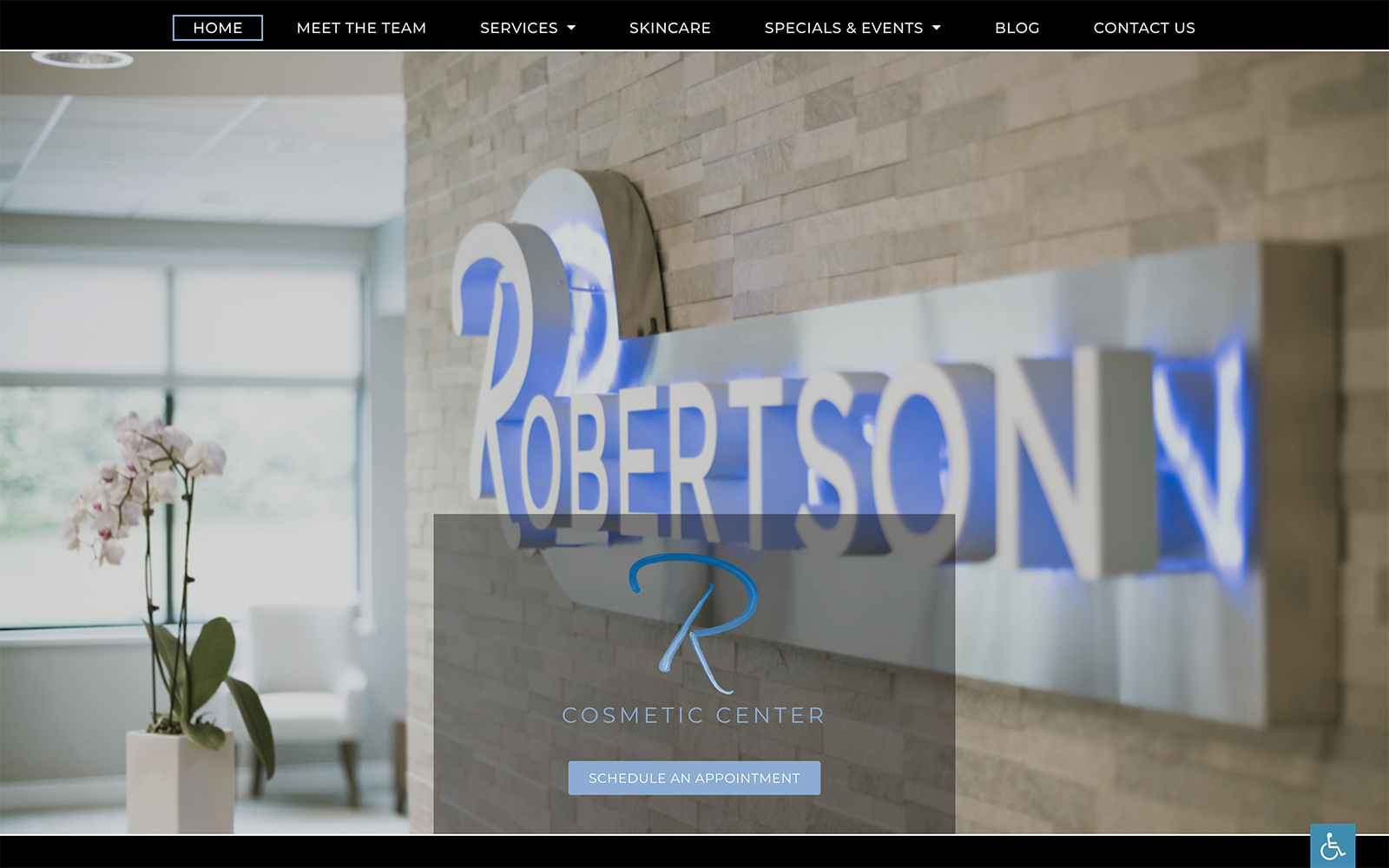
The hero image for Robertson Cosmetic Center does an excellent job of connecting with the viewer through the imagery of its clinic and its office space. The pink, blue, and black color scheme is striking and stands out from the competition in its execution. The colors represent a nurturing facility that can bring hope of aesthetic improvement with a touch of elegant professionalism. The gallery page is set up to present before and after images of patients proud to share the results of the work the clinic has done for them. Cosmetic service links are presented with images that brighten on mouse-over, inspiring viewers to click and learn more about the procedures and what they can do for them. The logo for Robertson Cosmetic Center is simple but elegant.
The Robertson Cosmetic Center website is packed with room for functionality, and empowering patients in their relationship with the clinic. Among these features is a video page that can host educational films on the procedures the clinic can perform and the results the patient can expect. The testimonial page is a showcase for satisfied patients. Our system selects the highest-ranked testimonials from multiple social media services to present the best image for the clinic, eliminating dissatisfied reviews and showing it in the best light. “Our Office” is used to continue building rapport and sharing information about the clinic’s mission statement and philosophy with potential patients.


