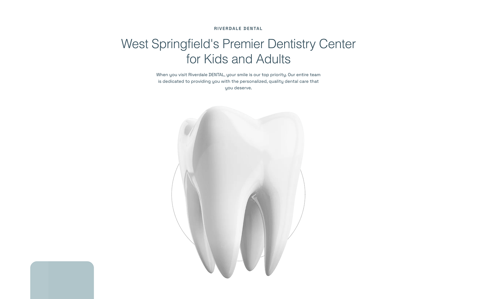
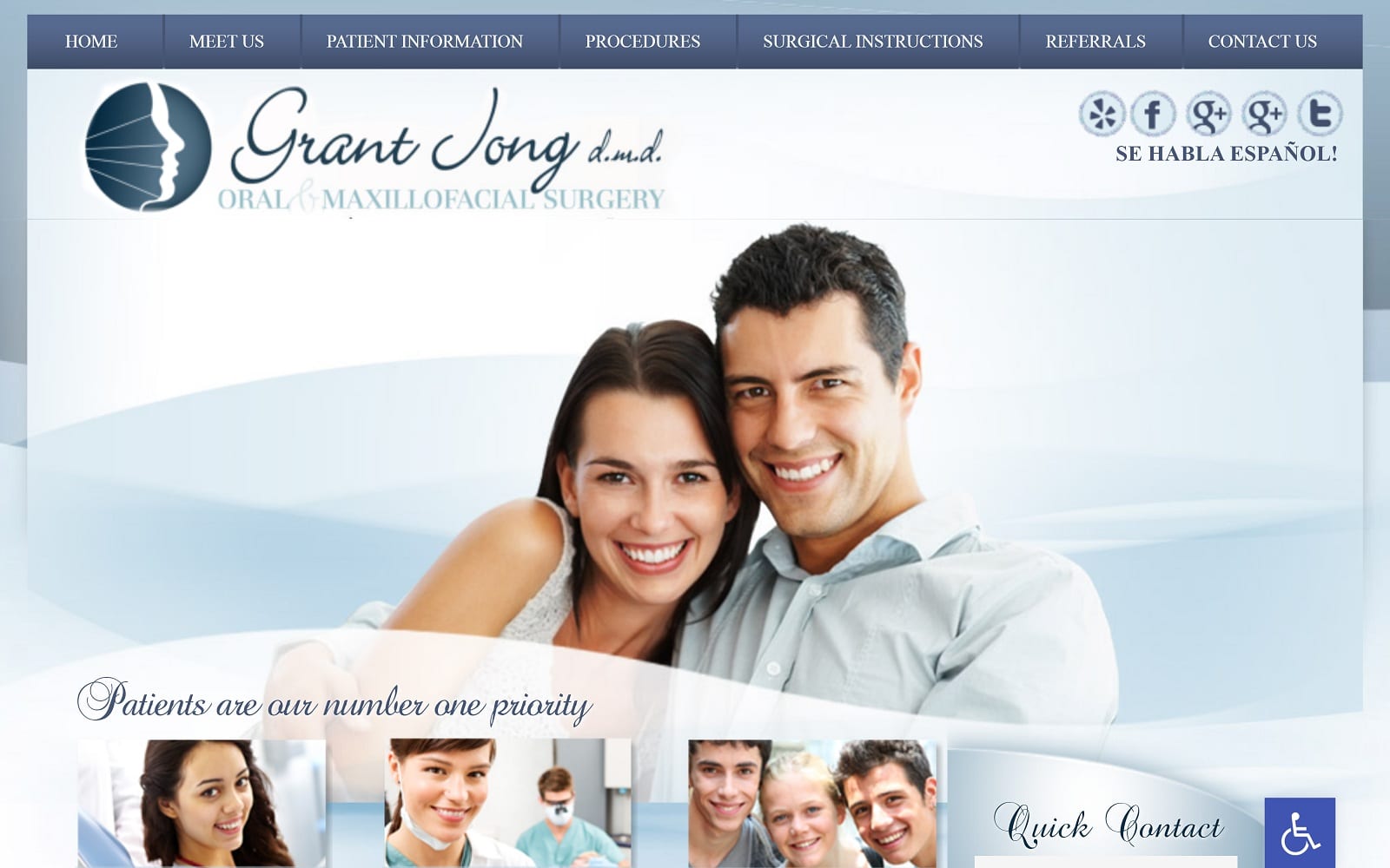
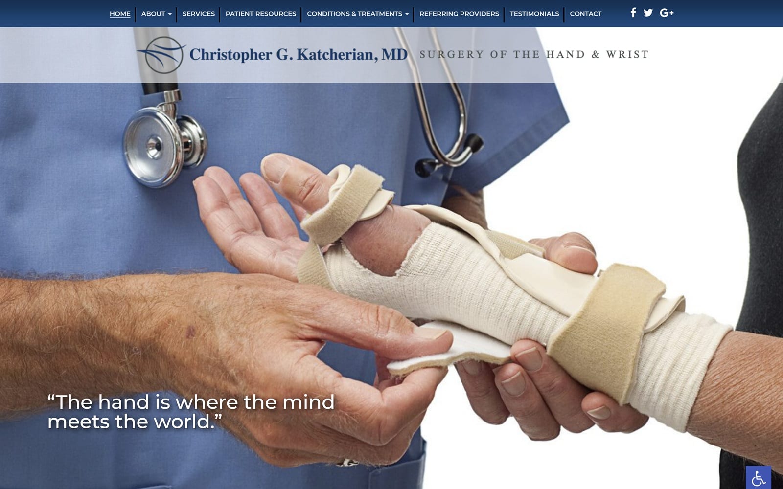
The website for Riverdale Den immediately impresses with its modern design and clean aesthetic. The color scheme, mainly white and pastel gray, mirrors the cleanliness we associate with healthcare, particularly dental care. It subtly reassures visitors about the hygiene standards and modernity of the practice. The color white is also associated with purity, innocence, and simplicity, conveying the idea that the services offered are straightforward and honest.
The layout is modern, aligning with recent trends in web design, such as minimalism and the use of ample whitespace. This offers visitors an easy, stress-free navigation experience. The minimalist design ensures visitors are not overwhelmed with too much information at once, keeping their focus on the important content.
Animated elements are used strategically to draw the visitor’s attention to key parts of the site, such as calls to action, new patient specials, or educational content about dental services. When used appropriately, these animations can help increase user engagement and encourage conversions.
The typography has been carefully chosen to reflect the practice’s modern and professional identity. Beautiful fonts can substantially impact a site’s overall look and feel, reinforcing the brand identity and making information easy to read and digest. Learn more about choosing a font for a dental website.
Performance:
The modern design of the website doesn’t just contribute to the aesthetics but also to the overall performance of the site. A clean, intuitive layout ensures easy navigation for users, resulting in a lower bounce rate and higher time spent on site.
The use of animations should be monitored to ensure they don’t negatively impact page loading times, as site speed is a critical factor in both user experience and SEO rankings.
SEO:
The website’s design and layout play a crucial role from an SEO perspective. A clean, well-structured site is easier for search engine bots to crawl, improving the website’s visibility in search engine results. Important elements such as title tags, meta descriptions, and alt texts for any graphics or animations must be used correctly for better SEO performance.
Additionally, the website should be mobile-friendly, as many users will access it via mobile devices. Google also follows a mobile-first indexing approach, meaning it predominantly uses the mobile version of the content for indexing and ranking. Check O360 SEO service for dentists.
Shareability:
In terms of shareability, the modern and appealing design of the website enhances its potential for being shared across social media platforms. Moreover, including clear and accessible social sharing buttons, along with compelling content about dental health tips or special offers, can encourage users to share the site with their networks.
Final Thoughts:
This dental practice’s website has skillfully blended aesthetic appeal with functionality. Its modern design and user-friendly layout enhance visitor engagement, drive conversions, and potentially boost its SEO performance. Careful attention to each design element’s role and impact contributes to a cohesive and effective online presence for the practice. Check out our custom dental website design services if you want a similar design.


