River Landing Dentistry is managed by the accredited Dr. Rebeca Zechmann. When dealing with healthcare services such as restorative and general dentistry, we made sure to create a website that was both reassuring and comforting to the viewers. Going through a smile makeover can be extremely frustrating and time-consuming. As such, we wanted to allow Dr. Zechmann’s diversity of services to shine through her online platform.
Overview of Design
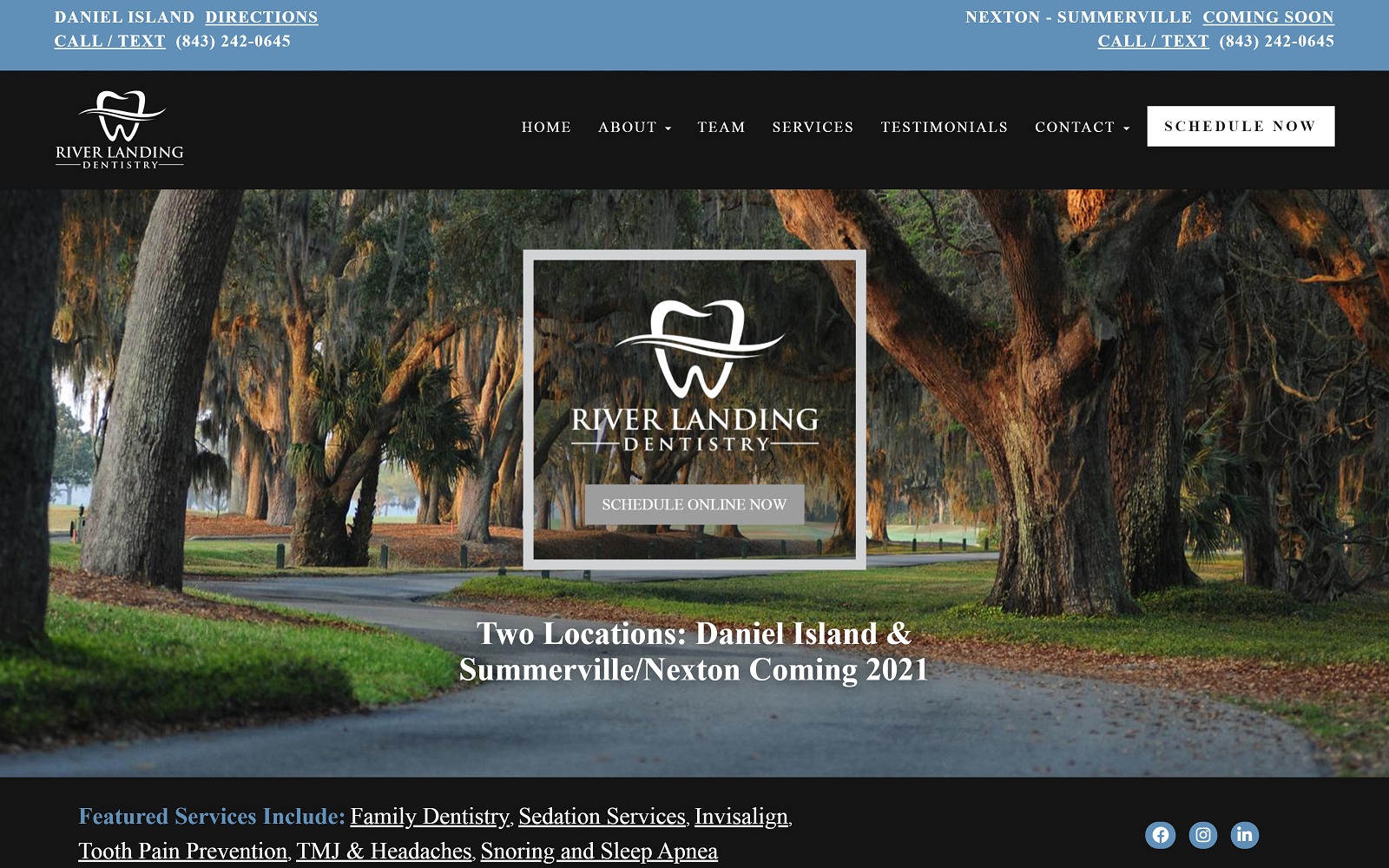
River Landing Dentistry focuses on providing the highest quality of dentistry to the local community through a plethora of different options. In fact, Dr. Zechmann and her team focus on more than just restorative and general dentistry. She also focuses on sleeping disorders and TMJ issues as well. Her team is also well-versed in cosmetic and preventative dentistry. With such a large skillset, we made sure to create an interface that would allow readers to read and digest information without feeling overwhelmed. The homepage is wide and has all the featured services that are offered at the office. We kept all the information spacious by implementing square borders and a content-rich navigation menu for additional access.
Use of Color and Images
We thought it would be best to keep the color scheme simple and effective on sites such as Dr. Zechmann’s. You do not want to overwhelm readers with additional colors when we have already incorporated the use of special effects and hovering images throughout the website. These effects add to modernize and connect users to the community around them. Through the use of simple black text over a white background, this ensures that all the reading is legible and concise. The scenic pictures help create a calming atmosphere for the readers visiting the site for the first time – most of the pictures are actually from the surrounding environment. Since River Landing Dentistry is based in a community setting, we made sure to highlight this important feature through visuals on the website itself.
Elements of Design
The dental service tab on our spacious navigation menu is home to all the different treatment options available. Next, to a small description of the services offered, are appropriately placed images that draw the reader’s attention. We made sure to include ample space for users to navigate and read accordingly. No one likes a cramped website; River Landing Dentistry is no different. Based on such a small community, we made sure to highlight the importance of testimonials and credentials through the different tabs on the navigation menu. We also optimized the site to be mobile-friendly to allow optimal access.
Marketing Aspect
To encourage further reading, we placed access to Dr. Zechmann’s blog on the navigation menu. Blogging is one of the key ways to organically grow and steer traffic towards your website. We wanted to make sure it was easily recognized where ever the viewer might be on the website. Knowing the doctor that will be working on your teeth can be a huge step in committing towards an operation. We provided a lengthy biography of Dr. Zeccmann’s credentials and awards to help readers get more personable. As an additional bonus, the website is protected from hackers using SSL Security. This means that your dear and dear personal information such as credit card numbers and phone numbers are safely imputed and encrypted to stop hackers dead in their tracks. When you are finally ready to commit to River Landing Dentistry, you will never have to worry about getting lost on scheduling an appointment. We incorporated an interactive widget on the side of each webpage to lets viewers book an appointment with ease.;River Landing Dentistry is managed by the accredited Dr. Rebeca Zechmann. When dealing with healthcare services such as restorative and general dentistry, we made sure to create a website that was both reassuring and comforting to the viewers. Going through a smile makeover can be extremely frustrating and time-consuming. As such, we wanted to allow Dr. Zechmann’s diversity of services shine through her online platform.
Overview of Design
River Landing Dentistry focuses on providing the highest quality of dentistry to the local community through a plethora of different options. In fact, Dr. Zechmann and her team focus on more than just restorative and general dentistry. She also focuses on sleeping disorders and TMJ issues as well. Her team is also well-versed in cosmetic and preventative dentistry. With such a large skillset, we made sure to create an interface that would allow readers to read and digest information without feeling overwhelmed. The homepage is wide and has all the featured services that are offered at the office. We kept all the information spacious by implementing square borders and a content-rich navigation menu for additional access.
Use of Color and Images
We thought it would be best to keep the color scheme simple and effective on sites such as Dr. Zechmann’s. You do not want to overwhelm readers with additional colors when we have already incorporated the use of special effects and hovering images throughout the website. These effects add to modernize and connect users to the community around them. Through the use of simple black text over a white background, this ensures that all the reading is legible and concise. The scenic pictures help create a calming atmosphere for the readers visiting the site for the first time – most of the pictures are actually from the surrounding environment. Since River Landing Dentistry is based in a community setting, we made sure to highlight this important feature through visuals on the website itself.
Elements of Design
The dental service tab on our spacious navigation menu is home to all the different treatment options available. Next to a small description of the services offered, are appropriately placed images that draw the reader’s attention. We made sure to include ample space for users to navigate and read accordingly. No one likes a cramped website; River Landing Dentistry is no different. Based on such a small community, we made sure to highlight the importance of testimonials and credentials through the different tabs on the navigation menu. We also optimized the site to be mobile-friendly to allow optimal access.
Marketing Aspect
To encourage further reading, we placed access to Dr. Zechmann’s blog on the navigation menu. Blogging is one of the key ways to organically grow and steer traffic towards your website. We wanted to make sure it was easily recognized where ever the viewer might be on the website. Knowing the doctor that will be working on your teeth can be a huge step in committing towards an operation. We provided a lengthy biography of Dr. Zeccmann’s credentials and awards to help readers get more personable. As an additional bonus, the website is protected from hackers using SSL Security. This means that your dear and dear personal information such as credit card numbers and phone numbers are safely imputed and encrypted to stop hackers dead in their tracks. When you are finally ready to commit to River Landing Dentistry, you will never have to worry about getting lost on scheduling an appointment. We incorporated an interactive widget on the side of each webpage to lets viewers book an appointment with ease.


