Overview of Design
At Recovery NOW, psychotherapists provide individual, family, and groups therapy, as well as certain specialty services to individuals who are struggling with mental health, substance abuse, and eating disorders. When our team was challenged with building a custom mental health website for this practice, we rose to the occasion with a space that strongly emanates a sense of hope and change.
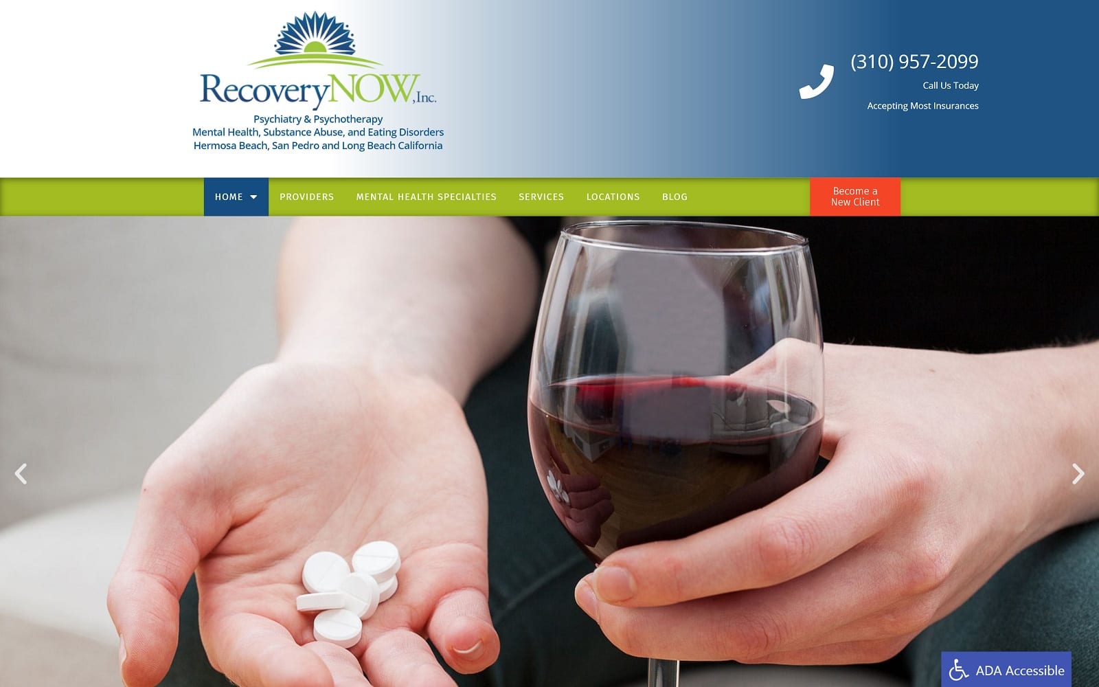
We emphasized Recovery NOW’s prominent logo – one that mimics the sun rising on a new day. Visitors get an immediate sense of optimism despite imagery that depicts the types of problems many people face when entering treatment at Recovery NOW. Moving through the site, carefully selected imagery depicts the types of issues an individual might be facing, as well as the outcome that is possible with successful treatment.
The home page also includes a brief welcome that recognizes the decision to enter recovery as a deeply personal one. It also emphasizes the importance of getting treatment from a licensed and qualified provider, and then links to a directory of its licensed therapists and posts from the blog. Visitors are also given multiple opportunities to contact Recovery NOW directly. Moving through the site, there is an exhaustive list of specialty services and descriptions, as well as various types of individual and group therapy solutions.
Use of Colors
Light blue and green are the primary hues chosen for this mental health treatment center website. Light blue, especially, is associated with health, healing, and being at peace with one’s self. Green was chosen as a complementary color with the goal of presenting this treatment program as a place of growth, hope, and safety.
Analysis of Design Elements
We softened the site’s image with subtle curves, which seem non-threatening and flexible as compared to the more rigid appearance of linear site elements. These are important characteristics for individuals who may otherwise feel anxious about entering treatment for a deeply personal or perhaps embarrassing problem.
Marketing Aspect
Given the nature of substance abuse and mental health treatment centers, we wasted no time presenting visitors with an opportunity to get help. There are calls to action throughout the website, including integrated contact forms, phone numbers, links to social media accounts, and an opportunity to call the practice directly from the website. We also included links to the site’s listing through important publications like Psychology Today, as well as recommended reading.
Image the Website Represents
The Recovery NOW custom mental health website begins with an image that cuts right to the chase. The image of an anonymous person combining alcohol with prescription medications leaves no question about the types of services offered through this treatment center. However, it is quickly followed by a scrolling image of a smiling woman who has seemingly achieve sobriety and feels more confident in her ability to overcome addiction and mental health disorders. Overall, the tone of this site is one of optimism for the future, assuring those who are seeking help that tomorrow always brings a new day.
Mental Health Website Design by Optimized360


