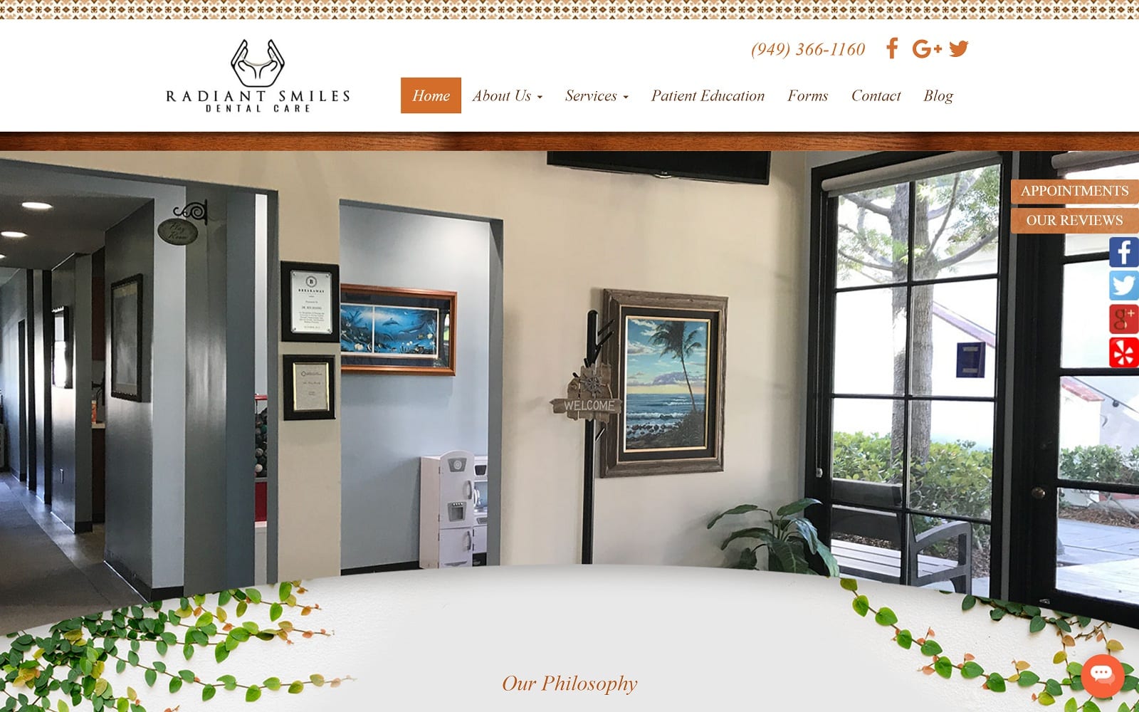
The philosophy of Radiant Smiles Dental Care is to provide the best quality dentistry to their patients in the most comfortable and convenient manner. Their friendly staff is well trained to assist patients and answer any of their questions, whether it’s regarding dental treatment or insurance questions. Dr. Hoang designed his dental website to complement the coastal community he lives in and his inviting office. The soft earth tone colors and textures add character to the doctor’s website along with adding a personal touch. The unique scroll effect of the homepage sets Dr. Hoang’s website apart from all other dental sites.
Design Overview and Use of Color
The overall design is modern, with a touch of style and bravado. The orange highlight that is seen throughout the web page compliments the white background and adds to the radiant smile aesthetic. Making a lasting first impression is important. The font is legible and clean; as you make your way throughout the website, you will notice a plethora of testimonials, informational information, and booking information. Top that off with interactive social media widgets and a stunning navigation menu and you have the perfect blend of personality and professionalism any dental patient could ask for.
Elements of Design
Dr. Hoang’s website boasts an impressive navigation menu of both informational information and contact information. Out the gate, there is an immediate call to action present. The fashion-centric photos (also using our parallax feature) creates an open and cozy atmosphere for the incoming patients. There are actual display pictures of the office itself to help visual patients see what is in store when booking an appointment. As always, the color palette of beige, brown, and orange create a lighthearted environment that is both elegant and classy.
Space is expertly managed throughout the website. The ample amount of white background along the text helps the patients navigate through the site with ease. The contact page also has an interactive Google map for those wishing to find their estimated time of arrival to the office. The about us tab features a short summary of the dental team’s educational information and mission statement. As you move down the tab, you will notice a tab dedicated to testimonials. This is a great way to attract new patients as well as giving your practice a boost in reputation. Being personable is key to establishing any new patient-to-dentist relationship.
Marketing Aspect
One additional marketing bonus that Dr. Hoang has incorporated is the use of a blog. When you enter his blog conveniently located on the right of the navigation menu, you are greeted to an interactive blog filled with videos and images. This standout method of marketing along with a great website design has allowed Dr. Haong to showcase both professional talent and personality – a great look for his dental office in the process.
Image the Website Represents
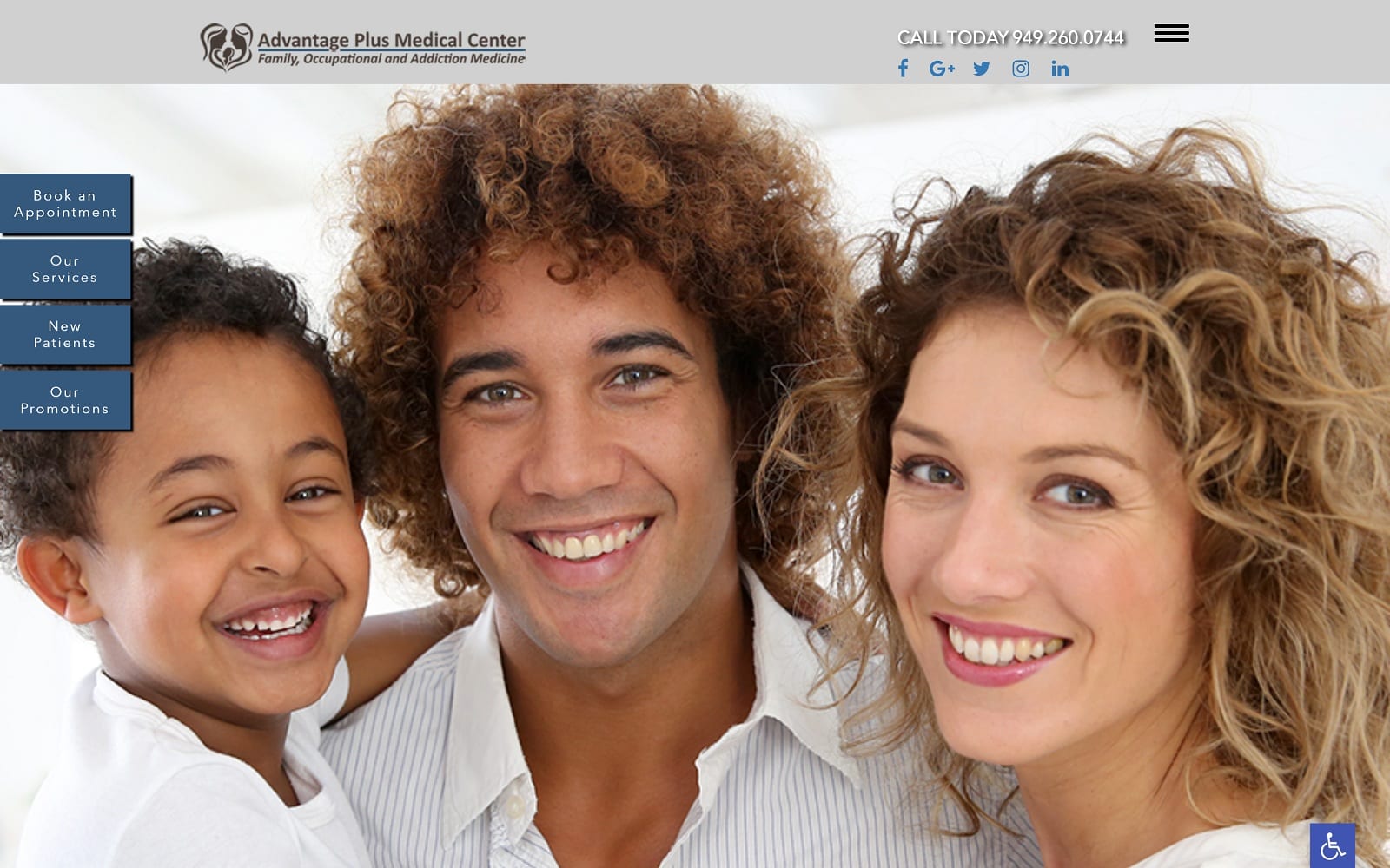
All the images and visuals are family-oriented and represent the hospitality of Radiant Smiles Dental Care. The bright colors and smiling faces make for a great first impression for incoming visitors. For the San Juan natives, making a difference in patient care is all about providing a nurturing environment. We made sure that the images on the website reflected that. All the different visuals and images cater to a wide demographic. Both young and old patients will find the website design attractive!
