Overview of the Design
The Optical Shoppe is an optometric practice that markets itself as an eyeglass and contact retailer just as much as an eye care provider. The goal of this website was to give visitors the impression that this practice can meet all of their eye care and eyewear needs under one roof. Often, websites for optometrists can lack features and visual effects that set them apart from the competition – especially if the sites are template based. With a custom optometric web design from Optimized 360, we can create a one-of-a-kind space that captivates the attention of visitors and converts them into new patients.
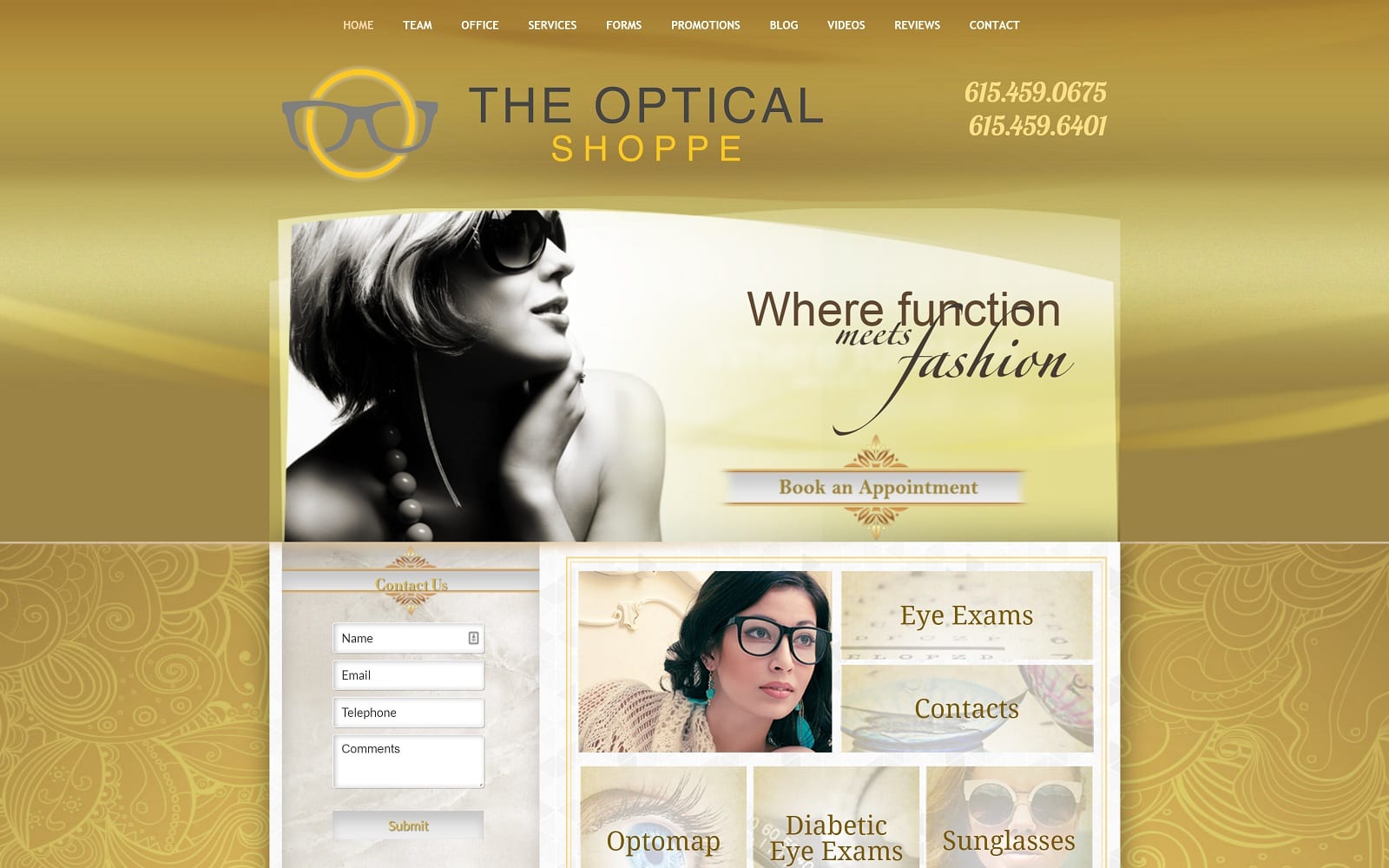
This site is built upon a traditional layout with an upper navigational menu directing viewers to various sections of the website. A classically chic header image serves as a gateway into a specialized services area, followed by a brief welcome from the practice. The remainder of the website includes information about the office, staff, and services. It also includes a special promotions tab that allows the practice to spotlight special offers for new and existing patients. Forms can be accessed from the website to expedite the office experience, and links to the practice blog and informational videos help to answer questions and educate potential patients about their eye health.
Use of Colors
We opted for a bold contrast of color with shades of yellow and gold offset by black, cream, and white neutrals. It is a bright choice of hues that enliven the site and make it more attractive overall.
Analysis of Design Elements
Curves are a subtle design element within this website used throughout the background and along the header image. With a lack of harsh edges, it gives the impression that patients are free to be themselves and express themselves with fashion-forward choices in eyewear. We also created a responsive image menu that lights up when the user hovers over each tile, highlighting specific services like contacts, glasses, diabetic eye exams, and more.
Marketing Aspect
This practice markets itself to individuals with discriminating tastes and who prefer on-trend looks. In addition to utilizing fashionable imagery, we also spotlighted the practice’s A+ reputation with BBB for multiple consecutive years. The home page emphasizes the flexible payment options, advertising no-interest financing, and an easy contact and appointment request form is linked to from the home page. Finally, links to social media accounts were included for those who wish to remain up to date on news and happenings at the practice.
Image the Website Represents
This fashionable website is designed to look very different than the local competition. Rather than put all of the attention on the doctor and office, this website shines the light back at the concerns and priorities of the visitor. We chose a neutral image of a woman dressed in high-fashion glasses and accessories, as well as images of young individuals outfitted in the latest eyewear trends.
Website Designed by Optimized360


