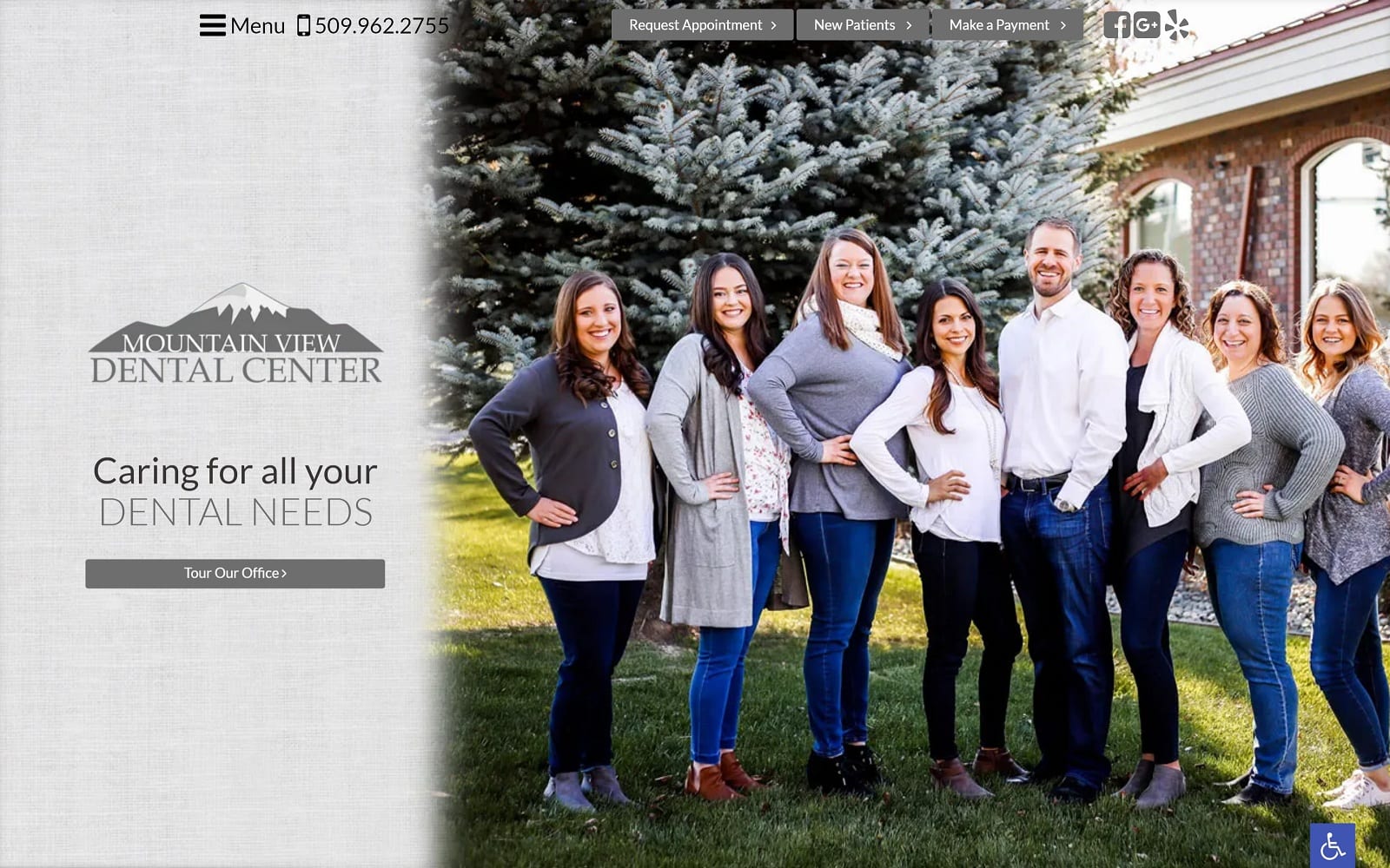
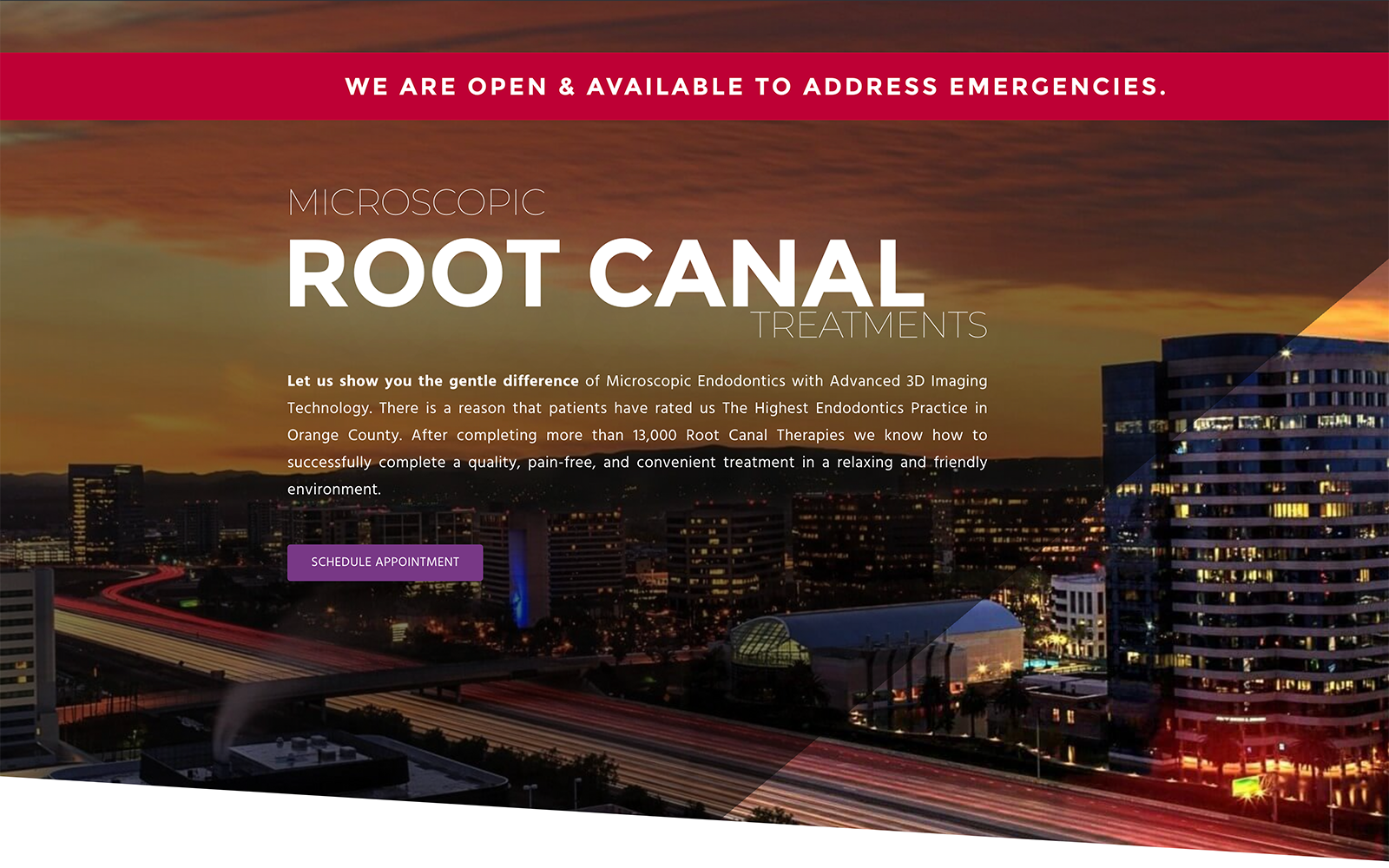
Dr. Joshu Kirk manages Mountain View Dental Center. With a passion for serving the community through his dental profession, we wanted to create a custom website for Dr. Kirk that would capture his love for both dentistry and connecting to the community.
Design Overview
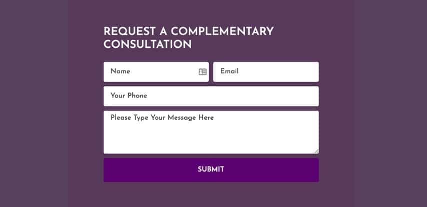
We set out to create a website that would use full-width navigation to give a modern appeal to the Washington community. With any dental website, we always want to be upfront and personable with our incoming web-visitors. The homepage features images of Dr. Kirk and his family, along with the different features offered at the office. Manifesting a sense of community and hope was crucial for Dr. Kirk. We also implemented a quick contact form and links that will redirect curious visitors to other useful web pages on the bottom of each page.
Use of Color
This dental website was created with neutral grey tones and clear text allowing patients to comfortably navigate the site. Dr. Kirk wanted to emphasize his knowledge of advanced technology in treating patients in addition to providing great service. The overall design and color scheme is simple and effective. There are natural undertones and themes integrated with both the display pictures and colors used throughout the website make for a great combination.
Use of Imagery
All the colors and imagery on the website reflect the professional manner that Mountain View operates under. Dental work can be daunting. We made sure the colors along with the friendly images on the website would help ease any anxious patients.
Elements of Design
The hamburger menu on the website is a nice touch that helps Dr. Kirk’s website stand out among the other dental websites in the area. A hamburger menu allows more optimal web page space. We made sure to use parallax effects to create a highly responsive and functional website that would load quickly on both desktops and mobile devices. We also included direct links to different calls to action on the top banner. To top it all off, we included widgets to the team’s social media as well.
To learn more about web design basics, here is a short 3 minute YouTube video to get you started.
Marketing Aspect
Under the new patients tab, patients may download several forms before heading towards an appointment. Not only is this a great way to commit patients to an appointment, but to also spend less time in a waiting room and more time spent on the stuff that truly matters.
The smile gallery tab on the hamburger menu features before-and-after treatment photos of previous patients. The dental videos tab features a video database that helps incoming patients review different dental services. This is a great way to help any patients with dental anxiety and can mean the difference between a skeptical patient to a committing, lifelong patient.
Learn how to Use Patients’ Testimonials to Promote Your Dental or Medical Practice to ensure you are maximizing your marketing efforts!
