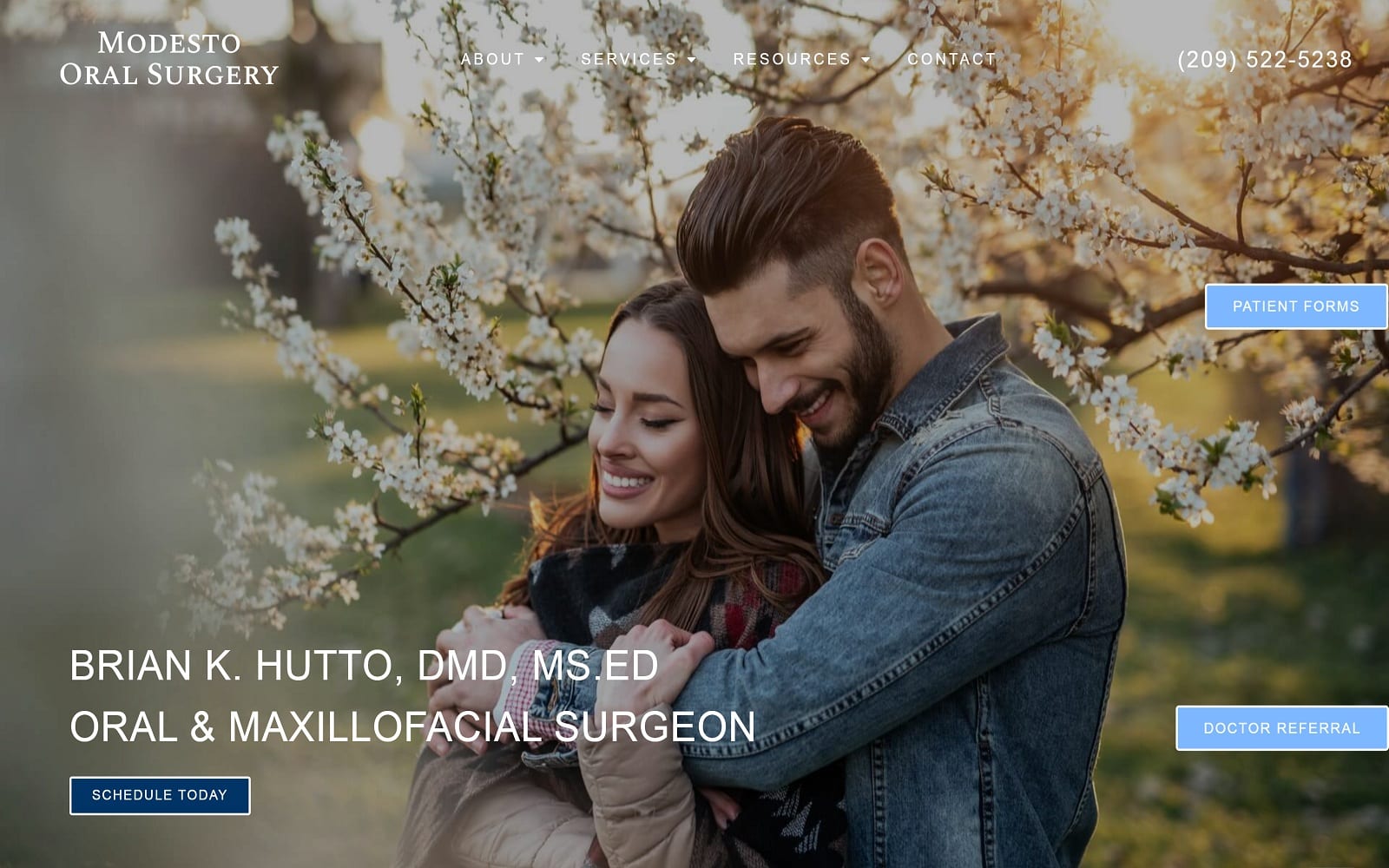
Modesto Oral Surgery opens with a slideshow of images featuring a diverse range of patients they serve set against the beautiful vistas of their local area. Combined with a basic light blue, gray, and white color palette, it creates a striking tribute to their dedication to their clinic family. Images are used throughout the site to let their clientele see themselves reflected in the clinic’s site, forming a subtle rapport that will help drive conversion. The heavy use of videos throughout the site gives it a modern, up-to-date feel while demonstrating a dedication to communication.
The hero images selected are focused on rapport building and demonstrating a dedication to relationships with their patients that last a lifetime. The main page visitors see on landing presents them with simple and easy methods of reaching out to the oral surgery clinic and getting to their first visit. This includes links to patient forms, doctor referral processing, and appointment scheduling that lets a visitor accomplish everything they need to join the clinic’s patient family without going deeper into the site. The phone number provided in the upper right integrates click-to-dial functionality to make reaching out to the clinic a one-click affair. The testimonial section of the site makes maximum use of limited space by using a slideshow of the reviews of previous patients of the clinic.


