Overview of the Design
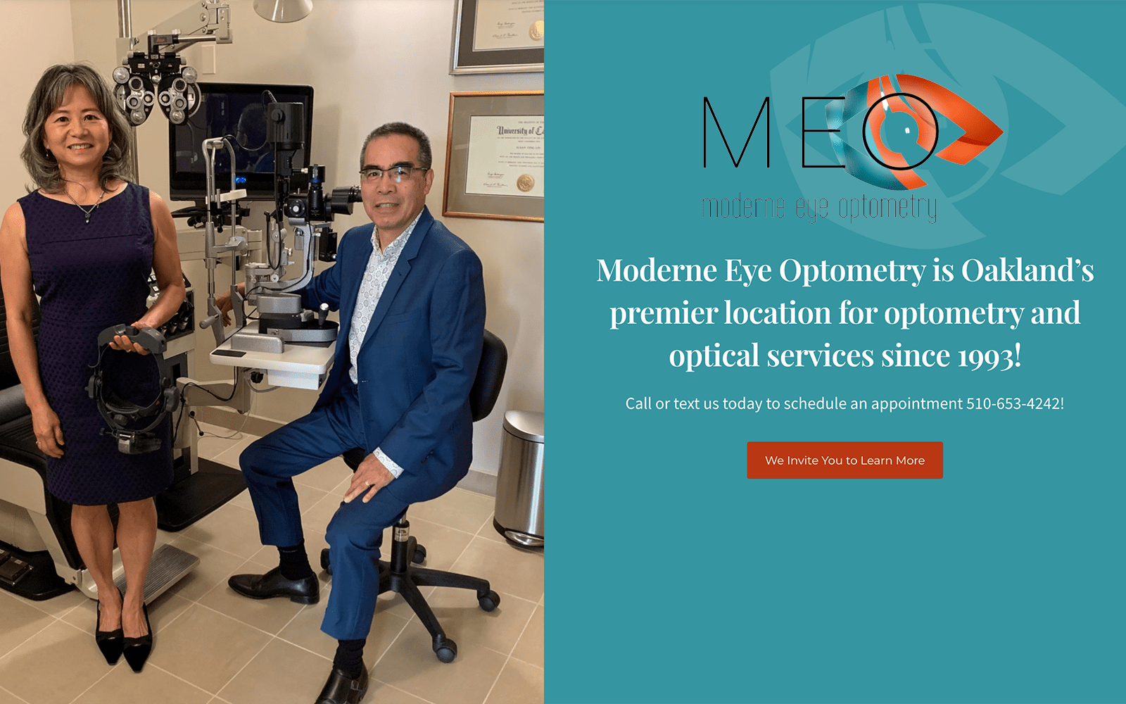
With a name like Modern Eye Optometry, it makes sense that you would need a modern website that reflects the mission of your practice. We enjoyed creating this custom optometry website, which features slight tweaks to the traditional components of the home page. The header images are slim, yet fill up the full width of the browser screen. The featured services section, however, adapts to a standard width, followed by featured conditions that expand back to a full screen view.
Use of Colors
This website is based on a green and orange color scheme, which contrast nicely against each other and directly correspond to the colors within the practice logo. Orange is a bright and cheerful color, whereas green demonstrates youth, health, and vitality. These hues make sense considering this practice exists to help patients maintain the youthful health and function of their eyes.
Analysis of Design Elements
This website is a combination of informative and visual. An extensive services and patient education section addresses common visual ailments, such as macular degeneration and diabetic retinopathy. For a smoother and faster in-office experience, new patients can also download the registration paperwork directly from the website and bring it with them completed to their first appointment. Social media links connect users to the practice Facebook and Instagram pages, and the eyewear section shows off some of the designer frames available in the practice office.
Marketing Aspect
Marketing for an optometrist means advertising to a large demographic. Everyone should have their eyes examined periodically, although many do not. Since this practice cares for optometric patients of all ages, we created a fun and educational space that answers common questions and also promotes specific services and products offered by the practice, such as Spectacular Specs. Visitors are also given the opportunity to request an in-person appointment directly from the website, and a “What’s New” section displays current promotions as they change over time.
Image the Website Represents
A close-up photo of an eye on the home page is an immediate giveaway to the nature of the practice. The other images in this web design are down-to-Earth and friendly. They depict actual images of the staff and real patients at Modern Eye Optometry enjoying day-to-day appointments and life in the office. Site visitors also get to know the entire team as well as the office through a variety of pictures throughout the site.
Optometry Website Designed by Optimized360


